


11:49 PM, Monday October 16th 2023
Glad I could help :D
")
")
")
")
")
")


Glad I could help :D
glad I could help :D
Organic Arrows
As arrows get farther away, the space between their segments should also get compressed/smaller
Using hatching “folds” an arrow either towards or away from us - some arrows have hatching which folds the back, smaller part towards us, making them look less 3D
Hatching should go fully across an arrow’s width - I’d also recommend fewer hatching lines, as they convey the same idea with less work
Some arrows are missing line weight, or aren’t capped off at the end
Some arrow’s curves don’t match - this will improve with practice, but rearranging the steps of this lesson (like here https://drawabox.com/lesson/2/4/example) might also help
You’re not afraid to overlap your arrows, which makes them look more 3D, nice work
Most of your arrows’ widths get smaller as they move further away, good job
Organic Forms / Contour Ellipses
Some forms pinch at the middle - it’s something to keep in mind, but as long as you’re aiming for simple organic forms, it shouldn’t be much of an issue
Some contour ellipses don’t align to their organic form’s minor axis/where the minor axis should be
Some ellipses’ degrees don’t change with their form
Most ellipses are drawn through 2-3 times, and are executed confidently, well done
Organic Forms / Contour Lines
Two forms have contour ellipses instead of lines
Some contour lines’ degrees do not vary/turn with their organic form
Your contour lines hook around and reflect the shape of their forms, good work
Texture / General
Each mark should be deliberate and build a specific shadow shape - avoid scribbling/hatching
If a detail is small enough to warrant a single mark, that mark should still be shaped in an intentional way and convey a cast shadow
Texture Analysis
The black and white bars for the texture gradients should be blended into the texture to the point where they’re not clearly visible - try making the transition from dark to light more smooth
For the bottom texture, incorporate the varying rotations found in the texture study into the texture gradient as well
The top and bottom textures have some outlined forms
Dissections
Some textures have fully outlined forms (pangolin scales, snake scales, stones)
Some dissections capture the surface color or form shading of an object (watermelon, chrome/metal) - for these exercises, we want to capture changes in a form's surface, which are things we’d feel running our fingers across an object. Things like watermelon or smooth metal have a lot of color changes, but not so much change on their surface
Some dissections don’t transition smoothly from dense to sparse levels of detail, and some have cast shadows going in inconsistent directions - It may help to picture the light source for each dissection, and then base cast shadows off of it (like in the texture gradient section)
Form Intersections
Your forms are solid and roughly equilateral, good work
Some pages/forms are missing hatching - I’d recommend applying hatching to every form you can in this exercise, as it really helps to keep track of all the stuff on the page
Some forms have hatching on more than one face, which can confuse the viewer’s eye and make things look less 3D
Some line weight is overly heavy, and some linework has wobbles - it’s harder with so much to keep track of, but make sure each line you make is confident and follows the ghosting method
The fourth page has a standalone pyramid
Some cylinders’ ellipses have the same degrees - the back ellipse should have a greater degree than the one in front (see here for more detail on constructing an ellipse https://drawabox.com/lesson/250cylinders/1/degree)
Some intersections on the forms are incorrect, but these aren't the core focus of the exercise, and will improve with practice
Organic Intersections
Some contour lines hook into the poles of the organic forms, which makes them look “torus” or donut shaped instead of simple
Some of the linework wobbles - keep trying to apply the ghosting method
Some cast shadows at the bottom of page 2 act more as outlines, going around the entire form, instead of casting a shadow based on a light source
I’d recommend line weight for clarifying overlaps, as it helps a lot with keeping track of which forms are in front
You've gained a very solid understanding of the concepts Lesson 2 teaches, well done!
Next Steps:
Keep moving forward! Your next steps are:
Add the exercises from Lesson 2 into your pool of warmup exercises
Move on to Lesson 3!
No problem, glad I could help :D
Thanks so much for the critique! I'll be able to learn and improve a lot from this feedback :D
BOXES
Drawing Through Each Box
You’ve drawn through your boxes, including the lines only seen with x-ray vision, well done!
Checking Convergences / Line extension
A few boxes are missing line extensions, particularly for the back corner (190, 229 - 234, 247 - 250). The only guidelines I noticed going the wrong direction were in box 10 - otherwise, you’ve correctly extended your boxes’ lines away from the viewer, good work!
Line Weight / Hatching
Your hatching is consistent, controlled and applied to the correct spaces, good job!
A few boxes don’t have hatching (66, 89, 96) - it isn’t explicitly required, but hatching is useful to show what sides of a box face the viewer. That being said, all the ones afterwards do, so I don’t think this is something to worry about.
I would recommend using line weight (going over a line again with a planned, confident stroke) around your boxes’ silhouettes, as it’ll reinforce their shapes and give more practice with lines.
Foreshortening / Varying Boxes
A lot of boxes have very rapid convergence (vanishing points close to the box) - while we want a mix of this and minimal convergence (boxes with vanishing points further away), I’d recommend more minimally converging boxes for two reasons:
Dramatic foreshortening implies large objects (or things that are close up) - since most things we draw have “normal” distance/size (with shallower foreshortening), practicing those is a slightly higher priority.
Minimal convergence requires farther out vanishing points, increasing our chance for error. It’s not always beneficial to make something harder, but here it encourages more accurate estimations, which is useful for improving both types of boxes.
Other than that, you’ve given your boxes dynamic sizes and shapes, nicely done!
OTHER
Some boxes have redrawn/crossed out lines (142, 221, 247). Speaking from experience, it’s very tempting to redraw or cross out incorrect lines - resist the urge as much as you can.
When we redraw/cross out lines to show or correct a mistake, we give that spot more line weight - this directs our eye towards it, working against the 3D illusion we want to make.
Also, if we avoid redrawing lines, it motivates our brain to ‘get it right’ the first time, so when we can undo/erase lines (like outside of the Drawabox) we’ll be able to spend less time getting an accurate mark.
Otherwise, your linework is confident, straight, and accurate, well done!
The only other thing I want to put here is that the critiques I’ve given don’t mean you did poorly. You came here to learn, and did just that. Keep moving forward!
Next Steps:
You’ve and gained a solid understanding of the concepts 250 boxes can teach! There is only one revision I request:
1. Draw one page of four minimally converging boxes - do your best to avoid redrawing/crossing out lines, and I'd recommend applying line weight and hatching to the proper areas. After, extend each of your lines away from the viewer, including the back corner lines.
If you have any questions/concerns let me know, and I'll do my best to answer them!
Thank you for the critique! :D
LINES - General
Your lines are confident, straight, and you’ve set out your goals beforehand, well done!
Superimposed Lines:
Only thing I noticed was over/undershoot on some longer lines - this will improve with practice, but lifting your pen off the page right as you hit the end of the mark might help too.
Ghosted Lines:
There are some slight inaccuracies hitting points, but this will improve with practice.
Ghosted Planes:
The planes on pg. 2 (“5.jpg”) could be a little more varied - other than that they look good!
ELLIPSES - General
Your ellipses are confident, accurate, and drawn through 2 - 3 times, well done!
Tables of Ellipses
Your sizing and minor axis alignment are quite well done, good job!
Ellipses in Planes
One warped plane on pg. 1 (“8.jpg”) seems to struggle with accuracy - this will improve with practicing warped planes, so I'd recommend adding a few more when doing the ghosted planes exercise.
Funnels
A couple ellipses don’t quite align to the axis of the funnels, but other than that they look good!
BOXES - General
Your boxes make use of parallel lines and vanishing points, and are well constructed, good work!
Plotted Perspective
Your hatching is very consistent here, nice work!
Rough perspective
Looks good, only thing I noticed was you only need to take your guidelines back to the horizon line on pg. 1 (“12.jpg”).
Rotated Boxes
Your boxes are rotating correctly, and you’ve drawn out each of the required lines, well done! Only recommendations I have are to add some hatching and line weight to the proper areas.
Organic Perspective
It’s not necessary to draw boxes completely obscured by others, since adding them won’t help convey a sense of depth/space - some line weight for the boxes in front might help as well.
OTHER
There's a very tiny amount of lines which are redrawn - you're doing very good keeping this in check, this is just a reminder to keep it up!
Not much else to put here, except the critiques I’ve given don’t mean you did badly - you came to learn what Lesson 1 teaches and you’ve done exactly that - keep moving forward!
If you have any questions/concerns, let me know, and I'll do my best to answer them!
Next Steps:
You’ve learned all the core concepts Lesson 1 teaches!
Your next step is to tackle the 250 box challenge.
LINES / General
Your lines look confident and quite straight, good work!
Superimposed Lines:
I’d recommend having some lines go fully across the page. Some longer lines have a little arc/wobble - to counter arcing, it might be helpful to think of arcing the opposite way just a bit.
Ghosted Lines:
Your ghosted lines are confident, straight, and accurate, well done! Only thing I’d say is it’s fine to let them overlap.
Ghosted Planes:
I can’t tell if this was done, but make sure to plot out points for each line beforehand including the second dividing lines (if you did this and I just couldn't tell, good work!). I’d also recommend putting the planes closer together.
ELLIPSES - General
Your ellipses are drawn through 2 - 3 times and are accurate, good work! Some ellipses do wobble - we want to prioritize smooth and confident ellipses over accurate ones. Ellipses in the correct bounds won’t do much good if they’re wobbly.
Tables of Ellipses
Your ellipses’ minor axis are quite well aligned, and there is less wobble here, good work! There are some minor inaccuracies with sizing and spacing, but these will improve with practice + more confident ellipses.
Ellipses in Planes
Just the general critique applies here.
Funnels
Your alignment here is quite good! Make sure to have ellipses on either side of the funnel's shorter centerline, not one directly on it. The top/bottom left sections of the exercise don’t have curved lines - while this is interesting in itself, it won’t prepare us as much for the more organic forms of Lesson 2.
BOXES
Your boxes are well constructed, and make use of parallel lines and vanishing points, good work!
Plotted Perspective
You’ve set out your vanishing points, used careful hatching, and your boxes are well constructed, good job! I’d only recommend 1 - 2 more boxes per scene, and to push the middle scene’s vanishing points out more.
Rough perspective
You’ve taken your guidelines to the horizon and set out your points beforehand, good work! There’s one box with a bisected face, which isn't necessary for this exercise.
Rotated Boxes
Pretty much all your boxes are rotating correctly, good work! There are two boxes on the bottom right which aren’t drawn, as well as a few lines throughout. Hatching is also missing - it might help to make the exercise larger, to give you more space between lines (making it easier to add hatching and see which lines are/aren't drawn).
Organic Perspective
The swoopy lines have some wobble to them, and a couple boxes have quick foreshortening. Only other thing I’d recommend is a few more boxes per scene.
OTHER
A couple marks are redrawn/give line weight when unnecessary - speaking from experience, it’s hard to resist the urge to redraw lines, but it’s worth it. Your work will look much cleaner, and it's faster as well.
Not much else to put here, except that the critiques I’ve given here don’t mean you’ve done badly/failed the exercises. You came here to learn, and you’ve done just that - you’ve gained a solid understanding of the core concepts Lesson 1 teaches, well done!
Next Steps:
REVISIONS:
You’ve worked hard to get where you are! There are only two revisions I request:
On a single page:
Do 4 “8x lines” from the superimposed lines exercise - go across the entire longest side of the page, pushing forward and drawing confidently.
Construct 2 funnels, making sure there are two ellipses on either side of the shorter centerline of the funnel. Try to prioritize smooth, confident ellipses, even if it means losing accuracy.
Afterwards, put each Lesson 1 exercise into your warmups selection (specifically the rotated boxes and some ellipses exercises) - I would also recommend reviewing/reading the instructions for an exercise every week or so (which has helped me a lot). Keep moving forward!
:D
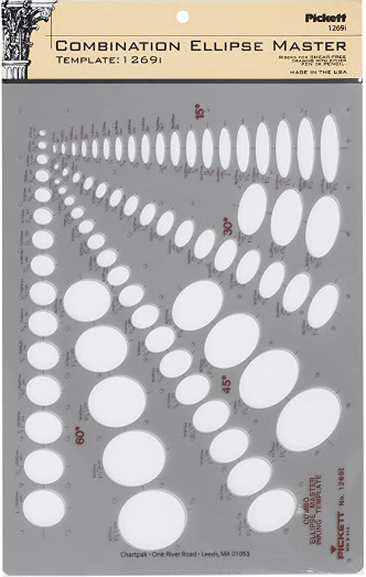
This recommendation is really just for those of you who've reached lesson 6 and onwards.
I haven't found the actual brand you buy to matter much, so you may want to shop around. This one is a "master" template, which will give you a broad range of ellipse degrees and sizes (this one ranges between 0.25 inches and 1.5 inches), and is a good place to start. You may end up finding that this range limits the kinds of ellipses you draw, forcing you to work within those bounds, but it may still be worth it as full sets of ellipse guides can run you quite a bit more, simply due to the sizes and degrees that need to be covered.
No matter which brand of ellipse guide you decide to pick up, make sure they have little markings for the minor axes.
This website uses cookies. You can read more about what we do with them, read our privacy policy.


