aeshnabx

High Roller

Joined 3 years ago

16400 Reputation

aeshnabx's Sketchbook

  • Sharing the Knowledge
  • High Roller
  • Technician
  • Geometric Guerilla
  • Tamer of Beasts
  • The Fearless
  • Giver of Life
  • Dimensional Dominator
  • The Relentless
  • Basics Brawler
    1:11 PM, Sunday November 6th 2022

    Hello again. You're rushing the work, the animals before that one had more care put into them, things like intersections, the eyes, the way that added masses work, even the linework is wobblier than before.

    It's ok, I think you should move on from here (if you haven't already), but work on the issues pointed out here and above all, try to really focus when working, rushing things will not help you to comprehend the things you're supposed to learn. So, to the 250 Cylinder Challenge. Good luck!

    Next Steps:

    • Move on to the 250 Cylinder Challenge
    This community member feels the lesson should be marked as complete, and 2 others agree. The student has earned their completion badge for this lesson and should feel confident in moving onto the next lesson.
    6:58 PM, Monday October 24th 2022

    Hi! Sorry for the delay. I'll give you my notes and then I'll go to your questions:

    • On the fox you made the whole neck-ears form in one stroke. Go step by step, it's better for the mental processes of building up forms. In this case it ends up flattening a bit the form. Is it intersecting with the cranium sphere? Or is it a superficial layer, where the ears are located? Of course we know what you're trying to do, but the point of this is to build on forms, step by step, one by one.

    • The hind leg isn't constructed; if you can't see it completely, you can look at other references or make an educated guess based on the leg you can actually see.

    • The added masses are where they're supposed to be, but be careful with those corners. Look at the corners in these masses. They're are aligned with the middle point of the sausage, signaling the way in which they wrap around the form. On your hind legs you almost got it, but not quite, so be really careful with those. And you can notice that, in that demo, where the corners are not needed, there ain't any of them.

    I highly encourage you to look at this whole submission. Uncomfortable did the critique, so it's better than anything I could tell you, and it deals with a lot of the same issues you have here.

    I would also encourage you to make your own archive of corrections, if you don't have one already. I've been saving a lot of random Uncomfortable's corrections on these lessons and it really helps to see different problems and the way they're resolved.

    • Your head construction is getting a lot better. Be careful with the eyes still, remember that they're bigger than we can actually see, and that they're covered by an eyelid most of the time, even when it's hard to see it. On your hyena for example, the eyelid doesn't wrap around the eye as it should, instead looking more representational; the muzzle could still be broken into more planes, as it is, it looks a bit flat.

    • As for the feet, you've got the right idea, but remember that once you have the basic form, you have to break it down and/or add secondary masses to make the actual form of a foot. Here's another demo from the lesson linked before that deals with feet.

    • Don't forget about the intersections. Your legs still look weak, and the intersections between sausages will help with that.

    Now to your questions:

    • I could not honestly tell you that I have a specific, reliable method for constructing open mouths. What I usually do is establish the muzzle footprint, same as always, and then construct each seccion of the mouth by itself, defining planes, adding masses, etc; joining them only when I'm done with it; always trying to take some measuraments so the opening doesn't get out of hand. I could be wrong though, so you could ask on Discord about that.

    Your head looks good, but yeah, more definition on the planes of the muzzle and a more defined form on it would've helped. Also notice that the nose has its own subdivisions. Try to think of the teeth as the claws on Lesson 4; you can revisit those in the informal demos section. So yeah, it looks good, and it's suggesting the right things, but just a bit more definition on the forms would go a long way.

    • Try to get the best references you can and avoid the ones where you can't see the things that you need. That being said, you can kind of see what the feet look like on the hyena, you could look at other references as well to make an educated guess of what they could look like; but then again, these are all exercises, try not to make them even more complicated.

    So yeah, you're on the right track. Just to prove the point, I'll ask you for a last non-hooved quadruped, draw it big, search for a good reference photo and make sure to check out all the things pointed out here and in the critique by Uncomfortable. That would be the last one, we're kind of grinding on Lesson 5 and we should avoid that :P Anyway, good luck!

    Next Steps:

    • One non-hooved quadruped.
    When finished, reply to this critique with your revisions.
    9:12 PM, Sunday October 2nd 2022

    Hi! Thanks for the critique, I'll work on the points mentioned and yes, at this point I needed a re-read of the texture section; looking back at the challenge I did everything with explicit detail, maybe that's why I felt so miserable when working on that. I never got things to line up perfectly and it was really frustrating.

    I have a question though. When looking at the demo for the challenge, the grooves on that wheel are explicit right? Because that was my guide when approaching the wheels, and looking at the challenge page, it doesn't say anything about that aspect, in fact the outlining of the tire treads is part of it. So I don't know if that's me getting confused or if it's part of the sections that need updating on the lessons.

    That's it, thanks again!

    3:59 PM, Sunday October 2nd 2022

    Hi! Regarding your questions:

    • On the running rat demo, you can see how to construct a muzzle in full profile. If you look at your fox reference, you can see that, even though he's on a full profile view, the different planes of the head are still visible.

    • Yes, we fit the mass around pre-existing forms. I think Uncomfortable describes it as bags of flour; I tend to think of bags of flour when the masses are directly on top of things, and clay or sticky gum when they're below or around other masses; the point is that they have to wrap around the constructions. That rat demo from before is a good example of that.

    Your constructions are looking a lot better, as is your line. In particular, your deer looks good, but you tend to slack off on the difficult parts such as feet, and you almost never add any masses to the head where they're necessary.

    Remember that if you're going to use lineweight you have to ghost your lines the same way you would do it with any other line. Again, don't try to capture the whole image with a couple of forms, instead, build simple forms as an initial construction and then add masses to replicate those complex forms seen on the reference. This is something you tend to do, especially on the legs.

    Here are the corrections for the fox. Most of the issues I see are addressed there. I think you're almost ready, but I'd really like for you to make another 2 animals.

    One should be the same fox, and another non hooved quadruped. Think of all the corrections, and keep in mind the rat and the donkey demo when working. Treat the legs as carefully as any other section of the animal, and make those lines as confident as you can.

    If you have any questions, I'll be around to answer them. Good luck!

    Next Steps:

    • Redo the fox drawing.

    • Add one more non-hooved quadruped.

    When finished, reply to this critique with your revisions.
    1 users agree
    2:45 AM, Sunday September 25th 2022

    Hi Bruh! I'll be critiquing your homework:

    • Form Intersections: You have the forms, and most of the intersections look fine, especially the ones on boxes, but you struggle with the ones that involve spheres. Think that, when a sphere intersects with a box, for example, the intersection should follow the direction of the box, but it also should be a bit round, since it's intersecting with a sphere.

    You can look at this album, where every type of intersection possible is laid down. You'll notice that whenever a sphere, a cone or a cylinder is involved, part of or the whole intersection will involve some degree of curvature.

    Be careful too, because there are forms that are laid too far apart, and don't intersect at all. And the last page has a lot of space for more forms, remember that for this exercise we try to fill the entire page with forms.

    • Object Drawings: It's advisable to include the reference photos on the submission. On this lesson, it's recommended to work on ballpoint pen too. I highly advice you to use a ruler, or a straight edge of any type for your lines. While your freehand lines are pretty good, what we're looking for on this lesson is precision, and the ruler is ideal for making our lives easier in that regard.

    So, as we said, we're looking for precision on this lesson. This means, more than capturing everything exactly as it is, we're focusing on planning every step of our construction. A good example of precision would be the ghosting method: when going through the planning of a straight line we can place an initial and ending dot, this will increase the precision of our drawing by declaring what we want to do. Once that is in place we can draw the mark: it may nail those points, it may overshoot or undershoot, etc.

    The important thing is that prior to any of that we have used the ghosting method to think about each mark's purpose and how we are going to achieve it best rather than figuring everything as we go. This kind of approach is more useful for the kind of geometric forms that we are working with as they have different planes, sharp corners, and clearly defined proportions.

    This leads us to the following problem: a lot of forms on your construction were made without considering the subdivisions and proportions, instead, working by observation and compromising our precision. For example, on the big speaker, you subdivided the box, but when it came to drawing the handles, you eyed it instead of making a clear division on the plane, and considering that that kind of handle will be kind of sunken into the speaker's box; that generates another type of problem, similar to the ones you saw on the barrel demo.

    On the big table with buttons for example, you subdivided the box and had a good framework for the space where the rows of buttons would be, but then you eyeballed them, when it would've been easier and more precise to subdivide the plane even more, so that every button was aligned and proportional with each other. Something similar happens on the cologne bottle. The long bottle was made without any subdivision: it would've been good to put that into a box, subdivide it, and then making the ellipses and constructing the bottle that way; like you did on the weights (I think they're weights).

    So, I think you should go for three more objects. Try to work with a ruler and ballpoint pen, subdivide the forms as much as necesary and draw your construction around those subdivisions. You'll have to measure some things by eye when deciding where to make the subdivisions, but working on that is the point. If you encounter curves, remember that it's more practical to handle them first as straight edges, and round them at the end.

    Try not to repeat lines, construct all the necessary ellipses inside planes. Go for precision, don't try to eyeball things. If a form is too complicated, remember that we can use ortographic studies as a way of working around that.

    It will get messy, and that's part of it. If you can, work with a light lineweight first and go for a heavier one when you're sure of your construction. Two of your objects can be whatever you want; but I want one of them to be a more complex form; think of the mouse demo, something that forces you to use orthographic studies. And as always, take your time with it. Good luck, and if you have any questions, feel free to ask.

    Next Steps:

    • Three more objects, one of which has to be a complex form that requires orthographic studies.
    When finished, reply to this critique with your revisions.
    2 users agree
    1:35 AM, Sunday September 25th 2022

    Hi Chanshizukamoe! I'll be reviewing your homework:

    Ok, so first: your line is really, really wobbly. You have to take the time to ghost and draw from your should on every single line. In time, it will become second nature to do it, but right now you have to take that time and make the effort consciously.

    I can see that you tried various points of view, and that's great, but you rushed the whole job: most of the time you can't make more than two sets of lines converge towards one point; and given the fact that, on a lot of corrections, you drew the correction lines in the opposite direction, it makes me think that you haven't fully grasped the idea of convergence; or that you really just went as quick as you could.

    Adding to the last point, your correction lines should be made with a ruler, always in the direction that your set of lines is converging. We need precision when correcting, and doing those lines freehand just adds to the confusion.

    Take care of your upload as well, there's a photo that's really dark and an unrelated one included in the submission.

    From box 180 or so, you starting to show some improvement; but your lines still diverged sometimes instead of converging, the line still was wobbly, and you also started to make really similar boxes on every ocassion. So much so, that the last 50 boxes were almost identical on their point of view.

    I think you should redo this challenge, taking all of these points into consideration. Go back to the challenge page, see the demos again, read the instructions, and go back to them every time you feel insecure or have doubts about what you're doing. Follow the steps to the letter. If you have too much trouble in the middle of the challenge, remember that you can ask for help on Discord, the community is really good and helpful.

    Now, the most important thing: Take your time. It took me two months to finish this challenge; you take whatever you feel it's necessary to make it right. I usually worked 5 boxes a day, 10 at most, because otherwise I would feel really exhausted and just make a mess. Take your time. Make sure that you are putting the effort and doing those boxes the best you can. If you feel exhausted in the middle of a page, hell, in the middle of a box: stop, come back to it later.

    Most of the challenge here isn't really physical (the act of drawing the boxes), it's mental: to think about how your lines are converging, to think how they're affected when you modify the Y or change the point of view. To make sure that all your lines on a given set are converging towards the same point. To think about how the convergence of your lines will alter the degree of foreshortening. And finally, when you make your correction lines (once the whole page is finished), think about the corrections you just made. What were your mistakes on that particular set of boxes; what you have to correct. What angles and points of view you haven't tried, are you repeating the same box or are you changing your POV? That kind of thing.

    And of course, all of the above is exhausting, so take your time. There's no rush at all.

    That's it. If you have any questions, feel free to ask. Good luck!

    Next Steps:

    • Do the 250 Box Challenge again, reading the demos again and every time it's necessary; take into consideration the critiques made here.

    • Take your time with it.

    When finished, reply to this critique with your revisions.
    2 users agree
    12:56 AM, Sunday September 25th 2022

    Hi AmenX! I'll be reviewing your homework. Let's see:

    • Arrows: They look great; if there were more of them and had a bit more of compression as they move away would've been good too, but as they are, they're good.

    • Leaves: Great job here, they're flexible and flow in 3D space, you followed the steps of construction and the edge detail looks good as well.

    • Branches: The main idea is there as well, remember that the ellipses define how the branch is turning in 3D space, so be consistent with them. On some of the branches the degree of the ellipses gets bigger, then smaller, than bigger in a short amount of space; it's subtle, but it adds up. On some other the change of degree isn't enough, and flattens the branch as a result.

    Finally, remember to construct them bit by bit, overimposing lines: on some of the branches looks like you did the edges on just one, wobbly stroke. It could be an illusion, but either way, work from your shoulder, ghost your lines and overimpose one line after another when constructing branches.

    • Plant Drawings:

    • On your olives, the line on the leaves looks a bit wobbly; there's a leaf that has some lines that don't add up to nothing; they're not detail, and they're not contour lines either. On the actual olives, remember that an sphere with a pole drawn on will be more efective at representing an actual sphere than the curve/ellipse method, like this.

    • The contour lines on the aloe don't look much like the actual plant. Even without reference, the aloe tends to have some curves on it's contour that aren't present there. I could be wrong though. In any case, when working on thicker leaves, think of them in a similar way as in the cactus demo, as far as the contour lines go.

    • On the big plant with holes in it's leaves, the branches are definitely too wobbly, remember what we talked before when it comes to them. The leaves also look too stiff, that could be on the reference though.

    • The stem on one of your mushrooms doesn't conect with anything and breaks the illusion. If the idea was that it is actually behind the mushroom cap, the lineweight doesn't help to convey that. Either way, it would be better for it to actually make contact with the rest of the construction.

    • When it comes to the morel mushrooms, try to follow the demo that's on the lesson. Your version isn't bad at all, but that method is pretty easy and it captures the texture better.

    • Some of your leaves and petals lack flexibility. Don't be afraid to overlap lines when necessary, that way that kind of form will flow better.

    Overall, you did a good job on this lesson, so I think you're prepared for Lesson 4. Keep working on the things pointed out here, and good luck!

    Next Steps:

    • Move on to Lesson 4
    This community member feels the lesson should be marked as complete, and 2 others agree. The student has earned their completion badge for this lesson and should feel confident in moving onto the next lesson.
    10:06 PM, Saturday September 24th 2022

    Hi! Here I made all the corrections. Some animals had the same mistakes pointed out before, so I didn't point them out again, but take them in consideration as a whole. I think you worked way too fast for what you had to look out for, so I think you should try again:

    • One hooved quadruped

    • One non-hooved quadruped

    • One bird.

    Make them count, observe very carefully where the masses are; where you could lay a footprint for the muzzle, that always gives itself away if you look at the planes of the head. Take a look at the informal demos again; and go back to them and these corrections whenever you have doubts. Remember that it's okay to stop mid drawing and continue it later, is better to do that than to feel overwhelmed and rush it.

    That's it, if you have any question, feel free to ask. Good luck!

    Next Steps:

    • One hooved quadruped

    • One non-hooved quadruped

    • One bird.

    When finished, reply to this critique with your revisions.
    2 users agree
    5:59 PM, Monday September 19th 2022

    Hi HFO1! I'll be reviewing your homework.

    On some of the intersections, there are some strange things, like curves on cylinders that don't accelerate enough when reaching the edge, that sort of thing, but overall, they look pretty good.

    As far as your object drawings go, I have to say that they look impeccable to me. You repeated some lines, and I'm sure that it was recommended to use ballpoint pen for this lesson, but besides that, the constructions are great, you subdivided a lot and whenever it was necessary; you chose a lot of complex objects too, so congratulations.

    I had the same problem with the headphones, and arrived at a similar solution, however, I think we handled the headband differently. This is a demo someone made to help me with that, using half an ellipse to work with the headband is what really helped me.

    I asume you used ortographic studies for things like the knifes and the detail on the little house, but I'm really curious about how you handled the spheric objects and especially that cart thing. I would've enclosed the whole thing in a box for starters and then I would've broken it into sections, but your solution looks a lot more elegant, and I'm curious to know how you determined the point at which the top section should start.

    Also, I don't know if you do it already, but after a week of posting your homework, if you haven't had a review, you can go on Discord and ask for it to be included on a spreadsheet, that way it gets critiqued as soon as possible. After Lesson 1 though you have to make 5 critiques per submission to get yours reviewed, but still, it's pretty quick. I say that because I saw you uploaded this lesson a couple of times before.

    Anyway, congratulations on finishing Lesson 6! Feel free to move on to the 25 Wheel Challenge.

    Next Steps:

    • Move on to the 25 Wheel Challenge
    This community member feels the lesson should be marked as complete, and 2 others agree. The student has earned their completion badge for this lesson and should feel confident in moving onto the next lesson.
    2 users agree
    5:31 PM, Monday September 19th 2022

    Hi TotalTempest! I'll be reviewing your work. Let's see:

    Organic Intersections:

    The line is a bit wobbly, and the excessive lineweight does not help. Remember to apply that only on sections that intersect each other, to clarify which form is on top of which. The sausages can be rounder (like two spheres joined by a tube), but it's something that will improve in time, just keep it in mind. I think that, for the most part, the forms feel solid and like they're falling onto each other, (the long sausage behind does not fall onto anything though), but the shadows that you applied don't help at all.

    Here's a corrected version (I'm working on Paint with mouse, so it's not perfect). The important things to remember is that the shadows will get bigger as the form starts to hang and separates from the form underneath; so it won't start thick right away. That suggests that the form is floating and it contradicts what you actually drew. The other aspect is that cast shadows have to follow the contour of the forms they're being cast on; the corrected shadow I made on the lower sausage does that, following the curved surface of the last sausage before reaching the floor.

    Finally, be mindful of your contour lines, they're supposed to represent how the form turns and twists in 3D space; so their degree will change depending on how the form behaves. Both ends of the curves have to be the same degree, keep an eye on that.

    Animal Drawings:

    So, I've been looking at your insect drawings and they're pretty good as far as construction is concerned. You didn't make the animal drawings with as much care. The initial construction most of the time is good (although some intersection lines could help, on the point the bird's head makes contact with the body, for example), but everything on top feels extremely flat.

    On your added masses, for example, you rarely did follow the contour of the forms they're sitting on, the best ones here are the ones where you followed the demos. Look at this. Notice that the added forms work like bags of fluor, or sticky gum, they warp and adjust to the construction they're being placed upon.

    Your added masses a lot of the time look like blobs that do not adjust to the initial construction, or have random corners. In this demo you can see how that works. Corners usually suggest other forms existing right besides them (like on the shell of a lobster, for example), so try to avoid them unless they're necessary.

    Your legs do not look like sausages at all a lot of the time, remember that making intersections on the places where they intersect each other helps a lot to solidify them as 3D forms. Most of the time you didn't construct the feet, instead trying to replicate them by observation. The best in this aspect are the bird's feet, which are actually constructed. You don't have to go overboard with that, but try to build their initial construction, add the planes, then add the toes or divide them where necessary. The intersection of the foot construction with the leg will also help you to solidify the whole thing.

    Your heads are better in that they show a clearer path of construction, but still there are problems with how you follow (or don't) the contour of the initial construction. Finally, the main problem I see is that you tend to skip steps or whole sections, instead trying to replicate the animal just by observation. Remember, we're not trying to make pretty pictures here, we're trying to learn about constructional drawing. So, an awkward looking but well constructed animal drawing is better for our purposes than a beautiful, identical animal drawing with zero construction.

    So, I'll ask you for 4 more animal drawings:

    • One hooved quadruped

    • One not-hooved quadruped

    • One bird

    • One animal of your choice

    Add the reference photos to the submission as well.

    Keep your line confident and clean, draw from your shoulder, take your time, don't rush it. Keep an eye on the demos, especially the informal ones, so you don't lose track of what you're doing. Follow the steps, from your initial construction, add forms, divide them into planes where necessary, add tertiary forms. Don't forget to add intersections where necessary, and to always take into consideration the forms you're working on when adding extra forms.

    That's it, if you have any questions, I'll be around to answer them. Good luck!

    Next Steps:

    Submit 4 more animal drawings:

    • One hooved quadruped

    • One not-hooved quadruped

    • One bird

    • One animal of your choice

    Add the reference photos to the submission as well.

    When finished, reply to this critique with your revisions.
The recommendation below is an advertisement. Most of the links here are part of Amazon's affiliate program (unless otherwise stated), which helps support this website. It's also more than that - it's a hand-picked recommendation of something I've used myself. If you're interested, here is a full list.
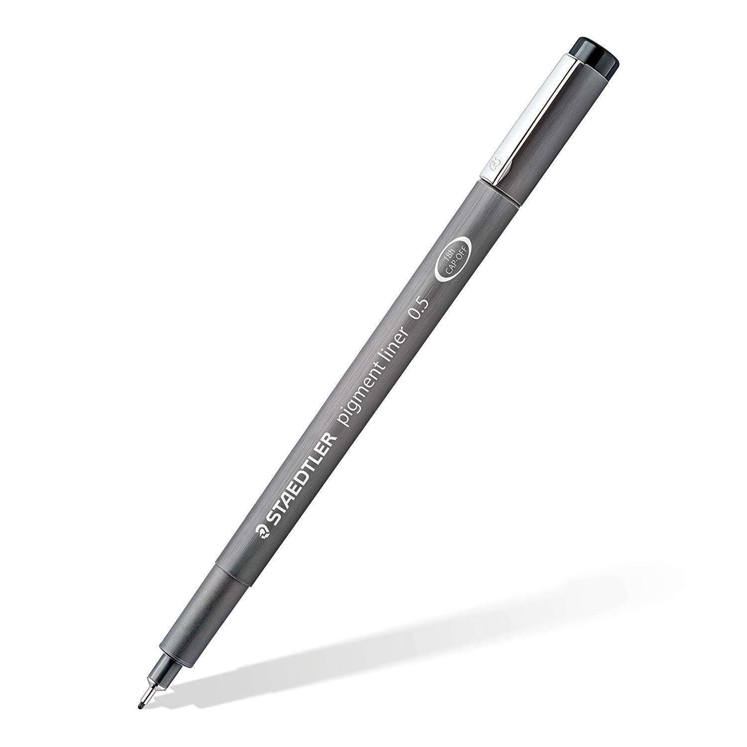
Staedtler Pigment Liners

Staedtler Pigment Liners

These are what I use when doing these exercises. They usually run somewhere in the middle of the price/quality range, and are often sold in sets of different line weights - remember that for the Drawabox lessons, we only really use the 0.5s, so try and find sets that sell only one size.

Alternatively, if at all possible, going to an art supply store and buying the pens in person is often better because they'll generally sell them individually and allow you to test them out before you buy (to weed out any duds).

This website uses cookies. You can read more about what we do with them, read our privacy policy.