Liamnguyen

Dimensional Dominator

Joined 4 years ago

625 Reputation

liamnguyen's Sketchbook

  • Sharing the Knowledge
  • Dimensional Dominator
  • The Relentless
  • Basics Brawler
  • Basics Brawler
    4:31 AM, Tuesday September 8th 2020

    Hi Uncomfortable,

    Thank you for your precious feedbacks!!

    In my last assignments, which I had submitted after I started doing lesson 2, SCYLLASTEW and SEVEY13 did address the paper issues to me and refered me back to lesson 0. I realized that I skipped the last section that said the requirement to have A4 paper printer. Your clarification really helps me to truly understand the importance of the size and how it relates to the body and shoulder motions. I remember how difficult it was to draw the 250 boxes in the A5 size, it constrains the shoulder movements and my palm kept hitting the sketbook edge.

    I was frustrating and confusing whether my chosen picture is qualified to be a texture. For the kiwi, I first thought it was a pattern rather than a texture, which can be seen but felt. However, I ended up drawing its surface instead of its actual texture. From that point of time, my definition of texture went terribly bad. I scrolled up and down a few times on texture lesson and found out I was wrong when I saw your kiwi texture. The "local color" and "cast shadows" terms will be my champions in my 25 texture challenge.

    I'll work harder on my lines!!! Again, thank you so much for your feedbacks and clarifications.

    11:29 AM, Thursday August 27th 2020

    Hi DRAMALLAMA,

    Thank you so much for your valuable feedback!!!

    I'll take it along my journey!!

    2 users agree
    10:24 AM, Monday August 24th 2020

    Hi LEEYAH,

    In my opinion, your overall work is awesome! However, there are a few things that I really wonder and mention:

    1. Which surface did you put your paper down to draw on? I saw your lines are a bit wobble and not so smooth, most clearly seen in the rough perspective exercise. Your superimposed lines and elipse indicate that you worked with good speed and accuracy, it shoulda not yielded any wobbling issues. That makes me wondering whether because of the table surface (not flat..) or your hesitation, or speed, or you were using your wrist.

    2. The rotated box exercise is really good. The only thing I can address is the gap between boxes are not consistent.

    3. Your paper material. Your line and ink are indicating that the paper surface is a bit rough, not smooth. I'm not really sure if it's true. If yes, it might considerably damage your pen tip.

    Overall, everything is drawn beautifully!! I hope these small nitpicks mentioned above are helpful!

    Next Steps:

    If you have any credit point, please submit the lesson 1 for official critics and wait to be marked as "complete" to move onto the next, which is 250 BOX CHALLENGE!!!!!

    This challenge will gain you a strong foundation of 3D and perspective.

    It's tough but the reward at the end of the tunnel is precious.

    I hope you like it!!!

    This community member feels the lesson should be marked as complete, and 2 others agree. The student has earned their completion badge for this lesson and should feel confident in moving onto the next lesson.
    1 users agree
    10:14 AM, Monday August 24th 2020

    Hi LEEYAH,

    In my opinion, your overall work is awesome! However, there are a few things that I really wonder and mention:

    1. Which surface did you put your paper down to draw on? I saw your lines are a bit wobble and not so smooth, most clearly seen in the rough perspective exercise. Your superimposed lines and elipse indicate that you worked with good speed and accuracy, it shoulda not yielded any wobbling issues. That makes me wondering whether because of the table surface (not flat..) or your hesitation, or speed, or you were using your wrist.

    2. The rotated box exercise is really good. The only thing I can address is the gap between boxes are not consistent.

    3. Your paper material. Your line and ink are indicating that the paper surface is a bit rough, not smooth. I'm not really sure if it's true. If yes, it might considerably damage your pen tip.

    Overall, everything is drawn beautifully!! I hope these small nitpicks mentioned above are helpful!

    If you have any credit point, please submit the lesson 1 for official critics and wait to be marked as "complete" to move onto the next, which is 250 BOX CHALLENGE!!!!!

    This challenge will gain you a strong foundation of 3D and perspective.

    It's tough but the reward at the end of the tunnel is precious.

    I hope you like it!!!

    6:53 AM, Monday August 24th 2020

    Hi QZHANS,

    I am really thankful for your feedbacks and analysis of my works. It truly ascertains me about the way converging line works and puts a strong concrete to my understanding of boxes!

    Thank you for your golden principal and advices!

    2:45 PM, Tuesday August 11th 2020

    Hi Sevey13,

    Yes I did those exercises on two different paper sizes.

    The first one is A4. The surface is rough, and as mentioned by Scyllastew it does damages to my fineliner :(.

    The second is A5 and the surface is smooth. I also have some other A5 ringed sketchbooks. I thought it would be fine to use any size of paper but not too small because A4 was not mandatory. And really thanks to your and Scyllastew's critiques, I found out that I have missed the Beginner's shopping list section (It does say A4 is required.

    I'll use A4 as to make sure everything is up to standard.

    Thanks a heap for your review!

    2:36 PM, Tuesday August 11th 2020

    Hi Scyllastew,

    Thank you so much for your review. It helps me to realize that I have really follow the instructions provided from the lessons. I haven't really put ghosting method before I actually drew a line.

    I am gonna follow all the steps and keep the critiques along the way in the future!

The recommendation below is an advertisement. Most of the links here are part of Amazon's affiliate program (unless otherwise stated), which helps support this website. It's also more than that - it's a hand-picked recommendation of something I've used myself. If you're interested, here is a full list.
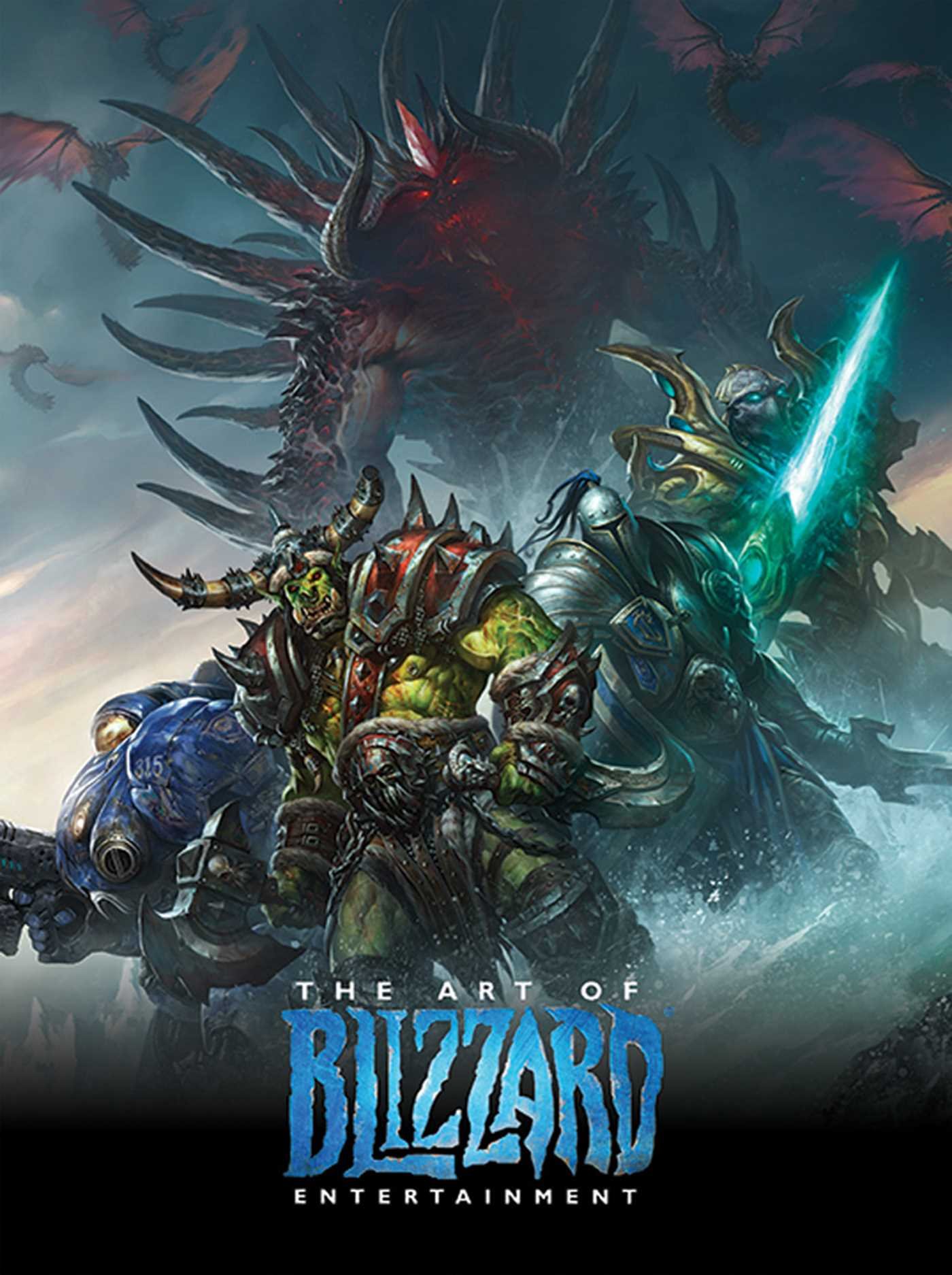
The Art of Blizzard Entertainment

The Art of Blizzard Entertainment

While I have a massive library of non-instructional art books I've collected over the years, there's only a handful that are actually important to me. This is one of them - so much so that I jammed my copy into my overstuffed backpack when flying back from my parents' house just so I could have it at my apartment. My back's been sore for a week.

The reason I hold this book in such high esteem is because of how it puts the relatively new field of game art into perspective, showing how concept art really just started off as crude sketches intended to communicate ideas to storytellers, designers and 3D modelers. How all of this focus on beautiful illustrations is really secondary to the core of a concept artist's job. A real eye-opener.

This website uses cookies. You can read more about what we do with them, read our privacy policy.