2:23 AM, Sunday April 25th 2021
I used a pentel 0.5 pointliner and filled in the dark blacks with a brush pen. On one of them did edges with the brush pen too.


I used a pentel 0.5 pointliner and filled in the dark blacks with a brush pen. On one of them did edges with the brush pen too.
Hey friend, here is the revision you requested. Happy drawing!
Hey, thanks very much for the in depth critique my friend! I'll go back and work on the line weights and do the revision you suggested. And yes, I hadn't read the ink article since I started and had forgotten some of the very good reasoning behind it!
Hey nice job getting through lesson two!
Here are a few suggestions:
Take the time to put your photos in the right order and right orientation, since your asking other people to review them when you upload them.
On the sausages (both contour and ellipse) you are often neglecting to vary the degree (the minor axis size) as it goes across the shape, making them look less 3d. You may want to go back to that exercise and look more at the examples / common errors part to get a better sense and practice that as a warm up. Also, you don't need quite that many ellipses going across the shape--so many gets visually distracting and thus doesn't show the form well.
Arrows: Work on getting smooth confident lines for them as a warm up. They are pretty shaky.
Hope those can be of some use to you. Good luck with your further studies!
Next Steps:
Move on to the next thing!
It seems your imgur link only includes 1 picture not the whole lesson.
These look well done to me. I only have a couple suggestions:
Consider your line weights more. They can be an effective way to make the construction feel more solid. You keep the lines almost evenly thin for everything instead of say, adding some weight on the outside contours or facing away from the light etc.
Be wary of proportions. Sometimes in your effort to construct you made the snout rather long and box like more than feels natural. Then again you seem to have fixed that in the later drawings.
Good work!
Next Steps:
Cylinder challenge or lesson 6!
Nice job finishing lesson 3.
Arrows: Remember the distance between the bends should be smaller with the far part and bigger with the near part to convey perspective. You made all the bends equidistant.
Plants: You have done quite a good job with the textures / details. Sometimes you are not constructing but just outlining though, for example your potted cactus drawings. They are just flat shapes with textures applied. Think of how the pot it a tapered cylinder and construct it that way using two ellipses. The cacti themselves are fairly simple so you should throw on a couple nice contour lines to construct the 3D aspect.
Next Steps:
Move onto the next step.
Nice job getting through this!
With respect to textures you should work on (or at least be more aware of) implicit vs. explicit (this idea is described in detail in the texture exercise page). You are mostly drawing every line you see, then just making the lines thicker on the dark side and taper off into thin/nothing on the light side. But that's not the goal of the exercise.
Here's another way to think about it:
Look for the cast shadows (NOT the outlines of the forms). Where are the deepest crevices with the darkest shadows? Draw those all over the box. Those will remain shadows over the course of the whole texture because light can basically never get in them. On the other hand shadows cast by something small just barely sticking up are not as strong, so you should only fill them in on the dark side.
Next Steps:
Move on to the next step.
Hi there, it seems your link is broken.
Nice job getting through the second lesson OPTIMUSERIK!
Arrows: You want flowy lines, so don't slow down and let them get wobbly. Confident is better than wobbly even if it misses the mark by a bit. You didn't do the line weight part of this exercise, so you may want to go reread the instructions and practice that a bit.
Sausages: Practice your ellipses as a warm up. Ellipses are really hard, but yours are going too far out of bounds and its holding back your drawings.
Solid Intersections: Some of your better work imo
Organic Intersections: Bend the sausages more. They should wrap around the one they sit on as much as its contour lines wrap around it.
Next Steps:
Move onto the next thing!

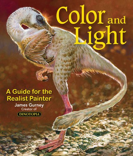
Some of you may remember James Gurney's breathtaking work in the Dinotopia series. This is easily my favourite book on the topic of colour and light, and comes highly recommended by any artist worth their salt. While it speaks from the perspective of a traditional painter, the information in this book is invaluable for work in any medium.
This website uses cookies. You can read more about what we do with them, read our privacy policy.