perkfever

Basics Brawler

Joined 2 years ago

400 Reputation

perkfever's Sketchbook

  • Sharing the Knowledge
  • Basics Brawler
    9:38 PM, Thursday August 4th 2022

    Thank you a ton for replying!

    Although this may disapoint you, I will not be completing the next steps that you have assigned. I do not feel that recompletting the Steps a third time will be worth the time spent, when I could move onto the next part in the lesson. DrawABox recomends that we "follow the instructions to the letter". And while that may sound like an excuse, I genuinely believe that feeling nonemotional with my work being far from perfect is part of improving. I don't plan on perfecting my fundamental with DrawABox, but learning them now, so that I can improve on it when I apply it to real work.

    Again, I'm sorry for the bad news. However, I will make sure I take everything you said into this review with importance. I've written as much as I can in my notes.

    • Draw Shadows running along the form underneath

    • Draw the outline of the shadow carefully to not suggest additional forms

    • Be more careful with wobbly lines

    • Make sure that the contour lines are placed with intent

    • Treat the feet as a 3d form

    • Wrap all additional forms

    • Treat the eyeball as always spherical

    • Treat the ear as leaves

    • Don't forget contour curves in feet and horns

    • Don't forget intersection between forms (legs)

    • Add Lineweight were appropriate

    Although I'm going against what you asked, thank you so much for all the work you've put in so far. It really means a lot to me. I wish the best of luck in your studies and hope we meet again!

    5:32 PM, Saturday July 30th 2022

    5 Animals

    https://imgur.com/a/cXv98FB

    Animal References

    https://imgur.com/a/zq6sqou

    2 Organic Forms

    https://imgur.com/a/B13Ae6z

    Hey again!

    Thanks for replying. This feedback really helps me improve, and it means a lot that you went out of your way to help me. I forgot to add in the organic forms in my last post, so thanks for reminding me.

    What I took note to work on was the:

    • lack of contour curves

    • adding intersection between forms

    • taking initial proportions

    • be careful with adding masses to the head

    • ridding the corner on additional masses

    • careful with line weight

    • be less sketchy with linework

    If I missed anything besides that, feel free to tell me, also if I forgot anything, feel free to ask for anything.

    Again, thanks a lot!

    4:18 AM, Thursday July 28th 2022

    Sorry for taking so long to reply! I only saw the notification pop up today. I'll get the all the steps in tomorow or the day after.

    Thanks so much for responding! It helps a lot. I'll get back to you soon.

    2 users agree
    12:07 PM, Monday July 18th 2022

    Hello! I'm gonna give you some feedback on your HW.

    Organic Arrows:

    The point of the organic arrow is to draw a plane in 3d space. To create this illusion, we need 2 things. One, we need our edges to overlap. Two, we need to add perspective.

    While I am noticing that you have applied both fairly well, it is unfortunate that you did not consistently apply these methods throughout. I think the major concern is the overlapping edges. With each decent curve, there should be an overlap.

    The trick is to keep the angle of both line's distance apart the same. So, what I want you to do is draw the initial line. Then, place the starting dot for the second line, don't draw the line yet. I want you to keep note of the distance and angle of the starting point of the original line, and the starting point of the second line. Let's say that the distance and starting angle is 1 inch at 45 degrees. By the end of the arrow, if you do it correctly, it should be something like 3 inches at 45 degrees. The distance should increase, while the angle should stay the same.

    • Overlap Edges

    • Increase Distance between lines for foreshadowing

    Organic Forms:

    Some things I noticed about the sausage form itself is that:

    • The ends of your sausages are different sizes

    • The ends of your sausages aren't circular enough.

    For the elipses itself. Ask yourself where the midpoint of your organic form is. It's your drawing, you can place it anywhere you want. BUT, you have to place it beforehand. I did see that you improved in the later half of the organic forms however.

    Texture Analysis:

    I think your texture analysis is really spot on. You didn't outline. You drew cast shadows.There was a gradual transition between the light and the dark. If I were to note one thing, it would be that when you are recreating the texture, remember that nothing is nature is at random. Even if it look like it is, everything is placed in a way that leads to the next. Not to say that you did this in your HW. I think you did a good job with this. But, I think this is an important thing to note for everyone. Good job on this.

    Disection:

    Unfortunately, I feel like you didn't apply the concepts that you did well in the previous texture analysis to this one. The point of this homework isn't to draw texture. It's to use the shadows from the textures to create a 3D object. That's it.

    Also, instead of using the previous Organic Forms HW to draw your textures, you just made one big organic form. This isn't going to help you to be frank. If you want to improve, you should take into consideration the guidelines that Uncorfortable set on the Website and Videos. Taking shortcuts and rushing isn't going to help. You're doing this out of your own volition, so you should make the most out of it, right? Also, don't be afraid to use your old homework. It's just paper.

    What I think you did right was:

    • You're Organic Forms improved, but you could've used drawn on the previous homework

    • You didn't outline the form.

    • Properly used cast shadows

    What needs improving is:

    • There is no transition between the light side and dark side of the form

      • shadows don't change as the form turns

      • Form seems flat

    • Needs to establish where the light hits the form directly, midline

    Form Intersection

    When you read the lesson, make sure you read it carefully. The lines of intersection seem fine. However the problem here is that you haven't applied the hatched lines correctly. Hatched lines are only suppused to be where the forms aren't covered, but you drew them along the entire plane regardless. Be sure the read the lesson carefully.

    Organic Intersection

    I'd say the major thing here is exagerating how the shadow flows along the form underneath it. Where the shadow correctly portrays what's above it, it doesn't give much context to the form that it is one. Be sure to really exagerate this for this homework.

    Overall, I'd say the most important thing to take away is make sure you read both the website and the video lessons carefully. Also, make sure you are looking at the website especially, cause the video lessons are only meant to be a general overview. It's not supposed to be the entire lesson. Sometimes you're missing the major guidelines of the homework, and other times you aren't doing the homework as intended at all. If you don't put what Uncomfortable has to say into consideration, you're setting yourself up for a hard time in his framework.

    Next Steps:

    The most important part is that you give the lesson on the website another careful reading. Otherwise, all of this carries little weight.

    1 More Page of Organic Arrows

    • Focus on crossing over edges

    • Focus on foreshortening

    1 more page of Disection

    • As the form turns, show the gradual transition from the light side to dark

    1 more page of Form Intersection

    • Use hatched line properly
    When finished, reply to this critique with your revisions.
    11:33 PM, Saturday July 2nd 2022

    Thank you!

    So, what I got is that overall is that I should:

    • Exaggerate more when I foreshorten long objects in perspective

    • Don't doodle

    • Pay more attention to where I begin my lines

    • Properly use the ghosting method while using the shoulder muscle and a locked wrist

    • And buy some printer paper

    That and draw my branches smaller and my plants bigger. You're also right that I should work on my line weight a lot more. The paper actually has borders that are a4 size, if not close. But, I definitely see the problem with the paper that I'm using. It doesn't look good at all for the anyone reviewing my work. I'll be sure to be more mindful of the people looking at my work in the future.

    Again, thanks a lot for reviewing this.

    6:12 AM, Tuesday February 15th 2022

    Thank you for replying!

    Sorry for the late reply, I was doing the 250 box challenge and hadn't checked-in in a while. Kinda wish I did this before I did the challenge, but I'm just thankful that someone replied.

    So, firstly, I made sure to apply the ghosting method for each line. Second, I'm practicing putting in more ellipses for warm-up. Third, I put in four addition boxes ???? in the rotated box section, and the corner boxes. Fourthly, I added the organic perspective with overlaying boxes. I believe that were all the instructions given and completed.

    I definitely see what you mean by using the ghosting method to get more confident lines. It definitely seems better, if only by slightly. I definitely need to draw more ellipses, but at least I'm drawing through them now. I've looked a bit into lesson 2 since I finished the 250 box challenge and I kinda see why you wanted me to draw over other boxes in the rotated box excercise. Drawing is about giving the illusion of depth, and by overlaying the boxes we are achieving this. This was a good warm-up for what is to come.

    Moving forward, I gotta make sure I draw confidently and get some ellipses practice in. I also gotta post my 250 box challenge cause I haven't don't that yet.

    But yeah, thank you so much for helping me on my journey to being a good artist. Again, I'm sorry this reply is so late. I'm bad with notifications. Also, I do believe that this was pretty harsh, but this was literally, genuinely, exactly what I wanted. Overall, this review has helped me tons, and I'll be sure to look to the community for help in the future.

    Thanks a ton!

    Perkfever.

    https://imgur.com/a/T6pluCa

The recommendation below is an advertisement. Most of the links here are part of Amazon's affiliate program (unless otherwise stated), which helps support this website. It's also more than that - it's a hand-picked recommendation of something I've used myself. If you're interested, here is a full list.
PureRef

PureRef

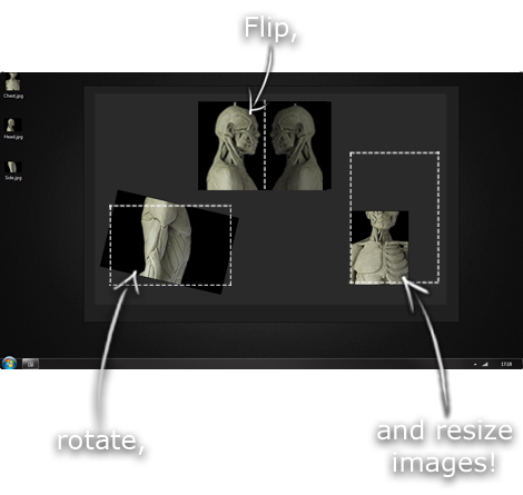
This is another one of those things that aren't sold through Amazon, so I don't get a commission on it - but it's just too good to leave out. PureRef is a fantastic piece of software that is both Windows and Mac compatible. It's used for collecting reference and compiling them into a moodboard. You can move them around freely, have them automatically arranged, zoom in/out and even scale/flip/rotate images as you please. If needed, you can also add little text notes.

When starting on a project, I'll often open it up and start dragging reference images off the internet onto the board. When I'm done, I'll save out a '.pur' file, which embeds all the images. They can get pretty big, but are way more convenient than hauling around folders full of separate images.

Did I mention you can get it for free? The developer allows you to pay whatever amount you want for it. They recommend $5, but they'll allow you to take it for nothing. Really though, with software this versatile and polished, you really should throw them a few bucks if you pick it up. It's more than worth it.

This website uses cookies. You can read more about what we do with them, read our privacy policy.