View Full Submission View Parent Comment
0 users agree
9:09 PM, Friday October 22nd 2021

hello rgb. I have look over your box challenge and your boxes look good and are drawn with boldness and confidence.but there are a few improvement you can make

Another thing is that some of your boxes where not converge correctly.it seems on some of them you extend your lines the way they were converging while they should be extending towards the vanishing point and not the viewer so we can understand the mistakes were making when making the box and why. this is a common mistake so don't beat yourself up

Another thing is there is a page of boxes that doesn't have their lines extended, you need to extend your lines so you can see what mistakes you're making to help decrease your margin of error

The majority of your boxes have the same amount of shallow foreshortening. The shallow boxes look great but its important to varie between dramatic and shallow foreshortening so you can get more mileage/comerablity in draw those two types

Overall you did fine but they need more work, i recommend you re read the lesson and practice drawing 30 boxes with the critiques i have given

Next Steps:

draw 30 more boxes

-in 3 point perspective

-extended lines being extended to the vanishing point

-5 boxes per page

  • do it all with the ghosting method
When finished, reply to this critique with your revisions.
6:06 PM, Monday October 25th 2021
edited at 9:20 AM, Oct 26th 2021

Thank you for the feedback. I have done 30 more boxes as per your suggestion.

http://imgur.com/a/bbXJr57

edited at 9:20 AM, Oct 26th 2021
6:23 PM, Wednesday February 2nd 2022

sorry that i responding to this a year later. i was busy with my own drawing and forget to take the time to critique.

but yea your boxes look better.,although distorted. I say continue to lesson 2 if you haven't already

Next Steps:

proceed to lesson 2. keep working on you boxes. your doing great

This community member feels the lesson should be marked as complete. In order for the student to receive their completion badge, this critique will need 2 agreements from other members of the community.
The recommendation below is an advertisement. Most of the links here are part of Amazon's affiliate program (unless otherwise stated), which helps support this website. It's also more than that - it's a hand-picked recommendation of something I've used myself. If you're interested, here is a full list.
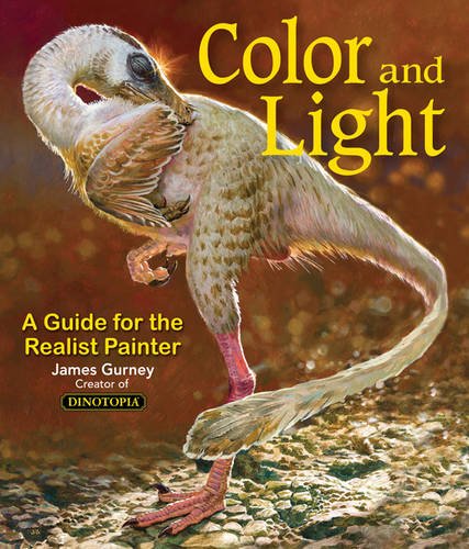
Color and Light by James Gurney

Color and Light by James Gurney

Some of you may remember James Gurney's breathtaking work in the Dinotopia series. This is easily my favourite book on the topic of colour and light, and comes highly recommended by any artist worth their salt. While it speaks from the perspective of a traditional painter, the information in this book is invaluable for work in any medium.

This website uses cookies. You can read more about what we do with them, read our privacy policy.