


4:28 AM, Friday February 19th 2021
That's certainly the mindset needed to get through this stuff! If we focus on impressing people when we should be focusing on learning, we won't end up doing much of either.
Starting with your arrows, you've done a great job of both capturing how these move through space with confidence and fluidity, and have clearly demonstrated the depth in the scene by compressing the spacing between the zigzagging sections.
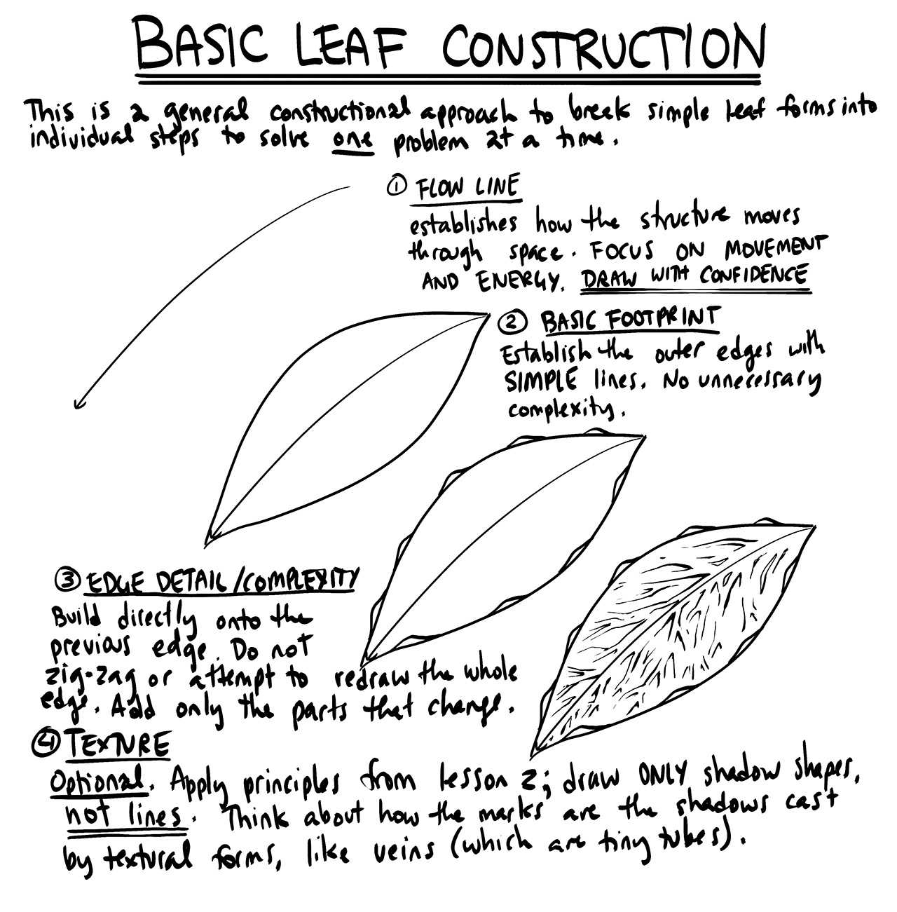
Moving onto the leaves, you've definitely done a good job of capturing how the leaves similarly move fluidly through the space they occupy. Looking at how you've built up edge detail, I noticed that you played with a different approach than what was demonstrated in the lesson. It's an interesting experiment, but you end up with the kind of layered segmentation you might see on an insect, which inadvertently makes the leaves appear more three dimensional than intended. While it's certainly a tactic that will come into use in the next lesson, it unfortunately doesn't work too well here.
Instead, as shown here, you should simply be building individual little "bumps" that rise off the simpler leaf edge and return to it. Don't zigzag your edges back and forth like you did here - work in individual bumps, as explained here, in order to stay within the third principle of markmaking from Lesson 1.
And one last thing on that topic - I can see that when you drew the initial leaf shapes, with the simpler edges, you drew with a lighter mark, and then when you added edge detail, you drew with a heavier one. Keep the line weights roughly the same here. Line weight should only be adjusted at the end of a drawing, to clarify specific overlaps between forms when necessary. No need to try and distinguish one phase of construction from another, as though you're trying to replace the simpler one in its entirety.
Continuing onto the branches, you're largely doing a good job here, and I'm pleased to see that you're extending your segments fully halfway to the next ellipse. One thing to help you keep improving on this front - when drawing your next segment, instead of drawing it where the previous one ought to have been, use the previous segment as a runway and overlap it directly. This'll force you to learn from the little mistakes where they go off track, instead of having the freedom to ignore it. It will make things a little harder, but you'll learn from them more quickly.
Onto the plant constructions! You've done a good job of constructing your leaves and petals with that same fluidity throughout the first three pages, so those are looking solid. When it comes to adding other objects like berries/fruit, I do have a few suggestions though. Here you definitely opted to go in a totally different route, not really employing any basic form construction, so... that was a choice. Fortunately you went back to more drawabox-oriented approaches with your tomatoes. Here the forms themselves definitely read as being more flat, simply because of the additional complexity in their silhouettes, with the bottoms coming out rather pointed. Your actual references aren't really as pointed as this. As shown here, focus first and foremost on keeping your silhouettes simpler, and then when necessary for a ball-like form like this, you can place a little contour ellipse on one end to reinforce the illusion that it is indeed three dimensional.
Making forms feel 3D doesn't need to be complicated - in fact, keeping it simple tends to work far better.
Moving onto your last few pages, I can definitely see that here you got a little caught up in the idea of "decorating" your drawings - that is, making them look more like pretty renderings, capturing shading and such. It's not uncommon that students mistake the detail phase for simply being an opportunity to make your drawings stand out, but that is not the case.
What we're doing in this course can be broken into two distinct sections - construction and texture - and they both focus on the same concept. With construction we're communicating to the viewer what they need to know to understand how they might manipulate this object with their hands, were it in front of them. With texture, we're communicating to the viewer what they need to know to understand what it'd feel like to run their fingers over the object's various surfaces. Both of these focus on communicating three dimensional information. Both sections have specific jobs to accomplish, and none of it has to do with making the drawing look nice.
So, when moving onto the detail phase of a drawing, remember that what we're really communicating to the viewer is information about what can be touched with our hands, rather than what can be seen with our eyes. And of course, don't forget that back in Lesson 2 we discussed that form shading would not be included in the drawings you do for this course.
Furthermore, don't get caught up in trying to reproduce the photos. The photos are just sources of information to inform the object you construct in your drawing.
Now overall even though the last few drawings were definitely negatively impacted by this incorrect arrangement of priorities, I do still feel that for the most part you've got a good grasp of the material, and that any further issues can be improved upon as you work on the next lesson.
Preemptively though, I do have one recommendation as you get into insects - resist the urge to go heavy on the contour lines. Use them sparingly, only when they serve a clear purpose. It's very easy to just slap on as many contour lines as you want, without really thinking about why you're adding them in the first place.
So! I'll go ahead and mark this lesson as complete.
Next Steps:
Move onto lesson 4.


