The recommendation below is an advertisement. Most of the links here are part of Amazon's affiliate program (unless otherwise stated), which helps support this website. It's also more than that - it's a hand-picked recommendation of something I've used myself. If you're interested,
here is a full list.
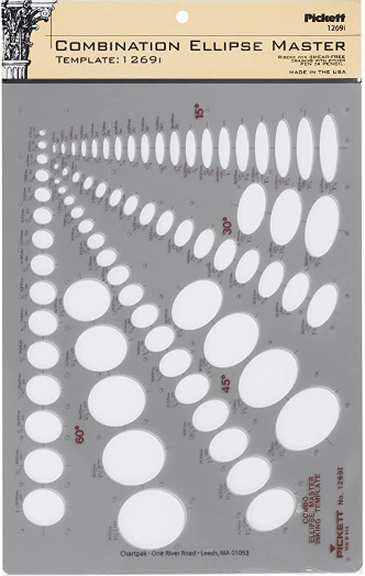
Ellipse Master Template
This recommendation is really just for those of you who've reached lesson 6 and onwards.
I haven't found the actual brand you buy to matter much, so you may want to shop around. This one is a "master" template, which will give you a broad range of ellipse degrees and sizes (this one ranges between 0.25 inches and 1.5 inches), and is a good place to start. You may end up finding that this range limits the kinds of ellipses you draw, forcing you to work within those bounds, but it may still be worth it as full sets of ellipse guides can run you quite a bit more, simply due to the sizes and degrees that need to be covered.
No matter which brand of ellipse guide you decide to pick up, make sure they have little markings for the minor axes.


