Lesson 1: Lines, Ellipses and Boxes
1:18 PM, Tuesday March 1st 2022
Some of the drawings were done on A3 rather than A4, so there's sometimes two pages in one photo. I left the pen in for scale.

Welcome to drawabox! Let’s take this one exercise at a time, shall we?
Starting off, your superimposed lines are mostly good. The straight ones are smooth, and properly lined up at the start, but not always of a consistent trajectory – be mindful of that. As for the arcing lines, they’re at times a little insecure, but I suspect that this is due to how ambitious they are – starting students will usually stick to simple curves! :P Your ghosted lines/planes look fairly confident, but I notice that you’ll sometimes stop short of the end point, and extend your line in a separate stroke. That’s not something we encourage – you get one shot at each line, and, after you’ve taken it, it is what it is. By that same token, try not to redo a line in its entirety. If it’s off, it’s off – spend more time ghosting it next time, and that’s enough.
Moving on to the ellipse section, the table of ellipses exercise is, unfortunately, a little wobbly. Remind yourself that our #1 priority is confidence, not accuracy. As such, it’s more important for us to have our ellipses be smooth, and rounded, than it is for them to touch all sides of their frame, or for their rotations to match. Draw with that in mind. Also, be mindful of your pivot. Another thing I notice is that a few of your ellipses will come out a little pointy (usually indicative of a lesser pivot), so always check back, to ensure that your marks are originating from your shoulder. The ellipses in planes show some improvement; the ellipses in funnels revert back to their prior state. I expect that the latter is partly due to their size, however (it’s harder to engage the shoulder during small marks), so see if drawing a little bigger fixes it.
The plotted perspective exercise is nicely done. Great lineweight, here.
The rough perspective exercise starts off strong, and shows some nice improvements throughout the set, as far as its convergences are concerned. Linework has 2 issues. One of them we’ve addressed (the automatic reinforcing); the other, is a simple lack of confidence. There’s no need for it, however, considering how there’s no difference between these lines, and the ones in the ghosted lines exercise. Certainly, the big picture (what they add up to) is different, but the lines themselves, are not. Try not to let yourself get overwhelmed.
The rotated boxes exercise looks great. It’s big, its boxes are snug, and properly rotating. The hatching cleans it up quite well, also. The far planes of the boxes are, occasionally, a little flat, but that’s something we’ll address in the box challenge, so no need to stress about it. For now, this is beyond satisfactory.
The organic perspective exercise, too, is well done. I do wonder, however, looking at the amount of overshooting, if you’ve not extended these lines arbitrarily, and met them from the other side? If so, know that what you should be doing is potting start/end points for them – you should be doing that for all of your lines, recall.
Next Steps:
There’s a couple of things to take note of, and try to improve over time, but nothing worth keeping you here. Consider this lesson as complete, and move on to the box challenge. Good luck!
Thank you so much for the detailed response, Benj!
I think I did do a lot of the boxes in the organic perspective without start/end points, yes, so I'll make sure I do that in the 250 boxes. The overshooting isn't really related to that but is just something I have a problem with. Maybe I was drawing the lines too quickly - it seems to be getting better now in any case.
I'll make sure to work on my ellipses. When I drew those, using my shoulder still felt quite alien to me, but I'll go back to them now that I've gotten more comfortable with drawing from the shoulder! And I'll go for smooth confident curves rather than making sure they touch the edges.
The tips are all very helpful, so thank you again. I look forward to submitting the next exercises!

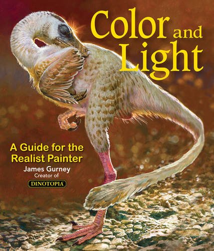
Some of you may remember James Gurney's breathtaking work in the Dinotopia series. This is easily my favourite book on the topic of colour and light, and comes highly recommended by any artist worth their salt. While it speaks from the perspective of a traditional painter, the information in this book is invaluable for work in any medium.
This website uses cookies. You can read more about what we do with them, read our privacy policy.