


This website uses cookies. You can read more about what we do with them, read our privacy policy.
0 users agree
7:50 PM, Monday October 19th 2020
Congratulations on completing the 250 box challenge. I can see that you put in a lot of effort into this challenge, unfortunately there are a number of things that you will need to address before moving onto lesson 2.
Before we begin I just want to mention that in the future, when you go to scan your homework submissions, it would be better to scan your homework using the "photo" setting instead of the "drawing" setting. The drawing setting tends to up the contrast on an image and can cause you to lose some of the subtlety in your line work.
Looking at your work I can see that most of your pages are not done to the specifications listed in the challenge.
-
Too many boxes per page - Try to stick to 5-6 boxes per page (assuming you're working with the recommended A4, 8.5"x11" sheets of paper), in order to give yourself enough room to draw each box at a reasonable size while also leaving some space to extend your lines. If you are using a paper that is a larger size than A4 please be sure to mention it so that I can take it into consideration for your critique.
-
Hesitation/Lack of confidence - I can see fairly consistently in your mark making that you are hesitating a lot, even towards the end of the challenge though it is reduced there. Just remember that the confidence of the stroke is far and away your top priority. Accuracy is something that you will improve on as you continue working through Drawabox and practice ghosting. Once your pen touches the page, any opportunity to avoid mistakes has passed, so all you can really do is push through. Hesitation serves no purpose. Mistakes happen, but a smooth, confident mark is still useful even if it's a little off. While it is important that you use the ghosting method of each mark you make while doing Drawabox one thing you can try to help with ending your marks closer to where you want them is lifting the pen off of the page rather than stopping the motion of your arm.
-
Not using the ghosting method when adding line weight When looking at the extra line weight you added to some of your boxes I can see a lot more wobbling and hesitation in your mark making. When you go to add weight to a line it is important that you treat the added weight the same way you would a brand new line. That means taking your time to plan and ghost through your mark so that when you go to execute it the mark blends seamlessly with your original mark. This will allow you to create more subtle and clean looking weight to your lines that reinforces the illusion of solidity in your boxes/forms. It is also important to remember that when you are doing Drawabox you should use the ghosting method to plan and execute every mark you make, this includes the hatching we sometimes use on our boxes. You can also read more about line weight here.
I think this diagram will also help you with your extra boxes. So, when you are looking at your sets of lines you want to be focusing only on the lines that share a vanishing point. This does not include lines that share a corner or a plane, only lines that converge towards the same vanishing point. Now when you think of those lines, including those that have not been drawn, you can think about the angles from which they leave the vanishing point. Usually the middle lines have a small angle between them, and this angle will become negligible by the time they reach the box. This can serve as a useful hint.
For your revisions you will be doing another 50 boxes. I will be looking at your mark making as a whole. I expect to see less wobbling and hesitation in your mark making. I also want you to apply extra line weight to each box. Make sure that you take your time at each step.
Next Steps:
50 additional boxes as described in the critique.
12:47 AM, Tuesday January 5th 2021
Hi! I am wondering how to create extra line weight properly? Whenever I try to add line weight, I either have to go slow to make sure the lines overlap. But when I do this, it often ends wobbly. When I try ghosting and adding a line over another line in one stroke, this often leads to two lines that do not perfectly overlap one another.
I was also wondering how fast do you go when you make a line stroke after ghosting? I tend to do the stroke quickly. Would it be better to go slower?
Thanks!
1:14 AM, Tuesday January 5th 2021
The ghosting method involves executing each mark with confidence - which means not slowing down for precisely the reason you noted. When we hesitate, it causes wobbles. Now, drawing with confidence may well result in little separates/inaccuracies, but that will improve with practice. The actual process of making the mark remains the same, even if your results won't be perfect immediately.
As for how fast you should be drawing, the wording I specifically use is a "confident" pace. That doesn't mean as fast as you can go, but at a speed where you can resist the urge to steer with your eyes. If you can slow your pace down while maintaining an entirely smooth stroke, then that's great. But the second you start seeing wobbling, you'll need to speed up again to make sure that your brain isn't trying to micromanage how your arm moves.
This will improve with time and practice, and you will steadily find that the speed you need in order to maintain a confident stroke will decrease.
9:20 PM, Friday January 8th 2021
Thanks for the reply and help. So, I noticed that when I try to add line weight, I used the ghosting method to redraw the entire line over the existing one. But I keep accidently creating a second one because I cant perfectly overlap them. I have attached a photo as an example:
https://drive.google.com/file/d/1Pf5QghTc1oHc3NcK6hyooyQDR0pEdTH2/view?usp=sharing
https://drive.google.com/file/d/1Pd2Wz2VE0tLKMzn9iYYw5Oft_1sf-XhH/view?usp=sharing
https://drive.google.com/file/d/1PceFgl_9e4HeXc3nSk7VADu-jtFztJkw/view?usp=sharing
What am I doing wrong? How do I fix this?
8:41 AM, Monday January 11th 2021
Hi! Here are my 50 revision boxes. Just a warning that my first pen ran out of ink, so the lines are thinner in the beginning. Also, I tried my best to add line weight, but it usually ended up being two separate lines that are not perfectly overlapping each other. Sorry :(
https://drive.google.com/file/d/1RCHiVwjTNOGMN5TKof9s94FkcumtP4kw/view?usp=sharing
5:52 PM, Tuesday January 12th 2021
The diagram I shared with you previously explains that you need to constantly be thinking about how your lines converge towards a shared vanishing point. Sometimes that vanishing point is close by, resulting in rapid convergence, sometimes that vanishing point is far away, resulting in a very gradual convergence.
Throughout these boxes, you've primarily been trying to side-step that convergence altogether by making your sets of lines remain completely parallel on the page. Given everything explained in Lesson 1 on the topic of perspective and boxes, this is incorrect.
It looks like you're actively trying to apply 1 point and 2 point perspective wherever possible, but that is fundamentally incorrect. Vanishing points "go to infinity" (resulting in those lines running parallel on the page) only in very specific orientations relative to the viewer. Considering that we're rotating these boxes freely in 3D space, this is very rare. It's not something you impose on a box regardless of how it's oriented in space - it's something that occurs when the axes of that box runs parallel to the viewer's own orientation.
Throughout this challenge, you may as well not worry about 1 and 2 point perspective, drawing everything with a concrete vanishing point, and only controlling how rapidly those lines converge.
As discussed in the foreshortening notes where you are encouraged to use both dramatic and shallow foreshortening, shallow foreshortening is not defined as all your lines running parallel on the page. It is defined as minimal convergence - not none.
In perspective, if an object generally has no foreshortening whatsoever, that tells us that there is no physical space between its opposite ends, which for a box would be completely impossible.
Please take greater care in reviewing the Lesson 1 material, the box challenge notes, and the diagram I shared previously.
Then redo the 50 boxes.
Next Steps:
50 boxes as described in the critique.
8:57 AM, Wednesday January 20th 2021
Hi!
I drew 5 redo boxes, but I didn't want to draw anymore in case I was still doing them incorrectly. I reviewed lesson 1 material again, and I watched your video for making boxes. So, I followed the same procedure to make the 5 redo boxes. I understand that I was using 1 and 2 point persepctive when I should not have been. Can you take a look at the 5 boxes and make sure I am on the right path? Obviously there are glaring mistakes like not having the lines converge to one vanishing point, but is there any other glaring issue that you see? If not, Ill continue making the rest of the 45 boxes.
https://drive.google.com/file/d/1UEffagMBfyzD_LyqZbV4zCxKSFXqHh1a/view?usp=sharing
Also, when I watched your video, you showed that after making a 'Y' with the boxes, you found the vanishing points for each side. For a specific section of the box, you found the vanishing point for the first side, then the second side. Then for the third side, you said to make the point parallel to the line already headed to its vanishing point that was oppposite to it. I was wondering ... if you have dramatic foreshortening, why would you want to make it parallel? Shouldn't it be converging a bit as well?
Thanks for your help!
5:15 AM, Friday April 2nd 2021
Hi! Sorry for taking so long. Here are the 50 boxes revision:
https://drive.google.com/file/d/1ygWCj71YrUdWVkLcUOpgr1Xc5cP8pnE4/view?usp=sharing
I sometimes struggled when trying to add extra line weight, so some boxes look as if they have two lines for one edge.
Thanks for your help!
2:53 AM, Sunday April 4th 2021
This looks like a good improvement! Your sets of lines are doing a better job of converging towards their shared vanishing points.
I will go ahead and mark this lesson as complete and you can now move onto lesson 2!
Next Steps:
Continue to lesson 2!
9:16 AM, Sunday April 4th 2021
Thank you for giving me a lot of helpful feedback during this whole submission :)
The recommendation below is an advertisement. Most of the links here are part of Amazon's affiliate program (unless otherwise stated), which helps support this website. It's also more than that - it's a hand-picked recommendation of something I've used myself. If you're interested, here is a full list.
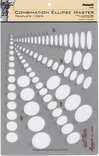
Ellipse Master Template
This recommendation is really just for those of you who've reached lesson 6 and onwards.
I haven't found the actual brand you buy to matter much, so you may want to shop around. This one is a "master" template, which will give you a broad range of ellipse degrees and sizes (this one ranges between 0.25 inches and 1.5 inches), and is a good place to start. You may end up finding that this range limits the kinds of ellipses you draw, forcing you to work within those bounds, but it may still be worth it as full sets of ellipse guides can run you quite a bit more, simply due to the sizes and degrees that need to be covered.
No matter which brand of ellipse guide you decide to pick up, make sure they have little markings for the minor axes.