Lesson 3: Applying Construction to Plants

8:25 AM, Wednesday September 1st 2021

L3-Kawameki.pdf - Google Drive

Google Docs: https://drive.google.com/file/d/1G5r02rWu-hhZ0yvov6Sw5lC_cOH0iP_w/view?usp=sharing

Hello Comfy,

That lesson was very fun, maybe too fun actually, so I can't help but feel anxious at the idea that I might have rushed it or acted careless. I've been spending my free time drawing plants as well because I guess I found myself very interested in them all of a sudden. To get to the actual content of the course, I apologize for the double appearance of the mushroom (I dunno why it suddenly appeared at the start of the pdf). I included all of the demos at the end, excluding the daisy as the page was too messy. I feel like I still struggle on the adding details/texture part of the constructions, so I have a few questions:

  • In the demo about the potato plants, you use black areas as a way to add hierarchy and enhance the negative space around your plants, but for the mushroom you add details using outlines and cast shadows. What are we specifically trying to look for in the use of such black areas and shadows? Cast shadows only, or using shadows as a constructional tool to allow us to organise the page for the viewer (but not by doing form shading, for example with negative space and focus points)? I was confused about it.

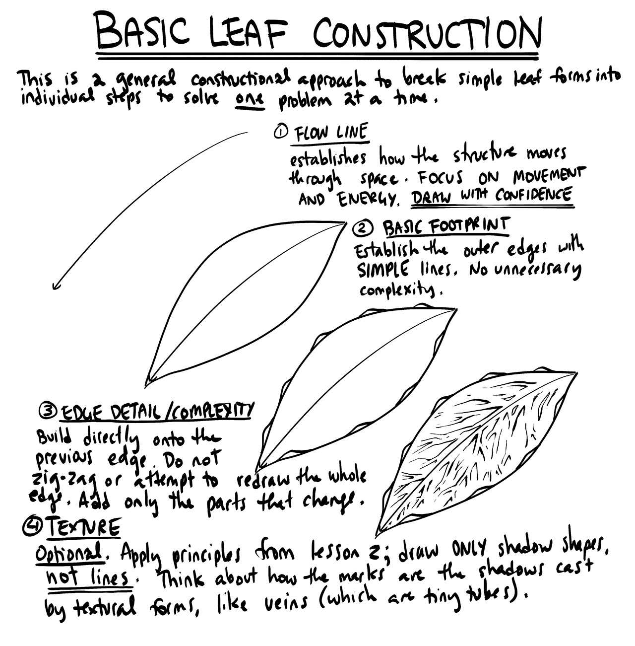
  • Same goes for leaves in the construction. I tried to give them more definition in the 3D space using contour lines, or in the case of succulents ellipses/curves, but I feel overall that I missed the mark on it, flattening them by mistake. I understand how you are supposed to create the flow with overlaps etc, from the leaves exercise, but from the references I found, the greater majority of leaves that are either 90° of the viewer or front facing just look flat when drawn. Could you help me with that?

Many thanks for the work you do.

0 users agree
7:46 PM, Wednesday September 1st 2021

Starting with your arrows, these are coming along alright, although they are somewhat erratic in their execution, with seemingly arbitrary widening/narrowing of the ribbon that throws off the illusion that the ribbon is a consistent width, moving away from the viewer. In general, the linework here does seem a little rushed - make sure that you're applying the ghosting method and executing these from your arm to achieve a nice, smooth stroke. Try to minimize hesitation, and just let your arm do what it does best. The irregularities do generally line up with what we see when a student falls back to drawing more from their elbow, so keep an eye on that.

Continuing onto your leaves, I really do feel like you have the capacity to do this just fine, but that you're focusing your energy, attention and time more on the detail towards the end, rather than the earlier steps. It's the earlier steps - that is, executing the flow lines, and establishing that early silhouette - that matter most. These first few steps lay down the foundation upon which the structure is drawn, so ensuring that the flow lines appropriately convey the manner in which the leaf is moving through space (using the ghosting method and executing from the shoulder), and so on. In general, the impression I'm getting here is that you still need to invest more time into each individual stroke, thinking about what each one is meant to accomplish on an individual basis.

Keep in mind that every drawing here is an exercise, and that every stroke will demand a certain amount of time from you to be done well. It's easy to get caught up in the sense that "I only have X minutes for this sitting", and to try and assign yourself a certain amount of time to accomplish the task. That's what leads to rushing - instead, you allow the task to determine how much time it demands of you, and if that means breaking a page or even a single drawing across multiple sittings, that's what you're required to do.

Lastly, I noticed that when you do get into the detail phase here, you appear to be more focused on a general sense of "decorating" your drawings - that is, doing what you can to make them more interesting and attractive to look at. What we're doing in this course can be broken into two distinct sections - construction and texture - and they both focus on the same concept. With construction we're communicating to the viewer what they need to know to understand how they might manipulate this object with their hands, were it in front of them. With texture, we're communicating to the viewer what they need to know to understand what it'd feel like to run their fingers over the object's various surfaces. Both of these focus on communicating three dimensional information. Both sections have specific jobs to accomplish, and none of it has to do with making the drawing look nice.

So when it comes to texture, we are focusing on the physical three dimensional forms that are present on the object's surface, and on implying their presence through the use of specific, intentionally designed cast shadow shapes. You can see an example of this in the leaf exercise instructions diagram, where the veins along the leaves' surface are just tubes which are being implied by strategically placed shadow shapes. Each shadow shape is designed based on understanding the nature of the tube itself, and its relationship with the existing surface - they're not drawn arbtirarily. Furthermore, it's best to lean towards less of these textural marks, rather than more - just focus on capturing the bare minimum that gets the idea across.

Moving onto the branches, your work here is coming along fairly well. I do have a few things for you to focus on as you move forwards on this:

  • Make sure that you extend each segment fully halfway to the next ellipse. You do this much of the time, but there are cases - especially where you reach bends in the structure - where you fall short. This is important in terms of achieving a smoother, more seamless transition, which we establish by having the segments overlap one another as shown here.

  • Also as shown in that diagram, it's best to try to overlap the last chunk of the previous segment directly, using it as a runway instead of drawing your next mark where the previous one ought to have been (in the case of having made a mistake). Forcing yourself to deal with those mistakes will help you learn from them more directly.

  • Right now you're drawing a bunch of ellipses with the same degree. Remember that as described in the Lesson 1 ellipses video, as we slide along the length of a cylindrical form, the ellipses will shift in their degree, getting wider as we move away from the viewer.

Continuing onto your plant constructions, these are moving in the right direction for the most part. The issues I raised for the previous two exercises are certainly present here, though I am seeing some improvement. I do feel you're taking some more time with the execution of your linework, but there are still a few points I want to raise:

  • To answer your question about the potato plant right up front, your assumption there is incorrect. I am not filling the negative space between the leaves. At least, that's not the driving motivation for the result. All the filled black shapes should be reserved for cast shadows, and that is precisely what they are here as well - the camera angle has us looking straight through the leaves onto the ground below, and that ground is covered densely enough by the foliage to be fully filled in with shadows. While this isn't clear at this step, once we add the cast shadows for the other leaves as shown here it gives enough contextual information to show that the space in question is indeed simply covered in shadow.

  • So, to that point, think of filled black shapes as being a tool with a specific purpose - to convey cast shadows, and in doing so, imply the presence of other forms (be they large constructed forms or smaller textural forms). In the case of your shimeji mushrooms for example, you should not be filling the inside of the base/pot with black, because that filled shape does not directly relate to any existing form.

  • Line weight should similarly be treated as a tool with a specific purpose - the purpose of clarifying how specific forms overlap one another in particular localized areas. Don't go out of your way to just reinforce the silhouettes of your forms, as this will create a lot of arbitrary noise. Any area where two lines cross of equal weight one another can be seen kind of as an intersection of roads. When the eye enters through one road, it can take any of the other three to continue on its journey. That ambiguity should be avoided - instead, we use line weight to take one of those lines and lift it up over the previous one, creating a sort of "overpass" where the eye cannot jump from one path to the other. You can see an example of this in these two overlapping leaves. In general, keep your phases of construction consistent in their line weight, and then you can go back over your drawing to find these kinds of key overlaps to clarify with a subtle application of line weight.

  • When adding texture, always remember that it comes back to implying the presence of little forms that exist on the surface of our objects. I noticed that you've got a lot of cases where you're putting one-off strokes as textural marks - one recommendation I have is to purposefully force yourself to draw all your textural marks as shadow shapes (so first outlining the given shadow shape, then filling it in). As shown here, this can help you achieve more dynamic, purposeful marks, and will help you avoid the temptation of just painting them off in one go, which can often be less thought out.

  • When drawing flower pots - specifically cylindrical ones - be sure to construct them around a central minor axis line to help you keep your ellipses aligned to one another. Furthermore, do not limit yourself to just two ellipses and a basic cylinder. Add as many ellipses as are needed to flesh out the structure of the pot. A good start is adding a smaller ellipse inset within the opening to create the thickness of its rim. Sometimes students feel that the flower pot is not an important part of the lesson - this is incorrect. All we're doing here, from Lesson 3-7, is looking at the same problem of construction and spatial reasoning from many different lenses. Whatever we're drawing should be drawn in full, given as much time as it needs, without exception. This lesson is not about learning how to draw plants in particular. Plants are the excuse we use to learn about 3D space.

I think I've given you a fair number of things to work on, so I'm going to assign a few additional pages of revision below.

Next Steps:

Please submit:

  • 2 pages of leaves

  • 3 pages of plant constructions

Remember to let the task decide how long you need to spend on it. Your pace should not be determined by how much time you have, how quickly you expect you should be able to complete the task, or how quickly someone else is able to do so.

When finished, reply to this critique with your revisions.
12:43 PM, Tuesday September 7th 2021
edited at 3:36 PM, Sep 7th 2021

https://drive.google.com/file/d/1kBuzM6tIayVi0cXb91DSD9zgxwTB-8SG/view?usp=sharing

Hello Comfy,

Here are the redos. I feel like it's useful to mention that both Arch and I did them (mine have a bunny stamp), since we can have different skills with the same knowledge. I will use I for the sake of this message. Anyway, I feel like I got a better understanding of flow, and it really helped to track how much time I took and making sure that I spent enough time on the first steps, even if it feels enticing to put a mark down quickly because you feel like it's the right one, when it usually isn't. I still had trouble with the branch ellipses and the change in degrees, but I feel like I sort of understood that by the end. It really helped us to slow down, and do one construction a day in multiple sessions (or sometimes we would stretch it on two days, anyway) instead of the 2 or even 3 we used to do before. This allowed us to carefully check each of our marks relative to the rules of foreshortening, degree change etc. I am eager to see what you have to tell about them.

Just another note, I noticed that I mistakenly applied form shading on the seed pod and the rose, I will be more careful next times.

Kawa

edited at 3:36 PM, Sep 7th 2021
3:47 PM, Tuesday September 7th 2021

These are definitely looking much better, and it shows that you're taking more time to think through your marks, generally increasing your accuracy and the overall care with which you approach each construction. I'm glad you caught that what you did on the seed pod/rose was form shading. I can see some areas where you've used filled black shapes to capture local colour in the hyacinth bulb as well. Remember - every time you fill in a shape with solid black, that shape needs to directly correspond to a specific form that is casting it as a shadow.

Anyway, I'll go ahead and mark this lesson as complete.

Next Steps:

Move onto lesson 4.

This critique marks this lesson as complete.
The recommendation below is an advertisement. Most of the links here are part of Amazon's affiliate program (unless otherwise stated), which helps support this website. It's also more than that - it's a hand-picked recommendation of something I've used myself. If you're interested, here is a full list.
The Art of Brom

The Art of Brom

Here we're getting into the subjective - Gerald Brom is one of my favourite artists (and a pretty fantastic novelist!). That said, if I recommended art books just for the beautiful images contained therein, my list of recommendations would be miles long.

The reason this book is close to my heart is because of its introduction, where Brom goes explains in detail just how he went from being an army brat to one of the most highly respected dark fantasy artists in the world today. I believe that one's work is flavoured by their life's experiences, and discovering the roots from which other artists hail can help give one perspective on their own beginnings, and perhaps their eventual destination as well.

This website uses cookies. You can read more about what we do with them, read our privacy policy.