View Full Submission View Parent Comment
1:15 AM, Monday July 12th 2021
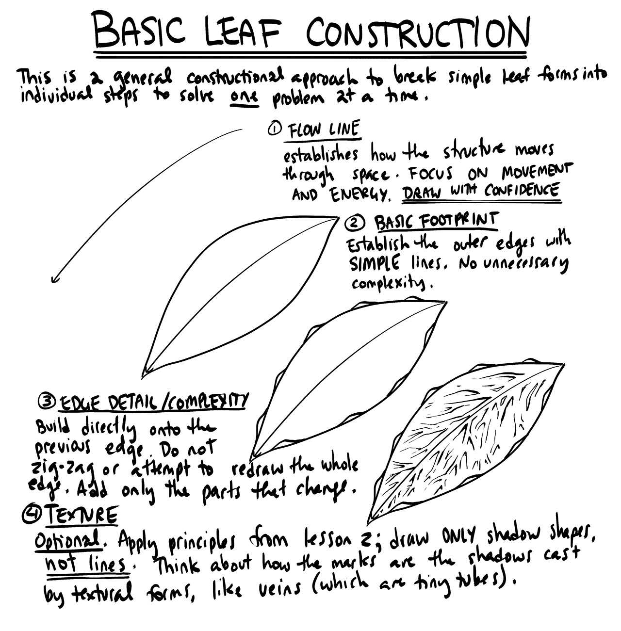
  • Honestly, I think you're tending way towards overdoing it, rather than underdoing it. If you're aiming to capture veins, or the depressions that exist in the petals, you shouldn't be attempting to cover them with tons of ink. It's better instead to work with the mindset of conveying the information pertaining to that small-scale 3D information, with as little as possible. You can see an example of me capturing the veins on a leaf by only drawing shadow shapes where the veins branch out in the leaves exercise example.

  • Darkening the bottom parts of your leaves would be more a matter of adding form shading, not cast shadows, since there would be no actual form casting those shadows. As discussed in Lesson 2, form shading is going to be a part of the drawings we produce for this course.

  • The ghosting method's explicit process (putting down points, ghosting through the motion, etc.) can be skipped for marks you're better off drawing from your wrist (like the ones that benefit from stiff precision rather than smooth fluidity, but you should still be applying its core principles. That means thinking about the marks you want to draw ahead of time, weighing what they're meant to achieve, and generally breaking the process into separate steps for planning and execution.

When I say you're focusing too much on decoration, it really comes from the fact that you appear to be focused on coverage. That is, covering your drawing with more and more ink, but not to any real useful purpose other than the aesthetic result. So ease up on the use of ink, save yourself some pens, and try to go with a less-is-more approach.

2:32 AM, Tuesday July 13th 2021
edited at 3:12 AM, Jul 13th 2021

I know that it can be subjective, but now I feel like I tried to convey too much textural information...without using very efficient/economic marks, apparently.

  • Again, in the leaves/petals examples, I thought that "adding more ink", or rather blocking up some texture, provided enough contrast to notice the veins and depressions while still treating those areas as form shading...but perhaps I should have just tried to capture very little to no texture in them?... Perhaps not treating them as form shading at all would have been a better choice?

Thanks again for the feedback. I'm still puzzled by what would be the right balance here, so I will now move on to the next lesson.

edited at 3:12 AM, Jul 13th 2021
12:52 PM, Tuesday July 13th 2021

Shoot, I messed up in my response. i meant to say that form shading will not be a part of the drawings you do for this course (which is ehat the linked section explains). So yes, not treating them as form shading would have been the better choice.

It's best to treat all of the filled black shapes you draw as cast shadows, without exception, at least in the scope of what you draw here.

Sorry for the confusion.

1:35 PM, Thursday July 15th 2021
edited at 4:11 PM, Jul 15th 2021

---(I'm starting to think most of this is actually just more of my confused thoughts that I should have kept to myself.)---

Your linked section does not explicitly mention to never use form shading—it merely says that it's not the main focus of the course and that it's not used for the purpose of making forms feel 3D. This is followed by "everything we add to our drawings serves a specific purpose. Therefore if the shading does not serve any such purpose (since it's already being handled by the techniques listed above), then we do not bother to include it."... But then, to end this explanation with "Shading where those transitions are achieved with textures specific to the surface of that object, however, are perfectly acceptable." can make the instructions rather confusing with the way you put it.

I had three purposes in using form shading: adding clarity and contrast, helping to maintain a hierarchy and sneaking in some textural information. To my understanding, there was no reason for me to not use it when adding texture because I was not using it to make my drawings "pretty" with hatching lines or as a means of construction. Not to mention that I've seen you use something similar to it in demonstrations like this or as I think I misunderstood here, at step (4). Only after the fact do you tell me straight up to not ever use it in Drawabox, and so I won't.

In fact...

  • Are these really cast shadows?... I'm not sure anymore, given that some of them seem to occur on the sloping planes of the leaf itself without being cast by another object...

Sorry if I seem a little impatient and also for continuously coming back to you with something else, especially if you're dealing with over a thousand people. It really is a difficult course.

edited at 4:11 PM, Jul 15th 2021
View more comments in this thread
The recommendation below is an advertisement. Most of the links here are part of Amazon's affiliate program (unless otherwise stated), which helps support this website. It's also more than that - it's a hand-picked recommendation of something I've used myself. If you're interested, here is a full list.
PureRef

PureRef

This is another one of those things that aren't sold through Amazon, so I don't get a commission on it - but it's just too good to leave out. PureRef is a fantastic piece of software that is both Windows and Mac compatible. It's used for collecting reference and compiling them into a moodboard. You can move them around freely, have them automatically arranged, zoom in/out and even scale/flip/rotate images as you please. If needed, you can also add little text notes.

When starting on a project, I'll often open it up and start dragging reference images off the internet onto the board. When I'm done, I'll save out a '.pur' file, which embeds all the images. They can get pretty big, but are way more convenient than hauling around folders full of separate images.

Did I mention you can get it for free? The developer allows you to pay whatever amount you want for it. They recommend $5, but they'll allow you to take it for nothing. Really though, with software this versatile and polished, you really should throw them a few bucks if you pick it up. It's more than worth it.

This website uses cookies. You can read more about what we do with them, read our privacy policy.