


This website uses cookies. You can read more about what we do with them, read our privacy policy.
0 users agree
12:54 AM, Saturday July 3rd 2021
Starting with your arrows, you're definitely drawing these with a great deal of confidence right off the bat, but you definitely are having trouble with the marks you add on top. You are, correctly, only adding line weight in more limited areas (though always focus it on areas where you want to clarify overlaps between forms - so like right where the arrow bends over itself). What you're not doing (or don't seem to be doing) is applying the ghosting method to those marks. This should be used for all your marks, not just the initial ones, to both ensure a confident execution, but also enforce the investment of time in the planning and preparation phases to increase your control/accuracy.
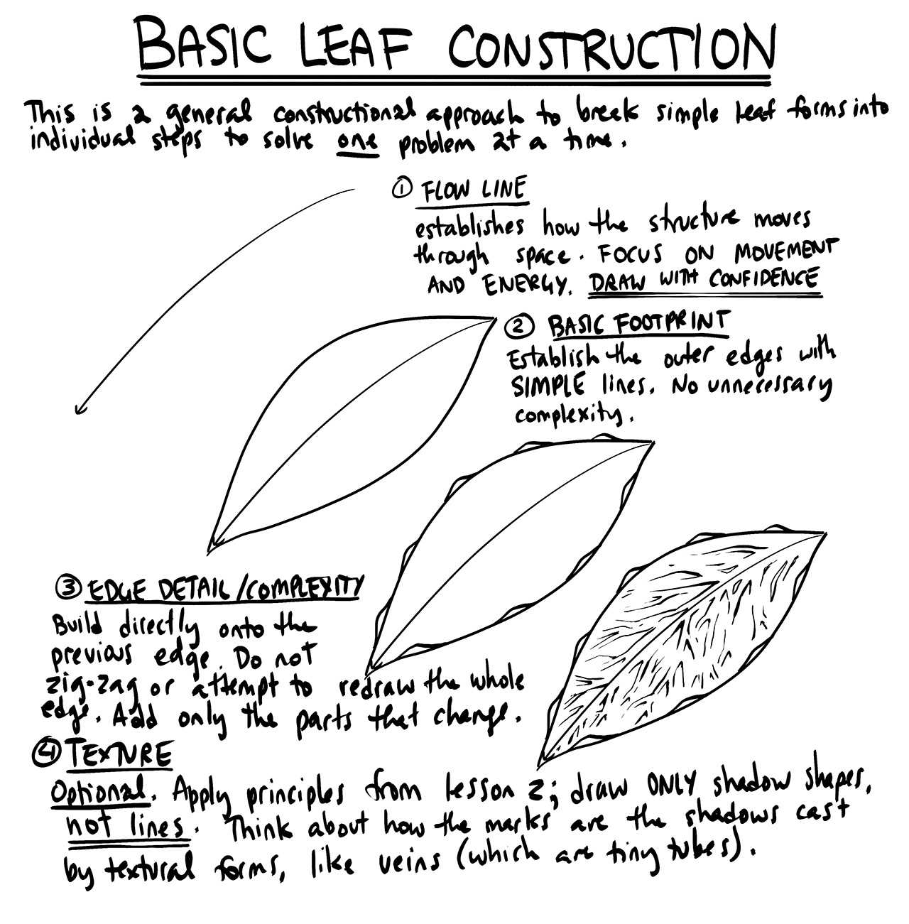
Moving onto the leaves, that confidence I mentioned towards the beginning carries over quite well. You're doing a good job of capturing both how the leaf sits statically in space, as well as how it moves through the space it occupies. Looking at how you're building up your more complex edge detail, you're doing a good job of building right upon the existing structure, adding the pieces that change, and generally ensuring a very strong relationship with the previous phase of construction. Some of the markmaking, again, could be better. It's common for students to spend less time on each individual mark when there are many to draw, but this is a temptation you should resist. Give each and every mark as much time as it requires, to avoid the little gaps or overshoots that underline the solidity of your form.
Continuing onto the branches, you're doing reasonably well here, but aren't consistently extending your segments fully halfway to the next ellipse, as shown in the instructions. Doing so will help make your transitions from segment to segment smoother and more seamless, especially if you use its tail as the runway for your next mark, overlapping it directly rather than where it ought to have been.
Moving onto your plant constructions, you've done a pretty good job. You're employing the principles of construction, building up one simple step at a time, and are doing a good job of maintaining tight, specific relationships between those steps. The main overall issue is simply what I mentioned before - when you get into the smaller marks of a construction, you get somewhat sloppier, not necessarily planning and preparing before each execution. Other than that, I do have a few recommendations and things to keep in mind:
-
Try to avoid drawing objects too small, and generally not giving them the space they really require from you on the page. I know you're enthusiastic to draw lots of these on each page, but it can actually limit your brain's capacity to think through those spatial problems, while also making it harder for you to engage your whole arm while drawing. This can contribute to some of the sloppiness when it comes to smaller details. Be sure to give every drawing as much room as it requires on the page, first and foremost. Once you're done, check if you can fit another drawing there. If you can, go for it. If you can't, it's okay to even have pages consisting only of one or two drawings, as long as the space on the page has been used well.
-
Remember that the degree of an ellipse determines how that circle in 3D space is oriented. If it's wide, it's turned towards the viewer, if it's narrow, it's turning away. On this drawing, the contour ellipses/slices along the stem each look like they're turned towards the viewer, even though the stem is running more up/down in front of them.
-
When you want to add more structure to a form, altering its silhouette by cutting/adding 2D shapes, it flattens it out. This works fine if you're drawing leaves and petals, because they're already flat. It's a problem, though, with forms that have more volume to them. So in cases like the plant at the bottom of this page, it's better to approach them like this.
-
Once you hit the 'detail phase' of a drawing, I get the impression that your focus shifted to the general, vague idea of 'decorating' your drawing. To make it look better, and more impressive. That's tricky though, because it's not really clear when we've decorated it enough. It's kind of arbitrary and subjective, so a difficult goal to define. What we're doing in this course can be broken into two distinct sections - construction and texture - and they both focus on the same concept. With construction we're communicating to the viewer what they need to know to understand how they might manipulate this object with their hands, were it in front of them. With texture, we're communicating to the viewer what they need to know to understand what it'd feel like to run their fingers over the object's various surfaces. Both of these focus on communicating three dimensional information. Both sections have specific jobs to accomplish, and none of it has to do with making the drawing look nice. So focus instead on conveying what can be felt and touched, rather than simply what can be seen.
-
Also, remember that as discussed in Lesson 2, your drawings for this course should not incorporate form shading, instead reserving the filled black shapes for cast shadows.
As a whole, I do think you could do a fair bit better if you invested a little more time in the planning and preparation of individual marks, but you're already doing a fairly decent job. So, I will go ahead and mark this lesson as complete.
Next Steps:
Move onto lesson 4.
12:16 AM, Tuesday July 6th 2021
"When you want to add more structure to a form, altering its silhouette by cutting/adding 2D shapes, it flattens it out."
I fail to see where I went wrong here, in the example you pointed out. Given the reference I was using, I don't think I was adding flat shapes to add structure. I even drew lines on top of the small shapes to give them volume instead of just adding to the silhouette of the plant. They are small, but i also added ellipses to indicate the poles on three of those additional forms.
I am unsure to have understood everything in the critique, but I am taking note of it.
Thanks again!
1:25 AM, Tuesday July 6th 2021
In that section you quoted, I was talking about the area I highlighted here on this plant. That's basically where the technique we would use to add edge detail to a leaf's edge was used for more voluminous forms, resulting in them feeling much flatter than you likely intended.
8:34 PM, Sunday July 11th 2021
Once you hit the 'detail phase' of a drawing, I get the impression that your focus shifted to the general, vague idea of 'decorating' your drawing. [...] With construction we're communicating to the viewer what they need to know to understand how they might manipulate this object with their hands, were it in front of them. With texture, we're communicating to the viewer what they need to know to understand what it'd feel like to run their fingers over the object's various surfaces. Both of these focus on communicating three dimensional information. Both sections have specific jobs to accomplish, and none of it has to do with making the drawing look nice. So focus instead on conveying what can be felt and touched, rather than simply what can be seen.
When it comes to texture, I still tried to understand how the smaller forms would sit on the plants.
For example, on the 5th page, the texture on the petals of the top-left plant is supposed to represent tiny depressions on its surface. With page #6 (top-right plant), I added cast shadow forms created by the bumps in its center, as with the soil on page #8, in which I also tried to define the small veins on some leaves by blocking them in with "shadow" forms.
For these examples, I didn't just draw what I saw. I tried to visualize what was really there and added just enough information to suggest how it would feel with shadow shapes. Nevertheless, I may have gotten careless when transitioning to less and less detail with some of my texturing.
-
Can you tell me more about these specific examples?
-
Aside from the veins, should I have just completely darkened the bottom parts of the leaves in page #8 and leave out the little possible highlights on their edges that suggest some unevenness of their surface? I'm not sure if they're adding too much noise despite how I interpreted them.
-
Do you want me to use the ghosting method to plan even the tiniest marks that went into shadow shapes in said examples? (This would seem rather unnecessary.)
1:15 AM, Monday July 12th 2021
-
Honestly, I think you're tending way towards overdoing it, rather than underdoing it. If you're aiming to capture veins, or the depressions that exist in the petals, you shouldn't be attempting to cover them with tons of ink. It's better instead to work with the mindset of conveying the information pertaining to that small-scale 3D information, with as little as possible. You can see an example of me capturing the veins on a leaf by only drawing shadow shapes where the veins branch out in the leaves exercise example.
-
Darkening the bottom parts of your leaves would be more a matter of adding form shading, not cast shadows, since there would be no actual form casting those shadows. As discussed in Lesson 2, form shading is going to be a part of the drawings we produce for this course.
-
The ghosting method's explicit process (putting down points, ghosting through the motion, etc.) can be skipped for marks you're better off drawing from your wrist (like the ones that benefit from stiff precision rather than smooth fluidity, but you should still be applying its core principles. That means thinking about the marks you want to draw ahead of time, weighing what they're meant to achieve, and generally breaking the process into separate steps for planning and execution.
When I say you're focusing too much on decoration, it really comes from the fact that you appear to be focused on coverage. That is, covering your drawing with more and more ink, but not to any real useful purpose other than the aesthetic result. So ease up on the use of ink, save yourself some pens, and try to go with a less-is-more approach.
2:32 AM, Tuesday July 13th 2021
I know that it can be subjective, but now I feel like I tried to convey too much textural information...without using very efficient/economic marks, apparently.
- Again, in the leaves/petals examples, I thought that "adding more ink", or rather blocking up some texture, provided enough contrast to notice the veins and depressions while still treating those areas as form shading...but perhaps I should have just tried to capture very little to no texture in them?...
Perhaps not treating them as form shading at all would have been a better choice?
Thanks again for the feedback. I'm still puzzled by what would be the right balance here, so I will now move on to the next lesson.
The recommendation below is an advertisement. Most of the links here are part of Amazon's affiliate program (unless otherwise stated), which helps support this website. It's also more than that - it's a hand-picked recommendation of something I've used myself. If you're interested, here is a full list.

Staedtler Pigment Liners
These are what I use when doing these exercises. They usually run somewhere in the middle of the price/quality range, and are often sold in sets of different line weights - remember that for the Drawabox lessons, we only really use the 0.5s, so try and find sets that sell only one size.
Alternatively, if at all possible, going to an art supply store and buying the pens in person is often better because they'll generally sell them individually and allow you to test them out before you buy (to weed out any duds).