2:31 PM, Saturday July 30th 2022
thanks for the suggestion!


thanks for the suggestion!
Hey there! I'm a still a beginner, so my feedback can be limited.
In the first page, there is a bit of fraying at the starting end of the line, you should carefully place the tip of the pen at the starting point, ghost, and then execute your lines. In the second page, it looks like it has gotten better, nice.
Awesome, the lines look really crisp, but there's a bit of wobbling, it's good to see that you prioritize line confidence over accuracy, accuracy and wobbling will get better with warm ups. Try to lift your pen up right before your line reaches the end point to prevent overshooting.
A lot of the lines look better in section, one thing that stood out was that you drew the ellipse only once, it should be drawn over 2-3 times.
Great, sometimes the ellipses are not aligning to the minor axis, but again, it'll reduce with warm ups.
Awesome, your ellipses fit snugly within the boundaries, and they're drawn over at least 2 times. I did notice that some of your ellipse degrees aren't consistent with the others (they're not the same). They should be of equal degrees.
Good, the boxes look solid and are within the safe zone (cone of vision)
Some of your lines are not parallel to the horizon line, but in general it's good :)
Great! However, i noticed that one of your boxes at the point where it turns (top left) seems out of place.
A fair bit of the boxes look too similar in size, it's hard to tell which box is closer to the viewer, try making the boxes closer to the viewer larger and the ones further smaller.
Next Steps:
You should move onto the 250 box challenge!

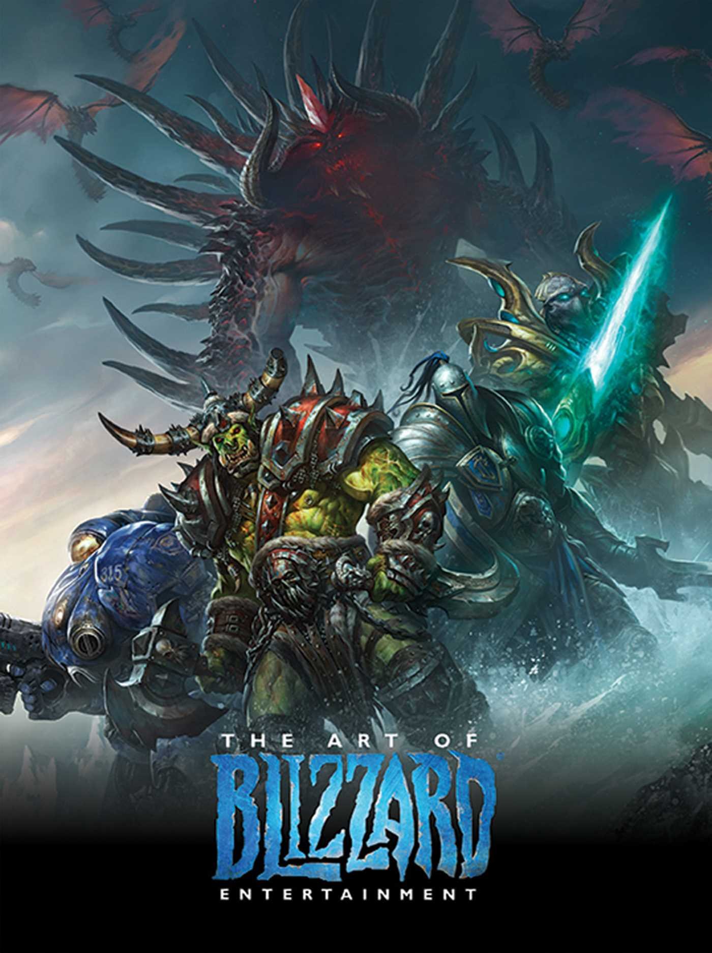
While I have a massive library of non-instructional art books I've collected over the years, there's only a handful that are actually important to me. This is one of them - so much so that I jammed my copy into my overstuffed backpack when flying back from my parents' house just so I could have it at my apartment. My back's been sore for a week.
The reason I hold this book in such high esteem is because of how it puts the relatively new field of game art into perspective, showing how concept art really just started off as crude sketches intended to communicate ideas to storytellers, designers and 3D modelers. How all of this focus on beautiful illustrations is really secondary to the core of a concept artist's job. A real eye-opener.
This website uses cookies. You can read more about what we do with them, read our privacy policy.