SomeoneAnomalous

Joined 4 years ago

3225 Reputation

someoneanomalous's Sketchbook

  • Sharing the Knowledge
    3 users agree
    6:22 PM, Friday February 26th 2021

    Hi! Congratulations on finishing lesson 2, you're now officially done with the basics!

    I'll be going over every exercise and give some feedback, if for any reason at all you're left with questions, please go ahead and ask.

    Arrows

    In general these look fine, but there's a few things which I'd like to point out.

    • Quite a number of your lines still look hesitant. It also looks like you repeated lines in order to hide your mistakes, which in this case is wobbly lines. Keep in mind that you want to ghost these lines and make them as confident as possible.

    • The compression on some of your arrows is not entirely correct. Remember that as your arrows sit back further in space the space between the folds is smaller, and gradually increases as your arrow moves toward the viewer.

    Organic forms

    Your organic forms are fairly well done. Something which is very evident from your ellipses is that these are drawn with accuracy valued over confidence. It's okay for your ellipses to go a bit out of bounds, and is preferred to stiff-looking ellipses that do fit. Your ellipses do vary a bit in degrees, but not much, and some are done incorrectly. It's good to see you experimenting with varying degrees. The degrees of these ellipses show the orientations of these cross-sections in space which would either be more open or narrow. So when you make an ellipse more open, it shows more, and if it's more narrow, it would, naturally, show less. Using this, you can make your sausages appear as if they turn towards/away from us (the viewer.) Here's an image which really helped me understand this concept.

    Texture analysis

    The main thing in this exercise is having to draw cast shadows, I'm glad to see that's what you're doing. Remember not to fall back on random stippling here, which shows in your moon texture (the rightmost one.) You want to think about every mark you put down.

    Dissections

    In some of these dissections you're focusing more on form shadows instead of cast shadows (e.g. beehive, corn.) You want to make sure you only draw the cast shadows. Don't forget that cast shadows are shadows that occur when a form block the light. The form shading in this case is on the form itself, while the cast shadows are the shadows projected on another surface. For your beehives you drew and enclosed the form shadows, while you only want to draw the cast shadows (the "inside" in this case.) You're also not really breaking the silhouette. I encourage you for further attempts to experiment with it more. (you can make outlines here.)

    From intersections

    This exercise is all about getting to know how 3D space works and how these forms relate to eachother. There's some boxes with extreme foreshortening but most boxes have somewhat similar foreshortening which helps make it look more cohesive. Make sure to take your time ghosting circles as it's imperative that they don't look uneven, if they are, they won't look like spheres.

    Organic intersections

    Remember that for this exercise you want to keep the forms simple, so two connected identical balls would be ideal. Something to also remember is to keep drawing through your forms. Apart from some oddly-shaped sausages they look fine, but the shadows don't quite work. Usually people tend to have their shadows stick to the form, which is something I also see you doing a bit, but there's also spots where there's too much shadow. If you look at the two sausages sitting on top of the bottom sausage (first page,) you'll see that the shadow is a bit too large. Your sausages don't always look stable. There's a bit of floating here and there and also a gap.For this exercise you really want to make sure the whole drawing feels solid.

    All in all you did well, good luck with lesson 3!

    Next Steps:

    Onto lesson 3!

    This community member feels the lesson should be marked as complete, and 3 others agree. The student has earned their completion badge for this lesson and should feel confident in moving onto the next lesson.
    2 users agree
    9:04 PM, Monday February 22nd 2021

    Hi! Congratulations on finishing your first lesson!

    I'll be going over each of the exercises individually. If you're left with any questions at all, don't feel afraid to ask.

    Superimposed lines

    In general these look pretty good. Sometimes theres a bit of fraying on both sides, so remember to place your pen carefully at the starting point before making your mark.

    Ghosted lines

    A number of your lines are wobbly, but most look confident. With practice you'll get even better at these.

    Ghosted planes

    There's some big improvement in line quality here! It's also great to see that you're taking the confidence > accuracy advice to heart.

    Table of ellipses

    These look fantastic. Naturally there is some wobble and a few ellipses are overlapping but most fit snugly within their boundaries, and are drawn confidently. Good job!

    Ellipses in planes

    The same applies here, most are drawn confidently and fit well within their respective planes. They'll get even better with practice.

    Funnels

    It seems like you've grasped all of the concepts here, the major/minor axes look good, and so do the ellipses.

    Plotted perspective

    For this exercise you really want to make sure to extend your lines to their VPs, as this exercise is meant as an introduction to perspective, it's imperative to get it right.

    Rough perspective

    Remember that you want your width/height lines parallel/perpendicular to your horizon line, your lines look quite wobbly here, so make sure to take your time to ghosting these lines. It also looks like you're repeating your lines. It doesn't matter how off, or wrong your lines are, you should keep it. Repeating it usually just draws more attention to your mistakes.

    Rotated boxes

    Good job on this exercise, there's still some issues previously mentioned, such as repeating lines but it looks like you generally understood it.

    Organic perspective

    Something to keep in mind is that you want your line to be darker the closer it is to the viewer, and gradually become lighter as it goes further back in space. Overall your boxes look fine, but quite a number of lines are repeated.

    All in all I'd say you're definitely ready for the box challenge, something I strongly encourage you to do, though, is to stop repeating lines. This is going to be important for the box challenge as well. Good luck!

    Next Steps:

    On to the box challenge!

    This community member feels the lesson should be marked as complete, and 2 others agree. The student has earned their completion badge for this lesson and should feel confident in moving onto the next lesson.
    2 users agree
    3:23 PM, Monday February 22nd 2021

    Hi! First of all, congratulations on finishing lesson one!

    I'll be going over each of the different exercises individually. If you're left with any questions, please ask.

    Superimposed lines

    So what I see here is that you've got fraying on both ends of your lines, something to keep in mind is to place your pen carefully at the begin of each of your lines. There also seem to be a number of arcing lines, this may be caused by not using your shoulder pivot. Another reason might be that you have a natural tendency for this, in which case you have to consciously arc a bit in the other direction. I can say though that this will definitely get better with practice.

    Ghosted lines

    These look good, sometimes a bit wobbly and/or arcing so remember to take your time with ghosting.

    Ghosted planes

    The same thing applies here, though it's good to see that you're following the advice of confidence > accuracy.

    Tables of ellipses

    The focus on this exercise lies in getting used to drawing ellipses in various sizes/angles/degrees and positions. This is really tough to do without a bunch of tables and rows, and as a result your ellipses don't quite fit within a set space. You also don't consistently draw through your ellipses twice, which would give you a smoother, more confident shape. It's also really useful for building muscle memory.

    Ellipses in planes

    There's some improvement here! Some of your ellipses do look (a tad) wobbly, so make sure to ghost as much as you need to.

    Funnels

    The problem here is that your ellipses don't really line up to the minor axes, you want the minor axes to cut your ellipses into two symmetrical halves. Don't worry about varying degrees yet, the most important thing here is to get your ellipses to fit snugly withing your funnels, and have them line up properly.

    Plotted perspective

    Nothing to add here, looks good.

    Rough perspective

    Remember that for this exercise you want your width/height lines to be parallel/perpendicular to your horizon respectively. Your perspective looks accurate though.

    Rotated boxes

    Nice attempt! It looks like you've understood the concepts and idea behind this exercise. You'll get plenty of practice in the 250 box challenge.

    Organic perspective

    One thing you could improve upon is darkening the line as it is closer to the viewer, and make it lighter as it gradually goes further into space. The boxes look pretty good, and as I said, there'll be plenty of practice.

    Great work on lesson 1!

    There's one thing I'd like you to do in order to be prepared for the following lessons.

    Next Steps:

    • One more page of table of ellipses, this time really paying attention the angle, degree, size, but most importantly position. Make sure to take as much time as you need to ghost these. I also encourage you to try and make columns and rows like this: https://drawabox.com/lesson/1/11/step1 it's much easier to practice if you make a bunch of smaller rows.
    When finished, reply to this critique with your revisions.
    2 users agree
    4:31 PM, Sunday February 21st 2021

    Hi! Congratulations on finishing lesson 1!

    I'll be going over each exercise individually, if at the end you're left with any questions don't hesitate to ask.

    Superimposed lines

    These look pretty good, but there's the slightest bit of fraying going on on both sides, so make sure to place the pen carefully at the starting point when putting down your mark.

    Ghosted lines

    These are great, there's a bit of wobbling here and there but with time that'll go away.

    Ghosted planes

    It's great to see you take the confidence over accuracy advice to heart, again, your lines are very confident.

    Table of ellipses

    In general these are well-drawn, the problem, however, is that the position of a lot of these is off. You want your ellipses to fit in snugly between each other and touch but remain within their boundaries. Make sure to take your time ghosting not only the shape of the ellipse, but also in the right position.

    Ellipses in planes

    There's a lot of improvement here, your ellipses fit much more snugly within their respective planes. Not much else here to say, good job!

    Funnels

    The only problem I can see here is that a number of your ellipses don't touch each other, but other than that they look good.

    Plotted perspective

    These look great.

    Rough perspective

    In this exercise you want to make sure to keep your width/height lines parallel/perpendicular to the horizon respectively, which is something I don't see being done continuously, and is something to keep in mind. The perspective looks accurate and is well done.

    Rotated boxes

    These look quite accurate, and in the box challenge you'll improve even further.

    Organic perspective

    All in all these look great, but keep in mind to make a darker line as it is closer to the viewer and make it gradually lighter as it falls back in space.

    You did an excellent job here, you're definitely ready for the box challenge. Good luck!

    Next Steps:

    On to the box challenge!

    This community member feels the lesson should be marked as complete, and 2 others agree. The student has earned their completion badge for this lesson and should feel confident in moving onto the next lesson.
    2 users agree
    7:22 PM, Saturday February 20th 2021

    Hi! First of all, congratulations on finishing lesson one!

    I'll go over each exercise and give some feedback, if you're left with any questions don't feel afraid to ask.

    Superimposed lines

    To start off, there seems to be fraying on both sides on some of your superimposed lines. Make sure you take your time and properly position your pen at the starting point. This is so important to do because in order to make confident strokes, and thus lines, the right preparation is necessary.

    Ghosted lines & ghosted planes

    Overall these look good, but there's a bit of wobble. Keep practicing and eventually that'll go away.

    Table of ellipses

    The issue here is that you're drawing through your ellipses many, many more times than just twice or trice. The reason why it's recommended to draw through them twice/thrice is that it helps your draw quicker, with more confidence which then results in a smoother, more even shape. It also helps build muscle memory. On your first page, especially on the upper half, most of your ellipses are overlapping/going out of bounds. You want to make sure they are touching each other, but not overlapping. Make sure you're ghosting enough and when you feel confident draw it. Your second page looks better, with much less overlapping. Nonetheless some ellipses still go out of bounds/don't quite fit snugly within their boundaries, and I noticed you didn't draw through some ellipses. This will cause them to get more uneven, bumpy etc. It's better to draw through them twice/thrice as mentioned above. Nice improvement though!

    Ellipses in planes

    The same applies as above, make sure you try and draw your ellipses to fit snugly within their respective planes, and a number of them are wobbly. There's no shame in taking your time ghosting these! They are hard, but with practice they will definitely improve.

    Funnels

    The problem here is that you're not drawing minor axes, this is such an important step and can absolutely not be skipped.

    https://drawabox.com/lesson/1/13/step1

    Again, you're not drawing through most of your ellipses . The purpose of this exercise is getting used to fit your ellipses snugly in a set space, and getting used to the minor axis line which will be used many times in lesson 2. That's why it's imperative to do this exercise correctly. Had you drawn a minor axis line, most of these would've been done perfectly. As a reminder, you want the minor axis to cut an ellipse in two symmetrical halves.

    Plotted perspective

    Looking good, not much to say here.

    Rough perspective

    There's only one page of rough perspective, so I'm going off of that. Well done on the perspective! It looks like every line is going towards the VP quite well. Unfortunately this is hard to see, as you didn't use your depth lines and extend them toward the horizon. This is an important step in order to check your work. I see you also repeat lines, you should leave these alone, even if they are wrong. It only draws more attention to your mistake.

    Rotated boxes

    Your line work looks a lot better! The issue here is that you're not drawing through your boxes. The reason you want to draw throught them is so that you get to understand how forms sit and operate in space, by not drawing through them you're missing out on a lot.

    Organic perspective

    Make sure to start off with a darker line as it is closer to the viewer, and then gradually lighten your line as it goes further into space. Most of your boxes look (a tad) wobbly, so make sure to ghost as much as you need to.

    You have done well, but there's some thing I would like you to do in order to fully grasp the concepts necessary to go into the box challenge and lesson 2.

    Next Steps:

    Please add the following:

    • Another page of funnels, this time with the minor axes included, while also taking your time ghosting your ellipses.

    • Your rotated boxes page, but now with your boxes drawn through them.

    • Another page of organic perspective, keeping my feedback in mind.

    When finished, reply to this critique with your revisions.
    2 users agree
    12:14 PM, Saturday February 20th 2021

    Hi! Congratulations on finishing your first lesson!

    Superimposed lines

    Overall these look good! There's no fraying at the start of your lines, and there doesn't seem to be wobbling at all. There does seem to be a bit of arching going on, which may be caused by not using your shoulder pivot. Alternatively, this may be a natural tendency in which case you'll have to consciously arc your line in the opposite direction. I can speak from experience, eventually it'll get better.

    Ghosted lines

    Your arching lines are mostly gone, that's good. Some lines are a tad wobbly, so remember to take your time with ghosting and that confidence is more important than accuracy, which will come with time.

    Ghosted planes

    As with your ghosted lines there's a bit of wobble sometimes but generally these are well done.

    Table of ellipses

    These look very good, most of your ellipses fit quite snugly in their confinements, sometimes their position isn't quite right, but it'll get better with more practice

    Ellipses in planes

    The same things from your table of ellipses apply here, well done for the most part.

    Funnels

    The purpose of this exercise is getting used to the minor axis line, and getting your ellipses to fit snugly within a set space. I feel like you've done this well. A few of your ellipses aren't cut in two symmetrical halves, but most of them are. Again, you'll get better at this the more you practice.

    Plotted perspective

    While it's good you hatched the front view of the boxes, they are hard to tell apart. This is because you drew boxes behind other boxes (in the middle of your page,) while it's not a problem to have them overlap a little, drawing boxes mostly behind other boxes makes it hard to distinguish them, especially when you don't add lineweight. The boxes are drawn using the vp's properly, but in the future I enourage you to add line weight to set them apart more.

    Rough perspective

    The first thing that I noticed is that in some cases your width lines aren't parallel to the horizon, and your height lines aren't perpendicular to the horizon. This might just be because a number of your lines are wobbly, but it's especially visible on the first, leftmost box on your second page. (notice how the width line is going from the upperleft to the lowerright?) The rest looks good.

    Rotated boxes

    Again, it's very difficult to critique this exercise because I can't really distinguish these boxes from eachother, this is also why using a fineliner is recommended, there are no gradients to complicate things. You have undoubtedly already read this article, but I'm still going to link it. https://drawabox.com/article/ink From what I can tell, your boxes look good. They are all close together and rotating properly.

    Organic perspective

    It's immediately obvious that theres no variance in line weight, you want to draw lighter the further away a line goes, and gradually darker the more it moves towards a viewer. Your boxes look pretty good, and you're gonna get a ton of experience while working through the 250 box challenge.

    You did very well! There were no glaring issues, and it seems like you understood all of the concepts well. I wish you luck with the box challenge, it's gonna be tough.

    Next Steps:

    250 Box challenge

    This community member feels the lesson should be marked as complete, and 2 others agree. The student has earned their completion badge for this lesson and should feel confident in moving onto the next lesson.
The recommendation below is an advertisement. Most of the links here are part of Amazon's affiliate program (unless otherwise stated), which helps support this website. It's also more than that - it's a hand-picked recommendation of something I've used myself. If you're interested, here is a full list.
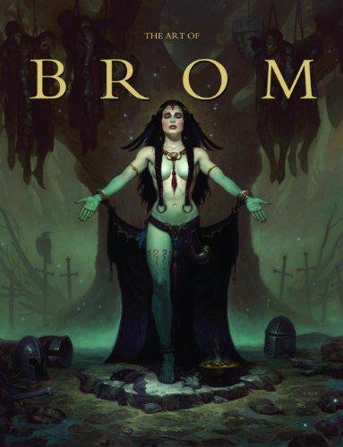
The Art of Brom

The Art of Brom

Here we're getting into the subjective - Gerald Brom is one of my favourite artists (and a pretty fantastic novelist!). That said, if I recommended art books just for the beautiful images contained therein, my list of recommendations would be miles long.

The reason this book is close to my heart is because of its introduction, where Brom goes explains in detail just how he went from being an army brat to one of the most highly respected dark fantasy artists in the world today. I believe that one's work is flavoured by their life's experiences, and discovering the roots from which other artists hail can help give one perspective on their own beginnings, and perhaps their eventual destination as well.

This website uses cookies. You can read more about what we do with them, read our privacy policy.