


7:37 AM, Tuesday August 18th 2020
Thank you!
I see the animal lessons use a lot of sausage forms themselves, I'll work on improving these issues!


Thank you!
I see the animal lessons use a lot of sausage forms themselves, I'll work on improving these issues!
Thank you very much for the critique!
Following the plants critique, I have tried to fix the line weight and quality issues, but I am still getting it quite wrong. I've tried to limit line weight only to distinguishing which forms were in front, but I still got the feeling after each drawing that I ended up with too much line weight. And poor line quality... Are there any line quality exercises I should do? Or just lesson 1 as warmup and keep drawing? For most of the points, I think it's a dexterity issue for me now (whereas before I was just ignorant altogether).
I feel very bad about not using sausages for legs. I did feel strongly that I was too stiff and that process would have helped me a lot. I was just a very bad student in this.
There are two minor/more specific things I'd still like to ask if I may...
On this insect: https://i.imgur.com/rxS27e4.jpg I feel the "snout" is wrong, spatially, but wasn't sure how to make it better.
And while drawing the hidden legs of insects, I get confused in combining what happens to cylinders when they move closer to or away from the central vision point and what happens to them when they're rotated.
Should I worry about these, or will they become better with the 250 cylinders challenge? This particular issue is one that's been plaguing me for a long time, and one of the reasons I was excited to find DaB :D (looking at drawings from half a year ago, I feel DaB has already helped me a lot with spatial thinking)
Thank you again for the critique! I hope I can fix these for the animals homework.
Ok, thank you very much!
I will read the first lessons again, especially on line quality and line weight and try to respect the rules in all my drawings. I will definitely take my time on lessons 3, 4, 5, 6, 7, but indeed, I should work on the flaws I still have in the first 2 lessons. I don't want to seem like I'm ignoring the lessons, I feel this course has already helped me a lot, it's just that I'm fighting against a few years of bad habits, as far as line quality goes. :) I'll keep chipping away at it and hope to catch myself whenever I mess up.
Thank you for the critique and the steps to follow!
I find it very difficult, because the initial lines, even though I generally ghost them, aren't always accurate. This is the same issue I've had for years when trying gesture drawing or life drawing in graphite... I end up with too heavy lines and it messes everything.
Will it help if I just abandon the search for accuracy in favor of committing with each and every line, even if the drawings will look wrong at first?
Also, I would like to ask about this:
"In regards to your line weight, you are running into one significant issue - by making the internal lines so much heavier than the lines along the silhouette of the forms, you're making those branch forms feel more like a loose collection of lines rather than a single cohesive form"
By internal lines, do you mean the cross contours? With the branches I find it a bit more difficult to say if a branch segment is going into the paper or out of it without adding a bit of weight to the cross contour curve. And this is also the reason why I added the hashing on branch #8, trying to match the cross contour. But as you've remarked, these things break the forms, indeed. I feel a bit lost in how to express this "going away/coming towards viewer" for the branch segments. I definitely agree that my approach falls flat, I just don't know how to make them a bit more solid/clear.
Anyway, thank you very much for the critique!
I wanted to get as fast as possible to the construction lessons, because the fun part of my homework is mostly drawing animals (and now some plants are quite fun to draw too), so I'll do more constructions and try to work on the issues with the confidence and line weight.
Thank you very much! Yeah, line quality is something I'm still very bad at and I'll keep practising it! I suppose the superimposed lines exercise from lesson 1 might be the best one to warm up for a while.
Also... thank you very much for these exercises! The form intersections messed up my brain sooooo much, and I definitely felt an improvement from the first page to the last page. (First page took me 8+h of mostly just thinking, but then it became faster and faster to decide which part of which forms is behind which part of the other form and whatnot)
Thank you very much for the critique and the link! :D
I will continue to do some boxes now and then (and lesson 2 has a lot of boxes in its exercises too anyway :) ) and will also mark everything on the page. If I had done that in the first place it would have also been very easy to rearrange the images in the album on imgur, so I'll definitely keep it in mind from now on.
Ok, thanks again for all the info! :D
Thank you very much for the critique!
The scratchy lines are a combination of the pens becoming scratchy very fast if held at 45ish degrees, rather than almost vertical (went through 3 pens in this lesson), and, indeed, my tendency to correct lines now and then. I had this habit and trying to get rid of it, so I'll keep working on this as well. (some extra fraying was from adding line weight, but some was just me keeping the bad habit)
One question, though, if I may, on just this: I'm now going through the 250 boxes challenge and sometimes I feel I really need to correct a line because it's diverging rather than converging with its parallels. Is it ok to at least correct glaring perspective mistakes while doing these? Or just scrap that whole box and start over?
Thank you again! :D
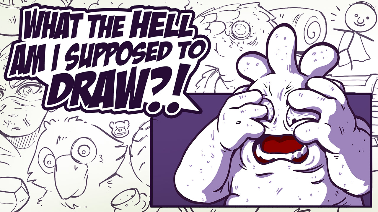
Right from when students hit the 50% rule early on in Lesson 0, they ask the same question - "What am I supposed to draw?"
It's not magic. We're made to think that when someone just whips off interesting things to draw, that they're gifted in a way that we are not. The problem isn't that we don't have ideas - it's that the ideas we have are so vague, they feel like nothing at all. In this course, we're going to look at how we can explore, pursue, and develop those fuzzy notions into something more concrete.
This website uses cookies. You can read more about what we do with them, read our privacy policy.


