Uncomfortable in the post "Lesson 1: Lines, Ellipses and Boxes (Patreon Critique Thread)"
2019-06-27 16:24
Unfortunately your last submission was on June 24th. Students must wait two full weeks (14 days) in between submissions, so you'll have to hold onto that until July 8th and resubmit then. This is both to ensure that students do not flood us with submissions, and that they are given enough time to work through a given lesson or challenge without rushing.
Uncomfortable in the post "Lesson 1: Lines, Ellipses and Boxes (Patreon Critique Thread)"
2019-06-26 19:50
Your work here is really fantastic. I have just a couple minor things to point out, but by and large you've done a phenomenal job.
To start with, your lines are exceptionally well executed. You're clearly focusing on executing your marks with confidence, not allowing your brain to steer the stroke, but instead trusting in your muscle memory, and for your arms to do what they do best. You maintain a consistent trajectory throughout the stroke, and don't waver or hesitate in order to get back on your intended track.
Once introduced to the ghosting method, you add the first two phases of mark making - planning and preparation - to precede your execution, and do so without changing how you actually put the marks down. You're still confident and consistent, but now your strokes are reinforced with proper planning to achieve greater accuracy and precision without stiffening up.
This confidence and willingness to apply the ghosting method with this degree of deliberateness carries over into your ellipses, and helps you to achieve smooth, evenly shaped ellipses that generally do a wonderful job of fitting snugly within their intended containers. I noticed in your ellipses in planes that you had a slight tendency to deform them in order to touch all four edges - this is something you should avoid, in favour of maintaining the elliptical shape above all else (and then gradually finding how to place and orient the ellipses to still achieve contact with all four edges), though the degree to which yours were distorted was minimal compared to most other students with this issue.
Jumping ahead to your rough perspective boxes, for the most part I can see you taking a great deal of care in maintaining horizontals that run parallel to the horizon line, and verticals that run perpendicular to it. This shows me that you're willing to take that moment before each mark to really think about exactly what behaviour that stroke should follow, and what your intent is with it. Being that this is one point perspective, we really only have the three possible kinds of lines, and so we need to know specifically which category our stroke falls into before moving forward with it.
Now, I am noticing that your linework here is perhaps just a little bit more hesitant than your previous stuff - it's almost unnoticeable, but I can see signs that you may not be approaching each stroke with quite as much preparation. Always remember that each and every stroke we put down deserves and requires as much time as you need to execute it to the best of your ability, whether it is floating on its own, or part of a larger form or more complex object. Whether it's an individual or part of a collection, a line is always just a line.
You really nailed the rotated boxes. You maintained narrow, consistent gaps so as to avoid any unnecessary guesswork, and you covered the full range of rotation on both major axes without any 'flairing' of the corners. One minor point - your boxes ended up being quite long (depth-wise). While it's not stated that these should be perfect cubes (because there's no need of that), aiming more equilateral is definitely better for this exercise.
Lastly, your organic perspective boxes are coming along very well. You're already demonstrating a strong grasp of 3D space, and how these forms sit within it. Your convergences are coming along well, and maintain a consistent trajectory towards the shared vanishing points. You're even drawing through most of your boxes, which is great to see (although in the future, don't make those lines fainter - draw them with the normal confidence you'd draw anything else). And, perhaps unimportantly, your compositions are quite pleasing and well balanced.
I am noticing a few places where you're perhaps correcting mistakes, once the line has been committed. In the future, try and avoid that sort of thing. Once a mark is down, it's usually best to leave it be rather than to draw attention to it or get in the habit of having to adjust and tweak everything.
Now, the quality of your organic perspective boxes puts me in an awkward spot. At this point I will of course be marking this lesson as complete. I generally assign the 250 box challenge next, as this last exercise is intended to be an introduction, an opportunity to expose students to a different kind of spatial problem that they may not have otherwise considered. You are however already demonstrating considerable comfort with this sort of thing. At the same time, I don't want to accidentally leave you without some of the particularly valuable aspects of the challenge either.
So, I'm going to ask you to complete at least 50 boxes from the 250 box challenge (with all the line extensions drawn upon the completion of each page). When you submit your work, be sure to include a reminder that I only assigned 50 instead of the whole enchilada.
Uncomfortable in the post "Lesson 1: Lines, Ellipses and Boxes (Patreon Critique Thread)"
2019-06-26 19:23
Both your lines and ellipses sections are very well done. You're demonstrating confident linework, without any hesitation or attempts to steer the pen with your eyes as you draw. You're showing that you trust in your muscle memory, and are allowing your arm to do what it does best. You then reinforce that by applying the ghosting method, adding the planning and preparation phases to your mark making process without changing the execution phase. You imbue your strokes with a greater tendency towards accuracy and precision without impeding the confidence and flow of the strokes.
This helps you to achieve smooth lines that go where they need to. You've got a little bit of arcing to some of your longer lines, which you can read about here, but by and large this is going well. Additionally, this combination of preplanning and confidence does a great job of keeping your ellipses evenly shaped and free of stiffness, even when dealing with the tricky situation of having them fit inside of awkwardly shaped planes.
Now, when you hit the boxes section, you do encounter some difficulties.
First off, I'm not seeing the rough perspective boxes represented here - it looks like you may have forgotten to include it, so I'll have to ask you to submit that as well before I mark this lesson as complete.
That said, in both your rotated boxes and organic perspective boxes, there is a visible change in how you go about drawing your lines. These marks don't appear to be using the ghosting method, with your investment of time shifting all towards the execution of your marks, drawing more slowly rather than planning and preparing beforehand.
This results in lines that are a great deal stiffer, and much less smooth than you demonstrated earlier. Every single mark demands and requires just as much time as it needs to be drawn to the best of your ability, whether it is on its own, or if it exists as part of a larger, more complex form or object.
Now, these last two exercises are absolutely meant to be quite challenging, and so it's common for students to get a little overwhelmed, and in reaction to that, dump what they've learned and fall back to older habits. Whenever you feel a little in over your head, don't push forwards - take a step back and take stock of the situation. You may find that you don't know where your lines should necessarily go, but a line is still a line regardless of where it is drawn, and you know how to draw lines. So step through the process, determine which line you want to draw, and then execute it with confidence. Even if the line is oriented incorrectly, it will still be smooth and confident - and that's at least a win on one front.
Looking at the rotated boxes exercise, there are two main things I look for:
-
Whether the student kept the gaps between the boxes narrow and consistent, so as to avoid any unnecessary guesswork, as explained here. Your gaps were definitely close, but still had a tendency to be rather inconsistent. There wasn't really any attempt to keep the lines that were close together running roughly parallel to one another.
-
Whether the student is covering the full 180 degree arc of rotation on both major axes. You're achieving this in your second attempt, though your corners (which are incomplete) seem to be flaring out farther, rather than sticking to their neighbours. Maintaining the consistent gaps would have helped with that, at least somewhat.
On that point, no matter how badly an exercise is going, see it through and bring it to completion. Don't leave exercises half finished, as you have done here with the missing boxes in both attempts.
Lastly, your organic perspective boxes are a good start, though there is plenty of room for improvement, specifically in getting your sets of parallel lines to converge more consistently towards their shared vanishing points. This exercise is all about exposing students to a different kind of spatial problem they may not have otherwise considered, and so it is more of an introduction rather than a test, and I fully expect students to have difficulty with this. We will continue to work on this, of course.
Now, before I mark this lesson as complete, I'd like you to submit your two pages of rough perspective boxes. Once I do mark it as complete, I'll want you to move onto the 250 box challenge next.
Uncomfortable in the post "Lesson 2: Contour Lines, Texture and Construction (Patreon Critique Thread)"
2019-06-26 19:09
So starting at your arrows, they're generally flowing quite fluidly across the page, although right now you're falling into the trap of having them limit their movement to a relatively flat, two dimensional slice of space right at the "surface" of the page itself. What we want to push into is the full depth of the three dimensional world beyond the page. To achieve this, we can push and exaggerate the scale of the far and near ends of the arrows, as well as play with having the spacing between the zigzagging lengths of arrow compress as we look farther away (as explained here)
Your organic forms with contour lines are generally looking pretty good, save from a few key issues:
-
The forms should be, as explained at the beginning of the instructions for this exercise, simple, like two equally sized spheres connected by a tube of consistent width. Yours are a little all over the place, with different sized ends, and pinching through the midsection that increases the overall complexity of the form. This whole start-simple with basic sausage forms thing is critical as we move forwards, as we'll be employing constructional techniques which rely on the idea of building up complexity by adding more simple forms, rather than increasing the complexity of our base units.
-
From the looks of it, you may not be thinking very much about how the degrees of your ellipses and curves should be shifting over the course of the sausage forms.
-
Your contour curves are wrapping quite nicely around the forms themselves, though one thing that may help is to add a little contour ellipse at the end that faces the viewer. Being that it would sit at the tip, it would be considerably smaller than the other curves, and since that surface would be facing the viewer, the whole contour line would be visible (allowing us to draw a full ellipse rather than just a curve). You can see such an ellipse on the bottom right of this image.
Your texture analyses come along quite nicely - you've got a great start on both pushing your observational skills, as well as on thinking in terms of fluid shadow, rather than restrictive line. You're still working through it of course - on the gradient of the last texture, you purposely outlined each little node, which generally is something you should avoid. Lines themselves are made up - they're a tool we use to define the borders between objects and masses, and are quite useful at that. They also have the unfortunate side effect of communicating to the viewer that every little form that exists along the surface of the object has been drawn explicitly - that there is nothing that exists that has not been drawn.
That may sound confusing, but when you think about how we often rely on IMPLYING the presence of textural elements rather than drawing it all in complete detail, we want the freedom to be able to draw some aspects of things, while leaving others to the viewer's brain to fill in. That is why we DON'T USE LINE when drawing texture. We don't even draw the forms themselves that exist - we draw the shadows that they cast, implying their presence by drawing around them. This allows us to be much more flexible, plunging an area into solid black or overexposing it with direct light, leaving only the shadows trapped in cracks too deep for light to reach. Despite changing the nature and number of marks we're using to convey the texture, we don't actually change the object that is being communicated to the viewer.
So, when you're drawing elements of a texture, try not to draw them directly. Instead, when you see a mark, ask yourself what kind of form is casting the shadow you perceive as that mark, and then try to figure out that shadow in your drawing.
As I've gone over texture to a great degree above, I'm only going to mention one quick additional point about your dissections - here you've allowed your patience and care to slip, as far as the use of your observational skills goes. You've relied a lot more here on your memory, rather than drawing directly from your reference and looking back at it frequently. Always remember that your memory is not reliable, and using it will result in your textures being oversimplified and largely symbolic rather than a direct capture of what is actually there in your reference.
Your work on the form intersections is pretty solid, though you do need to mind the instructions a little more. For this exercise, I did say that you should avoid forms that are overly stretched (like long cylinders and long boxes), sticking to those that are more equilateral in the interest of keeping the complexity of the exercise down. Additional foreshortening woes will distract us from the core of the exercise.
Additionally, keep on top of your spheres there - they tend to come out a little uneven, which undermines the overall illusion of form. You may be drawing more from your elbow than your shoulder there. Aside from those two points, you're demonstrating a good grasp of 3D space and form, and are drawing these forms together in a way that feels cohesive and consistent.
Lastly, your organic intersections are coming along well. You're demonstrating a good grasp of how these forms pile up on top of each other, finding a state of equilibrium between themselves without appearing as though they cut into each others' volumes, or that they're simply flat shapes pasted on top of one another on a page. The illusion of a 3D world here is quite strong, and I'm glad t osee the use of that little contour ellipse at the ends of your forms here. The only weakness here is that your contour curves aren't quite as strong in the second page, where they tend to be a little too shallow at times.
Anyway, I'll go ahead and mark this lesson as complete. Feel free to move onto lesson 3, but keep the points I've mentioned here in mind and be sure to continue practicing these exercises as part of a regular warm up routine.
Uncomfortable in the post "Lesson 3: Applying Construction to Plants (Patreon Critique Thread)"
2019-06-26 18:42
You seem to have forgotten to include the link to your work!
Uncomfortable in the post "Lesson 3: Applying Construction to Plants (Patreon Critique Thread)"
2019-06-25 20:44
Ah, I see the arrow thing. It was actually the line weight that threw me off, and caused me to read the arrows as being the wrong way around. Looking more closely at the hatching line forced my brain to invert and understand how you intended them. In that case, the size is fine, but the space between those lengths being compressed further will give us more of a sense that the arrows are coming out at us in space rather than moving diagonally across the page.
The thing about the the instructions is that there is a lot of information there in the lesson, and while I try to simplify and organize things as much as I can, it's inevitable that students will sometimes have difficulty absorbing all of it, and perhaps go into it expecting to be able to hold a lot more information in their heads than they can (resulting in them not rereading the material when necessary, and forgetting a lot of things). That's why applying them becomes difficult - we read through them and understand them at their surface, but a lot of that information gets lost in the shuffle, and we move forward without it, instead of taking a step back and reflecting on what is written there.
As for the whole believing-in-a-lie thing, it's a process. We all start out with what you're doing - trying to think in terms of the logical tricks we can use to trick the viewer in to believing something that we already know is a lie. That's what the how the perspective rules are applied, and everything else - they're tricks, and we KNOW we're trying to trick people. And that only takes us so far, because the lie we're spinning ends up becoming so complicated, with so many tricks in play simultaneously, that we're bound to contradict ourselves on the page, and undermine our goals.
As much as I try to reduce the reliance on having things "click", especially by breaking this path up into elements we can understand, this is one of the few areas where we do need to put the mileage in to properly transition from being a swindler to being the lunatic who is preaching on the side of the road about things that simply do not exist. The one who truly believes what they're saying is true.
Jumping ahead to the list of drawings where you felt you followed the process of simple to complex properly, for 2 - these are definitely more on the complex side, as you can simplify them by drawing the outer shape of each leaf without the bit where they cut back in towards the stem. That's something I would add in a subsequent phase of construction, by cutting back into the simpler form.
Others are moving in the right direction, although I still do think that we need to solve the matters of flow and at least move a little further ahead on spatial reasoning before we dig into those again.
Uncomfortable in the post "Lesson 1: Lines, Ellipses and Boxes (Patreon Critique Thread)"
2019-06-25 20:21
Overall you're doing a pretty good job! There are a few things I noticed, as well as some marked improvement that I could see over the set.
What jumped out at me in your super imposed lines and your ghosted lines exercises was that there was a little bit of hesitation behind your lines, that caused them to stiffen up every so slightly. It's not the sort of thing that is particularly easy to pick up, but the little signs are there that you're a little unsure of yourself as you make those marks, and that you're second-guessing your muscle memory as you execute them.
As you get into the ghosted planes however, I believe you get a little more comfortable with the technique, and do a much better job of separating the planning, preparation and execution phases of the ghosting method. The lines appear smoother and more confident here, which tells me that you're shutting off your brain when you move to make the marks themselves, and allowing your arm to do what it does best without interference. This is definitely a big step in the right direction. Even though the issue was fairly minor, that last little bit of stiffness can be difficult to conquer.
For the most part, your ellipses are coming along well. You're visibly working on pushing forward with confidence, and while there's a touch of stiffness here and there, I believe you're doing a good job of capturing smooth, even shapes for each ellipse and avoiding much distortion. I noticed that in a few of these you definitely went a little overboard in drawing through your ellipses - try and limit it to two or three rounds before lifting your pen, with two being ideal.
For your funnels, remember that the core of this exercise is built around the idea of aligning your ellipses to the central minor axis line. I'm noticing a tendency in yours to slant a little, so keep working on that.
Jumping ahead to your rough perspective boxes, you're doing a good job of keeping your horizontals parallel to the horizon line and your verticals perpendicular to it, which shows me that you're thinking about the fact that this is a one point perspective situation which dictates a limited set of possible behaviours for each line. The fact that there is no slanting in these lines suggests that you are taking a moment before each line to properly consider which behaviour that stroke should follow, before jumping into it. I'm also pleased to see that you're applying the line extension method to check how your estimation of perspective might drift. Overall that drifting is fairly limited, and you're doing a pretty good job of aiming those alignments correctly.
Moving onto your rotated boxes, you did a good job of keeping your gaps narrow and consistent so as to avoid any unnecessary guesswork. You did however fall into the trap of having your boxes run roughly parallel to each other (aside from the central box). Keep an eye on those relative rotations between the boxes so you can better cover the full 180 degree arc on each major axis.
Lastly, you've got a good start on your organic perspective boxes. I'm actually VERY pleased to see that you decided to draw through all your boxes here - even when students have encountered that technique from having moved ahead previously, they don't all realize that this is a technique that can be used wherever you feel it may help you to better grasp how the forms sit in space.
Now, there certainly is room for improvement, specifically in getting your sets of parallel lines to converge more consistently towards their shared vanishing points, but that is entirely expected. This exercise is all about exposing students to a different kind of spatial problem they may not have otherwise considered, and serves as an introduction rather than a test. We'll also continue to work on this.
I'll go ahead and mark this lesson as complete. I'd like you to move onto the 250 box challenge next.
Uncomfortable in the post "Lesson 2: Contour Lines, Texture and Construction (Patreon Critique Thread)"
2019-06-25 20:00
Woops, I wish I'd checked this sooner. No issue on the whole tier/upgrade thing, but your link points only to a single image rather than the full album!
Uncomfortable in the post "250 Cylinder Challenge (Patreon Critique Thread)"
2019-06-25 18:04
While the requested revisions can be submitted immediately, you can essentially see "the clock" as being based on the last time you submitted something, including those revisions. This is both to ensure that we're not getting bombarded with too many submissions from a single student in a month, and that the student is not encouraged to rush through any a lesson's work.
Uncomfortable in the post "250 Cylinder Challenge (Patreon Critique Thread)"
2019-06-25 17:57
It looks like you're submitting a little early - your last submission was on the 14th, so you'll have to hold onto this until the 28th and post it then. I did however notice, with a quick glance, that through your cylinders in boxes you only seemed to be applying your line extensions to the containing boxes, and were not similarly checking the alignment of your minor axes and contact points for the ellipses of each of those cylinders. That definitely would have helped you get even more out of the exercise.
Uncomfortable in the post "Lesson 3: Applying Construction to Plants (Patreon Critique Thread)"
2019-06-25 14:40
There's definitely a lot of things to work on here. As a whole, I get the impression that you may not have read through the lesson material as carefully as you could have, resulting in a number of things being overlooked.
Starting with your arrows, the perspective here is generally reversed. You have your father ends being MUCH larger than the closer ends. You're also still struggling to get the space between the zigzagging lengths to compress beyond a certain point - you seem to be afraid to allow them to overlap. Both of these really impede the overall sense that the arrows are flowing through 3D space, and instead they feel as though they're running across the flat page only.
This sense of flatness carries over into your leaves as well. Now, as explained back in lesson 2, the BELIEF that we're drawing objects within a three dimensional space - that the piece of paper itself is just a window, and that the lines we draw actually move in all three dimensions - is critical, but also not something that comes immediately. This is definitely something you're struggling with a great deal, as your lines still convey the sense that you're really just thinking about how these lines move across the page itself.
Give this section from lesson 2 another read, as well as the section on telling a convincing lie.
When drawing these leaves, you need to think about that initial flow line as moving from a point closer to you, to a point farther from you (or vice versa). Furthermore, as you draw it, you need to think of it not as a line that has a beginning and an end, but rather as something that represents the actual forces that apply to the leaf. The wind, the air currents, the tension in the leaf itself - they're all forces that push through the leaf and onwards through space. They're not static and stiff - and even adding a little arrowhead to the ends of your flow line, and being sure to draw with confidence as though you're PUSHING that force through space, is going to help. Don't forget to draw these strokes from your shoulder as well. That kind of stiffness that I'm seeing often comes from drawing from the wrist.
This is something that is fundamentally lacking in all of the leaves that you've drawn in your plant constructions as well, and that stiffness/lack of flow is something we'll have to address.
Moving onto your branches, this exercise is all about learning to achieve long, complex edges by constructing them as individual segments that flow smoothly and fluidly into one another. We work towards being able to get these segments to be seamless as they move from one to the next, giving the impression that they are a single continuous line.
One major issue I'm noticing is that in a lot of these is as follows: you a line from one ellipse, past the second, and then stop halfway to the third. Then for your following segment, you start right around where the previous one ended and continue on. That is not what is explained in the instructions.
Instead of starting the second segment halfway between the second and third ellipses (where the first segmented ended), we want to start the second segment at the second ellipse, so we can OVERLAP the last piece of the first segment, using it as a sort of runway before taking off. This is how we achieve a smooth, seamless stroke. We also need to make sure for this reason that as the first segment ends, it aims towards the third ellipse, otherwise its path is going to visibly deviate, resulting in little visible "tails" and breaks.
As this deals heavily with lines that flow smoothly, again - focus on drawing from your shoulder.
I'm not going to dig into your plant constructions too much, but there are a few core concepts of construction that you're missing.
Construction is all about starting from simple and building up complexity in successive passes. We start with simple forms because those are the ones that can be drawn to appear solid most easily. A perfect circle, for example, can be read as a sphere (and a small contour ellipse on one of its ends is all we really need to sell this illusion). The more complex we make an initial form however, the more likely it is that it will be read as a flat shape, just lines on the page. You'll notice that in the leaf construction steps, we work through steps, and every one of these steps answers a question about what we're drawing. First we establish the flow line, which tells us how that leaf is going to move through space. Next, we enclose a SIMPLE leaf shape or footprint around the flow line. This is with basic arcing lines, no waving, no complex edge detail, no irregularities. Then, we work within the bounds created by that simple leaf shape to push and pull edges, creating little waves or fraying or whatever we need to add complexity. We're still adhering to those edges as shown here, treating them like a scaffolding that we need to hold to.
Each step is answering an individual question, solving a separate problem, and then as we move forwards, once a question has been answered, we adhere to it all the way through (even if it doesn't match the reference perfectly due to a mistake we've made).
In just about all of your plant constructions, aside from drawing a basic flow line, you then go on to draw the shape of the leaf in one go, attempting to answer both the bounds of the overall leaf as it moves through space (following the flow line) and how the edges deviate within those bounds, all at once. By tackling multiple problems at the same time, you end up with a result that achieves neither.
Here's what I want you to do:
-
5 pages filled with the arrow exercise. Focus on the idea that these arrows are moving through 3D space, and that the page you're drawing on is a window into a three dimensional world. You're not just drawing lines on a flat page - you're creating real objects.
-
5 pages of leaves. Don't worry about detail, focus only on how they move through space. Because they're generally much shorter than arrows, it's more difficult to get them to feel as though they flow. Make sure you're drawing from your shoulder, that you're pushing out confident strokes, and thinking about the forces that manipulate these leaves in the world.
-
5 pages of branches. Draw these bigger so you can engage your shoulder properly, and focus on getting the individual segments to flow together seamlessly. Also, make sure you're maintaining a consistent width along the whole length of each branch.
With EACH of these exercises, make sure you read the instructions and rewatch the associated video. Don't work from memory, make sure that when you're doing the work, the instructions are fresh in your mind. Don't rush, take your time.
Once you submit these, I'll take a look at your results and we'll see if you're ready to move onto applying these constructional principles in actual plant constructions.
Uncomfortable in the post "Lesson 1: Lines, Ellipses and Boxes (Patreon Critique Thread)"
2019-06-25 02:11
It looks like you only linked to one page of your homework! Make sure that you're linking to the full imgur album instead, it usually has a url that looks like imgur.com/a/ABCDEFG
Uncomfortable in the post "Lesson 1: Lines, Ellipses and Boxes (Patreon Critique Thread)"
2019-06-24 00:54
Was just taking a glance at the submission and assigning the correct badge/flair, and I figured I'd pop in to mention that your ghosted planes demonstrate considerably improved control compared to the ghosted lines, where you see a little bit of arcing. That kind of growth is good to see.
Uncomfortable in the post "Lesson 1: Lines, Ellipses and Boxes (Patreon Critique Thread)"
2019-06-24 00:50
Your lines are looking good! You're doing a great job of focusing on achieving smooth, confident strokes without any hesitation or uncertainty. You commit to a trajectory the moment your pen touches the page, and don't fall into the trap of attempting to steer it with your eyes as it is drawn, and instead hold to the same course. This eliminates any wobbling. You then go on to apply the ghosting method quite effectively to reinforce those marks with further control and improve your overall accuracy.
Keep working on limiting those overshoots, but all in all you're doing a great job.
Now, I do have to mention that you've actually submitted too early. All three sections of the lesson must be completed (lines, ellipses and boxes) before submitting for critique, as explained in the homework section and in the requirements below the patreon-only thread link from the lesson.
So go ahead and finish up the other two sections, then resubmit the whole set.
Uncomfortable in the post "Lesson 2: Contour Lines, Texture and Construction (Patreon Critique Thread)"
2019-06-24 00:47
Starting with your arrows, they're definitely flowing quite nicely across the page. One thing to keep in mind however is that as your arrow moves farther back in space, you want the space between its zigzagging lengths to compress. Just like the width of the arrow itself gets smaller, so should the space around it.
For your organic forms with contour ellipses, you're doing a good job of aligning them (mostly) and your degrees generally have a nice shift going on, though there are a couple things to watch out for:
-
The sausage forms should be, as mentioned in the instructions, essentially two equally sized spheres connected by a tube of consistent width. You've got a lot that are much more complicated than that, and this will bite you in the future. We want to keep them as simple as possible so when we employ them as part of constructions later on, we can build up complexity by combining many simple forms rather than by increasing the complexity of our base elements.
-
Keep working on your accuracy with your ellipses - they're falling outside of the bounds of the forms. Keeping them snug between the edges of the form is key to help push the illusion that the line runs along the surface of the form.
In your contour curves section, I'm noticing that the degree of your ellipses remains more constant rather than having that nice shift over the length of the form, and your alignment is off for some of them.
Your texture analyses are definitely coming along well, but there are a couple things to keep in mind:
-
Avoid outlining things entirely. Remember that we're NOT drawing each individual element or form that exists along the surface of your object. This tells the viewer that everything you have drawn exists and anything you have not drawn does not exist - it doesn't leave room for anything to exist there that you merely are implying. Instead, when we deal in cast shadow, we're not drawing the elements and forms themselves - we're drawing around them, drawing the impact they have on their surroundings. This is ALL about implication, and therefore whether we plunge our object into darkness or overexpose it with direct light, it's not going to affect what is present in the object being drawn (as far as the viewer is concerned).
-
In your third texture, your use of straight lines was okay - but on the second texture, the hatching lines did not actually reflect what was present in your reference. You instead applied a generic pattern and drew it in an auto-pilot fashion, rather than actually carrying over specific details one at a time. When you're carrying over details, don't focus on the marks themselves. Think about how each little mark is a shadow, and consider what little form might be casting it. Then try and imply its presence by drawing a shadow it might cast in your drawing.
In your dissections, don't be afraid to let your textures fall into solid black. You've got a lot of areas where you've got a lot of tightly packed white/black specs, and this causes a lot of high contrast focal areas that you may not intend to create. These will draw the viewer's eye - and where your viewer's eye goes should always be in your control.
Your form intersections are alright, though your linework on that first pageis visibly scratchy and haphazard. Don't forget about the ghosting method - every mark should be drawn using that three step plan-prepare-execute process, including when you're putting down line weight. Additionally, if you make a mistake, do not correct it. This is just going to make the problematic area darker, and draw more attention to it. Lastly, when adding line weight, make sure it is with tapered, confident strokes, so they blend into the original line rather than having visible stopping points.
Your organic intersections are coming along fairly well. You're doing a good job of demonstrating how the forms exist together in space, wrapping around each other as they pile up in three dimensions, rather than being simple shapes pasted on top of one another on the page. Do watch your cast shadows however - you have a tendency to draw them as though they're glued onto the object casting them, rather than actually projecting them onto the surface below. I explain this a little further in these notes.
Overall you're doing a good job, but you do have a few things to work on. I'll go ahead and mark this lesson as complete, so feel free to move onto lesson 3.
Uncomfortable in the post "Lesson 1: Lines, Ellipses and Boxes (Patreon Critique Thread)"
2019-06-23 23:49
Nice work! Overall you're demonstrating a good grasp of the lesson material. To start with, your lines demonstrate a great deal of confidence, and throughout your super imposed lines you're focusing a great deal on achieving smooth, continuous strokes. I see no signs of hesitation, and your marks remain consistent in their trajectory from the point they take off, rather than showing signs of being steered by your eyes as you go.
Through the ghosting method, you reinforce these confident strokes with additional control and accuracy, improving the overall results without actually compromising their flow. Keep working on getting them to stop at their intended end points - this will improve with practice, though additionally getting used to lifting your pen off the page instead of slowing to a stop should help with this.
Your ellipses maintain the same principles of confidence and flow over accuracy, which certainly is key. For all intents and purposes however, your accuracy is still pretty good. There are definitely places where the ellipses overlap each other, or fall into their neighbouring sections rather than remaining snugly within the space they're allotted, or even float a little loosely inside of their own space, but you're definitely moving in the right direction on that front, and it is of course secondary to maintaining a consistent, elliptical shape. Keep at it. This will improve with practice, and with additional use of the ghosting method.
The accuracy takes the biggest hit in your ellipses in planes, but this is kind of to be expected. A lot of students will stiffen up and deform their ellipses to have them touch all four edges of their awkward containers - while you have plenty of room to improve, you did take the better route of focusing on keeping them evenly shaped as your first priority. Keep at it, and you'll be able to maintain that while also having them touch all four edges properly.
Jumping ahead to your rough perspective, I am noticing signs that you may not be approaching the mark making process entirely correctly. That is, we're working one point perspective, where all the boxes run parallel to the ground plane. This means all your horizontal lines should run parallel to the horizon line, and your verticals should run perpendicular to it, as explained here. Taking the time to actually think about the intended behaviour of the line you're going to draw beforehand (during the preparation phase of the ghosting method) is critical to ensure that you achieve the stroke you want.
Your rotated boxes are quite well done. You've kept the gaps between your boxes narrow and consistent (aside from right underneath the horizontal axis), and covered the full 180 degree arc of rotation, especially on the horizontal axis. Your vertical axis is a little less so, but is definitely getting close. Just be sure to push the outermost boxes' rotations further, and tuck in their furthest edge in order to give the impression that the exposed face is turning away from the viewer.
Lastly, you've got a great start on your organic perspective boxes. There's definitely room for improvement, specifically with getting your sets of parallel lines to converge towards their shared vanishing points, but this is entirely normal and expected. This exercise is all about exposing students to a different kind of spatial problem that they may not have otherwise considered. It's an introduction to the concept, rather than a test, and we will continue to work on this.
So, I'll go ahead and mark this lesson as complete. I'd like you to move onto the 250 box challenge next.
Uncomfortable in the post "Lesson 1: Lines, Ellipses and Boxes (Patreon Critique Thread)"
2019-06-23 01:25
Your work here is really fantastic. I have just a couple points to raise, but by and large you're really doing a great job in following the instructions and completing the exercises exactly as they're written.
Starting with your lines section, you've very clearly approached them with full confidence and no hesitation. I don't see any sign that you're slowing down, or trying to steer your hand with your eyes - you commit to the direction of your stroke from the moment it takes off, and even if it strays from your intended path, you do your best to keep it smooth and straight. I do see a few slight corrections in your super imposed lines, but still there's nothing overt, and certainly no wobbling.
With your ghosted lines and planes, you reinforce that confidence with the planning and preparation phases of the ghosting technique and achieve a great deal of accuracy and precision. There's not a lot of overshooting or undershooting, and your lines remain straight, while hitting the points you've set out.
Moving onto the ellipses exercises, these follow the same principles - you're taking the care to plan and prepare beforehand in order to increase your overall accuracy, but you still execute them with a smooth, confident stroke, achieving a smooth, evenly shaped ellipses that is well rounded and free of deformation or distortion.
I did notice a little more stiffness or deformation in the ellipses in planes where you may have slowed down a little bit to fit them into the awkwardly shaped planes, which is pretty common. Of course this exercise focuses on being able to maintain the roundedness of your ellipses even while trying to touch all four edges of the planes - as you move forwards, make sure that the elliptical shape is your highest priority, even if that means missing one of the edges. This is a very minor complaint however, you're doing a very good job at this exercise as well.
Jumping ahead to your rough perspective boxes, I can see that you're giving each and every stroke a good deal of attention - you're keeping your horizontals parallel to the horizon line, and your vertical perpendicular to it. I'm also very pleased with how patient you are with extending each and every line - while it may seem like you're missing the vanishing point here and there, your accuracy is actually far higher than most people at this stage. You're falling within a fairly limited distance of the vanishing point, which is quite impressive.
One thing I did notice here however was that you have a slight habit of reinforcing your lines immediately after drawing them, so for many of these marks, we see doubles. I want you to fight against this bad habit - every single mark we put down must be the result of the ghosting method, meaning that we cannot allow ourselves to draw by reflex or instinct. Everything within these drawabox lessons must follow planning and preparation. Additionally, if you make a mistake with a line, you may feel the urge to correct it, but generally the best course of action is to leave it alone. Adding more ink to a problem area is only going to draw more attention to it.
You've done a great job of keeping the gaps between your boxes narrow and consistent, so as to eliminate any unnecessary guesswork. Your rotations between the boxes are coming along well, although you could stand to push them a little further. Along the horizontal axis they're coming along reasonably well, although along the vertical axis, the rotations aren't pushed nearly as much. Remember that we're trying to cover a full 180 degree arc here, and try and exaggerate the rotations more in the future.
Lastly, your organic perspective boxes are a great start. It's important to mention that this exercise is all about exposing students to a different kind of spatial problem that they may not have otherwise considered, and as such, it is more of an introduction rather than a test. I fully expect students to struggle with this, and despite that you've done a good job. There is still room for improvement, specifically in getting those sets of parallel lines to converge more consistently towards their shared vanishing points, but we will work on that more next.
I'll go ahead and mark this lesson as complete. I'd like you to move onto the 250 box challenge next.
Uncomfortable in the post "250 Box Challenge (Patreon Critique Thread)"
2019-06-23 01:15
These are definitely moving in the right direction, and show a good deal of improvement compared to the previous ones. There's still a ways to go, but I'm very pleased with how it's all coming along. I'll go ahead and mark this challenge as complete, so feel free to move onto lesson 2. Be sure to incorporate some freely rotated boxes into your regular warmup routines, though, so you can keep building on what you've learned here and honing those spatial skills.
Uncomfortable in the post "Lesson 2: Contour Lines, Texture and Construction (Patreon Critique Thread)"
2019-06-23 01:13
Overall you're doing a pretty good job throughout this lesson. There are a few points I want to draw to your attention, but you seem to be absorbing most of the core concepts to great effect.
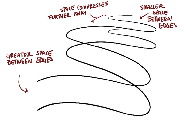
To start with, your arrows flow quite nicely through space, though I am noticing one thing that is holding you back from fully exploring the depth of the scene. That is, while you do play with the scale of your arrows as they move farther away, the actual distance between the zigzagging lengths of the arrows remains the same. Based on the rules of perspective, it is all of space itself that compresses as we look farther away, so there should be less and less room between these zigzagging lengths as we go farther back.
For your organic forms with contour lines, you're doing well for the most part. The degrees of your ellipses and curves seem to shift appropriately, your ellipses are evenly shaped, and your curves do a fairly good job of wrapping around the form (although they're a little rushed sometimes).
The main issue here is the organic forms themselves - in the lesson I specifically state that they should be kept simple, as though they're two equally sized spheres connected by a tube of consistent width. Here you've got a lot of forms that vary all over in width, and often have ends of dramatically different scale. We want to keep the forms themselves as simple as possible because later on in the lessons, as we get into construction the concept of starting with simple forms and reaching greater complexity by combining more simple forms (rather than increasing the complexity of each base component) is going to come into play in a big way.
For the most part, your texture analyses are pretty good. There's certainly room for improvement, and a couple little bits I want you to keep in mind, but you're moving in the right direction. The first thing I want to stress is the importance of leaving lines behind. In the first texture, you employ shadow shapes very well, but you do so over top of the outlines you've drawn for each and every surface form. This means that you've been very explicit about everything that is present, leaving no room for the implication of other textural elements. You're effectively telling the viewer that every little bump, scratch, etc. that is present in this texture that has been drawn, and none exist that have not.
On the other hand, the big advantage of working with shadow is that we don't actually draw any of those forms themselves - we don't draw bumps, we draw the shadows those bumps cast. This means that the way the texture is drawn can change based on how much light we decide to apply to it (drowning it in shadow, overexposing it with direct light, etc) without changing what we are communicating to the viewer.
The other point I wanted to raise is that in your third texture analysis, you get rather scribbly and erratic with your linework there. Always fight against the urge to just draw random strokes - always ensure the marks you put down match specific features you see in the reference image, and when doing so, think about the forms that actually cast those shadows, and use your understanding of those forms to determine how you draw the shadows they cast.
Now, all in all I think you do a much better job of all of the things I've mentioned here in your dissections, which shows a continued growth and understanding. You don't scribble there, and you're less dependent on explicit lines. Definitely a move in the right direction.
Jumping onto the form intersections, these are generally pretty well done, with forms that feel consistent within the same space, and intersections that define a clear understanding of how all the forms relate to one another. The sets are quite cohesive - my only recommendation is to ease up on the use of hatching, and rely instead on line weight more to clarify the overlaps of different forms.
Lastly, your organic intersections are very well done. They nail the idea that these forms slump and sag against one another, finding a state of equilibrium without infringing on each others' volumes. These feel believably three dimensional, rather than like shapes pasted on top of each other on a page. Very well done.
I'll go ahead and mark this lesson as complete. Feel free to move onto lesson 3.
Uncomfortable in the post "250 Box Challenge (Patreon Critique Thread)"
2019-06-23 01:02
Really nice work! You've shown a great deal of growth and improvement over the course of these 250 boxes, along with intense patience and care in the application of the line extensions, and your overall analysis thereof.
You're showing me that you're clearly understanding what those line extensions were telling you, and you've steadily applied what you've learned throughout. There's still a few minor hiccups towards the end, and I have a tip on how to continue to reduce them, but you're absolutely barrelling down in the right direction at considerable speed. Really fantastic work.
So you're clearly already aware of the fact that when you draw a given line, you need to think about how it relates to all the others that it's gonna run parallel to, including those that haven't been drawn, rather than looking at the lines with which it shares a corner or a plane. You're showing that very clearly here.
The next step is to think about how those lines leave the vanishing points, and the angles that sit between them as they do. You'll often find that two of the middle lines of a given set will actually have a pretty small angle between them, resulting in them being quite close to each other on the box itself, and depending on just how far the box is from the vanishing point, you'll also find that at the box itself, they're running pretty close to parallel to one another. Keeping an eye out for these kinds of relationships will help you not only take advantage of a relatively easy pair of lines to draw, but also to avoid situations where they converge too early, or just fly off on their own (like that one errant green line in box 250). These notes elaborate on this concept a little bit.
Anyway, aside from that, keep up the great work! I'll go ahead and mark this challenge as complete, so feel free to move onto the next lesson.
Uncomfortable in the post "250 Box Challenge (Patreon Critique Thread)"
2019-06-21 20:48
You had a bit of a rough start on these 30, but by the end you were showing considerable more focus on those convergences. There's still a lot of room to grow, but you're on the right track now, so I'll go ahead and mark this challenge as complete. Just be sure to work some freely rotated boxes into your regular warmups so you can keep developing your skills in this area.
Uncomfortable in the post "Lesson 3: Applying Construction to Plants (Patreon Critique Thread)"
2019-06-21 20:46
All in all you're doing a great job here. You've got a lot of solid construction, you're applying line weight quite well, you're leveraging cast shadows to great effect and you're demonstrating a pretty good grasp of both form and 3D space. There are a couple little things that I'm going to address, but as it stands you're demonstrating a good grasp of the material covered in the lesson.
The first thing I wanted to call out was that in your arrows, keep an eye on the distance between the zigzagging lengths of your arrows. Right now you have a tendency to keep them spaced out evenly, even though perspective dictates that as we look farther away, the same distances would appear to compress and shrink. Compressing them in this manner will help you to capture the illusion that they're flowing through the depth of the scene more, and coming out at the viewer.
Your leaf exercises are solid. They flow very nicely, and you're applying the principles of construction very well here, establishing how the leaves move through space in the earlier phase, before adding the deviation/fraying/waviness/etc on the edges. You're tackling things one at a time, rather than trying to solve many problems at once, which is at the core of construction's strengths.
Your branches are also very well done. You're blending those segments of each edge quite fluidly into one another, creating longer, more complex lengths without losing the sense of seamlessness. You've also done a good job of keeping the widths of your branch forms consistent, which helps to maintain the illusion of solidity and flow.
Your plant constructions are generally very well but there are a few places where you skirt the rules of construction a little bit. When drawing for yourself later on, you'll be welcome to do this as you please - but as you work through these lessons, I really must insist that you follow the specific steps of construction as closely as possible.
One such case is with the left side of this page, where you've drawn each leaf initially as an elliptical shape, before drawing each leaf's actual shape on top of it, in a manner that treats the initial ellipse as more of a suggestion, rather than an actual support scaffolding. Each phase of construction serves to answer very specific questions about our drawings, splitting complex problems into smaller ones.
If establish an answer to a problem (like how a leaf flows through space), then if later draw the leaf in a way that ignores and seeks to re-answer that question, I'm now going to be asserting to the viewer two entirely different things. This results in contradictions, which undermine the illusion of solidity and form in a drawing, especially as many of these accumulate. Back in lesson 2 I talk about how every drawing is a lie - we're creating an illusion, telling a tall tale, that what this is not a drawing, but rather you're actually looking at that object in true 3D space. The more you undermine yourself in that, the less effective the illusion becomes.
This is why, when constructing our leaves, we always make sure that the edge variation/detail always comes off the simpler construction and returns to it. We're not redrawing those edges, we're building off those 3D surfaces, or cutting into them as they exist in 3D space - not as they exist as flat shapes on a page.
I noticed that on one of the big leaves towards the base of this plant, you zigzagged your edges with a continuous stroke, rather than pushing each ripple off the original edge. Remember that in lesson 1 we talk about maintaining a consistent trajectory for each stroke, rather than zigzagging, and in the notes for the leaf exercise, I talk about not zigzagging your edge detail.
I also saw that for the leaves on this drawing, you jumped ahead to a more complex phase of construction as your starting point. You tried to establish how the leaves flowed through 3D space while also tackling the more complex shapes and the edge variation. Because you tried to tackle so much at once, the result ended up feeling quite flat and felt more like they were just shapes on the page. It's definitely a good example for explaining why construction, and breaking things up into stages, is so important.
The last thing I wanted to mention was that when constructing anything cylindrical - like the flower pots - that requires ellipses to be drawn according to a certain alignment, constructing them around a set minor axis line (like the organic forms with contour ellipses in lesson 2) will help a great deal.
Aside from these points, you've done a great job. I'll go ahead and mark this lesson as complete, so feel free to move onto lesson 4.
Uncomfortable in the post "Lesson 3: Applying Construction to Plants (Patreon Critique Thread)"
2019-06-21 19:16
Intimidating or not, overall you've done a great job! There are a few little things that I'm going to point out, but by and large you're employing construction fairly well, and have yielded some pretty positive results. I can definitely see that overall you've been able to apply what you've learned in the lesson in a way that suggests that you'd be able to use these techniques quite effectively outside of these lessons, as you've tackled a number of different challenges quite successfully.
The actual issues I noticed are generally pretty minor, although still very much worth mentioning. To start, with your hibiscus, I really want to stress the importance of treating each phase of a drawing as though you are answering a question. You can think of drawing an object like someone asking you a bunch of questions about it, and as you answer it, it gradually is revealed. For example, when you drew the large ellipse/circle early on, the question was "how far out does this flower's petals extend in space?" and your circle answered this by defining the outer bounds of where those petals would extend.
The important point here is that we need to adhere to these answers that we give all throughout the drawing, otherwise we risk contradicting ourselves and undermining the illusion we're creating. So once you give that answer of the outer bounds of those petals, we must adhere to it. Here you've drawn petals that treat that circle as more of a loose suggestion, and so most have extended well beyond it. As a result, we've got a big circle there and it doesn't really play a meaningful role as part of the resulting drawing, because there are other aspects of the drawing that simply ignore it.
Ultimately it doesn't matter if your circle doesn't match the reference image - once that scaffolding has been put in, you need to abide by it in order to maintain the illusion of form and solidity as much as possible as you move forwards, lest you risk undermining the lie you're telling the viewer with mixed messages.
A similar issue comes up in a few places, one of them being this cactus. The cactus is made up of four major masses - three arranged together in a line, and one branching off. The middle one in the set of three, specifically its lower-right, is where I want you to focus.
Notice how you initially put down a large ellipse to define where it sat, but you went back over it to help refine that form's silhouette? We see something a little similar on the form at the top, towards its bottom left, where . you've got that initial ellipse, but you've cut across it.
The reason this is a problem is because the way in which you've cut across these underlying forms does not take into account how those forms exist in 3D space. You're treating them as though they are flat shapes on the page, and in doing so, you're ignoring the fact that they are three dimensional, that they are masses that exist in a 3D world. As soon as you cut across them like this, you're asserting to the viewer that the shapes they're looking at are simple and flat, just marks on a page.
Generally speaking, construction relies on putting down simple, basic forms (as you did), and then either building on top of them with more 3D forms, or cutting away from them. The key here is that as we do so, we need to constantly assert how these forms and the pieces being added to or cut away from them exist in 3D space, and how they relate to one another. Good examples of this are the organic intersections and form intersections from lesson 2. In the organic intersections, we wrap the forms around those they rest upon, helping describe how that surface flows through space in the manner that the additional form interacts with it. In the form intersections, we describe specifically how two forms interact with one another by drawing contour lines along the surface, defining exactly where the two forms meet in space.
If ever you need to cut a form away from another, you need to be very explicit in terms of how the piece being cut away and how the piece left over exist in space, and how they relate to one another, in the same manner. Now, subtractive construction is usually not necessary - we can achieve most constructions through additive construction instead. Of course, regardless of which approach we use, we always need to be aware of how our forms exist in 3D space, and how our marks manipulate them as 3D forms, rather than as flat shapes on a page.
The last point I wanted to mention was that as it stands, your texture/detail is generally pretty vague and somewhat scratchy. Now there is no need to add detail at all, of course - and you've got plenty of solid constructions where there's no texture and that's totally fine (although applying a light touch with some line weight can help to clarify some of your overlaps). When you do delve into texture however, when you do make that attempt, it's very important that you do the following:
-
Study your reference not just closely, but constantly. Your memory is not sufficient - you need to continuously look back at your reference to refresh that memory, focus in on one specific element at a time and transfer it to your drawing. Don't allow yourself to find patterns and draw them on autopilot, instead transfer specific things bit by bit.
-
Every mark you put down should be a shadow. The things we see on these textures, every little element, is generally going to be some kind of a shadow cast by some small form that exists along the surface of your object. So instead of focusing on the marks themselves, you need to think about what is producing them - we're effectively drawing around various kinds of forms, bumps, outcroppings, etc. and implying their presence without actually drawing them directly.
Now, I did notice that you did not include the page of branches exercise. I'm working under the assumption that you just forgot to include it. From your actual constructions however, I can see ample use of those techniques, so I'm going to let that slide.
I'll go ahead and mark this lesson as complete. Feel free to move onto lesson 4.
Uncomfortable in the post "250 Box Challenge (Patreon Critique Thread)"
2019-06-21 01:00
These are definitely a big step in the right direction! There's still plenty of room for improvement, so be sure to integrate them into your regular warmup routine - a couple freely rotated boxes here and there will do you good. Anyway, keep up the good work. I'll mark this challenge as complete, so feel free to move onto lesson 2.
Uncomfortable in the post "Lesson 4: Applying Construction to Insects and Arachnids (Patreon Critique Thread)"
2019-06-21 00:58
There's some key weaknesses here, but overall you're actually demonstrating a pretty good understanding of construction as a whole. Your drawings end up feeling fairly three dimensional, and convey a good grasp of how these insects exist in 3D space, rather than just as flat drawings on a page.
I'm also noticing a good use of layering forms for the segmented abdomens of many of these insects - you're pushing past the silhouette of the initial abdomen form to create the impression that these are layers of carapace/exoskeleton that build on top one another. This really helps to push that illusion that it's all 3D.
The main issue that I'm seeing is that your linework isn't always entirely steady, especially when you have to draw skinny forms like the sausages we use to construct our legs. You can draw larger forms/ellipses to be fairly evenly shaped, but when you have to maintain the spacing between the edges of a sausage, especially at a smaller scale, you do struggle to keep it consistent. As a result, most of your legs end up being made up of forms that feel quite flat.
You also have a habit of reinforcing your lines, as though your sketching roughly, going back over them if you make a mistake, or if you feel that it's not clear enough. This works against the fundamental principles of drawabox, where we get used to drawing every single mark with the ghosting method, and think about each stroke before putting it down. If something goes wrong, then it's always best to leave it be, rather than piling more ink onto it, as this will draw more attention to the mistake.
I know that some of these drawings were were you were testing the water beforehand, kind of sketching your way through solving the problem before tackling the real drawing, but as you work through Drawabox, I want you to try and apply this kind of mindfulness, the ghosting technique, planning/preparing and finally executing each stroke for all the work you do. You can do many drawings of the same thing if you like, but I still want you to focus on drawing each mark in this manner.
It all comes down to these drawings themselves being exercises - so treating them as being practice drawings followed by a "final" isn't really the kind of approach we want to take.
Getting back to the sausage forms, they're the main area in these constructions that you need to work on. As shown here, you need to focus on the forms being the same as two equally sized spheres connected by a tube of consistent width. You also need them to intersect a good amount, and most importantly, you should be reinforcing their intersection with a clear contour curve. The sausage forms themselves should be simple enough to give the impression that they could be three dimensional, but it's this contour curve that establishes how the different sausages relate to one another in 3D space - by adding them correctly, we make it very clear that the forms are three dimensional. Currently you're skipping this step, and your forms tend to be more complex (with ends with different sizes, and widths that are not entirely consistent), and as a result they end up reading as being quite flat.
Aside from that, you're doing a pretty good job. There's certainly a good bit to work on here, but you'll have ample opportunities to do so in the next lesson (as the sausage method is still very important when constructing the legs of other animals). So, I'll go ahead and mark this lesson as complete. Feel free to move onto lesson 5, but be sure to keep working on what I've mentioned here.
Uncomfortable in the post "Lesson 5: Drawing Animals (Patreon Critique Thread)"
2019-06-21 00:32
About the tiger demo in the intro video - you're absolutely right. I definitely need to get to rerecording some of the video content, as over time the specific goals and focuses I have with the lessons evolve and adapt based on the mistakes and challenges I see my students facing. That's one of those things I've developed much more since the intro video was recorded back in 2016, so it's definitely due for a refresh.
Anyway! I noticed one major issue in how you approached your animals in this round, which was not present in the previous one - so it looks like you might be slipping up somewhat. In each of these, the ribcage mass floats a lot more arbitrarily within the torso, with a lot of space underneath it between the edge of the torso and the bottom of the ribcage mass. As you can see here, the ribcage and pelvis establish the ends of that sausage, and the sausage should be tight around them.
Additionally, you're not drawing through those ellipses, and as a result they tend to come out a bit uneven and stiff, making the ribcage and pelvis masses feel less solid and three dimensional.
Generally speaking, I am finding that there is a general stiffness to much of your linework here - it seems a lot more hesitant, resulting in a subtle sort of uneveness that isn't always easy to detect, but that makes things feel much more rigid, and in turn makes your forms feel much flatter. On top of that, you have a tendency to overuse your contour curves to compensate for this, but frequently end up with contour curves that are much too shallow, and serve to further flatten things out. Don't forget about overshooting your contour curves, which helps to push you to wrap them around more believably, since it forces you to think about how they wrap around along the other side.
Now, this varies from drawing to drawing. For example, the tapir does feel a little more three dimensional, and the back leg (the raised one) is reasonably well drawn. It's still a little stiff, but it's really the only place where you've actually used flexible, gestural sausages in your leg construction. Elsewhere - like the moose - the sausages are very stiff and straight. The elephant's legs on the other hand do feel a little more gestural, but they're large cylinders rather than connected sausages.
The last point I want to raise is that you're still adding additional masses as flat shapes, and then dropping contour lines on top of them. You're starting from flat/2D and trying to make it 3D - that's generally now how this works. Our drawings can easily go from being 3D to flattening out, but working the other way is generally much more difficult, and much less successful. When adding a form on top of another, you really need to think about how its silhouette is going to wrap around the form beneath it, how it exists as an independent mass, just like the organic intersections.
So, here's what I want to see:
-
Two more pages of organic intersections.
-
Two pages of sausage chains - that is, demonstrating the sausage techniques as we use it for legs, but just focus on creating chains like the one shown here. Focus on establishing a rhythm of flowing back and forth - you'll see the flowing arrows alongside the sausage chain mimicing the rhythm of the chain.
-
4 pages of animal drawings. Don't rely so much on contour lines, as you're using them as a crutch. You need to focus on how every single form you add exists in 3D space, and how it relates to the rest of the construction. You're still pasting shapes on top of one another, and then trying to make those shapes feel 3D after the fact. It's a lot easier said than done, but you need to believe in the illusion you're creating if you're going to convince others of it.
You're getting there, slowly, but you still have a lot of ground to cover. Keep at it - you're going through some rough territory, but you'll come out the other side before long.
Uncomfortable in the post "250 Box Challenge (Patreon Critique Thread)"
2019-06-20 21:21
Well, the ghosting method itself has some built-in tricks for this. Since we put points down to represent the start and end of our lines, you can place points in the direction of your line's trajectory without actually drawing the full line. Once you've got the points down for two lines that are ostensibly going to intersect at a corner, you can determine the true length of that stroke and then commit to your actual lines.
Uncomfortable in the post "250 Box Challenge (Patreon Critique Thread)"
2019-06-20 21:05
To be completely honest with you, that listing of all the lines, subsets, vanishing points, etc. actually gives me a fair bit of confidence that you understand the concepts covered in the lessons. It's that awareness of how they break down into sets, and that they share vanishing points that definitely says a lot in terms of what you've learned from the challenge.
It's also demonstrated directly in your work, as you've put in a great deal of time and care into each and every box: in drawing it, in extending the lines, and in analyzing the results and pinpointing where things went wrong and how you can do better. As such, you've shown a good deal of growth, both with your grasp of 3D space, as well as with the general confidence of your linework.
I am however noticing certain tendencies that speak to how you actually approach drawing each boxes, where I believe a little advice will help. Most importantly, you definitely show an understanding of the goals for how those lines ought to behave (specifically when extending the lines and analyzing the results), but while you actually draw them, you may not be focusing on the right thing.
The key is that while some students will while drawing a given line as part of a box, focus on a corner and the lines with which it shares that corner, or the lines with which it defines a specific plane, these are distractions. Instead, it all comes down to the sets that run parallel to one another, and that converge towards the same vanishing point.
As such, we must focus, as we draw a given line, specifically on those other three lines with whom this one runs parallel (including those that have not yet been drawn), and no others. We want to think about how they are all to be oriented in order to converge towards the same point. The Y method helps drive this forward, as each arm of the initial Y will point directly at one of the vanishing points, and as you add another line to each set, the specific location of each VP becomes solidified.
As we think about those trajectories, we can also consider how those lines leave the vanishing point, and the angles that sit between them. It's often that for the two middle lines of a given set, the angle between them will be quite small - combine that with the distance from the vanishing point to the box itself, and we can find ourselves in situations where these two lines can effectively be drawn as being parallel to each other. This is a useful relationship to keep in mind, as it can help us avoid having those lines converge too early. I explain this further in these notes. Keeping these two points in mind will help you as you move forwards, especially in cases where you have one line in a given set that tends to go off on its own.
Anyway, I'll go ahead and mark this challenge as complete. Keep up the great work, and feel free to move onto lesson 2.
Uncomfortable in the post "Lesson 2: Contour Lines, Texture and Construction (Patreon Critique Thread)"
2019-06-19 20:10
All in all you're doing a pretty great job! There are a few minor points I want to address in terms of how certain exercises are being approached, but you're definitely nailing all of the core elements of the lesson, and are demonstrating a good grasp of 3D space.
Starting with the arrows, they're flowing very nicely. One small suggestion is to get the space between the zigzagging lengths of arrow to actually compress as we look farther away from us. You don't actually have a lot of arrows that zigzag all that much, but I noticed that when they do, there isn't really any noticeable shrinking in the amount of space as we look farther back - it remains fairly consistent, which erodes some of the sense of depth. I explain this further in these notes.
Your organic forms with contour lines are looking pretty good - you've got pretty good degree shifts (although the bottom right of this page seems to be a little off - remember that the wider the degree of that cross-section, the more it is oriented towards the viewer, so that arrangement doesn't seem entirely believable).
I did notice however that your organic forms pretty consistently had one big end and one smaller end. As mentioned in the instructions, you should be treating these forms as though they are two equally sized spheres connected by a tube of consistent width. This is important, as it keeps the form as simple as possible, which will come into play in the future when we use them as the building blocks for more complex constructions. Constructional drawing is all about building up complexity through the addition of more forms in successive passes, rather than increasing the complexity of the base building block.
The other point I wanted to raise was that in the contour curves section, you may still benefit from placing a little contour ellipse on the end that faces the viewer, right at the tip, like the "pole" on a globe. It'll help sell the illusion quite a bit.
Really phenomenal work in your texture analyses and dissections. You're demonstrating excellent observational skills, as well as a good sense of the difference between relying on line (which is important in construction but quite limiting when working on texture and detail), and on cast shadows (which are extremely useful to imply the presence of many small textural forms). As a result, your textures are well balanced, and don't shy away from allowing many shadows to merge together to create large swathes of solid black, or from allowing the blank areas to merge together similarly to create an "overexposed" look where the only shadows remaining are those in the deepest cracks where the light cannot yet penetrate.
Your form intersections are definitely coming along well. I'm very pleased with your ability to construct solid, believable forms all within the same space in a manner that feels cohesive. This is the main focus of this exercise - the intersections themselves are coming along quite well too, and are demonstrating a well developing grasp of how these forms relate to one another in space.
Lastly, your organic intersections are spot on. You've got a very strong sense of how these forms relate to one another in a believable manner, as they slump and sag against one another in search of a state of equilibrium without interpenetrating. You're also leveraging line weight and cast shadows very nicely here to separate the forms out and clarify their overlaps.
Keep up the great work. I'll go ahead and mark this lesson as complete, so feel free to move onto lesson 3.
Uncomfortable in the post "Lesson 3: Applying Construction to Plants (Patreon Critique Thread)"
2019-06-19 19:50
Starting with your leaves, these are generally pretty well done. For the most part you're following the steps closely, and as you add the various bits of edge variance/waviness/etc you adhere to the previous, simpler phase of construction. It is worth mentioning however that these definitely feel a little loose/rushed, with some lines overshooting, some small gaps, and so on. Drawing with confidence is great, but always be sure to apply all three stages of the ghosting method to each and every mark you put down, so as to give it the best opportunity to fall exactly where you intend it to.
With your branches, you're definitely shooting yourself in the foot a little bit by purposely aiming straight for the most complex configurations you can. Increasing the complexity of an exercise doesn't necessarily serve to make it more effective, and often times it can result in you getting distracted from the core of the exercise. As such, when doing this exercise in the future, try not to have them winding all over - simple flowing branches are perfectly fine for our purposes, and will likely be more effective. Focus on keeping the width of the branch consistent through its length. It is worth mentioning however that you are doing a pretty good job of having the individual segments flow seamlessly into one another, which is good to see.
By and large your actual plant constructions are quite well done. You're mindful and aware of how your forms sit in space and how they relate to one another, and you're doing a good job of working from simple components and building up complexity gradually rather than skipping steps. There are just a few things that caught my eye that I'd like to mention:
-
I mentioned this before, but it's worth mentioning again - you are generally a little loose. That goes hand in hand with confidence, which is good, but you can definitely improve your overall linework by really pushing the use of the ghosting method. I'm seeing this primarily in your ellipses - it's great to see that you're continuing to draw through them as you should be, but you need to continue working on tightening them up.
-
I noticed several occasions, especially on this page where you only drew each leaf up until it was overlapped by another. Remember that we want to be drawing each and every form in its entirety - our focus here is not to create a pretty, clean end result, but rather to fully understand how each form exists in relation to its neighbours, and how they all sit in space. I did notice several other drawings where you did draw through your forms properly, allowing the leaves to overlap and so on, but you definitely need to push yourself to be more consistent in doing so.
-
Your texture work varies quite a bit - you've got some excellent use of cast shadows on this page, so I think it's fair to say that your understanding of how to handle these kinds of texture improves a fair bit over the set. Earlier on, especially on the mushrooms, you were more inclined to outline each little textural form, continuing to think more in terms of line rather than in terms of the shadows the forms themselves cast.
-
Proper use of line weight and proper line economy are definitely both lacking here. A lot of your drawings end up feeling quite scratchy (you have a tendency to automatically reinforce your marks, and to think on the page, both of which are bad habits), and there are many cases where you don't help clarify your forms' overlaps with a little additional weight. In cases where you do, you sometimes will go a little too heavy with that weight instead. Remember that line weight is important to build up a sense of hierarchy in your drawing, but the key is to make it subtle. Line weight is all about talking to the subconscious through a visual whisper. And as for the line economy, we want to make sure that every single mark we put down serves a purpose - so we think before drawing, considering what we want this line to achieve, and how this line needs to fall onto the page in order to best do that job. Drawing through forms, drawing through ellipses, etc. it all serves a purpose - drawing several strokes for a single straight line however does not.
Aside from that, you are doing a very good job. I'll go ahead and mark this lesson as complete, so keep up the great work and feel free to move onto lesson 4.
Uncomfortable in the post "Lesson 3: Applying Construction to Plants (Patreon Critique Thread)"
2019-06-19 19:21
Overall you've done a pretty great job! In many ways you are demonstrating considerable grasp of the concepts involved in construction, although there are a few minor points I'll touch upon that'll keep you on the right track as you continue to move forwards.
Starting off, your leaves are generally flowing quite nicely. This is for the most part limited to the flat slice of space defined by the page itself, though you do have a few that push further into the depth of the scene. That's still something you'll want to play with more as you practice these, focusing on the idea that the page itself is just a window into a larger three dimensional world.
Additionally, I noticed a few cases where you'd construct your simpler enclosing shape for a given leaf (step 2, after establishing the flow line), and then when you moved onto the third step of adding further edge detail/variance, you often treated the simpler edge as more of a suggestion rather than a framework to build on atop. I can see areas where you build up those more complex edges with a single continuous stroke, zigzagging over the simpler lines from the previous phase. As explained here, it's important that you focus on the idea that you are building onto or cutting away from the surface you've already constructed within the world. We need to make sure that our more complex edges keep returning to this edge as we add variation, fraying, waviness, etc, treating it as a scaffolding rather than a suggestion.
Additionally, on the maple leaf, you definitely jumped into a lot of complexity that was not supported by the scaffolding put down by the previous phase of construction - in other words, you skipped steps. Construction is all about building up complexity gradually, laying down the foundation and working our way up from simple elements. Here is an example of how more complex leaf structures should be handled.
The last point I wanted to mention in regards to these leaves is that on occasion, you add lines along the surface of your leaves. Sometimes these function as full contour lines that stretch all the way across the surface to help define how the surfaces warp and turn through space.
In other situations, you try and match the veins of your leaves - in this case, we're getting more into the realm of detail, and therefore need to focus on capturing the shadows those veins cast, rather than trying to represent them with distinct lines (as lines don't really exist, and are simply a tool to help us establish the borders between forms in space).
The last example is definitely in the realm of detail, but where you basically just put down a few partial marks that don't give any impression of actually directly representing any feature on whatever reference you may be using. Detail should always be informed from reference, and when we pull that detail from reference we need to be sure to transfer specific elements that we see. We don't want to fall into the trap of seeing "lines" and then drawing some lines blindly on the page. Whenever you transfer a detail into your drawing, try not to think of that detail or element in terms of something you can label or name. So if you're drawing a snake, I don't want you to think in terms of "okay it's got some scales here, so I'll go draw scales". Instead, focus on the nature of the specific individual scale - how it sits in space, what kinds of shadows it's casting. By focusing on them as individuals, on their qualities that cannot simply be summed up in a word or two, we can avoid half-assed symbolic details and focus on what is actually present in the reference image.
Moving forwards, your branches exercise is coming along quite well. I can still see some of the ends of those segments sticking out a little bit, but this is fairly normal. Keep working on getting them to flow smoothly from one to the next, and when you draw the follow-up segment, make sure to use the last piece of the previous one as a "runway" for your stroke. This will ensure that you're blending them together seamlessly.
As for your actual plant constructions, these are really solidly done. I can see areas where some of the issues I picked out above are visible, but you're still employing construction quite well to achieve solid, believable examples of the objects you're drawing from. I'm very pleased to see that you're drawing through all of your forms, including the leaves (rather than allowing them to stop where they get overlapped by another one). You're clearly demonstrating a good grasp of how all of them flow through space, and how they can be combined together.
The last thing I want to mention is just a quick point - when you actually really get into adding detail, try not to get distracted from our core goal here. It isn't to simply detail something as much as possible - instead, it is always to communicate whatever it is that we're drawing to the viewer. Detail and texture is just another tool to that end (to convey the surface quality of an object, where things are bumpy, rough, pointy, wet, sticky, etc.) and once that has been achieved, you can quickly get into the territory of overdoing it. Make sure that your detail is doing a particular job, and always try to err on the side of less rather than more. This will also help keep you safe from situations where your details might contradict the construction and spatial information you're communicating - after all, every single mark we put down in a drawing is a statement that we're asserting to the viewer, and any of these statements can start to undermine each other if they're not consistently reporting the same thing. Once our statements start contradicting each other, the lie that we're telling the viewer starts to fray at the edges, and eventually falls apart.
It's very easy when drawing texture to get caught up in it and forget about the drawing as a whole, and end up losing some of the convincing construction we had previously. I'm not saying this with any particular drawing of yours in mind, it's just something I feel is worth mentioning.
Anyway! Keep up the good work. I'll go ahead and mark this lesson as complete, so feel free to move onto lesson 4.
Uncomfortable in the post "Lesson 3: Applying Construction to Plants (Patreon Critique Thread)"
2019-06-19 02:10
Ahahaha, sorry no, that was my mistake. I've had a very long day. I meant you can move onto lesson 4 :P
Uncomfortable in the post "Lesson 3: Applying Construction to Plants (Patreon Critique Thread)"
2019-06-19 01:23
This is definitely moving in the right direction! As you push through the many mushroom drawings, I can definitely see an overall increase in your level of comfort with construction itself, and getting the individual forms to feel more solid, and ultimately to relate/align in a believable manner. Your work on the textures is also improving, with the nodes on this one's cap starting to focus more on the actual shadows being cast, rather than outlining each one in its entirety. Still room for improvement there, but it's very much in the right direction.
Worth mentioning, with the lines running along the stalks, always remember that these are essentially grooves that we can see because of the shadows that fill them, where light cannot quite penetrate - it all comes back to shadows again, so in those areas you do still need to push yourself to think more in terms of shadows rather than perceiving textural elements as simple lines. Also, make sure that each of these grooves is a specific element you see in your reference image - don't think in terms of "I saw some lines so I'm going to draw some lines". Focus on each groove and draw it as a unique individual, trying to match what you see in the reference.
For your branches, you're definitely making headway, and there's something I noticed. On this page, the one flowing from the top left down towards the bottom right, came out VERY well, with extremely clean and precise overlaps. Now this could have been a mixture of you getting better and simple luck, but what occurs to me is that the angle/trajectory of this one may play a role in why it came out well.
Remember that you are still supposed to be applying the ghosting method to each and every one of the marks you put down - and that means taking the time to rotate the page so as to find a comfortable angle of approach. If however you're keeping the page at the same orientation in front of you and trying to draw many lines at different angles, you are going to be making things far more difficult than it needs to be right now.
Another point to mention in regards to the branches - don't forget that the ellipses need to align to that central minor axis line, such that each ellipse is cut into two equal, symmetrical halves down its narrowest dimension. I'm noticing a lot of cases where you're not doing this, so keep an eye on that.
Lastly, the leaves in your potato plant are coming out quite nicely.
I'm going to go ahead and mark this lesson as complete. There's certainly plenty of room to grow, but you're headed in the right direction, and the break you took seems to have helped. Feel free to move onto lesson 5.
Uncomfortable in the post "250 Box Challenge (Patreon Critique Thread)"
2019-06-18 21:00
Your boxes have shown growth in a number of areas, but there are also a few critical problems that have hindered you along the way. This is both good and bad - it's bad because it means you struggled a lot more than you needed to along the way, but it's good because the problem itself is one that is very easily fixed, and with that roadblock cleared, you should be able to see considerably greater improvement moving forwards.
The problem is simple: when applying the line extension technique to your boxes, you, more often than not, extended them in the wrong direction. As explained here, we want to extend the lines back into space, away from the viewer. You have many situations here where you've extended at least one set of your lines away towards the viewer. At best this would be confusing for you as you try and figure out what this is telling you about the convergences of your lines, and at worst, it would hamper your progress considerably.
In these notes, I explain the situation with examples of lines being extended correctly and incorrectly. Within your own work however, if we look at box 250, we can clearly see all three sets of lines being extended towards the viewer (based on the face with the hatching lines being front-facing). If the hatching was on one of the back faces, then those lines would be extended correctly. Alternatively, we can look at 248 where the hatching sitting on a front plane tells us that the purple and red lines are extended correctly into the distance, but the blue lines are extended towards the viewer.
As you worked through the set, you seem to have attempted to handle what the erroneous line extensions were telling you by striving to make the boxes more and more isometric - that is, focusing on getting those lines to run parallel to one another on the page, eliminating their actual convergences. In doing this, you also moved away from a healthy split of shallow/dramatic foreshortening of your boxes, as detailed here.
Now, I am going to ask you to do another 30 boxes, taking greater care in extending the lines in the correct direction and focusing on both shallower and more dramatic foreshortening. As you do so, I want you to apply the following advice:
When you draw a given line, it's easy to get confused in terms of which lines you need to pay attention to when finding the correct behaviour of the one you're adding. Some students will initially focus on the corners that share a corner with the one they're drawing, while others will attempt to focus on the lines that define a plane with the one they're drawing. Both of these are distractions.
Instead, focus entirely on the lines that run parallel in 3D space to the one they're drawing - and therefore the ones that converge towards the same vanishing point (including the ones that haven't yet been drawn). This is actually something you do appear to have a good sense of, though I'm curious to see if it will hold when dealing with actual convergences. As you focus on how those lines need to be oriented in order to converge together at the same point, you can also think about the angles that end up sitting between them when they leave the vanishing point. As explained here, you may find that certain pairs of lines have very small angles between them - often you'll notice this in the two middle lines of a given set. In combination with the vanishing point being a fair distance away from the box itself, you'll find situations where those two lines will be running virtually parallel to one another - a very useful relationship to take note of.
So, as I mentioned - I'd like to see another 30 boxes. I'm confident that with this sorted out, they should show considerable improvement. For the future, be sure to read the notes and instructions more carefully in order to avoid these kinds of issues.
Uncomfortable in the post "250 Box Challenge (Patreon Critique Thread)"
2019-06-18 20:42
Great work! I think this is my fourth box challenge critique today, and yours definitely shows the greatest awareness of the intended behaviours of the various sets of parallel lines. You're definitely doing a good job of showing that you understand what you need to be aiming for as you draw your lines - that is, having those lines converge towards that shared vanishing point, and this is also something you improve upon a great deal throughout the set.
Your use of line weight is also coming along great - it goes a long way to make the individual boxes feel solid and cohesive, as though they are solid forms rather than a collection of independent lines.
The one piece of advice I want to offer has to do with how you think about the lines as you draw them. It's clear that when you're drawing a line, you're not getting distracted by thinking of the lines that share a corner with the one you're drawing, or the ones with which it defines a plane. You're definitely focusing on the set of parallel lines as a whole, so they converge.
The next step is to consider the actual angles between those lines as they leave the vanishing point. You'll often find that the two middle lines of a given set have a fairly small angle between them. Combined with the distance of the vanishing point from the box itself, we can often end up with situations where those two middle lines end up running virtually parallel to one another. Being mindful of that particular relationship is very useful, as explained in these notes. Towards the end of your set, I mainly notice issues where a single line (often one of the middle two, though not always) strays from the convergence that is fairly consistent for the other three. This kind of awareness of the angles between them at the vanishing point can definitely help to solve that one errant line.
Anyway, keep up the great work! I'll go ahead and mark this challenge as complete, so feel free to move onto lesson 2.
Uncomfortable in the post "250 Box Challenge (Patreon Critique Thread)"
2019-06-18 20:25
I'm definitely seeing a great deal of care and analysis in how you extend your sets of parallel lines, which is great to see. Doing so is a major element of this exercise, so I'm glad to see that you're taking the time to do so properly.
I do however notice that throughout the set, while you are showing some improvement, there are still a lot of cases where you seem to be doing that analysis after the fact, but not really factoring it into how you approach drawing each box.
Since we're extending those lines to study where our lines succeed in, and fail to, converge consistently towards a shared vanishing point, the logical point to glean from this is that as we draw a given line as part of a box, we should be focusing on how we can get this line to converge more consistently with the lines that run parallel to it.
This means that as you draw that line, you shouldn't be thinking about the lines it shares a corner with (as many beginners do), and you shouldn't be preoccupied with the lines with which it defines a plane (something I'm seeing frequently in your work, as it results in lines converging in pairs rather than all four together). Instead, you should be focusing entirely on the other three lines the one you're drawing runs parallel to - including the ones that have not yet been drawn.
You need to focus on how they're all going to converge together. This is what the Y method explained in the 'how to draw a box' video as well as in lesson 1's organic perspective exercise, focuses on. As we draw our initial Y, we establish one line from each set, pointing towards the vanishing point.
Furthermore, as we think about how the lines of a given set points towards the VP, we can also think about the angles between them as they leave it. Often we'll find that the two middle lines of a given set will have a fairly small angle between them. This is extremely useful to note, because when that angle is small enough, and the box itself is far enough away from the vanishing point, this can result in the lines running virtually parallel to one another on the page (as explained in these notes). It's an extremely valuable relationship to be aware of.
One other point I wanted to mention was that you should keep an eye on which direction you're extending your lines. Generally speaking you're doing fine, but I noticed a few - like 211 and 208 - where one of your sets gets extended in the wrong direction.
Now, before I mark this challenge as complete, I'd like you to do 25 more boxes, applying what I've described here, and showing me that you can think about those convergences and the relationships between these lines as you draw them.
Uncomfortable in the post "250 Box Challenge (Patreon Critique Thread)"
2019-06-18 20:08
Congratulations on completing the challenge. Working through all 250 boxes certainly is an accomplishment, and of that you should be proud. I'm also very pleased to see that you applied the extensions to each and every line.
Looking over your work however, I do get the impression that you may have been a little more focused on reaching the end, and a little less on what the extensions themselves were telling you about the kinds of mistakes you tend to make, and how to improve on them. Based on the rules of perspective, what we're working towards is getting our sets of parallel lines to converge consistently towards the vanishing point that each set shares. So, when we apply the line extensions, we're specifically looking for cases where our lines don't converge consistently.
I don't by any stretch expect students to be able to do this perfectly even upon completion, but I am noticing even in your boxes the occasional case where a set of parallel lines will actually diverge as they are extended.
The key is to think about what you want to achieve with those lines as you are drawing them. This means that as you draw a given line, you shouldn't be thinking about the lines with which it shares a corner, or the lines with whom it defines a plane. You need to be thinking entirely about the other lines that run parallel to it - including those that have not yet been drawn - and how they are all going to converge consistently towards that single, shared vanishing point. Furthermore, we can think about how these lines leave the vanishing point, and the angles that sit between them as they do. You'll often find cases where two lines - usually the middle pair of a set - have a very small angle between them. This can often result in those two lines running virtually parallel to one another once they reach the box, especially if the vanishing point is a fair distance away. I explain this further in these notes.
Based on what I see here, you have improved somewhat towards the end, but by and large you seem to be relying on more instinct and intuition rather than actually thinking about the problem and how to best approach it. So, before I mark this challenge as complete, I'd like you to do another 25 boxes. Take your time, apply the Y method detailed in lesson 1's organic perspective boxes and think properly through each stroke about how it needs to behave.
Uncomfortable in the post "Lesson 4: Applying Construction to Insects and Arachnids (Patreon Critique Thread)"
2019-06-18 19:55
You certainly did have a lot of whining (your word, not mine!) but to be completely honest, your work here is really phenomenal. You're demonstrating an extremely well developed sense for construction, fluid and confident linework, and a well developing approach to texture and detail. As such, it's probably important that I remind you - your own perception of the quality of your results is rarely in line with the truth (for better or for worse). In this case, you're likely nitpicking on fairly minor points.
Now, it is certainly true - your more recent pages are leagues ahead of your older stuff, but even the older points were quite strong. The major difference is that your prioritization of form and construction, and your use of line weight to reinforce those elements, has matured considerably.
Your older drawings did have forms that were fairly solid, but there was still a tendency to think more in terms of the flat shapes that were sitting on your page - from the looks of it, your brain would start navigating the two dimensions of the page, and then gradually try and push what you'd drawn into the third dimension. As a result, contour lines were a little shallower, and you had a tendency to draw larger shapes and then cut back into them - again, as 2D shapes, without going very far to establish how the piece being cut away existed in 3D space.
Your newer pages are vastly improved in these areas. There's a strong impression that you've moved past the notion that you're drawing a page, and every form you put down conveys the impression that it exists as a solid element within a three dimensional space. The pieces fit together as individual, separate components merged into a single complex object. For example, if we look at your praying mantis' head, the spheres of the eyes feel tangible, in how they connect into sockets in the rest of its head. It's all very believable and real.
On top of this, your approach to texture and detail has developed a great deal. Your wasp and butterfly were beautifully rendered, and really carefully detailed. There's definitely a lot of patience and care there, no doubt about it - but I did get the impression that it was a little noisy, and it had the tendency of creating focal points that you may not have intended.
On the other hand, if we look at your mosquito, you focused more on communicating the surface texture of your objects to the viewer, rather than really brow-beating them with it. At the end of the day, focusing on this idea of "communication" rather than detail for detail's sake is key. It allows us to avoid situations where textures become overbearing, and also allow us to focus on our primary goals. There is of course the risk that a texture will end up being drawn in such a way that it contradicts the underlying construction in small ways - for example, a texture can very easily make anotherwise rounded surface start feeling flat. Being more subtle with our details can help to avoid this.
There's just one thing I wanted to mention in regards to your organic forms with contour lines. Yours are entirely fine, they're conveying the illusion of solidity and volume extremely well. That said, in the instructions (back in lesson 2) I do mention that you should strive to keep the sausage forms themselves fairly simple. That is, you essentially want to match the form of two equally sized spheres connected by a tube of consistent width. Try to avoid having these forms pinch in their midsection, or shift from an end of one size to another. This is at the heart of construction - developing complexity through the combination of more forms, rather than making our base building blocks more complex themselves.
Anyway! Keep up the fantastic work. You really are doing a great job, so try not to get so caught up with the little issues you may perceive. Perfectionism is not a character trait that defines who you are - it is something everyone struggles with to different degrees, and it is something we work past. It is something you too will conquer, but you need to work at it, to push past the voice in the back of your mind and remember that the goal here is not pretty drawings, but rather to learn from each one as an exercise in spatial reasoning. And of course, you certainly have been. So, I'll go ahead and mark this lesson as complete. Feel free to move onto lesson 5.
As for the pen issue, you may be finding that a 0.4 is easier to use with a subtler touch, and that a 0.5 feels more heavy handed, making it feel awkward to work with. On this front, all the more reason to continue using the 0.5, as this will further develop your pressure control.
Uncomfortable in the post "Lesson 4: Applying Construction to Insects and Arachnids (Patreon Critique Thread)"
2019-06-17 20:46
Okay! So first I'll address your work as a whole, then the specific issues/questions you had.
Overall, I actually felt you did a pretty good job. What I'm looking for here is primarily whether or not you're demonstrating a good grasp of how these forms exist in 3D space, how they relate to one another, and how they can be combined to create more complex objects. I did notice a few issues however:
-
For your organic forms with contour curves at the beginning, you pretty consistently focused on forms that would be larger on one end and smaller on the other, especially on the second page. Remember that the instructions for this exercise state that you should be aiming to draw a form that is essentially two spheres of equal size connected by a tube of consistent width. This is very important, as construction relies on keeping things as simple as possible, only developing complexity through the combination of several simpler forms rather than making the building blocks themselves more complicated.
-
Overall you're definitely demonstrating a good deal of patience, taking the time to draw through all of your forms and really flesh out where they sit in space in their entirety. I am noticing however that in a few more minor areas, you do sometimes allow yourself to get a touch sloppy - for instance, in your dragonfly if we look at the ends of the legs where they get that segmentation, you're drawing quick lines to wrap around the underlying sausage, but the contour lines themselves do tend to be a little bit shallow. It's not entirely noteworthy, but I still felt like pointing out the tendency to perhaps not take as much time in figuring out how these should wrap around the underlying form properly, due to there being many of them, and them being quite small.
-
On your scorpions' claws, you started out with a ball and then added the claw bits, which is fine. The only issue is that when you add the actual pointed sections, you add them as though you're adding to the silhouette of that initial ball, rather than constructing a separate form and attaching it. It's important to demonstrate the actual intersection between both forms, rather than only defining the pointed section as it exists in 2D space.
Aside from these fairly minor points, you're really demonstrating a solid grasp of the lesson material, and your skills in terms of the use of construction are coming along swimmingly. It really goes to show you that against your own expectations, and against your own particular criteria, your work may not be up to scratch, but those are generally going to be ill informed. Whereas I know exactly what I'm looking for, and I can brush other things aside as being minor points that will simply improve with continued practice. What I'm seeing is that you are indeed buying into that illusion that these aren't just lines on a page, but rather real, solid forms in a 3D world.
As for your questions/concerns:
-
There's two things to say about shadows. Firstly, focus on what their actual purpose is - as with every other part of this drawing, we're focusing on communication, and the shadows are intended specifically to communicate the idea that the object is grounded, that it's not floating arbitrarily. To start with, our shadow doesn't need to match the object all that closely to achieve this. Once we do start trying to create that sort of match, then we can start to run into issues where some parts of our shadows contradict others in terms of where our light source is. For example, if we look at the rhino beetle on the bottom right of this page, that shadow suggests two separate locations for the light that casts it. On one hand, the shadow is clearly being cast from over the viewer's right shoulder (resulting in the shadow pushing further away from the viewer), BUT we also see the part of the shadow cast by the beetle's main torso being cast closer to the viewer. That's what makes it look off - it's not consistent. On the other hand, on the bottom left, that shadow is pretty vague, not really trying to make any strong declarations, but it does serve to make the beetle feel quite grounded. Once you're able to get your light source matters more consistent, then you may also want to play with the idea that the legs do in fact have multiple joints, and these would influence the shadows they cast. Right now you're riding the line between vague and detailed shadows, and often the quality of our work comes from our decisiveness, and the clarity with which we know what we are looking to achieve.
-
For your sausage intersections, from what I'm seeing there isn't really anything wrong with how you're handling them in those examples. The only issue I saw was that the first example you linked, the legs you pointed out weren't really following the whole spheres-of-equal-size rule, and you weren't quite achieving a healthy amount of overlap between the intersecting sausages.
And of course, the bit about the scanner doesn't bother me at all. Plenty of people submit with cameras instead, but I take no issue with what you've done here.
I'll go ahead and mark this lesson as complete. Feel free to move onto lesson 5.
Uncomfortable in the post "250 Cylinder Challenge (Patreon Critique Thread)"
2019-06-15 17:37
To start with, it's worth mentioning that while you're cleared to tackle this challenge immediately after finishing lesson 2, it isn't required until before you start lesson 6, and due to the complexity of the challenge (mainly the second half), doing it later is recommended as students end up with a lot more mileage and a stronger overall grasp of 3D space. I'm stating this prior to actually looking at your work, as it's something that always be taken into consideration regardless of how well your challenge actually went.
So! Looking at your first section, you've definitely taken off at a good pace. At the very beginning, I noticed that your ellipses tended to be a little stiff, a little uneven, but as you push through into the second page and onwards, they start to loosen up and grow a little more confident and smooth. This is important, as it helps keep your ellipses evenly shaped, which is critical for construction. On occasion there's still a touch of stiffness, but you're definitely showing improvement on this front.
I'm fairly pleased with your error checking against the alignment of each ellipse - you're generally doing a good job of ignoring the big minor axis you drew around, focusing instead on the ellipse itself and pinning down what its true minor axis is. It's quite easy to get distracted by that big line, feeling that everything is in order due to how it asserts itself, but you've done a good job of looking pats that at what is really there.
I'm also seeing a pretty good tendency to shift the degree of your ellipses from one end to the other. The shifts aren't too dramatic, but tend to be in line with the overall foreshortening of the cylinder as a whole - they are usually going to be pretty proportional in tha manner - that is, as regular foreshortening will effect just how much smaller the far end gets, so too will it determine how much wider it gets as well, relative to the closer end. There are a couple where the degree didn't quite shift enough (like 90 for instance) but they did not constitute any sort of trend, and so I'll chalk them up to the odd slip-up.
Now, for the second half, it's fair to say that you definitely struggled a great deal. As mentioned at the beginning of this critique, that's no big surprise - you're fresh off lesson 2, and don't necessarily have the kind of experience that other students might have had when tackling this particularly demanding exercise.
There are a few tendencies I notice, some of which you definitely improve upon, but all of which are worth mentioning.
-
The first that jumps out at me is a tendency to have your ellipses sometimes sit within the plane, but not actually occupy all of it. Always push yourself to get the ellipse to touch all four edges of its enclosing plane, while remaining evenly shaped and properly elliptical. This is vastly more difficult than it may seem.
-
The alignment of those contact points are usually a big pain point for you, and that's entirely normal. It really is at the core of this exercise's difficulty, and it has a tendency to really mess with our minds as we draw them. Stepping back and thinking about it objectively, there are three properties of each ellipse - its overall scale, its degree (width) and its orientation. These are the three tools we have to modify that ellipse in order to get it to fit within a given space. Adjusting them will yield different configurations within its containing plane, and changing one will generally require you to compensate with another in order to keep touching all four edges of the plane. The key is to get used to 'pinning' one property (usually the orientation of the ellipse, and therefore the alignment of its minor axis) and then adjusting the other two (degree and scale) to achieve contact points that align correctly towards another vanishing point.
Now on cylinders like 249 are definitely showing considerable improvement 0 it's not perfect, but you're showing that you're able to demonstrate some degree of control over where the minor axis and contact points align to. I am however still seeing many cases (247, 246) where you're not expanding the ellipse to touch all four edges of the plane, so you definitely want to work on that more purposefully.
I'll go ahead and mark this challenge as complete - you've definitely learned a great deal from this, but be sure to continue practicing and applying it as you go.
Uncomfortable in the post "250 Box Challenge (Patreon Critique Thread)"
2019-06-14 21:44
Nice work! You've definitely shown steady improvement in your understanding of how these forms sit in space, and how the individual sets of parallel lines converge towards their shared vanishing points. There are still hiccups and mistakes, but by and large the margins are narrowing, and you're being more consistent in your choices.
The few mistakes I'm seeing come primarily from what I perceive as momentary slip-ups. That is, when drawing the lines that go awry, you may have shifted your focus to perhaps thinking about how the line you're drawing relates to those with which it shares a corner, or even those with whom it creates a plane. For the most part, I think you are mindful of the lines that run parallel to the one you're drawing, but on occasion you forget.
But that really is key - to get used to thinking about each line in terms of the others of its own set of parallel lines, including those that haven't yet been drawn, and focusing on how they all converge towards the same point - be it close by or far off. This in turn allows us to think about the angles at which they hit the vanishing point, and the angles that sit between the individual lines. When we notice that two lines of a given set have a very small angle between them at the VP, we can often surmise that these lines - especially if the VP is a fair distance away from the box itself - will likely run virtually parallel to one another once they reach that box. This serves as a critical relationship that helps make it easier to draw those lines in relation to one another.
I explain this further in these notes, though you're already demonstrating its use in cases like box 248. Its green lines show a virtually parallel pair in the middle, which is exactly correct. The purple lines probably have their middle pair converging a little too quickly, however, and the orange set have the outer two lines perhaps converging a little too slowly.
Anyway! You're doing great so far, so keep it up. I'll go ahead and mark this challenge as complete, so feel free to move onto lesson 2.
Uncomfortable in the post "Lesson 4: Applying Construction to Insects and Arachnids (Patreon Critique Thread)"
2019-06-14 21:33
Contour lines indeed are truly magical! The key to all of this is that the exercises are above all else, meant to help develop your understanding of form - so while the contour lines help communicate elements within the drawing itself, they also help develop your innate spatial sense. They are an obvious and clear way of communicating certain relationships - but as you become more familiar with them, you will find yourself making slight, subtler alterations to how you capture the silhouette of objects, of how certain forms wrap around others and so on, which will do much of the work of those contour lines beforehand. But that isn't something you need to worry about just yet.
And yes, that earlier stage of the scorpion does demonstrate a good grasp of how the box exists in space, and how the segmentation wraps around it.
Uncomfortable in the post "Lesson 4: Applying Construction to Insects and Arachnids (Patreon Critique Thread)"
2019-06-14 19:50
Overall better, but don't forget to define the intersection between forms with contour lines. This is specifically to help define in your brain how those forms relate to one another, as well as to help establish how your forms - even rounded ones - divide up into top/side/front/etc planes, as shown here.
You'll notice in that the contour line has a specific point where its curvature changes dramatically. This marks a turn in the surface, which we can think of as that separation between planes. Being aware of how our objects exist in terms of these various distinct planes can help to really reinforce the grasp of how they exist in 3D space.
Anyway, keep that in mind. I'll go ahead and mark this lesson as complete. Feel free to move onto lesson 5.
Uncomfortable in the post "Lesson 5: Drawing Animals (Patreon Critique Thread)"
2019-06-14 19:31
Overall, the degree to which you've absorbed the core concepts of the lesson, and of construction as a whole, really shows! It's always good to see students who feel their outlook on a particular topic has changed, and also have the work to back that up. There are a couple things I want to point out, but by and large you're doing a pretty great job, as you always have been.
The first point that jumps out at me is that when you're adding additional forms to your construction, you waffle between applying them well (wrapping them around the underlying form, with consideration for how the two interact in 3D space - similarly to the organic intersections from lesson 2, which is why they're included in this lesson as well), and applying them with less thought to how everything sits in three dimensions.
A great example of doing it correctly is how you handled the oryx demo, specifically the big mass above the shoulder. You can see how it curves around the neck. An example that is less good is the mass added to these two dogs' backs.
To be completely fair, as I scrolled through your work trying to find examples of the technique not being used as well, I realized that you're actually nailing it the vast majority of the time - so consider this to be a fairly minor nitpick.
While much more often than not you're pretty diligent with your head constructions, I did notice that when you ended up being a little more relaxed on that front (like this bottom of this page), it definitely had an impact, with the eyes feeling a little more pasted-on rather than fully built out. Again, I am definitely nitpicking, but you leave me with little else to prove my worth :P
It's also worth mentioning that your eye for proportion does have plenty of room to grow, though it's not actually something we dig into too much. Generally speaking students' sense of proportion improves with practice, as they do more and more observational drawing - although there are techniques very briefly mentionedin the otter video demo (around minute 12), specifically with identifying negative shapes present in your reference and trying to build around them in your drawing.
The biggest issues, proportion-wise, are generally the horses' heads (which even I messed up in the head-construction demo), so it's really just something to keep working at and get used to.
As far as fur textures go, you're definitely improving a fair bit through the set, but when you try and tackle particularly long-furred animals, or things with a lot of tufts, I do think that you may want to slow down and craft those tufts a little more - maybe reduce the quantity and focus instead on having teach tuft really sell itself. I think the little isolated tests you did on your elephant page were actually coming along quite well - they established themselves more as an extension of an imaginary silhouette, whereas some of your furrier animal drawings end up feeling as though you're tacking on individual lines, rather than adding to the actual shape/footprint of the silhouette as a whole.
Anyway, all in all you're really doing a great job and are continually headed in the right direction. I'll go ahead and mark this lesson as complete, so feel free to move onto lesson 6. I'm quite curious to see how your current skills carry over to more hard surface, geometric objects, as that ends up being one of the big first shifts that really establish how well one understands and applies construction - though based on what I'm seeing here, I'm sure you'll do fine.
Uncomfortable in the post "250 Box Challenge (Patreon Critique Thread)"
2019-06-13 19:07
Just to add to the critique - here's a little diagram that helps explain what /u/ElectricSquiggaloo explained about thinking in terms of the lines that run parallel to one another: https://i.imgur.com/8PqQLE0.png
Uncomfortable in the post "Lesson 4: Applying Construction to Insects and Arachnids (Patreon Critique Thread)"
2019-06-13 19:03
Reddit is really starting to get on my nerves. I'm going to be starting work on a dedicated community platform on the drawabox website itself to handle all the critique stuff, but honestly that can't be finished soon enough. So, I apologize for the stupid spam filter nonsense.
With your pages of sausages, you've got some that come out really well, and many that don't quite make the cut. I labelled some of them here - I apologize for some of the half-assed nature of the writing/marks, I'm on vacation this week and forced to use my Microsoft Surface Book 2's jittery pen.
I'm noticing that your bigger ones tend to be more successful, while your smaller ones tend to be a lot stiffer, with a greater tendency to fall out of the "two equal spheres connected by a tube of consistent width" formula. This suggests to me that you may still be falling back to drawing with your wrist a great deal when drawing at this scale.
In addition to maintaining the spherical ends and the consistent width of the tube, the contour lines you draw to reinforce the joints have a tendency to be quite shallow. Remember back to lesson 2, how we hook our curves as they reach the edges, and overshoot slightly to wrap around the joint fully. Be sure to apply that here. You do have a few that are better - like on the second page, the joint between the two I labelled as "Good", that curve reinforced the joint and illusion of form quite well.
Your spider drawing's legs are considerably better this time. A few still came out as stretched ellipses, but most were solid sausages. The dragonfly construction's definitely looking nice too, although the contour lines you drew along its abdomen to create that segmented look are again, too shallow, and not properly wrapping around the form.
Your branches certainly do continue to require work, and this relates back to one of the points of difficulty with the sausage chains - you're having trouble maintaining the consistent width of the form, especially with longer strokes. This suggests that you still need a great deal of practice with the use of the ghosting method, and in drawing from your shoulder rather than your elbow or wrist.
Now, I'm satisfied enough with the spider to mark this lesson as complete. There are some issues with the hair/fur which I haven't touched upon, and will deal with once we actually get into the animals in the next lesson. You very clearly need to continue practicing your sausages and your branches, and the use of the ghosting method for longer strokes a great deal, so be sure to spend a lot of time on those in your warmups, and perhaps set aside longer periods of time to hammer them out further. Also, remember that the sausage technique will be applied a great deal with tackling animals as well.
So, I'll go ahead and mark this lesson as complete, but you know what your next steps will involve. Feel free to move onto lesson 5.
Uncomfortable in the post "250 Box Challenge (Patreon Critique Thread)"
2019-06-12 22:02
Very, very nicely done! You actually started off quite well to begin with, demonstrating many of the little issues I expect to see towards the end of a set (a tendency to have one line go off at a slightly different trajectory for instance, but nothing too severe), and as you pushed through the set you continued to improve your estimation of your convergences in small ways. Small though they were, such things are bound to accumulate over the course of 250 carefully drawn, and patiently analyzed boxes. So it's safe to say you still improved a great deal.
By the end of the set, your lines are still as confident and well executed as they were at the start, but your convergences have improved substantially, with the trajectories being remarkably consistent. While I'm sure some of the ones with far-off vanishing points would probably show some inconsistency, those are also the ones with the greatest leeway. Even when extended as far as they have been, they still look very close to correct, which is pretty phenomenal.
Additionally, you've covered an excellent range of foreshortening, from more dramatic to shallower, and as such should be wonderfully prepared for what lays ahead. Unfortunately, I don't really have any advice to offer - you already seem to be applying what I generally share with students at this point, specifically these notes on being aware of how your lines converge as you draw them, and the angles between them as they leave the vanishing point, so as to better identify which ones can pass as being virtually parallel, and which need more purposeful convergence.
Keep up the fantastic work and feel free to move onto lesson 2. Congratulations on completing this considerable achievement, and doing so with such measured patience and care.
Uncomfortable in the post "Lesson 2: Contour Lines, Texture and Construction (Patreon Critique Thread)"
2019-06-12 21:53
To start with, great work on the arrows. They flow very nicely and do a great job of showing how they flow into the depth of the scenes, especially when you play with the effect of perspective on them - not just to make the arrow smaller as it moves farther away, but also to compress the space between the zigzagging lengths. One thing that you may want to play more with is pushing more overlap, where the space between those zigzagging lengths eventually becomes nil, and the lengths are forced to pass over each other in a more meaningful way, giving the impression that the arrow is coming right towards the viewer.
Your organic forms with contour lines are decently done, though I have a few things to point out:
-
Remember that as mentioned in the instructions, your forms should be simple. Stick to those that resemble two equally sized spheres connected by a tube of consistent width. You've got some here that pinch in the midsection, or have ends of different sizes. This kind of complexity is something I want you to avoid for this exercise.
-
Your ellipses are coming along well, though many still have a bit of stiffness to them. It's definitely important to focus on getting them to fit snugly between the edges of the organic form, so as to push the illusion that they're running along the surface of the object, but only once you've succeeded in getting the ellipses to flow smoothly, creating an even, confident, rounded shape.
-
Your contour curves are visibly smoother, which is good, though I'm seeing signs that you may still either be drawing them quite slowly, or applying too much pressure. When we draw naturally, our lines will have a tendency to taper slightly towards the ends, where our pen touches down and lifts off the page. This has the benefit of making the strokes feel a little more lively. Yours on the other hand appear completely uniform, which happens when the mark is made too slowly to taper at all, or with too heavy a stroke that such tapering is not possible. Usually it's a combination of both, so keep an eye on that.
You've got a great start on your texture analyses, though I do have one important thing to point out - you're still pretty heavily invested in the use of line first as you draw your textures, followed by a strategic application of shadow. Instead, I want you to stop thinking in terms of lines altogether. Lines are a very useful tool we use to delineate between regions, forms or masses - they produce borders that don't really exist in the world. This works great when constructing objects from complex arrangements of form, but they very much get in the way when dealing with texture, because their presence tells the viewer that we intend to draw each and every form that is present in an explicit manner, and that anything we have not drawn simply does not exist. Instead, we want to work in a more implicit manner - relying on the shadows cast by forms (rather than drawing the forms themselves) we from the very start work based on implying the presence of objects.
Shadows are considerably more flexible, allowing us to change their weight and presence by modifying how we want the light to play across a given surface. We can plunge part of a texture into darkness, making the shadows heavy and large such that they all merge together into a large shape along the surface of our object. That doesn't mean that the contents of that shadow shape is completely smooth - rather, all kinds of things could be there, and they are generally implied by how the edges of that shadow shape is carved.
Conversely, we can do the opposite - hit the texture with direct light such that it becomes overexposed, with all the shadows being blasted away, save for those in the deepest cracks where light cannot penetrate. The result is a surface that is mostly blank, but with little shadows here and there that suggest the beginnings of the presence of the forms that actually cast them.
Now, you are certainly attempting to move in the direction of relying more on shadow, but you need to strike line away completely - don't try to plan it out first with those lines and then add shadow afterwards, instead actually think in terms of the forms that are present, and draw the shadows that are cast accordingly. That's something I don't quite feel you're doing yet - that is, thinking in terms of the forms that exist along the surface of an object, and deriving the shadows from them. Right now you're thinking more in terms of putting shadows down a little more arbitrarily, and hoping to achieve the appropriate effect.
This of course applies just as well to the dissections, though here you have been forced more into dealing with the textures as being the result of solid forms. I can see you playing a little more with shadow (for example on the chicken skin), though you still have a habit of outlining a lot of these (like the feathers, corn, etc.)
Jumping forward to your form intersections, these are demonstrating a good start, and a well developing grasp of 3D space and how forms can relate to one another within it. It's worth mentioning that the actual intersections themselves are not the focus of this exercise, and are instead something I'd like students to start taking a stab at, so the gears in their brain can start turning in regards to this. As such, you do have plenty of room for improvement in terms of how the intersections themselves work, but you're headed in the right direction.
What I primarily look for here is whether or not a student can draw many forms together within the same space such that they feel consistent and cohesive, rather than as separate forms pasted on top of one another.
Lastly, your organic intersections are similarly working well, and demonstrate a good grasp of how these forms wrap around one another as they find their place in this ever-resolving stack of forms, all finding a state of equilibrium without cutting into each others' volumes.
All in all, you're doing well, so I'll go ahead and mark this lesson as complete. Feel free to move onto lesson 3.
Uncomfortable in the post "Lesson 4: Applying Construction to Insects and Arachnids (Patreon Critique Thread)"
2019-06-12 21:38
Starting with your organic forms with contour lines, these are generally coming along pretty well, but just a couple of things to keep in mind:
-
Continue to work on getting the contour curves to fit snugly within the bounds of the form, so as to maintain the illusion that they're running along its surface. You're close, but there are a few slipups here and there. Of course, maintaining the confidence of the strokes is more important, but since you're doing a good job of that, this is the next point to work on.
-
The little contour ellipses you add at the end are definitely a good touch, but keep in mind where you place them. They're meant to basically sit at the tip of the form itself (it's a contour ellipse that sits right at the end, where the cross sections' diameters get smaller and smaller). A lot of yours are positioned incorrectly, creating an inaccurate visual cue for where the tip of the form would be. Always try to imagine it as though the ends are spheres, and that this ellipse sits around the "pole" of one of those spheres (thinking in terms of the pole of a globe).
All in all your constructions are quite well done, and you're demonstrating a solid use of the sausage method for constructing legs in fluid, gestural segments, as well as a general understanding of how these different forms connect to one another, and how they relate in 3D space.
There are however a few areas of weakness that I'd like to point out.
-
In this spider I noticed a couple issues. First and foremost, the head definitely seemed vastly oversimplified. There's likely a lot more going on there, and you may want to revisit your reference and take a closer look at the volumes/forms that are present. Additionally, when it comes to the relationship between the abdomen and cephalothorax, you've drawn through both forms, which is good, but be sure to clearly define the intersection between them as you've done with your sausage segments on the legs. Additionally, adding a simple contour ellipse at the end of the abdomen as shown here would probably sell the illusion of that form much more effectively than the several contour lines you used. More than anything, I believe that topmost contour line ended up breaking the illusion somewhat, as at that point we should have been able to see a full ellipse (based on how that surface would have been oriented towards the viewer).
-
I quite liked how you handled the segmentation of the lobster's tail, although going back to add a little additional line weight to clarify the overlaps of forms would definitely have helped to sell the relationships between the forms. That goes for all of your drawings - your constructions are solid, but a touch of line weight would definitely help to make things visually clearer and build a subtle hierarchy to aid the viewer in making sense of it.
-
It is worth mentioning that the claws are drawn incorrectly - that is, you've added the claw sections onto the initial ball you started with as though they were simple flat shapes, rather than as forms. You need to demonstrate how those additional forms actually connect to the form you're attaching them to by drawing the form in its entirety and showing how the intersection line wraps around the simpler ball form.
-
Your scoprion demo demonstrates this same kind of an issue, but has another major one as well. In it, you've drawn a simple box for its body, but then go on to draw over the box as though that box no longer exists. When applying constructional drawing methods, you cannot ignore the presence of a form that has already been drawn. Whenever we draw something, we need to treat it as though a solid mass has been added to our world, and we can no longer simply drop something else into the space it now occupies. Instead, we need to either build on top of it (wrapping forms around it in three dimensions) or cut and carve into it (which means demonstrating an awareness of both the pieces that we want to remain, and the pieces that have been cut away, as they exist in 3D space - usually using contour lines to define those cut lines along the surface of the object. Generally working additively is much, much easier, and we only work subtractively when we absolutely must. You'll notice that in my scorpion demo, even though I remove some of the back of the box I start out with, I'm still working within its framework as it exists in space - I never draw arbitrarily over it or attempt to replace it outright with another form.
Before I mark this lesson as complete, I'd like you to do two drawings:
-
One following along with the scorpion demo from the demonstration video
-
One scorpion drawing done from a different reference, on your own.
Uncomfortable in the post "250 Box Challenge (Patreon Critique Thread)"
2019-06-27 20:09
Unfortunately in order to ensure that we don't get swamped with submissions as well as to ensure that students are given ample time to go through a given lesson or challenge without rushing, submissions can only be made once every two weeks. As your last submission was on June 22nd, you'll have to hold onto this work and submit it again on July 5th at the earliest.