Lesson 3: Applying Construction to Plants (Patreon Critique Thread)
https://drawabox.com/lesson/3
2019-02-22 21:39
Uncomfortable
cbc2508
2019-04-22 11:49
Hello!
Here's my submission for lesson 3 https://imgur.com/a/ivCx55y. I just changed my patreon contribution to 10$/month, not sure if that will only take effect on the 1st of May though...
Thanks!
Rox8Master
2019-04-24 02:53
Uncomfortable
2019-04-24 02:58
Don't forget about the 2-weeks-between-submissions rule. It doesn't apply to revision work, but when submitting work for a new lesson, you have to wait a full two weeks. Your last submission was 9 days ago, on April 14th, so you'll have to hold onto your work and submit it on April 28th at the earliest.
Rox8Master
2019-04-28 05:08
Uncomfortable
2019-04-28 22:42
Whew! Okay. So to start with, your arrows are pretty much flowing well - don't forget to compress the space farther away from the viewer (decreasing the distance between zigzagging lengths of ribbon) to push into the idea that it's going farther in space, rather than staying relatively close to the surface of the page.
Your page of leaves is definitely very rushed - something that has been a problem for you in the past. Notice the wealth of blank space on that page? That's a sign that you haven't made very much of an attempt. I can certainly understand some exercises being a lot less interesting than you'd like, but you ultimately need to decide whether you're going to follow this particular route (with all of its boring exercises), or not. And if you take that route, then you gotta commit to it all the way through, because you trust that practicing these things will help you develop important skills. There's no half-measures here.
For what you have drawn here, you're experimenting with the flowing shapes of the leaves reasonably well, though the detail (which isn't really necessary) is more scribbly and haphazard. In general, it's not a great idea to draw detail without looking at specific reference, as your visual library is not going to be developed enough.
Here are some notes on how you're handling twists. Always focus on that central flow line, drive it forwards and put a little arrow head on the end to remind yourself of how it represents the forces being applied to that leaf as it flows through space (like air currents and wind). Don't get trapped into thinking of the leaf as a static object that has a clear start and end - while the leaf does indeed have these things, the forces that drive it extend far beyond its physical surface.
You're moving in the right direction with your branches, but as is pretty normal at this point, you'll have to continue working on getting those segments to flow more smoothly into one another. Right now you've got a lot of obvious 'tails' where the segments separate. The whole technique is built around the idea of being able to take a smooth, flowing, complex line and build it up using individual segments with the end result being seamless enough to appear to still be a single line. Remember that in order to achieve this, when you draw one segment, it needs to overlap the previous one rather than setting out on a completely different path.
I can see you playing with your ellipses' degrees here and there to capture how the branch turns through space, which is good to see. As you do this, try to keep the shift in degree a little more gradual (you've got some pretty quick jumps from a narrow degree to a much wider one), and don't forget about keeping your ellipses aligned to the central minor axis line.
Jumping ahead to your plant constructions, your daisy's a good start though as shown here you seem to be a little afraid to let your petals fold over themselves. Remember that you cannot stretch a petal like it's made of rubber. As they fold back over themselves, they have limitations, and cannot elongate or shrink along either side.
I quite liked your mushroom/cactus constructions on the next page - you approached their constructions very well, and established decent forms with a good sense of volume. There were aspects that were a little bit rushed and would have been better had you invested a little more time into the markmaking process itself, but by and large it's still well done.
For the little nodes along the cactus' surface though, I want you to refer back to this section from lesson 2's texture analysis exercise. When it comes to texture, it's true that texture is made up of many individual forms that exist along the surface of an object, but we do not draw those forms. Instead, we draw the shadows they cast on the surface around them. Same goes for the pebbles at the base of the cactus.
I felt that in your hibiscus, your petals flowed a lot better than they had previously - there's a strong sense of confidence behind those lines, and they've come out quite a bit smoother than in the past. When adding the little bits of edge variation and detail, I can see that you paid more attention to having that information come off the underlying construction, rather than ignoring it or treating it like a suggestion. That's great to see. When doing so, keep thinking about how that petal's surface sits in space, and make sure that the little addition you make is in line with what has already been declared. Remember that, as explained here, our drawings are lies that we are telling, with every line being an individual statement. We need to make sure all of our statements line up, that they don't contradict or undermine one another. In this sense, adding additional marks to a drawing can either reinforce the lie, or serve to negate it, which in turn confuses the viewer and breaks the illusion.
On the following page, one thing stands out more than anything else - these drawings are extremely small. Constructional drawing is a spatial problem, and our brains deal best with spatial problems when we're given lots of room to work through. In addition to this, it allows us to engage our full arm and shoulder more effectively, rather than drawing in cramped, stiff fashion from the wrist. On subsequent pages, you do start focusing on just drawing one plant per page (which is totally fine), though even in those cases you still refrain from taking full advantage of all the space afforded to you.
I've got one point I want to mention about this drawing, and it relates specifically to the vein texture you've added. As I mentioned before, texture and detail is drawn not by thinking in terms of lines or outlines, but by focusing on the forms that exist along the surface of an object, and the shadows those forms cast. The veins along the surface of those petals don't exist as lines as you've drawn them. Instead, they are actual physical bumps along the surface, and they cast slight shadows on their surroundings. What you perceive to be the vein 'lines' are a combination of the shadows they cast, and likely some local colour of the veins themselves. As we're not drawing colour, and are instead treating our subject matter like it's a solid colour, that point becomes moot - and all we have to focus on are the cast shadows. I also expand on this here.
The last bit of critique I want to offer pertains to this cactus. Aside from being small, there are many aspects of this construction that I like. You were mindful of the minor axis that runs through the main trunk of the cactus as well as the flower pot, and you attempted to construct several concentric ellipses for the pot to establish the thickness of its rim.
The only point I wanted to mention was that where the branching arms of the cactus connect to the main trunk, you haven't actually defined how they connect. There's no intersection there - you've gotten the two dimensional, flat shapes of the drawing to connect, but without establishing the three dimensional intersection of forms, the result is a flattening of the drawing at that area.
By and large you're definitely moving in the right direction, though I think you've certainly got areas you can improve on. You're close to being cleared to move onto the next lesson, but I do have a few things I'd like you to do first.
-
Two pages of leaves, filled completely.
-
One page of branches.
-
Two more pages of plant drawings, taking advantage of the space on the page.
Do. Not. Rush. You're naturally impatient, and it's something that has come through in the past, as well as with certain parts of these exercises, though I think I can see signs that you're fighting against it. Keep at it, and make sure that you put as much time as you need to in order to do each exercise to the best of your current ability. Think through every stroke, apply the ghosting method, and prepare as much as you need. You're doing better, but I know you're not showing me your best.
Rox8Master
2019-04-29 01:39
, that is over 1400 words plus links and custom drawings
normally i don't add my own comments to my submissions. i don't add them in the interest of respecting your thoughts that i am not equipped to judge my own drawings. i believe that judging my own drawings is counterproductive when my goal is to meet the requirements laid out in the lesson.
but i wanted to bring up one point. i really feel like i do not understand lesson 2's textures in any substantial way. i feel like i understand the forms, organic forms, straight lines, ellipses, and rotating boxes in a way that texture eludes me. you have stressed that texture is not the focus of the lessons you write, so how bad is this really? you have written about my texture here as well, but the exact way to improve upon what i have previously done escapes me
by the way, i used this photo reference for this drawing you drew special attention to. the veins in my drawing do seem at second glance to more closely resemble the local colour instead of a shadow.
Uncomfortable
2019-04-29 03:55
Above all else, texture relies heavily on knowing what you're looking at. Being able to identify those little, subtle surface variations/forms that exist, and being able to separate their shadows from the local colour of the surface. The reference image you used for that flower was, as you identified, primarily local colour (information that is irrelevant to us). It was also not high resolution enough for us to really identify more than that. I mean, the vein pattern was probably following actual veins under the surface, so we could surmise that a texture something like this might exist there with each vein creating a slight bulge in the surface, and little shadows being cast on either side of it. We would not outline those veins fully however, because we're only drawing the shadows - not outlining the veins (or whatever form might be present in a texture).
If we were to draw every single little form that existed on the surface of an object, it would quickly become overwhelming and difficult to look at, due to the sheer contrast of it. So instead, when tackling texture we are forced to find another path - one that still accomplishes our goal of communicating information about the object to our viewer, but does so by leaning more on implying what is there. That is ultimately what shadows allow us to do - unlike individual lines, shadows can merge together into large shapes, keeping contrast at a minimum and avoiding the creation of unintentional focal points.
Furthermore, shadows can be controlled. These drawings are fully within our control - we're visually describing an object to the viewer, but the lighting that is applied to that object is up to us. We can plunge certain areas into darkness (making the shadows so big they start engulfing each other) or we can overexpose others to make the linework sparse (just little hints of shadows here and there, leaving the viewer's brain to fill in the rest).
But again - it starts from observation, from knowing what is present there. So when tackling texture and detail, it's very important that your reference image be high resolution enough for you to be able to identify what is actually there. Only then can you start thinking about how to actually convey it.
Rox8Master
2019-05-01 05:08
Uncomfortable
2019-05-01 20:30
Your leaves are showing improvement - they're flowing much better through space, and you're not showing as much fear with having them twist and fold over each other. The linework isn't great, admittedly - there's a lot of gaps between lines which undermines the overall solidity and cohesiveness of the forms, but it's still a step in the right direction. You are still applying the ghosting method to each and every mark you put down, right?
The branches are considerably improved. A lot of these are flowing much better, and the various segments come together much more seamlessly. There's a few hiccups here and there, and you've got some that have some more jerking, sudden turns (we want to keep these branches flowing smoothly), but by and large these are much better.
Your first plant construction is okay. You've approached each leaf methodically, you're not afraid to let them overlap completely, and you're still drawing through each one individually which is great to see. The leaves are a bit rigid, but in a way that makes me think that your reference image was just like that, rather than an actual issue with your drawing.
I am noticing though that when you attempt to add little ripples to the edges of your leaves, you try to get those added lines to come off the original linework of the earlier phase of construction and then return to it, which is good - but when you do, you seem to miss slightly resulting in a visible break. For example, this one. Notice how the line doesn't actually end on the simple leaf construction? It's instead just kind of floating there. This kind of thing is going to hurt the end result of your drawings.
Your last drawing wasn't that great - the forms themselves don't really feel well constructed. Remember that construction comes from building up from the simplest possible forms (because these are the ones we can make solid most easily), and then compounding on them until we reach our more complex goal. In this case, it looks like you went thinking in terms of drawing a series of separate lines, rather than thinking in terms of each individual form you were laying down.
In addition to this, when it comes to the detail you added (both on the cacti and on the ground), you seem to have ignored the critique I gave previously, where I address this exact issue:
For the little nodes along the cactus' surface though, I want you to refer back to this section from lesson 2's texture analysis exercise. When it comes to texture, it's true that texture is made up of many individual forms that exist along the surface of an object, but we do not draw those forms. Instead, we draw the shadows they cast on the surface around them. Same goes for the pebbles at the base of the cactus.
I'd like you to do two more plant constructions, with at least one of them showing me that you understand the use of cast shadows when adding detail and texture to a drawing. And make sure that when you add that detail, that you don't draw symbols from memory, but instead that you transfer specific visual information piece by piece into your drawing. Think about the little forms that make up each little detail instead of actual concrete objects you can name.
Rox8Master
2019-05-04 22:51
Here is what I have now.
Here are the references I used.
http://www.treeremovalbycir.com/images/cir_animacion_1.jpg
Uncomfortable
2019-05-05 17:10
I was having trouble of how to break down my critique here, since I've already covered quite a bit in past critiques - so I decided to just list my raw observations. So prepare yourself - they're rough. There's a little more hope and a path forward at the end.
Your first drawing:
-
Honestly, you picked a fairly complicated subject matter.
-
The reference photo has some fairly dramatic foreshortening (because we're looking right up at a fairly large object), but your drawing doesn't capture this. If we look at the ellipses you laid down along the trunk of the tree, you seem to place it in an entirely different orientation. Rather than having the viewer be at around ground level (so the smallest-degree ellipse should be around the base of the tree, closest to the viewer), you've got that smallest-degree sitting about halfway through.
-
In the previous submission, you demonstrated that you were capable of drawing branches that maintained a consistent width through their length, that flowed smoothly, etc. In this tree, your branches' widths pinch and swell all over the place, which severely undermines the illusion of solidity.
-
Because you're struggling with the outer silhouette of these forms (and keeping their widths more consistent), you attempt to compensate by covering your form in contour lines in order to regain the solidity that has already been lost. It doesn't really work this way, and overusing contour lines isn't going to accomplish much. With each additional contour line, we see diminishing returns. You generally only need a couple, and they will have the strongest impact - the more you add, the less they do, and the more rigid and mechanical your drawing ends up looking.
-
You also attempted to add form shading to your drawing to compensate for these construction issues, which we simply don't do in the drawabox lessons.
Second drawing:
-
You definitely went to town on this one with unnecessary contour lines as well, though the underlying forms (at least the major ones) were much simpler, and therefore maintained their illusion of solidity a bit better. The contour lines still weren't largely accomplishing anything, and were mostly detrimental. The smaller forms along the tops did not come out looking very solid either, as from the beginning, your cylinders were not well constructed.
-
My initial assumption upon looking at this was that the lines you drew for the spines coming off the surface of the cacti were actually just representing those spines as you'd done before. Upon closer examination of the reference though, it looks more like you did actually try to capture the shadows those spines were casting (which is a step in the right direction!). I do still want to stress the importance of treating these as shapes rather than lines. Lines lack dimension, whereas shapes can start out a little thicker at the base of the spine, and taper off as they move away from it.
I think you shot yourself in the foot a little bit from the beginning - you picked particularly difficult reference images. In addition to this, you still are exhibiting a bit of rushing - you're faced with a complex, overwhelming image and your reaction is the same that many students have. You panic, and try to put lines down without thinking them through entirely. There is some thought, but because the particular subject matter is so complex, there's still a lot of panic-driven marks that are put down in hopes that they make sense.
When I looked at your drawings initially, I thought you were just ignoring most of what I'd been saying, because there are a lot of mistakes that just come up again and again. Upon closer examination however, I'm starting to realize that this isn't entirely the case. You are trying to follow my instructions, but you're frequently biting off more than you can chew.
I also have to ask - are you continuing to practice the exercises from lessons 1 and 2 as part of your regular warmup routine? I'm noticing areas where these earlier skills are getting a little rusty - especially when you're forced to draw lines and ellipses in a much smaller space.
I'm going to set out some assigned work that will have you work through some of the earlier stuff, building up key skills that are relevant to this lesson, and allowing you to focus on them in isolation. Then I'm going to assign specific plants that I want you to draw, picking the reference images myself so you don't bite off more than you can chew.
-
2 pages of organic forms with contour curves. Take your time, read through the notes and watch the video before starting on it - you may remember the instructions, but I don't want you to trust in your memory.
-
1 page of texture analyses. Your observational skills, especially when it comes to details and texture, is lagging behind. You still have a tendency to draw symbols, or just drop down a few random lines in the hopes that it'll look like something more. This, more than anything else, requires patience and care. I'm not sure if I've mentioned this, but one trick that may help is that when you're drawing the texture of something, don't think in terms of the names of things. Like if you see a bump, don't think "bump" and go draw a bump. This will cause you to draw what you remember a bump to look like, rather than that specific bump present in your reference image. This does mean that you'll only be able to hold a very small amount - maybe one or two marks, or a simple shape - in your mind as you transfer it to your drawing, but that's entirely normal. You will have to go back to your reference image frequently as you transfer the whole thing. And again, focus on every mark you put down being a shadow-shape rather than a line. You need to ask yourself about the form that casts each mark you put down.
-
1 page of dissections. Same deal applies.
-
A study of this plant. Take the time to observe it carefully. On a separate page, you can even try doing a rough sketch (in whatever tool you prefer, even pencil) just to familiarize yourself with what's there, before attempting to use construction. Remember that you're not drawing a loose collection of lines - you're constructing solid forms in 3D space.
-
A study of this plant. Same deal - do a rough sketch on a different page beforehand to familiarize yourself with what is actually there in the reference. Be patient and work through it step by step.
This assignment will take a lot of time, so to ensure that you give it all the time it needs, I don't want to receive your submission until after May 20th.
Rox8Master
2019-05-05 18:24
Thank you for the critique. I have been doing the planes exercise regularly, and I did most of the other exercises at least occasionally, but did not work on the texture analyses/dissections. I will revisit this earlier material to identify my deficiencies.
Rox8Master
2019-05-24 06:54
You've asked me about the lesson 1/2 exercises in the past, so I've also attached a selection of practice pages for lesson 1/2. (They aren't in chronological or any other particular order.)
I had a question about the 25 textures challenge. It seems to me to be unique in the challenges in that it essentially boils down to "do 8 1/3 pages of an exercise that's discussed in another lesson." Since there aren't challenges for 8 pages of rotated boxes or 8 pages of ghosted lines, can I ask about how this fits into the lessons and if it's something I should pursue?
Uncomfortable
2019-05-24 19:35
Whew, okay. So, good news - I am going to mark this lesson as complete. You've shown enough to be able to move forward, though you still have a ways to go and plenty of room to grow. What's important is that you're moving in the right direction, but you cannot get complacent.
Looking at your exercises from the previous lessons, there are some points that I want to mention:
-
For your organic forms with contour curves, remember that you need to keep the sausage forms simple. Treat them as though they're two equally sized spheres connected by a tube of consistent width. Don't stretch the rounded ends out along too much of the sausage form, you want to keep that to the ends, and avoid having one end smaller than the other, or having pinching through the midsection.
-
This happens across all your linework, but it really stood out to me in your 'wavy hair' texture analysis. Your lines are very, very uniform. Throughout their entire length, they maintain roughly the same line weight. This causes them to feel somewhat stiff and uneven, and usually happens either if a student is pressing too hard or drawing too slowly. Both these situations obliterate the natural tapering that occurs when we lift the pen up at the end of a stroke. That subtle tapering makes our strokes feel much more fluid and natural, which is something your drawings as a whole tend to lack. I explain this further in the bottom half of these notes.
-
In your texture analyses, you primarily think in terms of lines, specifically using them to delineate the barriers between individual forms/sections. When you push into the density gradients you mix in some cast shadows, which is a good start, but the most important thing here is that you shouldn't be dealing in line at all. Line doesn't exist, it's a construct we use to help us with construction, and it doesn't serve us at all in this particular case. Instead of drawing things down in line and then adding shadows on top, I want you to try to imply the presence of the little surface forms through shadow alone. This goes for both the gradient and the original observational study. What we see are all just shadows, places where the light has been unable to penetrate, and that is what you're capturing.
-
Same applies to your dissections - you're defining the borders between every little surface form. No lines, only shadow shapes that can be impacted by how we decide to vary the play of light, either plunging areas into darkness or overexposing them to blast all the shadows away as needed.
-
One other point - on your corn, you filled in some of the kernels, I'm assuming because those kernels were dark. When dealing with texture, ignore "local" colour of the surface. The colour something is, whether it's actually white or black or yellow or red doesn't matter - we're treating objects like they're all a flat grey and focusing on the areas where light is occluded and shadows are cast. We want to describe the forms along the surface of these objects, not their colours.
-
Your super imposed lines are okay, but there's definitely a bit of stiffness there. This exercise is ENTIRELY about drawing confidently with your whole arm, accuracy has nothing to do with it. You're close, but I can see slight signs of your brain interfering to bring your line back to its intended trajectory rather than letting it maintain its course and go where it means to.
-
Your rough perspective boxes are admittedly a bit sloppy. I can see signs that you're not necessarily thinking about the intended behaviour you want your line to follow before you draw it. Being that this exercise is specifically one point perspective and all the boxes are to run parallel to the ground plane and to each other, we're left with three possible behaviours our lines can follow. Either the line is horizontal and must therefore run parallel to the horizon, or it is vertical and must run perpendicular to the horizon, or it runs off into the distance and must therefore converge towards the vanishing point. Looking at your work, you don't take the time to determine the specifics of which category a line falls into before drawing it, resulting in a lot of horizontals and verticals that slant or go awry.
-
I also don't see you applying the line extensions to your rough perspective boxes after completing the exercise.
Moving onto the plant studies I requested, these are done well enough that I'm marking the lesson as complete. There was one thing I noticed however - on the cactus, the two arms to the left side, you started them out as big ellipses, then placed the arm's proper shape inside of it.
I can entirely understand why you'd use this approach, but it has one critical problem. Every mark we put down in our drawing as we construct the object represents a solid, three dimensional form. Like a piece of clay that has been laid into the scene. Once it's there, it has to be dealt with somehow. If ever we want to cut away from it, we have to establish both how the piece that remains and the piece that has been cut away sit in 3D space. This is not something you did here (understandably, as it's a more advanced use of construction), and as a result, we basically have a big ball placed in the scene which is then ignored in favour of a different form. That ball ends up reading as a flat ellipse, which in turn starts to flatten out the rest of the drawing.
In this case, I would have used a sausage form without the initial ellipse.
It's worth mentioning that I noticed you attempting to focus on the shadows between the little rocks at the base of the cactus rather than outlining them all. This is a move in the right direction, though you're still very much working with uniform line rather than shadow shapes. Still, a good start.
Anyway, keep all of this in mind as you move onto lesson 4. As I mentioned, there is room for growth in all of these areas - your basic linework, those lesson 1 exercises, your texturework, etc.
lokivii
2019-04-26 01:12
Here is my lesson 3 submission: https://imgur.com/a/wuJRVTP
I started working on around the first of March, but then I focused on the 250 cylinders so I went back and redid my branches, but I left my leaves alone. I struggled the most with the leaves. I couldn't get them to feel solid on just construction and contour alone. My Daisy submission is the worst for this as the whole piece feels "weird". I also struggled with not using detail. I've tried re-reading your leaves section but I can't figure out a way to define how the leaves bounding curves should be defined. I always want to go big swoop at the beginning with a taper at the end for both sides (like my elephant ears).
I realized both in the past and in the present that I use detail as a crutch. I'm working on breaking that now, but I'm still struggling with not using it, because otherwise, my drawings feel very 2D. I'm not sure if I'm ready to move on to lesson 4 yet, but I really need your feedback to understand what I'm missing. I think my biggest issue is that my lines are too stiff and I'm still not relaxing my stroke. To fix this I've been practicing lesson 1's point to point exercise. I've also been following your advice and practicing my ellipses, and I think they are more controlled and less wobbly now.
Uncomfortable
2019-04-26 17:41
I think the biggest issue is that, like most people at this stage, you're not really particularly well equipped to self-critique. Despite that, you're going pretty hard on it, identifying issues that are not nearly as significant as you might think, and ultimately weighing down your own confidence.
On that note, I'm going to attempt to critique your work without your own assessment colouring what I decide is worth remarking upon.
To start with, your leaves exercise is fairly well done. A few of these remain fairly flat, but most contort and twist through 3D space in a manner that makes them feel more three dimensional. One point I do want to make about how you're adding detail is that while you're generally doing a pretty decent job, always remember that when adding complexity to the edge of the underlying construction, ensure that you adhere to that original edge. I explain this in greater detail here. Basically you don't want to create a new edge to replace your old one - you want the new edge to incorporate that previous simpler edge by having little bits that come off of it, and then return to it. At the moment, you tend to zigzag around it - you clearly are aware of the edge, but you don't really adhere to it as closely as you should.
Now, your branches are moving in the right direction, but there are a couple issues:
-
One of the major points of this exercise is to get used to drawing a long, complex edge using several smaller segments and having them flow seamlessly from one to the next. You've got a good start on this, but there are a couple of issues. Firstly, when overshooting the second ellipse, you should do so much farther - halfway to the third ellipse is ideal - so you have more of a runway for the next segment to overlap with. Secondly, you currently do have a pretty visible bend of the branch at many of your ellipses, which impedes the general flow of the overall branch. Keep in mind that just like all of our line exercises in lesson 1, we want our branch to flow smoothly and confidently.
-
Your ellipses do appear to be a little stiff at the moment. Some of your photos suggest that you're working in a smaller sketchbook (though I'm not 100% sure of this), and drawing smaller can often result in a student stiffening up, drawing from their wrist, etc. Don't forget to apply all the same principles to these ellipses. Apply the ghosting method, draw from your shoulder, and draw through your ellipse two full times before lifting your pen, focusing always on achieving a smooth, even ellipse.
-
These branches in particular do have a tendency to flow across the page rather than through all three dimensions of space, so that's something to work on. As you lay out your ellipses, think about what the degrees of those ellipses suggests about the trajectory of the path you're laying out. Take a look at these notes on the topic.
As far as your plant constructions go, I quite liked many of them. I felt that the flow of your leaves and flower petals was fairly good - you gave the impression that these objects flowed through 3D space, and that they did so fluidly, rather than getting stiff. Despite your own insistence that your daisy was the worst of the set, the bottom right drawing is actually very well done.
When it comes to these constructions, the first thing I want to make very clear is that you're drawing way too small. Like I said before, your sketchbook does look to be a smaller one, and on top of that, you're squeezing four drawings to a page. Construction is a spatial problem, and our brains benefit immensely from being given more room to think through the relationships between forms, and how various objects sit in space. Drawing smaller is a pretty common issue beginners exhibit, and they often do so out of a lack of confidence. There's frequently a subconscious drive to draw smaller so as to hide problems and mistakes, but the opposite often happens - drawing smaller causes us to stiffen up, it makes our linework appear clumsier due to the overall thicker strokes relative to the overall size of the drawing, and generally makes us sloppier. Not to mention the fact that smaller drawings tend to make us forget to engage our shoulder when drawing.
I honestly do believe that the areas where you're struggling to have certain forms flow through all three dimensions of space comes down to this. You do manage in many areas to get your leaves to flow nicely despite it, but there still are indeed cases (like your potato plants which got crammed up against the spine of your sketchbook) where things flattened out a great deal.
The last thing I want to address is your mushroom. There's just a few points I want to raise here:
-
Your mushroom here is constructed using a series of ellipses. Your ellipses are definitely looking quite stiff (again, partially due to the size), and you're not always drawing through them in order to engage a confident stroke and full use of your arm, and this rigidity definitely comes through the entire drawing.
-
I noticed you used a minor axis for the stem, which is great to see - but you can extend this all the way through into the cap, to help you keep all of them aligned to one another.
-
Be mindful of the degree of your ellipses, as I mentioned previously in regards to your branches exercise.
-
Your approach to drawing the grass underneath the mushroom was quite erratic and scribbly, something that is firmly discouraged back in lesson 2. I probably wouldn't have bothered drawing them (nothing is forcing you to - we're studying specific objects, and while there's benefit to drawing the ground around it, that grass easily becomes a distraction). If you were to draw the grass however, I wouldn't attempt to capture each blade as an individual line - they are all very similar to leaves, and I would at the very least attempt to capture each one's shape as it flows through space. I'd do so individually. Being intentional with your marks is extremely important, and attempting to rely on randomness always goes badly.
-
I'm also seeing a tendency to try and outline all of the little forms that exist along the surface of the mushroom's cap. Remember that texture is only conveyed through the shadows cast by these forms. You're not to try and outline every little thing. Give these notes a read, as well as these. Same goes for the pebbles on the ground.
So, there are issues here, but I think that your self-assessment was somewhat driving you in the wrong direction, and causing you to stress over aspects that yielded little benefit. Before I mark this lesson as complete, I'd like to see the following:
-
2 pages of branches
-
2 pages of mushrooms
-
1 potato plant drawing
Draw this on loose printer paper, A4/8.5"x11".
lokivii
2019-04-26 18:29
Hey Uncomfortable, I want to add that Im drawing on a large sized pad (I can provide a shot with a ruler to scale) I think its just shy of printer paper size but Ill follow your advice of using loose paper.
I also just acquired a drafting table that Ill be using as my drawing surface instead of a flat table. Thank you for the critique. I will reflect on your thoughts about my self exam. I realized (reading your critique) I shouldnt critique myself so much when I have someone with more experience doing that in order to help me.
Uncomfortable
2019-04-26 18:31
Hmm... I'm pretty surprised that it's an A4 sketchbook. Well, dedicating one drawing per page should help you take advantage of the space better, at least, and the loose paper should help somewhat. We'll see how it turns out and work from there.
lokivii
2019-06-18 23:12
Uncomfortable here is my Lesson 3 homework addition that you asked for. I took some time off because I felt a bit burnt out and I came back to it just a couple of weeks ago. Since then I have been trying to focus on my branches. I feel as if I'm still not getting the depth that I want out of them, but that is the only judgment I'll make on them.
Also, you mentioned you wanted all my drawings on 8.5x11" so I've done that. Since I put 4 mushrooms on a page last time I have given you 8 mushrooms on individual pages this time. Drawing bigger has definitely helped me feel more confident so thank you for that advice.
Uncomfortable
2019-06-19 01:23
This is definitely moving in the right direction! As you push through the many mushroom drawings, I can definitely see an overall increase in your level of comfort with construction itself, and getting the individual forms to feel more solid, and ultimately to relate/align in a believable manner. Your work on the textures is also improving, with the nodes on this one's cap starting to focus more on the actual shadows being cast, rather than outlining each one in its entirety. Still room for improvement there, but it's very much in the right direction.
Worth mentioning, with the lines running along the stalks, always remember that these are essentially grooves that we can see because of the shadows that fill them, where light cannot quite penetrate - it all comes back to shadows again, so in those areas you do still need to push yourself to think more in terms of shadows rather than perceiving textural elements as simple lines. Also, make sure that each of these grooves is a specific element you see in your reference image - don't think in terms of "I saw some lines so I'm going to draw some lines". Focus on each groove and draw it as a unique individual, trying to match what you see in the reference.
For your branches, you're definitely making headway, and there's something I noticed. On this page, the one flowing from the top left down towards the bottom right, came out VERY well, with extremely clean and precise overlaps. Now this could have been a mixture of you getting better and simple luck, but what occurs to me is that the angle/trajectory of this one may play a role in why it came out well.
Remember that you are still supposed to be applying the ghosting method to each and every one of the marks you put down - and that means taking the time to rotate the page so as to find a comfortable angle of approach. If however you're keeping the page at the same orientation in front of you and trying to draw many lines at different angles, you are going to be making things far more difficult than it needs to be right now.
Another point to mention in regards to the branches - don't forget that the ellipses need to align to that central minor axis line, such that each ellipse is cut into two equal, symmetrical halves down its narrowest dimension. I'm noticing a lot of cases where you're not doing this, so keep an eye on that.
Lastly, the leaves in your potato plant are coming out quite nicely.
I'm going to go ahead and mark this lesson as complete. There's certainly plenty of room to grow, but you're headed in the right direction, and the break you took seems to have helped. Feel free to move onto lesson 5.
lokivii
2019-06-19 02:02
Thank you very much for your critique, Im very happy to hear that Im moving forward. I had a moment during the last couple branches where I saw the 3D object and sort of sensed how to make my ellipses degree which is something Ive been struggling with.
When you say move onto lesson 5 do you mean I can skip lesson 4 about insects and arachnids and move onto animals? Just double checking so I dont skip a lesson by mistake.
Uncomfortable
2019-06-19 02:10
Ahahaha, sorry no, that was my mistake. I've had a very long day. I meant you can move onto lesson 4 :P
lokivii
2019-06-19 02:11
Phew good thing I checked. Well, take a load off my dude and have a good night. Thanks for all that you do.
Nihilisus
2019-05-06 15:22
Here is my attempt at Lesson 3: "Attempt at Lesson 3"
Lesson 3 was twice the point where I stopped, because I procrastinated, felt overwhelmed and frustrated. This time around tho I finally completed it, and I'm looking forward to your critique.
I personally feel most satisfied with the shrooms and most disgusted dissatisfied with the Pitcher plants / Potato Plants. If I was to critique myself I would say I was sloppy sometimes and lacked patience/ rushed. Especially with the plants with a shit ton lot of leaves, I quickly felt overwhelmed and wanted to resort to drawing the contour and not draw trough and trough because that quickly became confusing af and made me feel really uncomfortable (^(wink wink)).
Yours faithfully,
Nihilisus
Uncomfortable
2019-05-06 20:39
All in all you're doing a pretty good job, though there are a few things that stand out that I'd like to point out to keep you on the right track, and to reiterate important concepts so they're understood correctly.
To start with your leaves flow fairly well through all three dimensions of space rather than being restricted to the space defined by the flat, two dimensional page. They're folding over themselves, twisting, and generally demonstrating the full freedom of movement, and handling this quite well. One thing that does jump out at me however is the lines that you add along the surface of the forms. There's nothing wrong with adding a few contour lines, but it's important that every mark you put down serves a purpose, and that is executed with a mind to that goal. A lot of the additional marks you've put on your leaves have been loose and sloppy, as if they were drawn just for the hell of it. As a result, they definitely diminish the resulting work.
Your branches are looking pretty decent, though I'm noticing that you've only attempted to employ the use of segments to build up your edges in a few cases, and when you did, you had a tendency to only overlap them slightly. This results in more visible breaks. When you apply this technique, try to extend the first segment much farther, giving yourself more of a "runway" for the second segment to follow. Remember that the goal is to get the two lines to merge together seamlessly, with no visible breaks.
Throughout your plant constructions I'm seeing good use of the leaf construction technique on your leaves and petals, so they're flowing quite nicely through space. There are a few things that are worth pointing out however that will help as you continue to move forwards.
-
First off, draw bigger. You don't need to cram three or four drawings to a page - spatial problems like construction are going to benefit a great deal from being given more room to think through problems.
-
Looking at the mushrooms labelled C on this page, specifically the one on the left side of the cluster of 3. You initially put down a relatively simple tube/cylinder form as your basic construction, which is great to see. You then cut back into that tube (on the left edge, near the cap). Now, while cutting back into forms is not in itself a problem, the issue is how you went about it. You treated the tube like a flat, two dimensional shape that you could cut back into (as if with scissors). The way you did so didn't regard the form as being three dimensional, and so the result was that this act flattened your drawing somewhat. It's important that whenever you cut back into a three dimensional form, that you do so along the surface of that form, defining how both the remaining piece and the piece that was cut away exist in 3D space, and how they relate to one another. In general, this is avoided in favour of working additively (adding bumps rather than taking chunks away).
-
I also noticed a tendency to draw your underlying construction a little more faintly, then adding new lines on top to replace them that are richer and darker. This is a process I tell students to avoid back in lesson 2. I want you to treat every single mark you put down as being part of the final drawing, drawing them with the same pen, with full confidence. We can add line weight near the end, but this line weight should only be added to specific areas rather than covering and replacing entire lines, and should specifically be used to clarify overlaps between forms.
-
On this page you're establishing the outermost range of your petals with ellipses early on. This practice is fine, but it's important that you adhere to those bounds, rather than treating them like a loose approximation or suggestion. Constructional drawing is all about building up little by little, and adhering firmly to the decisions made in previous stages. It's a process that focuses on answering questions, bit by bit, and never contradicting an answer you've already given (for example, to say that the petals will go out this far, and then ignoring that in favour of having your petals go out to some other distance). So in this case, you want to draw those flow lines all the way to the edge of the ellipse you placed (to the best of your ability).
-
On this page, when drawing the smaller chunks of the cactus along the right side of the page, you did not draw these in their entirety. I can see that the underlying, lighter construction did, but the replacement lines you dropped in didn't really demonstrate any grasp of how that form would independently exist in 3D space, nor how it would relate to the other forms around it. Drawing each form in its entirety in this manner, and not relying on replacing linework (as discussed above) is critical to this. Do not focus on drawing a pretty picture - focus on these drawings as exercises in spatial reasoning.
-
Also, when drawing flower pots (which are essentially cylindrical constructions), you'll want to take advantage of the fact that all the ellipses would align to the same minor axis. You can put a vertical line down the center and construct your ellipses around it, taking care to use it for that alignment. Draw each of these ellipses in their entirety, including the one for the base which you seem to have neglected in favour of only approximating the curvature.
Before I mark this lesson as complete, I'd like you to do three more pages of plant drawings, demonstrating what I've mentioned here. Focus on using the same pen, with confident strokes for every mark you put down, and building up your construction steadily rather than attempting to replace the entirety of your linework with "cleanup passes".
You're definitely close, but I think demonstrating your ability to apply this particular aspect of construction and to focus on the drawings as spatial exercises rather than being quite as focused on the end result being clean, is important before I let you move onto the next lesson.
Nihilisus
2019-05-07 09:23
3 more pages of plant drawings
Uncomfortable
2019-05-07 20:23
There are a couple points I want to raise in regards to your new drawings where you don't quite apply what I explained in my previous critique:
-
Your first page is fine. I can see you making a greater effort to extend those flow lines to the bounds of the outer ellipse.
-
On both of your cacti, you neglect to draw through the entirety of your forms. You're treating them like flat shapes, and attempt to add contour lines to give them form after the fact, but they're somewhat lost causes already by then. What I'm talking about is the fact that you leave these forms open-ended. You don't close them off, drawing them in their entirety. Nor do you define how the different forms actually intersect with one another (this tends to help a great deal in reinforcing the illusion of form). To give you a specific example, looking at A where the cactus hits the rim of the flower pot, you entirely stop those lines. Instead, you should be drawing the entirety of the form, extending downwards to complete it. On B, the same thing happens when the arms of the cactus meet its main trunk - you stop those lines, when instead you should be continuing them on to build out this entire form as though it existed in isolation. Then you define where it intersects with the trunk, adding a contour line there as you would with the form intersections from lesson 2.
-
On your mushrooms, along the underside of the caps, you've added some vague lines to symbolize the "gills" there - but the specific marks you put down do not reflect anything specific that was actually present in your reference image. Instead, you drew symbols to represent the details you identified. That's not how we are to capture details - instead, as covered back in lesson 2, we identify the little forms that exist along the surface of our object and draw the specific shadows they cast along their surroundings. Don't draw what you remember, because human memory is faulty and prone to oversimplification. Draw exactly what is there. This means having to look at your reference almost constantly, identifying specific marks that you need to transfer little bits at a time, taking only a moment to put a mark down before looking back at your reference and refreshing that memory.
I'd like to see one page of cacti, focusing purely on construction, and one page of mushrooms, first solidly constructed and then fully detailed. You may want to reread the section on texture in lesson 2 before doing so.
Nihilisus
2019-05-08 18:53
Hopefully I got it right this time. (Shroom Ref Included)
Just some notes/questions from me:
-
I got the stem on Shroom "A" wrong, I started at the bottom and then switched to the top when I noticed that the bottom one is too thicc. :(
-
The Mushrooms in my 3 extra Plant drawings were I added vague lines was purely laziness as I thought texture was not necessary. (But I sure can use some texture exercises as I would count it amongst my weaknesses)
-
When you said to use the same pen is it meant in using the one single same pen or pens of the same kind - (Faber-Castell PITT artist Pen (I got several of these, each with a varying degree of deadness))
-
I still have trouble to internalize the closing forms off or form intersection thing, the one where my lines just entirely stop. Just so I understand this right.
-
I should stick to basic forms, in a sense building the subject out of simple forms.
- So I should first determine a basic form for the cactus - long flat sphere - and draw that form in its entirety, and then carve out/add the specific form of the actual cactus I see, right?
-
Uncomfortable
2019-05-08 19:51
I'll answer your questions first.
-
Leaving texture/detail out and focusing totally on construction is totally fine. Being lazy and adding sloppy, vague marks is not.
-
I mean pens of the same thickness/weight. All of these drawings should be done with a ~0.5mm pen. Sometimes students will try to put their construction lines down with a thinner pen and then go back over it with a thicker one to "commit" to their lines. I don't want students to do this here, specifically because of what I mentioned before about replacing linework. Now, drawing your construction with a pen that is dying is STILL going to require you to go back over your lines again to replace them, so I don't want you to do that either.
-
Yes - draw each simple form in its entirety, then build up on top of that. Also clearly define how any forms that interpenetrate connect to one another by clearly defining the intersection between them with a contour line. as we discussed in the form intersections exercise in lesson 2.
So, your new drawings are considerably better. There are some issues I want to point out but I am going to mark this lesson as complete.
In your cacti, you did a much better job of drawing through each form. You did however flatten the forms out when you went back over those lines to add the bumps/spines/spikes. The reason is that when you went back over it as you did, you treated it like it was a flat shape on the page, rather than actually treating it as though you were adding individual bumps to it. You changed the resulting silhouette shape (which is by nature flat), but didn't really give any impression that you were adding any solid, 3D forms onto the construction.
People draw differently based on whether they're actually thinking about how little 3D forms would stick onto a larger object, or when they're focusing on just making a flat shape bumpier. It comes back to the concepts in lesson 2 about believing in the lie you're creating.
Additionally, I noticed that you didn't establish the intersections between the various forms of the cactus. This is actually something that goes a long way to help reinforce the illusion of form - by creating the intersection lines (again, like lesson 2's form intersections), you are telling the viewer how those 3D forms relate to one another in a very clear, specific manner. The intersection line is one that runs along the surface of both forms simultaneously, and therefore very clearly tells us of the relationship between the two forms.
Your mushrooms were definitely a much clearer effort to observe your reference carefully and transfer information over. There is still lots of work to be done on texture, but you're heading in the right direction here. One thing that I do want to mention is that you are still working a fair bit in line. The mushrooms have those gills, and that kind of texture results in a lot of thin dark areas running up and down the mushroom's surface, so you're inclined to just draw lines running up and down.
Remember that all the marks that make up the textures we see are not lines - lines don't actually exist. Instead, they are shadows, and they manifest as solid shadow shapes. So instead of thinking in terms of drawing your details as lines, think of them as shapes - even if they're incredibly thin. Shapes can get thicker and wider and are always internally solid. Lines have considerably less dynamism in this manner.
Additionally, I noticed on the left mushroom you started applying what looked a bit like hatching - I want you to stay away from that for the drawabox lessons. By hatching, I mean a repeated action on auto-pilot, rather than studying the individual marks and where they should fall. Often students will use hatching to try and render/shade a drawing, which as explained here in lesson 2 is not what we're doing in these lessons. While we do care about the shadows forms cast, we aren't capturing any shading or rendering. The only cases where we use hatching is on very basic tasks like where you've got a simple geometric box you've drawn through and want to communicate which side is facing the viewer. That's not a situation you'd find in one of these constructional drawings, for the most part.
Anyway, keep those points in mind. I'll go ahead and mark this lesson as complete, so feel free to move onto lesson 4.
Nihilisus
2019-05-08 20:15
Thanks for clearing things up for me! I'll be back with Lesson 4 in 12 + Days.
And just one more thing, with the cati, where I added the bumps n spikes that flatted it. How should I go about that,
-
leave it out completely on constructional exercises and only adding it with texture,
-
Or should I add some contour lines. build like a grid over the form like you would see on a 3D Modell
-
Or should I just like you've written in the 'Telling a convincing lie' part, trick myself into believing on drawing in thirth dimension - I'm not too sure if the results will differ...
Uncomfortable
2019-05-08 22:22
I just doodled this to communicate the idea a little better. I'm not sure which reference you were working from, so I just made stuff up based on your drawing.
Basically you deal with each protrusion as though it's an individual object. You're not dealing with the outline of the overall cactus, but rather building each bump, spike, whatever as a separate form that you're adding one by one. Now because I don't want to necessarily construct every little thing (this is riding the line between texture and more construction), I'm going to lean a little harder on the shadows those forms are casting in order to imply the space they occupy. With each one, I am focusing on how these forms exist in space and how they relate to the main form I'm appending them to.
Nihilisus
2019-05-08 23:05
Thanks again, this illustrates it very well. : )
Heres the Ref I used for the cactus btw
memedarch
2019-05-10 22:33
here it is; lesson 3
https://photos.app.goo.gl/7AGG7VBePYpbtDFD8
Uncomfortable
2019-05-11 18:23
Technically this lesson is reserved for the $10 tier (you're at $5 currently) but I'm going to go ahead and do the critique anyway.
You're demonstrating a pretty solid grasp of the material, with just a couple points I want to mention.
To start with, your arrows flow quite nicely along the page - the edges are fluid and smooth, and their movement feels quite natural. That said, I can see that they're still remaining fairly close to the "surface" of the page (rather than pushing into the depth of the scene. I can see some variation in the width from one end to the other (suggesting perspective distortion, which is good, though you may want to exaggerate this). One issue however is that the space between the zigzagging lengths of your arrows remains fairly consistent. Basic perspective should result in all of space compressing as you look farther and farther, as shown here.
Your leaves are generally constructed quite well, and I'm getting a decent sense of how they move through 3D space. My only concern here is how you're handling detail. Detail isn't necessary in this exercise, but as always should you choose to add it, it's important that you do so with proper focus as opposed to being half-hearted in your attempt.
Many of these leaves have lines that run along the surface (simulating the veins of the leaf). Now, there is an option, as shown in one of my demos, to use these as an excuse to put down simple contour lines to help flesh out how that leaf surface flows through space. In this case, you'd be more focused on drawing the lines from the center line all the way to the edge, as you've done in a couple of occasions.
There are other occasions however where the lines you drew in this manner were much sloppier and much more stiff, suggesting that they were more of an afterthought. This tells me that you weren't really thinking about what you were trying to achieve with those marks. A mark without a clear sense of purpose is a wasted line that will only serve to make your drawing look sloppy.
In general, when actually dealing in texture, remember that texture consists of marks that represent shadows cast by the forms that run along the surface of your object. When dealing in texture, we try not to think in terms of "lines", as lines do not actually exist in the world. Lines are a construct that help us define the outline or silhouette of objects to help establish where they sit in space, and have no real place in the actual faithful reproduction of the textures we see. Instead, we need to think in terms of shapes, specifically the shapes of the shadows that are cast by these surface forms. You're never actually drawing those veins - instead you're drawing around them to imply their presence, as shown here.
Moving onto your branches, I can definitely see that you're struggling with getting your edge segments to flow seamlessly into one another, though this is a pretty frequent problem for students, and I can see some improvement. Basically you want to work towards getting rid of those visible "tails". There are two components to achieving this:
-
First, as your first stroke goes from the first ellipse and past the second ellipse, you have to strive harder to get it to aim towards the third ellipse. Right now they're frequently veering off on their own path.
-
Second, when starting your second stroke, you need to commit to following along the "runway" left by the first stroke, sticking to the path it created and overlapping it in order to create a seamless connection.
In addition to this, as you work on your branches, do be mindful of keeping the branches relatively consistent in their width. I'm seeing areas where the branches taper or swell, which serves to undermine the solidity of the resulting form.
Your plant constructions are generally fairly decent, though there are a number of more minor points I feel I need to mention:
-
Do not zigzag your lines, in this case when adding detail to your leaf edges. Doing so causes you to think in terms of how the mark you're drawing flows across the flat page, rather than how the edge moves through 3D space. As explained here, you should be adhering to the edge from the previous phase of construction, coming off it and returning to it with individual marks for each little wave or bump.
-
Starting out a flower with an ellipse to define the bounds of where your leaves should extend is a good idea, but the constructional drawing method requires you to adhere to the previous phases of construction. Each mark you put down is an assertion, or an answer to a question - in this case, you're answering how far your leaves should extend, so in order to respect that previous phase of construction, you should not extend your leaves past that radius. While it's not terribly harmful here, getting in the habit of ignoring/replacing those decisions made earlier on through a construction will result in there being lots of conflicting, contradictory information being communicated by your drawing to the viewer.
-
In your rhodotus palmotus mushroom, I noticed that when adding the bumps along the silhouette of the cap, you were focused more on how the silhouette existed as a flat shape. Instead, I want you to consider each individual bump as it exists as a form attached to the overall object. Don't try and capture many bumps in a single stroke, but instead focus on how each one sits in 3D space. This will yield a more successful, believable silhouette that will read as three dimensional even if it were completely filled in with solid black. Here's a quick demo I did for another student that conveys this same concept. Notice how I've drawn each one independently, focusing on how it attaches to the base form?
-
On your purple daisy, you added quite a few lines along the tips of each petal to try and capture the texture along there. I did notice however that this resulted in a lot of very dense areas of high contrast (lots of little bits of white mixed in with little bits of black), which draws the viewer's attention in a way you may not have intended. In this case, it's a good idea to remember that all texture is, again, a series of shadows being cast, and that these shadows can merge together to create large swathes of black. I can see that you weren't afraid to plunge things into solid black in other aspects of the same drawings, so don't be afraid to do it there either.
-
Don't forget to draw through your ellipses in order to keep them confident and evenly shaped. Also, when drawing simple cylindrical forms (like flower pots), don't forget to construct around a central minor axis line.
I've mentioned a lot of things, and while they are important in their own fashion and you should strive to absorb and apply them, as a whole you still have demonstrated a well developing grasp of the core concepts of construction. So, I'm going to go ahead and mark this lesson as complete. Feel free to move onto lesson 4.
memedarch
2019-05-11 18:46
thanks for the response. about donations i was not aware that i need to donate 10 dolars. but i am donating 5 dolar regularly ever since 2016 even before you start paid critics this should cover it i think. anyway i will try to increase it before i ask for an other critique.
i will try to be carefull about sloppiness. i am actualy aware of it but i have a bussy work schedule and i am limited to small sessions when i am able to draw. and i loose my focus very quickly. its a personal thing and also thats why i started those lesson for 4th time. but yet its not an excuse i just hope to improve it and finish the course this time.
Uncomfortable
2019-05-11 18:50
Yes, that's more or less why I decided to let it slide. I checked how much you've paid to date, compared it to the 18 critiques prior to this one that I've got listed in my records, and decided I'd give the critique anyway.
petyrlannister
2019-05-11 17:05
https://imgur.com/a/1wKxQoH Lesson 3
Uncomfortable
2019-05-11 19:30
You definitely show a fair bit of improvement especially when it comes to conveying the solidity and tangibility of your forms as you work through this set. There are however a number of things I want to point out that should help you improve on certain areas of weakness.
To start with, your arrows are very well done and flow nicely through all three dimensions of space, demonstrating a solid understanding of how perspective applies in this situation. Your leaves are similarly fairly well done, although when you add further detail (like ripples or waves to the edge) you do struggle to have them blend seamlessly into the previous phase of construction. There's always a visible shift from a lighter line weight to a darker one, that suggests to me that you're either switching pens, or more likely, pressing a little harder as you draw. It's important that you try to leverage the natural tapering that comes as your pen touches down onto the page - if you draw too slowly or press too hard, this tapering gets somewhat obliterated.
When tackling your branches, it seems that you may have mised an important part of the exercise - the focus here is on building up complex edges with shorter segments that are seamlessly joined together to create the impression of a single flowing line. While you certainly attempted to build up multiple segments, you seem to have missed the steps involved in getting them to flow seamlessly one from one to the next.
If you take a look at the steps in the lesson, specifically step 3 (both in the diagram and the text), you'll see that you're supposed to extend your first segment past the second ellipse, then draw your second line starting at the second ellipse. This means the two segments should have a healthy overlap between them, allowing you to use part of the first segment as a "runway" for the second. This will allow you to match the trajectory of that first stroke and blend it more seamlessly as it takes off on its own. This is critical in ensuring that the branch feels smooth and consistent, as though it was made with a single complex edge on each side.
Looking at your first page of mushrooms, a few things jump out:
-
Your central minor axis line is quite wavy - this line should be pretty straight, or at least following a slight but consistent curve. There's no reason for this line to wobble back and forth in this manner, and in doing so it doesn't serve very effectively at its purpose. It's worth noting that your use of minor axes later on in the lesson set does improve.
-
The minor axis line should also extend all the way up through the cap of the mushroom. Keep in mind that the minor axis basically helps us to align several ellipses to one another - it doesn't matter if these belong to different forms, as long as those ellipses need to hold that sort of a relationship to each other.
-
Strive to keep your cylindrical forms more consistent in their widths - here we can see that the cylinders get pinched and tapered in certain areas, which severely underlines the illusion of solidity, making them look somewhat flat.
I quite liked this cactus. It feels fairly solid and well drawn, though there are a couple more minor issues I'd like to address:
-
You'll notice that in my demonstrations, despite working digitally I always work with a very unforgiving brush that allows no faint strokes. As such, I don't want you to attempt to rely on any pens that put down faint marks (like those that are mostly dried out) in order to hide your underlying construction. One important reason for this is that doing so will force you to then go back over that line in order to "commit" it with a darker replacement. If you remember back in lesson 2's form intersection video, I specifically state that this is not something I want students to get in the habit of doing for these lessons, as it has a tendency to cause us to stiffen up as we draw, focusing overmuch on following the line underneath. Any application of line weight should be limited to small local areas, specifically to clarify overlaps between forms, and should be drawn with the same kind of confident stroke (using the ghosting method) as the original line would have been drawn.
-
With the little nodes that exist along the surface, think back to the texture exercises in lesson 2 - specifically how they talk about tackling texture like this in terms of the shadows they cast, effectively drawing around them in order to imply their presence. Give these notes on cast shadows a read, as well as these notes on not outlining textural forms. Same principles apply to the little bits of dirt on the ground.
Looking at this sunflower, I'm not entirely sure about it. The way the petals are laid out doesn't seem entirely believable to me - I'm not sure if the reference was actually that chaotic, but in my experience petals aren't quite so random and erratic in their layout, which suggests to me that you may have worked more from memory/your own guesswork and intuition than actual strict observation. This daisy did appear to be a little more strictly observed - notice how your petals tend to follow more of a logical rhythm, where they're not all the same, but the layout doesn't seem to be quite as erratic.
One last thing I wanted to mention was that your drawings have a tendency of appearing a little loose, in a manner that suggests to me that you're still somewhat thinking as though what we're doing here is sketching. What we're doing here isn't by any means rough or experimental - we think before every single mark we put down, because each mark serves as a statement or assertion that we are communicating to the viewer. We have to ensure that our statements are all clear, and that they do not contradict each other. As such, you may want to slow yourself down a little and put a little more time into the planning and preparation before each mark you put down on the page. Thinking about the purpose of each mark and what exactly you're trying to communicate through it is really critical in creating a drawing that feels cohesive and believable.
Before I mark this lesson as complete, I'd like you to do the following:
-
2 more pages of branches
-
3 more pages of plant drawings. One focused on mushrooms, one on flowers with petals, and one on another plant of your choosing.
In addition to this, when drawing your individual petals, remember that the flow lines extend all the way to the tip of the leaf or petal. So, when enclosing the shape around it, don't aim for the tip to sit a ways ahead of the end of the flow line, but rather at its end.
petyrlannister
2019-05-12 05:08
Thank You, Do you have any advice on constructing a rose or tulip, i have trouble understanding how to construct the petals that wrap around like that.
Uncomfortable
2019-05-12 19:33
Those kinds of flowers definitely have easier approaches. As shown here in this quick demo I just threw together, I'd construct a cylinder and then wrap my petals around it rather than relying on individual flow lines.
More than anything, it demonstrates the kind of fluid manipulation of form and construction that a strong grasp of 3D space (as these lessons gradually develop) can achieve.
NavrcL
2019-05-17 05:47
Hi Uncomfortable,
here's my lesson 3 homework.
Thanks for your feedback.
Uncomfortable
2019-05-17 20:40
By and large you've done a very good job. There are a handful of minor issues I'm going to pick at, but they are primarily nitpicking. Overall you're demonstrating a good grasp of the material, of the use of form, of being mindful of how objects sit in and flow through space, and so on.
Overall your leaf constructions are really solid. You're generally sticking to the process of doing a simple construction and then building on top of it, though I noticed a couple cases where you were treating the underlying construction as more of a suggestion when adding additional edge detail. For example, if we look at these, we'll see that you're zigzagging your lines, which I warn against here.
You're doing a pretty good job with your branches, and are getting the overlapping segments to merge together fairly well. One thing that will continue to help in this area is to extend your segments further past the previous ellipse, thereby giving your next segment more of a "runway" to match up with. Try to aim for halfway to the next ellipse.
Moving onto your actual plant drawings, you're applying the simple leaf constructions quite well to achieve nicely flowing forms, and your other elements convey a good deal of solidity. Here are a few points I noticed that you'll want to keep in mind however as you move forwards:
-
In general, try to avoid situations where you end up drawing half a form. For example, the flower pot on the bottom left of this page ended up getting cut off. Sometimes these situations are unavoidable, but in those cases I'd recommend actually cutting the form as you would any 3D form - that means capping it off rather than leaving the edges to suddenly stop without properly solidifying the resulting form.
-
When constructing cylindrical objects like flower pots that have a bunch of ellipses that need to be aligned to one another, be sure to employ a minor axis line, as this will help you ensure that the ellipses are matching up to one another correctly. Same as you would with any cylinder.
-
For the most part, you were pretty conscientious about drawing through all your forms, though I noticed that in the flower at the bottom of this page, you ended up drawing each petal only insofar as it was visible. Remember that the drawings are all exercises in spatial reasoning, so establishing each form in its entirety and clarifying how it sits in space is critical. This was pretty much the only place where I noticed you not drawing through your forms entirely - so by and large you're doing really well at this.
-
On your cacti you were definitely making a good effort to focus on the shadows cast by the little textural nodes along the surface of the main object. That said, I do still feel like you're a little attached to outlining it in its entirety first (to kind of establish its position). Try to push yourself to rely less on these outlines when dealing with textural elements, instead trying to think purely in terms of the shadows they cast.
Aside from that, you're doing very well. I especially liked your potato plant - you didn't shy away from the sheer amount of work and complexity involved in it, and you did a really good job of applying detail and creating focal points. You also employed shadow and line weight very well to organize this otherwise messy visual problem.
Keep up the great work and feel free to move onto lesson 4.
NavrcL
2019-05-22 12:01
Thank you for your great feedback. I'll try to focus on those parts you mentioned and going to move onto the next lesson.
Thanks a lot for your awesome work!
hanareader
2019-05-28 16:00
Uncomfortable
2019-05-28 20:52
To start, fantastic work on the arrows. They flow very nicely through space and feel very organic and fluid.
Your branches are coming along fairly well, though I am noticing a tendency for your lines to either bulge out or pinch in between each ellipse, rather than flowing smoothly through them. Remember that the focus of this exercise is to get the individual segments to flow together like a single continuous stroke. Keep that in mind as you draw them, being sure to push through each stroke with confidence to maintain a consistent trajectory and avoid this kind of deviation. I can actually see some improvement as you push onto your second page, though there are definitely some areas there where there's still a fair bit of disjointedness. It's hit-and-miss, but by and large you're demonstrating growth, and that you're on the right track.
Your leaf exercises are definitely carrying over the same fluidity of your arrows, which is great to see. They're very energetic and capture the outside forces that are pushing each leaf along and driving their motion through space.
Now, once you start drawing the plant constructions, some issues definitely arise. Looking at your daisies, there's actually a lot of good going on here. You're drawing through them well, you're mindful of your cast shadows to help separate forms, and you're very patient in drawing each and every petal. You've applied construction at its core fairly well.
There are however two main issues:
-
Compared to the leaves you drew previously as part of the exercise, these are quite a bit stiffer. There is a very distinct difference - you were previously flowing freely and smoothly, and here your lines are more rigid, as you're getting caught up with precision in matching your reference image. I suspect this is because when you're faced with drawing a specific leaf, you end up focusing primarily on where that leaf begins and ends. You're seeing it as a static object, with clear borders and delineations, rather than as a form that flows and moves through 3D space. Following the reference and drawing what you see is important, but at the end of the day, we're not here to reproduce what is there. We're here to communicate what it is telling us - we're communicating the idea that these leaves flow delicately through space, how they feel to touch and how all the parts relate to one another.
-
You added a lot of little lines along the lengths of your petals, which is in the right direction, but I'm noticing that those additional strokes are not necessarily correlating to specific details you're seeing in your reference image. You noticed a pattern, and then moved to reproduce that pattern across all the petals. Patterns are helpful, but in general I want you to make sure that every little bit of detail that you transfer into your reference image, every little suggestion of texture, is something specific. Every mark should represent a little cast shadow that was present there, that you were carrying over to describe a specific deviation in the surface of the form. Additionally, I noticed that these lines had a tendency to stop suddenly rather than tapering off - that's something you'll want to keep an eye on. Shadows of this sort don't stop suddenly, they shrink as the slight fold in the petal that casts it flattens out. We're not, of course, drawing lines, because lines are a construct that we use to help define borders that don't really exist. Every mark we put down in pursuit of a texture is a shadow, and should be treated more as a shape with varying thickness and breadth.
As we push through, your drawings do loosen up somewhat - I can see a little more life in petals and leaves that follow, though that's still something that needs work.
I'm noticing that you have a tendency of leaving your flower pots fairly undefined - simple cylinders and boxes. I can understand why you'd do this, though generally speaking be sure to flesh out everything you decide to include in your drawing with full construction. They don't all need texture and detail, but capturing the thickness of the lip, the level at which the soil sits, and so on is quite important.
Generally you've been very good at drawing through your forms - ensuring that each leaf and petal is drawn in its entirety so you can understand how it sits in space. When drawing your grapes, however, you didn't do this - instead drawing the individual balls more as flat shapes, only drawing them as far as they go before being hidden by another. Definitely would have been much better to draw each sphere, so as to better understand how they all relate to one another.
Now, all in all there are both strengths exhibited here and areas in need of improvement and growth. I am however going to mark this lesson as complete, because I do believe you'll benefit more from moving onto the next step rather than being made to grind through more plants. Keep what i've said here in mind, of course, as there will be plenty of opportunities to apply them in the next lesson, and as many opportunities to apply them when you revisit the material from this one on your own.
[deleted]
2019-05-31 14:41
[deleted]
Uncomfortable
2019-05-31 14:47
Hey, you're going to have to hold onto this one for a little longer. Based on the 2 weeks between submissions rule, you can submit this on or after June 5th.
mario3453
2019-05-31 14:48
Whoops!
Sorry man, I totally forgot that I was supposed to wait on June 5th before sending it, my bad.
So what do you suggest me to do?, do I leave the imgur link here so that you can come back and check it again on June 5th?
Uncomfortable
2019-05-31 14:53
You'll have to post it again on the 5th.
mario3453
2019-05-31 14:54
Ok then, I will go ahead and delete it now and I will repost it on June 5th.
mario3453
2019-06-05 17:33
Lesson 3: http://imgur.com/a/kNVBtIT
Uncomfortable
2019-06-06 00:42
Starting with your leaves, these are looking like a good start. There was one there in the bottom left corner that bent a little unnaturally (as shown here you've got it stretching on one side and compressing on the other, that's not how the material they're made of behaves), but all in all they're flowing quite well.
Your branches have a few issues.
-
I'm noticing that the degree on those ellipses are pretty much the same all throughout. As we encountered with the organic forms with contour ellipses, the degree of your cross-sections will change as we look at different points along the form. This is because the orientation of each slice is a little different in relation to the viewer, causing some slices to be more turned either more or less towards them than the others. Leaving them all at the same degree will make things look unnatural.
-
You definitely need to work on getting those individual segments to flow more smoothly into one another. There are some places where you're having more success where they come closer, and others where you seem to be entirely haphazard. Always remember that your second segment is going to start using the previous one line a runway - you want them to flow directly from one to the other as though it's a seamless transition. The end goal is for a complex, continuous edge that feels like it's made from a single stroke. This is necessary in order to maintain the illusion that the branch form itself is solid.
When we get into your plant instructions, there are a few things I notice.
-
Your leaves tend to be much more stiff here than they were previously. This usually happens because a student drawing free leaves on their own can think about how those leaves flow, pushing them through and imagining how the forces that run through them continue on beyond the end of the leaf. When drawing something from reference, we end up focusing too much on how that leaf starts in one place and ends at another. We focus on it as a static object with clearly defined bounds - not the fact that it is an object that moves through space, that is driven by wind currents and other forces. Pushing through that initial flow line with that kind of energy, of thinking it like an arrow, is critical. It helps you give life to an otherwise still drawing.
-
In this drawing, with those wavy edged leaves, you're leaving the principles of construction behind. Construction is all about building things up from simple to complex. A wavy edged leaf is not simple. Instead, it attempts to answer multiple questions simultaneously. First, how does the leaf flow through space? Second, what kind of area does this leaf cover in terms of its size/shape? Third, what kind of deviation is there along the edges in terms of rippling, fraying, etc. You combined two steps into one, and in doing so, you ended up not doing a very good job answering either question. You did this on this page as well.
-
Looking at this one, you're definitely straying away from the notion of drawing individual, enclosed forms. What you've got here is more an assortment of individual lines - many of which don't connect. This undermines any illusion of solidity we may be striving for. When drawing, I want you to follow this process: look at your reference image, studying it closely. Try to identify the underlying simple forms that exist there, based on what the lesson covers. Once you identify a specific simple form, construct that in your drawing as a single entity, not as a loose assortment of lines.
-
This daisy is a good example of the point I raised in regards to your leaves exercise. You've got a few here where one side gets stretched and the other compresses. Keep an eye on that.
-
For all intents and purposes, this mushroom isn't badly done. It isn't without its flaws. Your ellipses aren't completely even, but they're close. The gills under the mushroom's cap show observation of your reference image, although they're still all focusing on line rather than shadow as explored in lesson 2. All in all, lots of room to improve, but the right direction.
-
The flow of your petals in your hibiscus is definitely looking better. Not really sure what happened with that one petal with the dark, heavy lines around the edges. It looks like you attempted to cut back into the leaf to add edge detail, but ended up getting self-conscious about the construction lines, and went back over it. Never forget that our goal here is NOT about making pretty drawings. If you focus on that, you're wasting time and energy. These drawings are all exercises focused on building your understanding of 3D space and construction as a whole.
I think I've written plenty as it stands. The rest of your drawings are again moving in the right direction - the leaves flow a little better, the linework is a little more cohesive, although they're still somewhat haphazard in places. Before I mark this lesson as complete, here's what I'd like you to do:
-
4 pages of branches exercises. FILL those pages. Your one page here had plenty of empty space. Focus on getting those edges to flow smoothly together, reread the notes and rewatch the video as needed.
-
2 pages of texture analyses from lesson 2. You're quickly forgetting what was covered there, in terms of drawing texture by using cast shadows to imply the little forms that exist along the surface of your objects, rather than trying to enclose them in line.
-
4 plant drawings. Draw each one in its entirety - I notice that your drawings have a tendency of establishing the basics, but they don't get pushed too much farther than that. Focus on the individual forms, make them solid, and then build them up.
Take your time. Do not rush.
mario3453
2019-07-04 17:16
Lesson 3 revision: http://imgur.com/a/ykJjQN5
References of the textures and the flowers: http://imgur.com/a/Yy1rTym
Uncomfortable
2019-07-05 15:29
There's definitely visible improvement on the branches, but I have two things to point out:
-
You've still got a lot of visible tails - this tells me that you're not following the suggestion I provided earlier, about using the previous segment as a 'runway' for your next one. When you draw the following segment, you're drawing it separately from the previous one, rather than going right over the previous one and continuing from there.
-
Try drawing these bigger - meaning, making the cross-sectional ellipses larger. This is a spatial challenge, and as such your brain will benefit considerably from being given more room to work and think.
For your textures, I can see you making clear efforts towards working more with shadow, but you're still very much trapping yourself in outlining everything first, before actually putting the shadows down. You need to eliminate the lines altogether, and focus on the actual little textural forms that exist along the surface of the object, and how they cast the shadows that you interpret as being lines in your reference image. I'm going to paste below a long lecture I gave another person who asked me about why they struggle so much with texture, as I feel this should apply to everyone, and it should help you out as well:
Drawing texture relies on two things. Firstly, getting used to drawing what is actually in front of you. Beginners will always fall into the trap of looking at their reference, and then drawing what they remember seeing. As explained in the lesson, our memories are not trustworthy, and won't be for quite some time. It gets better with practice, but in principle, we're bad at remembering details.
Instead, what we tend to do is we'll look at something and then ascribe a word to it. For example, if you see a little protrusion you might think of it as a "bump". Once you've got that word in your head, you stop thinking about what that 'bump' actually looks like as an individual, and instead you go and you draw what you interpret the word "bump" to mean. So when you look at your reference and find some element of it that you want to transfer into your drawing, don't convert it into words in your head. Focus on the actual characteristics of it - you'll find that this is very difficult, because you won't be able to hold very much of this unnamed information in your head. That's great - it means you'll be forced to continually look back at your reference image over and over again, rather than trying to draw continuously (which is how we slip back into trying to draw from memory, and failing miserably at it). And of course, it goes without saying that any kind of scribbling or repetitious patterns all fall into the category of "I described it with a word, and then drew what that word meant to me" - and it's bad.
The second point is the nature of what it is we draw. You don't have to worry about this part while you're still getting used to the first one, but once you've got a bit of a grip on proper draw-what-you-see observational drawing, we have to discuss how you go about drawing it. Textures are basically a collection of tiny forms that exist along the surface of an object. They're JUST like the big forms we construct, but because they're so small and so numerous, we can't approach them in the same way without our textures looking awful.
When dealing with the big forms, we apply a very useful tool called line. You may have heard of it. Line doesn't actually exist in the world around us, instead it's a tool we employ to help define the boundaries between masses. Unfortunately, if we try to outline all of the little forms we see in our textures, this gives us two main problems:
With all the lines sitting on the page, the texture ends up being VERY visually noisy. Lots of marks, lots of small slivers of white and black, lots of contrast, it all ends up creating unintentional focal areas that draws your viewer's eye where you don't want it to go. Drawing is, after all, all about communicating things to the viewer, and in order to do that we need to have pretty firm control of where they're looking and when.
When we outline every little thing, we tell the viewer that "everything in this texture has been drawn explicitly, and that anything that has not been drawn does not exist here". This forces us into the quandry that is the first point - noisy, high contrast, overwhelming textures that have too much going on, in any situation where we want to convey a texture that does in fact have a lot going on. For example, if you have a fish with a lot of tiny scales, any way you slice it, if you want to communicate all those scales, using this kind of approach you'll HAVE to draw all those scales.
Remember though - line is not something that exists. It's a tool, it's something we impose on our drawings, and just like putting together furniture, you don't HAVE to reach for a screwdriver if you've got nails to drive into wood. I mean, you can, but it's probably not a great idea - and that's a choice for you to make.
So what other tools do we have in our toolbelt? When you look at a texture and perceive all these little lines, what you're actually seeing are shadows being cast by the little textural forms on the surface of your object. Again, lines don't exist - they're all shadows. These CAST shadows (not to be confused with form shading - cast shadows are the ones that are projected by objects when they block a light source) are our second tool. Instead of outlining everything (drawing each little textural form explicitly) we can imply their presence by capturing the shadow they cast on their surroundings. This means we're NOT drawing the form itself - we're just drawing its shadow, we're drawing around the form and by doing this, we imply the fact that it's there. The viewer's brain fills in the rest.
Cast shadows are a much better choice for this kind of problem because they're flexible. We can plunge an object into darkness, resulting in larger more expansive shadows that all merge together into a solid black shape. We can also blast it with direct light (like an overexposed photograph), obliterating all but the shadows in the deepest cracks where light cannot penetrate. By doing this we can increase or decrease the amount of actual ink that goes into capturing a texture, without changing what is actually present on the object being drawn. We can put in just the slightest shadows right where our fish scales meet instead of outlining them completely, and even leave most of them out, and that's still going to be enough information for the viewer's brain to fill it all in.
This frees us up to use texture however it suits us - we are no longer strapped into having to cover the entire thing with lines, but instead can choose to place little pockets of detail where we want them, and still communicate what we need to.
Now, your plant constructions are getting better - there's still a long way to go, but you're headed in the right direction. Your first page of plant constructions is notably better than the second, mainly because the second page's leftmost plant wasn't give very much room for constructing the main bulb and little petals. The sphere beneath the flower didn't end up reading clearly, which made the plant hard to identify.
So, while you do have plenty of room to grow, I am going to mark this lesson as complete and let you move onto the next lesson. Be sure to continue practicing this kind of thing on your own however, and continue applying the principles in later lessons as you work through those different topics.
Oh, and on the topic of texture, I recommend that you gradually work through the texture challenge in parallel with these lessons. Don't do it all at once - spread it out, and give your brain time to soak up what you're learning.
nahuel4
2019-06-05 20:29
here is my lesson 3
as you told me in the last lesson i tried to give more distance in the arrows so that it has a little more perspective
as for the branches i made like a lot of them , i had a hard time matching the lines i did in the method you said we should use,i tried to continue the line past the cylinder and half to the other one, i dont know if i explain myself .But i found it easier to just make one continous stroke taking 3 or 4 cylinders, the branches i submited are made with the method of the class i just had that doubt if maybe i was making to many cylinders or if it is better to make continous strokes
another problem is that i tried to touch every cylinder and some of my branches look stiff ,like they dont have the flow hat they should.Should i take more liberty with the cylinders? or is it the strokes im making the problem? i think in a few of the brenches i wait for the stroke to touch the cilynder to make the curve
and for the plants i have problems making little cylinders with the elbow and shooulder just asking if i can make them whith my wrist?
and for last i think some of the texture plants dont show some of my mistakes in the construction.
thanks and sorry for the long messege
Uncomfortable
2019-06-05 20:33
A quick reminder - the patreon tier you're currently at ($5/month) covers critiques for Lesson 1 and 2 as well as the box challenge. Lessons 3 and up are reserved for the $10 tier and higher.
nahuel4
2019-06-05 20:58
oh sorry i forgot i just moved up to the $10 tier and higher. i dont know if you recive a notification or somthing.
sorry again
Uncomfortable
2019-06-05 21:24
No worries, I got a notification in my email. I'll take a look at your homework submission in a couple of hours when I get home.
Uncomfortable
2019-06-06 01:05
Really solid work here. To start with, your arrows are looking much more dynamic, pushing into all three dimensions of space with considerable confidence. Your leaves exercises delve into construction nicely, as you establish aspects of the leaves in a step-by-step manner, solving one problem at a time. You start with the overall flow, then construct out the footprint/shape of the leaf, and finally tackle edge detail while adhering to the decisions that were made beforehand. I am noticing that the overall flow is a little hit-and-miss, with some being a little stiffer than others. When establishing the flow of your leaves, always think back to those arrows, and the idea that while the lines have a starting and ending to them, they're representing a force that extends well beyond that.
I can see what you mentioned with your branches, in having trouble get the lines to flow smoothly from one to the next, though most students do struggle with this. You're not doing too badly, and I'm glad to see that you're extending those segments a good half way to the next ellipse. The one point you're missing is that the next segment is meant to use the previous one as a sort of runway - here you're ignoring that extended section and going back to the ellipse itself, allowing the next stroke to follow its own path. Instead, draw directly over the remainder of the previous line, following whatever trajectory it established, even if it's not perfect.
Your constructions are quite well done, for the most part, although they do tend to be a little on the small side. I'm not sure how big the actual sketchbook you're using is, but try and take up the whole page with a single drawing. Construction is inherently a spatial problem, and spatial problems benefit greatly from being given more room to think. This also helps us to engage our whole arm so we can draw from the shoulder and achieve smoother strokes. Drawing bigger will also help with areas like the flower pots in your first few pages - I can see you attempting to establish the rim along the outside of the pots, but these tend to get quite cluttered, resulting in something of a mess. Still, I am pleased to see you constructing those pots around a central minor axis line.
Your leaves and petals definitely do a good job of maintaining a fluid movement through space. You're not afraid to twist and bend them, and when it comes to additional detail you're still mindful of how the bigger, simpler leaf shape flows through space while modifying its edges.
In regards to this cactus, I noticed that you have a tendency of outlining any small textural forms in their entirety - that includes the little nodes on the cactus itself, as well as the dirt/gravel at its base. Remember back to lesson 2 - we don't want to enclose each little feature in line, because this implies to the viewer that we intend to draw each and every little detail that is present. Instead, we set line aside and imply the presence of these forms by drawing the shadows they cast. These shadows are flexible - we can plunge a texture into darkness with large areas of solid black, where all the shadows merge together, or we can overexpose the image with direct light, blasting away those shadows and leaving them only in those deepest cracks where the light cannot penetrate. This approach does not tell the viewer that there are no forms present in those areas of solid black or solid white, but instead implies their presence through the few features and marks that are actually drawn.
You definitely handle these cast shadows better with your mushrooms, though you've definitely more room to grow in this area.
All in all, you're doing a great job, and are demonstrating an overall strong grasp of the concepts covered in this lesson. I'll go ahead and mark it as complete, so feel free to move onto lesson 4.
As for your questions/issues:
-
It is indeed easier to draw a stroke through 3 or 4 ellipses in the branches, but the purpose of the exercise is to teach you how to blend those segments together, so you can handle situations where you cannot tackle something in one stroke. Remember that what's easiest is not often relevant - it's about what you're meant to learn. The things we have to practice are often what is harder for us to accomplish.
-
Remember that the flow of your lines is always your first priority - meaning that it is what we need to sort out first, before anything else. So focus on getting those lines to flow smoothly first, before worrying about having them touch the ellipses. That's not to say that having them touch the ellipses is unimportant - just that we focus on solving one problem at a time. At the end of the day, it all comes back to the ghosting method - separating the process of mark making into several stages, where the execution focuses only on achieving a smooth stroke, is what allows us to balance accuracy and control against confidence and flow.
-
Again, all the more reason to practice drawing those smaller ellipses from your shoulder. Ask yourself if the mark you're drawing requires a smooth, even flow. If it does, draw it from the shoulder. You'll find that just about every kind of mark involved in constructional drawing will fall into this category. The only things that don't are usually more to do with texture.
-
About texture hiding mistakes - if a mistake is minor enough to be hidden by texture, it's probably not as big of a deal as you might think. In fact, it usually goes the opposite way - students will attempt to hide their mistakes with texture and detail, but those mistakes will always show through, because they are the foundation of the drawing. If your detail hides mistakes, it's because your overall understanding of what you were drawing and how it sits in 3D space was strong enough that you continued to wrap that detail around the forms in a believable manner, which reinforced the illusion you were creating rather than working against it.
nahuel4
2019-06-07 21:14
thanks for the critique uncomfortable. I appreciate it. and i know understand what you are saying
i will start right away
thanks
nahuel
petyrlannister
2019-06-07 05:46
Uncomfortable
2019-06-07 20:26
These are certainly looking better. I'm seeing improvement on those branches, and your ability to get the lines to flow together more consistently. Keep working on maintaining a consistent width throughout and maintaining the flow of the overall compound edges, but you're headed in the right direction.
Your plant constructions are also looking better, with a more solid, believable use of form. One thing to keep an eye on however is what's happened on the bottom right of this page. Remember that every single mark you put down represents a solid three dimensional form that now exists within your scene. We add these forms to the world and then build on top of them - so we cannot ever allow ourselves to draw something and then draw on top of it as though it isn't present. What we draw on top must acknowledge the presence of the form underneath, either wrapping around it or building off of it in a manner that respects how everything you've drawn occupies space. In that particular example, the underlying ball that you constructed seems like a ghost - like something that is present, but ignored by everything else.
Anyway, I'll go ahead and mark this lesson as complete. You're headed in the right direction, and will be able to continue building upon these skills in lesson 4.
whatbykenn
2019-06-09 05:05
Hallo! Got my lesson 3 work here. Let me know your critique. Thank you!
Uncomfortable
2019-06-09 23:22
To start with, your arrows are generally coming along well, though always remember to try and compress the spacing as we go farther back into space. As the lengths of the arrows zigzag back into space, the actual amount of room between them will, just like the arrow itself, get smaller and smaller the further away we look - so this is going to help sell the idea that it's plunging into the depths of the scene.
Your arrows are looking good. Similarly they have a decent sense of flow, though I do believe this could be improved upon. When drawing leaves, always remember that while the leaf itself is a physical object that starts and ends at concrete locations, the energy that drives that leaf to move and flow through space itself continues on. Like the arrows, think of the leaf as being representative of a greater force and don't be afraid to really push that flow with more energy and enthusiasm.
Your branches are moving in the right direction, though I am seeing a little bit of stiffness to them - generally a little visible hitch around each ellipse. Remember that the main focus here is to maintain a smooth, consistent flow from ellipse to ellipse, segment to segment, giving the impression that the compound edge is really just a single stroke.
Two things may help with that - first off, space our your ellipses more. Remember why we're practicing this - we want to be able to take difficult, complex edges that we can't easily nail in one go and break them up into pieces. This means that each segment can be as long as you can reasonably and confidently manage. Secondly, I'm noticing that you're only extending each edge just a little ways past a given ellipse. You should be extending it halfway to the next one, giving yourself a good deal of runway for the next segment. Make sure the following stroke goes right over the 'runway' created by the previous one, so they flow smoothly from one to the next. I've actually seen some cases (like in the pitcher plant later on) where you don't overlap at all, and instead start your next segment where the previous one ends. That is not the correct use of the technique.
Now, all that said, the rest of your constructions are very well done. Your petals flow quite nicely (still room for improvement but they're coming along well), your constructions are generally quite solid, your use of texture and detail is really well done too. I'm quite pleased with that cactus, where you've started conveying the little nubs on its surface with "C" type marks (you're drawing the crescents of the cast shadows rather than outlining each nub completely - this can also be applied to the pebbles/gravel along the ground around its base. You're also demonstrating a good deal of care with your linework, and generally not being too wasteful.
I did notice that on the mangos though, your contour lines were kind of half... well, they were halved. I was going to say that they were half-assed, but they're not - as far as they're drawn, they're not badly done, but you stop halfway through for a reason I can't identify.
Anyway, all in all you are doing well - the biggest thing you need to focus on is the use of the overlapping segments to create longer, more complex lines that feel like they're a single stroke. That is something you can certainly continue to practice as you move forwards.
I'll go ahead and mark this lesson as complete, so feel free to move onto lesson 4.
whatbykenn
2019-06-11 00:28
Thank you, I really appreciate the feedback and pass to move forward! Insects and arachnids should be challenging and enjoyable as well.
Some of the elements you're saying I need to work on, I totally agree with. I definitely struggled with overlapping lines to convey a single cohesive edge. The arrows, leaves, and branches exercises are something I can continue to use to push myself. I will really use the branches exercise to tackle that overlap issue and space out my ellipses.
And I really appreciate the shout out for my cactus! I think from your course, I consider a totally different approach to conveying texture so I'm glad its showing.
And those mangoes, I don't know. I think I was practicing using minimal contours/lines ( I think I saw you do that somewhere) but looking back on it now, it totally breaks the illusion haha. Should have reviewed how that really looked.
Again thank you!
-Chears
2019-06-18 23:22
Hi, Here's my Lesson 3. Thanks a lot for your lessons. I really feel that I'm learning: https://mrchearlie.tumblr.com/post/185688993075/drawabox-lesson-3
Uncomfortable
2019-06-19 19:21
Overall you've done a pretty great job! In many ways you are demonstrating considerable grasp of the concepts involved in construction, although there are a few minor points I'll touch upon that'll keep you on the right track as you continue to move forwards.
Starting off, your leaves are generally flowing quite nicely. This is for the most part limited to the flat slice of space defined by the page itself, though you do have a few that push further into the depth of the scene. That's still something you'll want to play with more as you practice these, focusing on the idea that the page itself is just a window into a larger three dimensional world.
Additionally, I noticed a few cases where you'd construct your simpler enclosing shape for a given leaf (step 2, after establishing the flow line), and then when you moved onto the third step of adding further edge detail/variance, you often treated the simpler edge as more of a suggestion rather than a framework to build on atop. I can see areas where you build up those more complex edges with a single continuous stroke, zigzagging over the simpler lines from the previous phase. As explained here, it's important that you focus on the idea that you are building onto or cutting away from the surface you've already constructed within the world. We need to make sure that our more complex edges keep returning to this edge as we add variation, fraying, waviness, etc, treating it as a scaffolding rather than a suggestion.
Additionally, on the maple leaf, you definitely jumped into a lot of complexity that was not supported by the scaffolding put down by the previous phase of construction - in other words, you skipped steps. Construction is all about building up complexity gradually, laying down the foundation and working our way up from simple elements. Here is an example of how more complex leaf structures should be handled.
The last point I wanted to mention in regards to these leaves is that on occasion, you add lines along the surface of your leaves. Sometimes these function as full contour lines that stretch all the way across the surface to help define how the surfaces warp and turn through space.
In other situations, you try and match the veins of your leaves - in this case, we're getting more into the realm of detail, and therefore need to focus on capturing the shadows those veins cast, rather than trying to represent them with distinct lines (as lines don't really exist, and are simply a tool to help us establish the borders between forms in space).
The last example is definitely in the realm of detail, but where you basically just put down a few partial marks that don't give any impression of actually directly representing any feature on whatever reference you may be using. Detail should always be informed from reference, and when we pull that detail from reference we need to be sure to transfer specific elements that we see. We don't want to fall into the trap of seeing "lines" and then drawing some lines blindly on the page. Whenever you transfer a detail into your drawing, try not to think of that detail or element in terms of something you can label or name. So if you're drawing a snake, I don't want you to think in terms of "okay it's got some scales here, so I'll go draw scales". Instead, focus on the nature of the specific individual scale - how it sits in space, what kinds of shadows it's casting. By focusing on them as individuals, on their qualities that cannot simply be summed up in a word or two, we can avoid half-assed symbolic details and focus on what is actually present in the reference image.
Moving forwards, your branches exercise is coming along quite well. I can still see some of the ends of those segments sticking out a little bit, but this is fairly normal. Keep working on getting them to flow smoothly from one to the next, and when you draw the follow-up segment, make sure to use the last piece of the previous one as a "runway" for your stroke. This will ensure that you're blending them together seamlessly.
As for your actual plant constructions, these are really solidly done. I can see areas where some of the issues I picked out above are visible, but you're still employing construction quite well to achieve solid, believable examples of the objects you're drawing from. I'm very pleased to see that you're drawing through all of your forms, including the leaves (rather than allowing them to stop where they get overlapped by another one). You're clearly demonstrating a good grasp of how all of them flow through space, and how they can be combined together.
The last thing I want to mention is just a quick point - when you actually really get into adding detail, try not to get distracted from our core goal here. It isn't to simply detail something as much as possible - instead, it is always to communicate whatever it is that we're drawing to the viewer. Detail and texture is just another tool to that end (to convey the surface quality of an object, where things are bumpy, rough, pointy, wet, sticky, etc.) and once that has been achieved, you can quickly get into the territory of overdoing it. Make sure that your detail is doing a particular job, and always try to err on the side of less rather than more. This will also help keep you safe from situations where your details might contradict the construction and spatial information you're communicating - after all, every single mark we put down in a drawing is a statement that we're asserting to the viewer, and any of these statements can start to undermine each other if they're not consistently reporting the same thing. Once our statements start contradicting each other, the lie that we're telling the viewer starts to fray at the edges, and eventually falls apart.
It's very easy when drawing texture to get caught up in it and forget about the drawing as a whole, and end up losing some of the convincing construction we had previously. I'm not saying this with any particular drawing of yours in mind, it's just something I feel is worth mentioning.
Anyway! Keep up the good work. I'll go ahead and mark this lesson as complete, so feel free to move onto lesson 4.
-Chears
2019-06-19 21:01
Notes for myself:
- Treat the construction of the leafs as scaffolding and not suggestions for the zigzagging edges.
- Push the leaves further to give more depth and tridimentionality.
- Build complex leaves, like the maple one, as if they were a group of leaves, and not skipping steps.
- Focus on the lights and shadows of the leaf veins, not to treat them like lines (lines don't exist IRL)
- Ensure that I'm blending the branches lines so they appear together seamlessly.
- Use texture to guide the eye of the viewer.
- Texture should do a particular job.
- Side towards having less detail rather than more. Else, texture might contradict construction.
Thanks a lot for the feedback! I shall continue on with lesson 4 then :)
Cabunicum
2019-06-19 13:00
Hi,
Lesson 3 ready for review:
Thank you !
Uncomfortable
2019-06-19 19:50
Starting with your leaves, these are generally pretty well done. For the most part you're following the steps closely, and as you add the various bits of edge variance/waviness/etc you adhere to the previous, simpler phase of construction. It is worth mentioning however that these definitely feel a little loose/rushed, with some lines overshooting, some small gaps, and so on. Drawing with confidence is great, but always be sure to apply all three stages of the ghosting method to each and every mark you put down, so as to give it the best opportunity to fall exactly where you intend it to.
With your branches, you're definitely shooting yourself in the foot a little bit by purposely aiming straight for the most complex configurations you can. Increasing the complexity of an exercise doesn't necessarily serve to make it more effective, and often times it can result in you getting distracted from the core of the exercise. As such, when doing this exercise in the future, try not to have them winding all over - simple flowing branches are perfectly fine for our purposes, and will likely be more effective. Focus on keeping the width of the branch consistent through its length. It is worth mentioning however that you are doing a pretty good job of having the individual segments flow seamlessly into one another, which is good to see.
By and large your actual plant constructions are quite well done. You're mindful and aware of how your forms sit in space and how they relate to one another, and you're doing a good job of working from simple components and building up complexity gradually rather than skipping steps. There are just a few things that caught my eye that I'd like to mention:
-
I mentioned this before, but it's worth mentioning again - you are generally a little loose. That goes hand in hand with confidence, which is good, but you can definitely improve your overall linework by really pushing the use of the ghosting method. I'm seeing this primarily in your ellipses - it's great to see that you're continuing to draw through them as you should be, but you need to continue working on tightening them up.
-
I noticed several occasions, especially on this page where you only drew each leaf up until it was overlapped by another. Remember that we want to be drawing each and every form in its entirety - our focus here is not to create a pretty, clean end result, but rather to fully understand how each form exists in relation to its neighbours, and how they all sit in space. I did notice several other drawings where you did draw through your forms properly, allowing the leaves to overlap and so on, but you definitely need to push yourself to be more consistent in doing so.
-
Your texture work varies quite a bit - you've got some excellent use of cast shadows on this page, so I think it's fair to say that your understanding of how to handle these kinds of texture improves a fair bit over the set. Earlier on, especially on the mushrooms, you were more inclined to outline each little textural form, continuing to think more in terms of line rather than in terms of the shadows the forms themselves cast.
-
Proper use of line weight and proper line economy are definitely both lacking here. A lot of your drawings end up feeling quite scratchy (you have a tendency to automatically reinforce your marks, and to think on the page, both of which are bad habits), and there are many cases where you don't help clarify your forms' overlaps with a little additional weight. In cases where you do, you sometimes will go a little too heavy with that weight instead. Remember that line weight is important to build up a sense of hierarchy in your drawing, but the key is to make it subtle. Line weight is all about talking to the subconscious through a visual whisper. And as for the line economy, we want to make sure that every single mark we put down serves a purpose - so we think before drawing, considering what we want this line to achieve, and how this line needs to fall onto the page in order to best do that job. Drawing through forms, drawing through ellipses, etc. it all serves a purpose - drawing several strokes for a single straight line however does not.
Aside from that, you are doing a very good job. I'll go ahead and mark this lesson as complete, so keep up the great work and feel free to move onto lesson 4.
Cabunicum
2019-06-20 16:53
Thank you for your feedback,
I totally see what you mean when you talk about how loose and scratchy my lines can be. I use to draw only by observation, but i'm here to learn constructional drawing and i'm fighting these bad habits. I'll try to keep in mind the ghosting method, not amplify the complexity of an exercice, to take time and to think before each stroke instead of thinking on the page, as you said.
See you in lesson 4 ;)
serpentvap
2019-06-21 00:28
hello
I ve done quite a long break between chapter 2 and 3. I don't really know why but i ve had kind of an art block. First, i found this chapter quite intimidating . And also, i guess it was because of me not drawing anymore for fun and focusing only on exercises, despite your warning in chapter 0. But i'm back and now i try to vary the exercises and above all, i draw for fun as well :p
Anyway, here is my submission for lesson 3 https://imgur.com/a/ZTDppYS
One thing i think i still have trouble with, is overlapping my lines to add some lineweight. I guess i have to be more confident and redo those exercices from chapter 1. And maybe im too shy with my texture work. But yeah let me know what you think, thx for your stuff
Uncomfortable
2019-06-21 19:16
Intimidating or not, overall you've done a great job! There are a few little things that I'm going to point out, but by and large you're employing construction fairly well, and have yielded some pretty positive results. I can definitely see that overall you've been able to apply what you've learned in the lesson in a way that suggests that you'd be able to use these techniques quite effectively outside of these lessons, as you've tackled a number of different challenges quite successfully.
The actual issues I noticed are generally pretty minor, although still very much worth mentioning. To start, with your hibiscus, I really want to stress the importance of treating each phase of a drawing as though you are answering a question. You can think of drawing an object like someone asking you a bunch of questions about it, and as you answer it, it gradually is revealed. For example, when you drew the large ellipse/circle early on, the question was "how far out does this flower's petals extend in space?" and your circle answered this by defining the outer bounds of where those petals would extend.
The important point here is that we need to adhere to these answers that we give all throughout the drawing, otherwise we risk contradicting ourselves and undermining the illusion we're creating. So once you give that answer of the outer bounds of those petals, we must adhere to it. Here you've drawn petals that treat that circle as more of a loose suggestion, and so most have extended well beyond it. As a result, we've got a big circle there and it doesn't really play a meaningful role as part of the resulting drawing, because there are other aspects of the drawing that simply ignore it.
Ultimately it doesn't matter if your circle doesn't match the reference image - once that scaffolding has been put in, you need to abide by it in order to maintain the illusion of form and solidity as much as possible as you move forwards, lest you risk undermining the lie you're telling the viewer with mixed messages.
A similar issue comes up in a few places, one of them being this cactus. The cactus is made up of four major masses - three arranged together in a line, and one branching off. The middle one in the set of three, specifically its lower-right, is where I want you to focus.
Notice how you initially put down a large ellipse to define where it sat, but you went back over it to help refine that form's silhouette? We see something a little similar on the form at the top, towards its bottom left, where . you've got that initial ellipse, but you've cut across it.
The reason this is a problem is because the way in which you've cut across these underlying forms does not take into account how those forms exist in 3D space. You're treating them as though they are flat shapes on the page, and in doing so, you're ignoring the fact that they are three dimensional, that they are masses that exist in a 3D world. As soon as you cut across them like this, you're asserting to the viewer that the shapes they're looking at are simple and flat, just marks on a page.
Generally speaking, construction relies on putting down simple, basic forms (as you did), and then either building on top of them with more 3D forms, or cutting away from them. The key here is that as we do so, we need to constantly assert how these forms and the pieces being added to or cut away from them exist in 3D space, and how they relate to one another. Good examples of this are the organic intersections and form intersections from lesson 2. In the organic intersections, we wrap the forms around those they rest upon, helping describe how that surface flows through space in the manner that the additional form interacts with it. In the form intersections, we describe specifically how two forms interact with one another by drawing contour lines along the surface, defining exactly where the two forms meet in space.
If ever you need to cut a form away from another, you need to be very explicit in terms of how the piece being cut away and how the piece left over exist in space, and how they relate to one another, in the same manner. Now, subtractive construction is usually not necessary - we can achieve most constructions through additive construction instead. Of course, regardless of which approach we use, we always need to be aware of how our forms exist in 3D space, and how our marks manipulate them as 3D forms, rather than as flat shapes on a page.
The last point I wanted to mention was that as it stands, your texture/detail is generally pretty vague and somewhat scratchy. Now there is no need to add detail at all, of course - and you've got plenty of solid constructions where there's no texture and that's totally fine (although applying a light touch with some line weight can help to clarify some of your overlaps). When you do delve into texture however, when you do make that attempt, it's very important that you do the following:
-
Study your reference not just closely, but constantly. Your memory is not sufficient - you need to continuously look back at your reference to refresh that memory, focus in on one specific element at a time and transfer it to your drawing. Don't allow yourself to find patterns and draw them on autopilot, instead transfer specific things bit by bit.
-
Every mark you put down should be a shadow. The things we see on these textures, every little element, is generally going to be some kind of a shadow cast by some small form that exists along the surface of your object. So instead of focusing on the marks themselves, you need to think about what is producing them - we're effectively drawing around various kinds of forms, bumps, outcroppings, etc. and implying their presence without actually drawing them directly.
Now, I did notice that you did not include the page of branches exercise. I'm working under the assumption that you just forgot to include it. From your actual constructions however, I can see ample use of those techniques, so I'm going to let that slide.
I'll go ahead and mark this lesson as complete. Feel free to move onto lesson 4.
k8sousa
2019-06-21 03:24
Hi! Here is my homework for lesson 3.
Thank you!
Uncomfortable
2019-06-21 20:46
All in all you're doing a great job here. You've got a lot of solid construction, you're applying line weight quite well, you're leveraging cast shadows to great effect and you're demonstrating a pretty good grasp of both form and 3D space. There are a couple little things that I'm going to address, but as it stands you're demonstrating a good grasp of the material covered in the lesson.
The first thing I wanted to call out was that in your arrows, keep an eye on the distance between the zigzagging lengths of your arrows. Right now you have a tendency to keep them spaced out evenly, even though perspective dictates that as we look farther away, the same distances would appear to compress and shrink. Compressing them in this manner will help you to capture the illusion that they're flowing through the depth of the scene more, and coming out at the viewer.
Your leaf exercises are solid. They flow very nicely, and you're applying the principles of construction very well here, establishing how the leaves move through space in the earlier phase, before adding the deviation/fraying/waviness/etc on the edges. You're tackling things one at a time, rather than trying to solve many problems at once, which is at the core of construction's strengths.
Your branches are also very well done. You're blending those segments of each edge quite fluidly into one another, creating longer, more complex lengths without losing the sense of seamlessness. You've also done a good job of keeping the widths of your branch forms consistent, which helps to maintain the illusion of solidity and flow.
Your plant constructions are generally very well but there are a few places where you skirt the rules of construction a little bit. When drawing for yourself later on, you'll be welcome to do this as you please - but as you work through these lessons, I really must insist that you follow the specific steps of construction as closely as possible.
One such case is with the left side of this page, where you've drawn each leaf initially as an elliptical shape, before drawing each leaf's actual shape on top of it, in a manner that treats the initial ellipse as more of a suggestion, rather than an actual support scaffolding. Each phase of construction serves to answer very specific questions about our drawings, splitting complex problems into smaller ones.
If establish an answer to a problem (like how a leaf flows through space), then if later draw the leaf in a way that ignores and seeks to re-answer that question, I'm now going to be asserting to the viewer two entirely different things. This results in contradictions, which undermine the illusion of solidity and form in a drawing, especially as many of these accumulate. Back in lesson 2 I talk about how every drawing is a lie - we're creating an illusion, telling a tall tale, that what this is not a drawing, but rather you're actually looking at that object in true 3D space. The more you undermine yourself in that, the less effective the illusion becomes.
This is why, when constructing our leaves, we always make sure that the edge variation/detail always comes off the simpler construction and returns to it. We're not redrawing those edges, we're building off those 3D surfaces, or cutting into them as they exist in 3D space - not as they exist as flat shapes on a page.
I noticed that on one of the big leaves towards the base of this plant, you zigzagged your edges with a continuous stroke, rather than pushing each ripple off the original edge. Remember that in lesson 1 we talk about maintaining a consistent trajectory for each stroke, rather than zigzagging, and in the notes for the leaf exercise, I talk about not zigzagging your edge detail.
I also saw that for the leaves on this drawing, you jumped ahead to a more complex phase of construction as your starting point. You tried to establish how the leaves flowed through 3D space while also tackling the more complex shapes and the edge variation. Because you tried to tackle so much at once, the result ended up feeling quite flat and felt more like they were just shapes on the page. It's definitely a good example for explaining why construction, and breaking things up into stages, is so important.
The last thing I wanted to mention was that when constructing anything cylindrical - like the flower pots - that requires ellipses to be drawn according to a certain alignment, constructing them around a set minor axis line (like the organic forms with contour ellipses in lesson 2) will help a great deal.
Aside from these points, you've done a great job. I'll go ahead and mark this lesson as complete, so feel free to move onto lesson 4.
thankyoulife
2019-06-25 12:31
Hello
Here's my submission for lesson 3. I just upgraded to next tier in Patreon too.
here are the refs I used for the plants.
Uncomfortable
2019-06-25 14:40
There's definitely a lot of things to work on here. As a whole, I get the impression that you may not have read through the lesson material as carefully as you could have, resulting in a number of things being overlooked.
Starting with your arrows, the perspective here is generally reversed. You have your father ends being MUCH larger than the closer ends. You're also still struggling to get the space between the zigzagging lengths to compress beyond a certain point - you seem to be afraid to allow them to overlap. Both of these really impede the overall sense that the arrows are flowing through 3D space, and instead they feel as though they're running across the flat page only.
This sense of flatness carries over into your leaves as well. Now, as explained back in lesson 2, the BELIEF that we're drawing objects within a three dimensional space - that the piece of paper itself is just a window, and that the lines we draw actually move in all three dimensions - is critical, but also not something that comes immediately. This is definitely something you're struggling with a great deal, as your lines still convey the sense that you're really just thinking about how these lines move across the page itself.
Give this section from lesson 2 another read, as well as the section on telling a convincing lie.
When drawing these leaves, you need to think about that initial flow line as moving from a point closer to you, to a point farther from you (or vice versa). Furthermore, as you draw it, you need to think of it not as a line that has a beginning and an end, but rather as something that represents the actual forces that apply to the leaf. The wind, the air currents, the tension in the leaf itself - they're all forces that push through the leaf and onwards through space. They're not static and stiff - and even adding a little arrowhead to the ends of your flow line, and being sure to draw with confidence as though you're PUSHING that force through space, is going to help. Don't forget to draw these strokes from your shoulder as well. That kind of stiffness that I'm seeing often comes from drawing from the wrist.
This is something that is fundamentally lacking in all of the leaves that you've drawn in your plant constructions as well, and that stiffness/lack of flow is something we'll have to address.
Moving onto your branches, this exercise is all about learning to achieve long, complex edges by constructing them as individual segments that flow smoothly and fluidly into one another. We work towards being able to get these segments to be seamless as they move from one to the next, giving the impression that they are a single continuous line.
One major issue I'm noticing is that in a lot of these is as follows: you a line from one ellipse, past the second, and then stop halfway to the third. Then for your following segment, you start right around where the previous one ended and continue on. That is not what is explained in the instructions.
Instead of starting the second segment halfway between the second and third ellipses (where the first segmented ended), we want to start the second segment at the second ellipse, so we can OVERLAP the last piece of the first segment, using it as a sort of runway before taking off. This is how we achieve a smooth, seamless stroke. We also need to make sure for this reason that as the first segment ends, it aims towards the third ellipse, otherwise its path is going to visibly deviate, resulting in little visible "tails" and breaks.
As this deals heavily with lines that flow smoothly, again - focus on drawing from your shoulder.
I'm not going to dig into your plant constructions too much, but there are a few core concepts of construction that you're missing.
Construction is all about starting from simple and building up complexity in successive passes. We start with simple forms because those are the ones that can be drawn to appear solid most easily. A perfect circle, for example, can be read as a sphere (and a small contour ellipse on one of its ends is all we really need to sell this illusion). The more complex we make an initial form however, the more likely it is that it will be read as a flat shape, just lines on the page. You'll notice that in the leaf construction steps, we work through steps, and every one of these steps answers a question about what we're drawing. First we establish the flow line, which tells us how that leaf is going to move through space. Next, we enclose a SIMPLE leaf shape or footprint around the flow line. This is with basic arcing lines, no waving, no complex edge detail, no irregularities. Then, we work within the bounds created by that simple leaf shape to push and pull edges, creating little waves or fraying or whatever we need to add complexity. We're still adhering to those edges as shown here, treating them like a scaffolding that we need to hold to.
Each step is answering an individual question, solving a separate problem, and then as we move forwards, once a question has been answered, we adhere to it all the way through (even if it doesn't match the reference perfectly due to a mistake we've made).
In just about all of your plant constructions, aside from drawing a basic flow line, you then go on to draw the shape of the leaf in one go, attempting to answer both the bounds of the overall leaf as it moves through space (following the flow line) and how the edges deviate within those bounds, all at once. By tackling multiple problems at the same time, you end up with a result that achieves neither.
Here's what I want you to do:
-
5 pages filled with the arrow exercise. Focus on the idea that these arrows are moving through 3D space, and that the page you're drawing on is a window into a three dimensional world. You're not just drawing lines on a flat page - you're creating real objects.
-
5 pages of leaves. Don't worry about detail, focus only on how they move through space. Because they're generally much shorter than arrows, it's more difficult to get them to feel as though they flow. Make sure you're drawing from your shoulder, that you're pushing out confident strokes, and thinking about the forces that manipulate these leaves in the world.
-
5 pages of branches. Draw these bigger so you can engage your shoulder properly, and focus on getting the individual segments to flow together seamlessly. Also, make sure you're maintaining a consistent width along the whole length of each branch.
With EACH of these exercises, make sure you read the instructions and rewatch the associated video. Don't work from memory, make sure that when you're doing the work, the instructions are fresh in your mind. Don't rush, take your time.
Once you submit these, I'll take a look at your results and we'll see if you're ready to move onto applying these constructional principles in actual plant constructions.
thankyoulife
2019-06-25 20:02
Right, thanks for the feedback, that was overwhelming, yet useful to read. Before embarking on the next 15 pages, here are some of my thoughts that could be useful to understand your students thought process. Merely communicating through submissions will limit my growth. I hope this two-way feedback will help me develop.
I did follow the instructions, applying them is a different story though. In the process of writing and reading your feedback about arrows (see extra comment below) made me realise the whole window thing, I hope to apply it next to improve my drawing.
Anyway, is the process of learning just drawing until it clicks? With the leaves, I noticed myself getting caught up in the same question after the initial flow line was drawn: *at what angle can I draw the enclosing lines so the leaf appears realistic?" start 45 degrees will make the leaf look like XYZ, while crossing the path at this angle will appear as YYY. My leaves are a result of that experimentation, I could've drawn all the leaves the same as in the video, *just to make the instructor happy*, I don't work like that though :).
Furthermore, e.g. I can draw a box in perspective to make it look 3D, primarily because I learned the Y-shape-trick. Next, a leaf in perspective *could* potentially have this method for drawing it correctly, rather than believing in a lie and drawing enclosing lines without understanding how the line should be drawn on paper.
I seem stuck to believe that the method for drawing objects to appear 3D is dominant to actually believing in a lie.
Arrows: actually the farther ends are not much larger, the page is just flipped during upload. Rotating it 180 degrees gives the correct perspective. The zig-zagging I think I know what you mean, I'd have to experiment with this further.
Plants and construction:
moving from simple to complex in this exercise is to first draw the branch, followed by the flow line for each leaf, next the enclosing lines, I think I at least managed to accomplish this in 2,4,6,7,8. I mean that was my belief. The carnivorous plant is the only one I did the actual top/head followed by the branch.
Finally, thank you again for the effort you put into this and giving feedback.
Uncomfortable
2019-06-25 20:44
Ah, I see the arrow thing. It was actually the line weight that threw me off, and caused me to read the arrows as being the wrong way around. Looking more closely at the hatching line forced my brain to invert and understand how you intended them. In that case, the size is fine, but the space between those lengths being compressed further will give us more of a sense that the arrows are coming out at us in space rather than moving diagonally across the page.
The thing about the the instructions is that there is a lot of information there in the lesson, and while I try to simplify and organize things as much as I can, it's inevitable that students will sometimes have difficulty absorbing all of it, and perhaps go into it expecting to be able to hold a lot more information in their heads than they can (resulting in them not rereading the material when necessary, and forgetting a lot of things). That's why applying them becomes difficult - we read through them and understand them at their surface, but a lot of that information gets lost in the shuffle, and we move forward without it, instead of taking a step back and reflecting on what is written there.
As for the whole believing-in-a-lie thing, it's a process. We all start out with what you're doing - trying to think in terms of the logical tricks we can use to trick the viewer in to believing something that we already know is a lie. That's what the how the perspective rules are applied, and everything else - they're tricks, and we KNOW we're trying to trick people. And that only takes us so far, because the lie we're spinning ends up becoming so complicated, with so many tricks in play simultaneously, that we're bound to contradict ourselves on the page, and undermine our goals.
As much as I try to reduce the reliance on having things "click", especially by breaking this path up into elements we can understand, this is one of the few areas where we do need to put the mileage in to properly transition from being a swindler to being the lunatic who is preaching on the side of the road about things that simply do not exist. The one who truly believes what they're saying is true.
Jumping ahead to the list of drawings where you felt you followed the process of simple to complex properly, for 2 - these are definitely more on the complex side, as you can simplify them by drawing the outer shape of each leaf without the bit where they cut back in towards the stem. That's something I would add in a subsequent phase of construction, by cutting back into the simpler form.
Others are moving in the right direction, although I still do think that we need to solve the matters of flow and at least move a little further ahead on spatial reasoning before we dig into those again.
thankyoulife
2019-06-28 21:54
Just read this "Also, remember that this homework must be drawn from reference." is this referring to the plants or all exercises?
Uncomfortable
2019-06-28 22:11
Just the plant constructions, although if you're doing any sort of detail work on the leaves, that should be informed from reference, as your mental visual library won't be developed enough to be able to detail them from your imagination.
thankyoulife
2019-07-02 13:51
Arrows
Leaves
I systematically focused on one type of leaf for each page: simple plain, curve left, curve right, curve right downards (no I didn't rotate the page only), double curve sort of thing
Branches
Self-critique: noticed better connection for each segments towards later pages and realised my ghosting technique was impaired when holding the pen too far from the paper, causing the connecting mark to land way of and cause a tangent despite the ghosting movement. Instead, I tried to put down the pen along the runway and used the ghosting method from there in order to achieve a smoother transition, worked most of the times :). The ellipses are misaligned or poorly drawn too often to make a better impression.
Uncomfortable
2019-07-02 20:45
Your arrows and leaves are looking considerably better, although I have to call this out:
(no I didn't rotate the page only)
Why not? As explained back in the ghosted lines exercise, which covers the methodology you are applying to all of your linework, you should be rotating your page to find a comfortable angle of approach as part of the planning phase.
Your branches are definitely moving in the right direction, and the flow between segments is significantly improved. There are a couple things I noticed:
-
You do need to keep working on maintaining a consistent width throughout the entirety of the branch. Don't let it get thicker/thinner in places, as this kind of complexity will undermine the illusion of solidity of the form.
-
You definitely need to watch the degrees of your ellipses. Most of these branches seem to be flowing across the page, though you have a lot of ellipses with degrees that are wide enough to suggest that that particular cross-sectional slice is actually turning towards the viewer.
Anyway, now that you're making progress on these fronts, let's see you tackle 5 pages of plant constructions. Take it slow, and focus on applying the concepts we've covered so far. Also, when picking your reference images, try not to pick anything too complicated, and always look for high resolution images.
thankyoulife
2019-07-03 17:20
I was referring to the right downward curve only, it was still a natural movement for me as I'm left-handed. The reason I mentioned was I wanted to practice the spatial understanding of a leaf curving downwards. Hope that makes sense.
Regarding references, where the previous one too complicated, may I reuse any of them?
Uncomfortable
2019-07-03 17:23
I mainly mentioned the reference thing offhand, but I just looked through the original references you'd used and only this one seemed particularly complicated. The rest are fine, so you can use them. Just be sure to take your time as you approach them.
thankyoulife
2019-07-03 18:11
Cool.
That reference, I cannot understand *why* it's more complicated than this e.g. https://i.imgur.com/vCdsVMp.jpg . Care to explain please? I'd really like to understand as it seems I'm incapable of assessing the complexity of the references too :)
In my perspective that flower 'only' has three leaves curved away,
Uncomfortable
2019-07-03 18:14
It is in the nature that those petals move through space in a manner that is much more difficult for a student to pin down. The one you linked on the other hand has a lot going on, but it's really just the same thing repeated over and over. The greatest likelihood of messing up with that one is simply not being patient enough to draw everything in its entirety.
So basically, if everything is made up from a relatively simple base unit, then that's not really a problem. But if that base unit - like the flower's petals - is complex in and of itself, then it's going to be much more difficult to tackle.
thankyoulife
2019-07-21 18:19
Long time ...
5 plant constructions
Small comments to each one
-
the basic construction is four flow lines for the leaves. The bottom part seems more solid. I was unsure how to create the fold inward effect so I skipped the details for the remaining three leaves.
-
This was a tough one with many interleaving leaves. I tackled it by the cylindrical trunk first, followed by flow line for each leaf. Then followed a loooong practice to achieve the 3D effect for them.
-
Branch, enclosing circle shape for the leaf. Followed by the two curves inwards towards the branch.
-
Tough one tackling the petals. Did the branches, followed by the cylindrical forms for the flower and then the flow lines. The 3D effect for the petals was difficult to achieve, spent a lot of time practicing that before finally reaching a drawing I was satisfied with.
-
Different to the others, basic cylinder form for the pot, flow lines for every leaf basically, Much like the demo.
Optional read below :)
-----------------
My reflections on this exercise and little rant warning, should be taken as feedback from a humble student of yours.
In terms of learning how to draw, I dont think copying your drawing demonstrations is the best way to learn construction. At best one becomes good at copying someone elses image. Do you agree? Therefore I went completely against that and picked my own images, of which I have a small comment on too...
To choose an image with many constructional elements, is a burden to put on a student. I think a set of images should be pre-selected by the tutors as part of the exercise. If the purpose is to practice construction, let us focus only on that. I thought about this during the texture analysis as well. I spent time on browsing images and assessing if their appropriate or not, which Im sort of unable to do at this stage or maybe I could, but that would mean spending my thought process on something less trivial instead of drawing. Anyway it helped with your other comment on this, but I wanted to share my thoughts on this after all.
I had to forgo this image as the constructional elements were not easily distinguished. Whats with that branch fork, where are the leaves, are they enclosing the branch? i.e. is the branch its flow line or? Anyway I just left it at the end as I spent too much time understanding how to break it down.
----
Uncomfortable
2019-07-21 20:31
Before I do the critique, I'll address your concerns at the end of your post.
The struggles you encountered gradually help the student to develop an eye for the references they're choosing - they either learn to pick something suitable for their purposes, or suffer through the difficulty of it going badly. At the end of the day, if it results in them having to do some revisions, that's not such a big deal. It certainly is something that can and does distract them a little from the core focus of the exercise, but I long since decided that it was a distraction that was still worth it, and for the most part students have managed fairly well.
As for copying the demonstrations, you're absolutely right that it isn't the same as drawing from reference - but that doesn't mean it's not useful. Keep in mind that the number of homework submissions I've received number in the thousands, so my empirical observations do carry some weight. There are many students who've found the demonstrations to be a useful bridge in adjusting how they think about approaching a particular kind of construction before tackling them on their own.
Anyway, onto your work. I should mention that I'm writing this without reading your own comment, so my feedback isn't influenced by your own observations.
Page 1:
-
You certainly chose a very simple one for your first shot. This was a good choice as far as simplicity goes, although it definitely is one of those photographs you really need to think about. Looking at this photo, you can tell that the leaves are all organic and flowing and smooth - but when you analyze them to find where their "flow lines" might sit, it's easy to end up finding relatively straight and stiff lines. As such, it's important in cases like this to really exaggerate things. What we're doing here is communicating to the viewer - not necessarily capturing everything in hyper accurate realism, but rather conveying all of our subject matter's qualities to the viewer. This means having to really push the flow and fluidity you know is there into your flow lines, even if it means deviating from what you perceive to be a largely straight line.
-
You picked a photograph with many, many leaves, and drew only four. The potato plant demo is similarly filled with similar leaves, and each and an effort was made to match its quantity. I don't see why you only drew four.
-
When adding more detail to the rightmost leaf, you focused in on the actual lines you perceived. This is pretty normal to see early on, but it's important to always remember what texture is. Texture is made up from the actual forms present on the surface of an object. Leaves tend to have two such kinds of textural elements - the basic rippling of the surface (which is often too subtle to cast any shadows), and the actual veins that sit inside the leaf. When adding texture and detail, and you see lines in your reference image, you need to think about what is actually producing those lines. Are they just basic local colour of the surface (in which case we ignore it) or is it actually a shadow being cast by some small almost imperceptible form? If it is a shadow, then we need to be aware of what is casting it, to be able to capture it in a believable manner.
Page 2:
-
This one's definitely better in terms of the flow of your leaves.
-
While I dinged you about choosing to draw only four leaves instead of the many that were present in the reference image, that is largely because it was an obvious choice to take the easier road. In this case, because there's several complete plants present in the photograph, you're welcome to pick just one and focus on that. In this case, the middle one was definitely quite successful as far as the leaf constructions goes, while the other two being less so.
Page 3:
-
This one wasn't necessarily a bad choice, but your decision to arbitrarily construct elements that were not visible at all was. That is, the stem/branch that each leaf was connected to isn't visible at all here. Finding other reference to fill in that gap is an option, though it's probably better just to focus on the elements you can see. Most photos like this are going to end up with a lot of overlapping forms, but in those cases, they're usually the same sort of thing, and what you can't see of one, you can see in another and infer the necessary information. When it comes down to inventing large chunks of your drawing however, that isn't going to do us much good at this point.
-
Here's how I would have tackled this one. Construct the flow line, then draw what is essentially a somewhat directional ellipse to match the leaf. I'm still keeping this simple - yours were quite complex, trying to trace along the silhouette of a leaf in your mind, rather than focusing on solving one problem at a time. Then for the section cut out of it, I drew SIMPLE curves coming out from the start of my flow line (I'll add complexity to them later). Then I add further edge complexity, being sure for my strokes to come off the simple shapes from the previous phases of construction and returning to them. And of course, when it comes to detail, I'd focus on shadow shapes rather than lines.
-
You didn't really take those leaves very far at all - certainly not as far as construction could have taken them. Texture/detail is entirely optional, and frankly, can be a distraction - but construction goes a lot further than simply dropping in the most basic forms.
Page 4:
-
I feel like you're showing more effort on every other one - so your second, and this one, show much greater effort and time being invested in your drawing.
-
Probably overdid it with the contour ellipses - you need only put as many down as you feel you require to serve as connect-the-dots when creating those complex curves from individual segments.
-
The individual segments should extend halfway to the next ellipse, you only seem to have drawn them a fraction of that.
-
You didn't draw through your ellipses. You should be drawing through each and every ellipse you draw for these lessons.
-
Remember that the degree of each ellipse tells us of the orientation of that circular cross-section relative to the viewer. Yours seem to be more arbitrary, without thought to what degree would best communicate the particular orientation of that part of the branch.
-
I think this one would be a great choice for doing a focused study for one of the flowers without the stems to worry about.
Page 5:
-
This was another one that received a good bit of effort, although it has its fair share of issues.
-
The main issue is proportional - looking at your reference image, that flower pot only occupies a quarter of the height of the overall object, but you've drawn it being at least half the overall height.
-
You jump into the concave/inward curvature of the leaves at their ends way too quickly. You need to define the leaf in simple terms first, THEN cut into that surface to refine it.
-
It's good that you attempted to place a minor axis down for your flower pot, but it barely touches any of your ellipses - and therefore it's hard to imagine how it helped you with any of their alignment. Draw your ellipses right on the minor axis line, so you can actually make direct use of it.
-
Drop an ellipse slightly inset within the top of the flower pot to give the impression of a clear "rim" with thickness, even if it's slight. Otherwise it can read as being paper-thin.
-
When adding line weight to anything - in this case your leaves - don't trace over the line with a slow-and-steady stroke, and don't attempt to add line weight to the entirety of a line. As discussed back in lesson 2, line weight should be added with a confident, persistent pace just as with any other line you've drawn. It should apply the full three sets of the ghosting method to ensure accuracy and flow, and the line weight itself should be limited to the area whose overlaps need to be clarified. Drawing slowly as you have done will make the underlying stroke very stiff.
-
Again, draw through your ellipses.
All in all, you have a lot to work on. There are issues that come up frequently that were covered in previous lessons (your linework tends to have a lot of stiffness to it, so you need to keep pushing yourself to apply the ghosting method and achieve smooth, fluid strokes, and you're not drawing through your ellipses as you should be, etc.). Make sure you're still keeping up with those lesson 1 and 2 exercises as regular warmups so as to not get rusty with them.
There are also a lot of decisions you're making throughout your work here that aren't really sound. There are many cases where you're putting in the bare minimum, and not really investing the kind of time and patience that these lessons demand.
You've got a lot of ground to cover. I'd like you to do another 6 pages of plant constructions. I'm not generally in favour of students comparing their work to other peoples', but in this case looking at some particularly exemplary submissions - such as /u/madsketch's lesson 3 homework can give you an idea of what you should be looking for in your reference images, and what you should be focusing on.
thankyoulife
2019-07-22 06:55
Your sincere feedback is much appreciated. I think I'll take a pause now as I'm a bit exhausted. I've reached a plateau. Afterwards I'll give it a shot to redo the demos and hope it leads to new insights.
Uncomfortable
2019-07-22 14:20
Sounds like a plan. Taking a break is always a good idea, it can help you get a fresh perspective on things.
thankyoulife
2019-08-18 12:51
Hi again
So I've decided to go with one construction and reassure I get this correct first like I did with previous lesson. I think I managed decently with this one, albeit the line work for the branch was not the best.
If you think this one's OK I'll move on.
Uncomfortable
2019-08-18 16:05
Yes, I think that's conveying a pretty well developing grasp of construction as a whole. You're combining different simple forms and staying within the bounds of the decisions you've made during earlier phases of construction, rather than contradicting yourself with new assertions. Keep it up.
romuald88
2019-06-26 18:38
hi uncomfortable!!!
here is my work for the lesson 3.
Uncomfortable
2019-06-26 18:42
You seem to have forgotten to include the link to your work!
romuald88
2019-06-27 17:33
lol....
sorry, here is my work :
Uncomfortable
2019-06-27 20:29
To be honest, this is quite a bit better than I was expecting, based on your work from lesson 2. You've demonstrated quite a bit of overall improvement and growth, and are employing the concepts covered in the lesson quite well.
Starting with the arrows, these are flowing quite nicely, and generally conveying a good sense of three dimensional space - though you've got a few cases where the spacing between those zigzagging lengths of ribbon remains too consistent. You'll want them to get closer and closer together as we look farther away.
Your leaves similarly show a good sense of flow, and a very careful attention to the constructional process. I can see you solving these spatial problems step by step, breaking it into smaller questions and answering them one at a time. Even more importantly, once you've answered a question - for example, how does this form flow through space, you adhere to it closely when you move onto the next question - such as, how do the edges deviate and ripple. Well done.
In your branches, you're don't an excellent job of creating those longer curves from separate overlapping segments - they flow fairly fluidly from one to the next, and you're working well towards making them completely seamless. I am noticing however that your branches generally are laid out on the "surface" of the page (rather than delving into the depths of the scene, so that's something to keep on top of. Try pushing deeper into the 3D world, reminding yourself that the page is not the entirety of the space in which you can construct objects - it is merely a window into a larger, infinite world.
Moving into the actual plant constructions, I am noticing a tendency for your actual leaves and petals to stiffen up somewhat. For example, in your céraiste des champs, your flow lines don't actually flow all that much - they're quite rigid, and might as well be straight.
This isn't an uncommon problem, and comes from the fact that we've gone from drawing fluid, almost abstract forms like arrows that flow unrestrained through space, to drawing actual physical objects. It's easy to get caught up in the fact that there is a point where this petal begins, and where it ends, and because of that we can stiffen up, focusing on the borders and edges of the actual object.
Instead, I want you to think of the leaf in terms of being a moving, flowing thing. Petals and leaves are so thin that they don't really have much mass of their own - they're instead subject to the whims of the forces applied to them, like the wind and the air currents. So when drawing that central flow line, think about how it pushes through space - the forces themselves don't have a beginning or an ending, they simply move and push ever onwards.
Additionally, adding a little arrow head to the end of your flow line can help reinforce this idea.
While you do struggle somewhat with those leaves, overall you're demonstrating a really good use of construction. You're not afraid to draw through your forms, and you're always building things up from simple to complex, exactly as the constructional method demands.
The last thing I want to mention is in regards to texture/detail. There are two main things I'm noticing:
-
I can see you relying a fair bit on line. If you remember from lesson 2, line is a very useful tool we can apply to establish the boundaries between forms, but they end up being far too explicit to draw something as detailed as texture, because it doesn't leave very much room for implying detail. Instead, I want you to think more in terms of the shadows that are cast by the forms that make up your textures. Sometimes these shadows will be as slim as lines, but the difference is that they are not the boundaries between forms - they are shapes cast and projected onto each other. So in this drawing, pushing the actual shadows being cast by all the little buds in the center would have given a much richer, much more confident result.
-
Early on, in that céraiste des champs, you had a habit of putting a few arbitrary lines down along the petals. These marks give the impression that they are not necessarily specific details that you saw in the reference image - but rather that you saw something like those ridges, told yourself that there were "ridges", and then drew a symbolic representation of them (simple lines). When drawing any kind of texture, you need to be basing it off of exactly what you are seeing. Try not to think in terms of some feature you can assign a name to, as that is how we end up oversimplifying things. Instead think about the forms that cast the shadows we interpret as line, and then try and figure out what kind of shadow that form would cast in your drawing.
-
Lastly, you have a tendency of using a lot of hatching - usually for shading. As explained back in lesson 2, we don't really handle shading/rendering in this course, and instead we purposely stay away from it. A strong construction will stand on its own without any shading, but students will often, when allowed, try to use shading to help reinforce a weaker construction. Leaving it out for now will help you rely more firmly on construction, and avoid using any crutches along the way. Every mark we put down is some sort of a tool, so shading for shading's sake ends up being unnecessary. The only place we really use hatching lines is where we've drawn through our forms (usually boxes) and have to provide a visual cue as to which face is pointing towards the viewer, and which is the 'rear' side. Of course, it's worth mentioning that form shading is different from cast shadows. Long story short, no shading/hatching in your constructional drawings.
So! I'll go ahead and mark this lesson as complete. Feel free to move onto lesson 4.
ebly_dablis
2019-06-27 03:31
Hello hello!
Here's lesson 3: https://imgur.com/a/7Buu4z5!
I feel like my quality is pretty variable in this lesson -- My plant constructions and leaves range from pretty good to terrible, while my branches are mostly awful. Although they're getting better near the end, I guess?
But we're not supposed to just grind away at the exercises, so here I go. I very much look forward to your feedback!
Uncomfortable
2019-06-27 20:53
You're definitely hitting a lot of points of struggle throughout this lesson, but you clearly attempt to address them and learn from them, and by the end while there's still a lot of room for improvement, I do feel that you are grasping the core elements of the lesson.
Starting with your arrows, you do still need to work on the point I mentioned in lesson 2 - that as you look farther away, the zigzagging lengths of the arrow should get closer and closer together. Don't be afraid to have these overlap each other. Right now it's giving the impression that they're moving across the two dimensions of the page, rather than through the depth of the scene. You can think of it as though the piece of paper is the surface of a pool of water, and you want to draw these arrows such that they're coming up from the depths, rather than just coasting along the surface.
Your leaf constructions are coming along reasonably well, although there's a few things I want you to keep in mind:
-
Your linework is a little stiff. Try and loosen up, and don't forget to draw from the shoulder. Every mark you put down should be executed with a confident stroke (applying the ghosting method).
-
On the maple leaf you attempted towards the middle of the page, you should have been approaching it as explained here and as explained here. Don't apply the methodologies covered in the lessons blindly - think about what exactly they're looking to achieve (so here, we're splitting up a complex object into many separate steps).
-
For the triangular leaf to the right of the multi-armed maple leaf, you've broken one of the cardinal rules of mark making: every stroke must maintain a single consistent trajectory, and when you need to change that trajectory, you must start a new line. In other words, don't zigzag. This is actually discussed specifically with leaves in the lesson, though in the other cases you've done a better job.
Touching again on what I mentioned about the 'purpose' of this technique, it's really a first introduction to the core of construction, where we take complex problems with many components and break them up so we can tackle them one at a time. For example, a leaf has a lot going on - we need to ask ourselves, how does this leaf flow through space? What area does it occupy/what kind of footprint does it have in the world? How do its edges ripple, fray, or otherwise deviate?
Once we answer one such question, we have to stick to the answer we give - otherwise we risk contradicting ourselves, and undermining the overall illusion we're trying to create. As discussed back in lesson 2, the act of drawing is the same as the act of telling a lie. We're convincing the viewer that what they're looking at is not a piece of paper, but rather an actual object. When you try to convince someone of something that never happened, the more you contradict yourself, the less convincing you become, and eventually you lose your audience entirely.
So, looking at the zigzagging edge I pointed out, you're not really adhering closely to the answer you gave about the leaf's "footprint" in space. You're treating it more as a loose suggestion, rather than making every little extension/spike/whatever you want to call it come directly off the simple shape we'd produced before. Here you're visibly replacing the line, rather than building onto what was there. When constructing, don't think of it in terms of one phase replacing the previous one. One simply builds atop the other, and you'll often have parts of the early phases remain throughout the entire drawing.
Moving onto your branches, the key issue is that you're struggling to get your segments to overlap one another. The core of this exercise is to get you used to constructing a longer, more complex line using many smaller segments, but ensuring that those segments flow seamlessly together, so they are ultimately indistinguishable. That's the difference between what we're aiming for, and chicken scratch.
Looking at your attempts, you have an initial segment go off the rails, and then for your subsequent line you start drawing where that previous one should have been. There's two key things you need to change:
-
First off, work on aiming that first segment towards the next ellipse, so it lines up more closely with the "intended" path you want that next segment to follow, so they coincide and flow together rather than creating these straying tails along the way. Apply the ghosting method, rotate your page as needed, etc.
-
Secondly, use that last length of your initial segment as the "runway" for your next segment. Don't draw the second one where the first ought to have been - you've committed, and need to adhere to your goal of maintaining the illusion that this long, complex line is made up of a single continuous stroke rather than many separate ones.
In doing this, we solve the problem from both ends. Of course, drawing from your shoulder is critical - you're still quite stiff much of the time, and need to work on the basic mark making concepts.
Now, while your plant constructions do suffer from the issues raised above, you're actually showing an overall understanding of construction. You're not afraid to start simple and draw through your forms, and you build up your complexity gradually as you go. On drawings like this, I'm noticing a lot of lines that don't really accomplish anything at all - the little segments that seem really arbitrary along the petals. I feel like you might be leaning towards trying to convey some sort of texture/detail, but are not committing yourself to the actual observation and study of your reference to achieve it, and therefore end up falling quite short. Do one thing at a time - nail your construction and your major forms, and don't worry about texture. Once you do want to tackle texture, make sure your construction is already as solid as it's going to get for that drawing, and then focus in on studying your reference closely, focusing on working with cast shadows, not with line, and thinking about the forms that exist along the surface of your object that cast the shadows you interpret as lines.
I'm very pleased to see that you employed the minor axis concept in aligning the ellipses of your mushrooms (despite that not being included in the demonstration), though you can always do the same thing with your flower pots too.
Jumping onto the last page, I do feel that this is your strongest drawing. The leaves flow more fluidly, and the construction feels much simpler, and for that, much more solid. Your use of line weight is also effective. This drawing doesn't really dig much into detail, and instead you focus on the core spatial problems without getting distracted.
I think that's what you need more of - elsewhere you dig too deep into texture while still trying to figure out your construction. Tackle one thing at a time, don't try and do everything at once.
All in all, you have plenty of room to grow, but I think you're demonstrating a developing understanding of the material. I'll go ahead and mark this lesson as complete, so feel free to move onto lesson 4, though be sure to read the instructions a little more carefully, and don't be afraid to reread it as many times as you need. There is a lot to absorb, and it's easy to forget the majority of it between sittings.
ebly_dablis
2019-07-03 01:38
Thank you very much for the detailed feedback!
I'm on to lesson 4! If I have another page of arrows/another attempt at the maple leaf, should I submit it here, or on the subreddit?
Uncomfortable
2019-07-03 01:53
Best to do it to the subreddit, since submissions here should be part of a full lesson (or specifically requested revisions).
nuttybun
2019-06-30 11:45
Uncomfortable
2019-06-30 18:05
I'm going to go ahead and do this critique since you've been a supporter for a while, even though currently you're not at the correct patreon tier (lessons 3+ are reserved for those pledged at $10).
Overall you've really done a fantastic job! While there are a few minor issues I want to touch upon, by and large you've demonstrated a good grasp of the concepts covered in the lesson, and are utilizing construction to really sell the illusion that we're looking at actual 3D objects, rather than a collection of lines on the page.
Starting with your arrows, they're flowing quite nicely through 3D space. Don't be afraid to let the zigzagging lengths get so close together that they begin to overlap however - this is how we can really sell the illusion that they're coming out from the depths of the scene, rather than simply gliding across the page. You definitely are doing a good job of letting the spacing between those lengths compress, which is great - getting some more overlaps in there will help sell the illusion even more.
Your leaves are generally done quite well, save a few of the more complex maple-leaf like ones, where you've got multiple arms going on. As shown here, you've got to remember that every technique that you're being taught needs to be considered as a tool in your tool belt, rather than a recipe to be applied only in a narrow set of circumstances.
The leaf construction steps explained in the lesson basically stand as a good representation of what the constructional method is all about. We're taking a complex problem - drawing a detailed leaf that flows through space in a particular way - and breaking it down into multiple individual problems, or questions, and answering them one at a time.
First, we ask ourselves, "How does this leaf flow through space?", and we answer it by drawing a basic flow line that captures how that element moves in space. Then we ask ourselves, "what kind of space does this leaf occupy?", and we answer it by establishing the simple 'footprint' the leaf has in the world, whilst adhering to the initial flow line we'd drawn. Finally, we ask ourselves, what kind of complex edge detail does this leaf have? And then we add that detail, but adhere to the footprint we established in the previous phase.
Now, if our object doesn't conform to the specific nature of a basic single-flow-line leaf, that doesn't mean we throw the whole technique out. For a leaf with multiple arms, we can establish each arm as though it were a separate "simple leaf shape" and then merge them together, effectively breaking the process into a few more steps. At no point do we ever want to be putting down any sort of complex detail/information without scaffolding to help support it, and at no point do we want to be solving more than one problem at a time.
I also noticed that when you add the edge detail, often times you do so in a way that doesn't directly adhere to the underlying, simpler edge from the previous phase of construction. For example, here we can see the lines zigzagging back and forth over the simpler edge, treating it more like a rough suggestion. Instead, we want to acknowledge the form that we put down previously, and build directly on top of it. Your edge detail should consist of individual strokes that rise off the simpler edge, then return to it, rather than a continuous stroke that zigzags over top, as explained here. Zigzagging actually breaks this cardinal rule of markmaking: lines must maintain a consistent trajectory. When you want to make a sharp change to a line's trajectory, it's best to break it into multiple strokes.
Looking at your branches exercises, these are looking great. Aside from your ellipses being a little stiff (make sure you're drawing through them and applying the ghosting method to them so as to achieve a smooth, confident execution), you're really nailing the core focus of this exercise, which is being able to construct longer, more complex edges with several overlapping segments which flow seamlessly from one to the next.
As for your actual plant constructions, aside from the issues I mentioned in regards to edge detail on your leaves, you're doing a great job. There are just a few other minor things I want to point out:
-
Make sure you draw each individual form in its entirety - if you're drawing a petal, for example, and it gets overlapped by another, don't stop its edge where it gets overlapped and hidden. You need to be drawing each one in its entirety so you can fully grasp how it sits in space, and how it relates to those around it. Remember that every drawing is an exercise in spatial reasoning - our focus is not on drawing pretty things with nice, tidy end results. They're all exercises, and drawing everything in its entirety is at the core of their purpose.
-
Constructing cylindrical flower pots around a minor axis line can help you to align your ellipses consistently, and should be used for any sort of cylindrical object.
-
If you have to cut off a stem or some other long form, make sure you actually cap it off with a contour ellipse. Leaving it open-ended, with two edges that run on and then suddenly stop, will undermine the illusion of form as that open end will flatten out. Imagine that you've actually cut the object with a blade, leaving a clear end to that form. Similarly, when two forms (like the stem and soil) connect, make sure you define their intersection with a contour ellipse, for the same reason. It helps reinforce the illusion that they're 3D objects, and helps you hammer in just how the different forms all relate to one another in 3D space.
-
For the cactus on this page, your tendency to outline each of the little nodes on its surface stood out to me. Remember that when you're dealing with any sort of texture/detail, we want to transition from utilizing lines (which are made-up boundaries between forms that help us establish the objects that exist in our scene in a more explicit, direct manner), to relying on the shadows those little forms on the surfaces of our objects cast. Cast shadows focus instead more on being implicit - we draw around the little forms, rather than drawing them directly, and relying on such shadows gives us a lot more flexibility. If everything is defined explicitly, we're telling the viewer that everything that exists in this world has been drawn, and anything that hasn't been drawn doesn't exist. It forces us to draw everything exactly as it is, resulting in a lot of visual information, and what tends to become very visually noisy. With cast shadows, we're implying the presence of things right off the bat. We can choose to change how the lights play against our object, either plunging it into darkness (resulting in a lot of those shadows getting very heavy and merging into one another, with large solid shapes of black), or we can overexpose it with direct light, blasting away all the shadows except those in the deepest cracks where light cannot penetrate. Regardless of how many of these shadows are drawn, we aren't changing the number of forms that actually exist in the drawing. The viewer's mind will still fill that information in, as long as there is just enough to imply their presence. The same thing applies to the gravel at the base of the cactus - don't define these numerous little forms with line, focus instead on the shadows they cast on their surroundings. I explain this a little further in these notes, as well as here.
That pretty much covers it! I'll go ahead and mark this lesson as complete, so you can feel free to move onto lesson 4. Just be sure to keep what I've mentioned here in mind as you move forwards.
[deleted]
2019-07-01 07:21
[deleted]
Uncomfortable
2019-07-01 17:45
So what you're running into with the arrows feeling three dimensional and flowing energetically, while the leaves have a tendency to feel flat, is actually a pretty common struggle. It comes from the fact that arrows themselves are in many ways, perceived as an abstract representation of energy, of motion, of flow. We see an arrow, but we are well accustomed to what it means. It's more than just a physical object with a start and an end.
On the other hand, when we draw a leaf, we can easily get caught up in the trap of focusing on the fact that this is a real, static object in space. We focus on where it is in the world, the space it occupies, and not about how it's actually moving. The thing about leaves is that they are, similarly to arrows, a representation of all the forces being applied to it. They have negligible mass, and instead are subject to the whims of the wind and air currents, to the tension in their own surface, and the things that touch them.
So the trick is to focus less on where that leaf exists in space, and more on how it is only there for a moment. How it's constantly being pushed and pulled around, and how it is, just like an arrow, representing movement. You do actually achieve this some of the time - specifically in the daisy drawing, where they do feel like they're moving through three dimensions of space.
Also worth mentioning, when you're adding additional detail to the edges of these leaves, remember that as they're moving through 3D space, you're effectively extending their footprint by adding those little spikes. They're subject to how the original surface occupies space, and you need to try and think a little more about how the whole thing is a real 3D object in a 3D world. Don't get caught up in the fact that you're drawing lines on a page - you're carving the tip of your pen through three dimensions, and your piece of paper is just a window, or a portal into that larger infinite world.
In your branch exercises, there are a few things to keep in mind:
-
You want to keep the width of the branch consistent. I'm seeing a tendency to pinch the width of the individual segments (between ellipses) - that width needs to stay roughly the same through the entire length of the whole thing. We're trying to keep this as simple of a form as possible, and the more little deviations we end up with, the more the illusion of three dimensionality will be undermined.
-
The core of this exercise focuses on constructing a long, complex edge with individual, overlapping segments that flow seamlessly from one to the next. Each segment should be drawn to flow, meaning you want to rely heavily on your shoulder here, and apply the ghosting method to get a smooth, confident stroke. Since our focus is on getting the next stroke to flow seamlessly from the first, we do our best to aim the first towards the next ellipse. This may not work out perfectly, so you then want to take your second stroke and use the remainder of the first as a runway, overlapping it intentionally. This is to eliminate any of those runaway tails that very clearly tell us that this long, complex edge was in fact drawn in parts.
I also noticed that elsewhere, when you apply the sort of branch technique for the stems of flowers, you aren't demonstrating as much concern for the actual ellipses and their degrees. Remember that the degree of an ellipse tells us of the orientation of the circle it represents in 3D space. If you want to have a branch/stem that runs straight up and down in front of the viewer, those ellipses have to have a fairly narrow degree (shifting slightly along its length) otherwise it's not going to read correctly.
Overall your plant constructions aren't actually particularly bad. You're demonstrating a decent grasp of how to combine forms together to create more complex objects, and so on. There are a few things that are making your life more difficult however:
-
You draw WAY too small. We benefit considerably from being given a lot of room to think through our spatial problems, though sometimes we'll feel inclined to draw smaller when we're not confident in ourselves. This has the wonderful benefit of shooting ourselves in the foot, because we actively make it harder to deal with spatial, constructional challenges. Draw bigger, take advantage of the whole page. This applies to the branches and leaf exercises as well.
-
Your linework is still pretty stiff, so work on engaging that whole shoulder, draw more confidently, and make sure you're not pressing too hard. Your linework has a tendency to be pretty uniform, without much tapering towards the ends, so it ends up feeling kind of lifeless. Natural, flowing linework will usually taper towards the ends because the pen is already moving as it starts to make contact with the page. If we draw too slowly or press too hard, that tapering gets eliminated.
And one last thing about texture - you're not following the concepts covered in lesson 2 as far as texture is concerned. You're outlining all of the little textural forms that exist on your surfaces, as though they're each a little form you need to construct. Because there's so much going on along the surface of an object, we can't actually draw each and every one - so we rely on cast shadows to imply the presence of those forms. So get used to that idea of not drawing the little textural forms themselves, but rather drawing around them, capturing the shadows they cast onto their surroundings to imply their presence.
Before I mark this lesson as complete, I'd like you to do the following:
-
1 page of leaves
-
1 page of branches
-
4 more pages of plant drawings.
[deleted]
2019-07-02 15:19
[deleted]
Uncomfortable
2019-07-02 21:13
So you are definitely moving in the right direction, though I do agree that there's still room for improvement. My bigger concern however is that you delivered what constitutes a more than half of the lesson's homework in under 24 hours. That's WAY too fast, and even if you didn't rush through it, it does suggest that you didn't pace yourself particularly well. That's probably how we ended up with this particular drawing, which was definitely the worst of the set. The petals are stiff, the construction feels flat, and the attempt at detail was visibly scratchy, and not driven by proper observation and study.
This last image however was definitely the best of the set, and by a considerable margin. The petals are starting to flow a lot more smoothly, and for the most part you focused more on construction, which led to a much more successful drawing.
I have two other points to raise:
-
In your leaves, you show a tendency to put down little lines on the surfaces that serve no purpose at all. When I see these from students, they're usually the result of attempting to add some kind of detail or texture, mixed in with a contour line, but accomplishes neither. Every single mark you put down needs to serve a specific purpose - if it's a contour line, make sure it is smooth and confident and runs along the entirety of the surface it is helping to describe. Furthermore, don't overdo it with these - if its purpose is already being achieved by another line, then leave it out. The thing about contour lines is that they have diminishing returns, even if they're drawn well. The first will help describe the surface a great deal, the second will help a little less, and then after that, further ones will generally not do a whole lot. They can still be worth drawing, but only if you have other reasons to do so, and if you make sure you're not stiffening up your drawing by adding them poorly. Now, if we're talking about detail, then you need to make sure that it's being informed by reference, and that you're observing it carefully, not drawing from memory, as explained here.
-
For your branches, these are flowing a lot better, and your segments merge into one another more successfully than before. The point I wanted to call out however was the degree of your ellipses. Most of the branches drawn here seem to be flowing across the page, but the ellipses themselves have degrees that suggest they're turned somewhat more towards the viewer than they should be. As explained in previous lessons, the degrees you choose for the ellipse that represents a circle in 3D space is going to determine how it is oriented. Like a coin, if you turn it in your hands, you can either be staring at its edge, seeing what is essentially just a 0 degree, flat, skinny ellipse, or you can turn it gradually to make it wider and wider until it faces you head on, with a degree of 90, a full circle. You need to keep this in mind as you lay out your ellipses.
I want you to do another 4 pages of plant constructions, but this time with NO attempts at detail or texture. Focus on taking the construction as far as you can. And this time, don't do it all at once - take your time with the task, and give each drawing, every individual LINE as much time as it requires of you, applying the ghosting method, planning and preparing before every stroke.
[deleted]
2019-07-07 07:10
[deleted]
Uncomfortable
2019-07-07 18:02
Big improvement! Very well done, you're demonstrating a much clearer grasp of construction as a whole, so I'm very satisfied with your results. I'll go ahead and mark this lesson as complete, so feel free to move onto lesson 4.
[deleted]
2019-07-05 03:59
Hello! Here's my lesson 3. Thank you!
Uncomfortable
2019-07-05 15:52
I have a long day of critiques ahead of me, so I am thrilled to receive your submission - simply because it's very well done. You're applying construction as a whole with considerable success here, and are largely demonstrating a good grasp of the concepts covered in the lesson.
Starting with your arrows, they're flowing very well through all three dimensions of space, including the very depth of the scene. You're applying perspective not only to the arrow itself (making it smaller as it moves back into space), but you're also shrinking the spacing between the zigzagging lengths.
You carry this understanding of flow and fluidity into your leaves as well, while applying the step-by-step leaf construction method to pin down one problem at a time, building up to the overall leaf without trying to tackle too much all at once.
Your branches are coming along well, and are moving in the right direction, though there certainly is room for growth. You're generally doing a good job of keeping those little 'tails' at the end of each segment directed into the following segment, but there are a few that stick out on their own. In these cases, it's generally best to get in the habit of using the end of the previous segment as a sort of runway as you draw the following stroke - this will ensure that the segments flow into one another.
You may also want to try drawing these bigger (by starting out with larger cross-sectional ellipses), as they are feeling just a little bit cramped. As this is a spatial challenge, our brains do benefit considerably from being given more room to think, and it also allows us to engage more of our shoulder, resulting in smoother, more fluid linework.
As I mentioned before, your actual plant constructions demonstrate an excellent grasp of construction as a whole. You're stepping through them phase by phase, never taking on too much, and adhering to the decisions you make in previous steps without undermining or overwriting them in following ones. This allows you to maintain the illusion of solidity throughout. You're also balancing texture very effectively, largely using a pretty light touch, and hammering out as much as you can through construction alone before really moving into that territory. I also don't see any of the common signs that the awareness that you're planning on detailing a drawing interfering with the processes preceding that phase - to put it simply, lots of students have a tendency to focus on all the detail they're going to put in later, and end up getting sloppy on construction. You don't do this, at all, so I'm very pleased.
I have just a couple minor points to offer:
-
In your pitcher plant, I noticed that your cross-sectional/contour ellipses weren't actually being aligned too well to the central minor axis that defined the flow of the overall form, specifically on the middle and rightmost drawings. Be sure to review the relationship between an ellipse and its minor axis, as explained here.
-
On this page, you've got a few cases of particularly complex leaves (with multiple arms). You start approaching them decently, defining an independent flow line for each arm, but then you skip to outlining the entire leaf completely, rather than building them each up as demonstrated here.
Anyway! Keep up the fantastic work. I'll go ahead and mark this lesson as complete, so feel free to move onto the next one.
[deleted]
2019-07-06 21:10
Thanks! Super helpful, as always. I will definitely draw bigger in future exercises.
I've been in camp all-details-all-the-time for so long that it's great to get some validation that I can learn to do things a different way. The complex poppy leaf that was outlined and drawn incorrectly was actually done before the other, built-up one. I realized what I was doing halfway through and switched things around. Your lessons made a big difference!
Good luck with the rest of the critiques, and thanks again.
xjahz
2019-07-06 18:36
Heres my lesson 3 submission: http://imgur.com/a/zOF3P7U
Ive been at it for a while now ! Truth is I did restart every plant pages because I felt like I did not follow the rules and focused to quickly on details instead of construction.
So after 8 more pages, I do think I did better, but Im still wondering about how I couldve changed my approach to have less of a mess of lines and more of a clear construction layout.
Eager to get some feedback from you, thanks !
Uncomfortable
2019-07-07 16:53
While you did end up restarting a chunk of it, overall the work shown here is quite well done. There are a couple little things I want to address, but by and large you're following the major concepts of the lessons quite effectively.
Starting with your arrows, they're flowing quite nicely through space. Don't forget that as an arrow moves farther back into space, not only will its width decrease with perspective, but the spacing between the zigzagging lengths will compress as well. You are demonstrating this in many cases, though there are a few where it could be exaggerated further to really sell the illusion of depth.
The strong sense of flow carries over quite nicely into your leaves, where I'm pleased to see that you're applying the basic constructional steps quite conscientiously. I'm not entirely sure why you went with that full-black one in the bottom right there, but for the others you definitely applied your detail well - focusing on it only once the basic construction was down, and following that construction closely rather than treating it as a suggestion or contradicting it.
When drawing those little veins, try and focus on the idea that you're not drawing them directly - you're capturing the shadows they cast, and implying the veins' presence instead. This means focusing on how you're not drawing lines - you're capturing shadow shapes, that will usually be heavier towards one side and lighter towards the other.
Overall your branches are coming along well, with only minimal issues in getting your segments to flow smoothly from one to the next. I did notice however that you tended to draw your ellipses quite small, resulting in very narrow branches across the board. At this point, I'd definitely encourage you to draw them larger - both to engage your shoulder more, and to give yourself more room to think through the spatial problems that are their construction. As you get more comfortable with doing it larger, you can then work on smaller ones - but starting out quite so small isn't ideal.
As for the few little fly-away tails of some of your segments, one thing that should help is making a point to use the previous segment as a 'runway' all the way from the previous ellipse as you draw the next one, being more intentional in overlapping the previous stroke so as to eliminate any such breaks.
Your actual constructions - aside from being kind of small and not occupying as much space as the page affords them - are generally pretty good. You're applying the constructional method to each and every leaf, drawing through all of your forms, and you're very patient and clear with your decisions.
I do however have a couple more things to point out:
-
As you push more into the realm of detail and texture with your drawings, I'm seeing a slight dip in the quality of your construction. This suggests to me that when you know you're going to advance into greater detail, that you think ahead to that, taking your focus away from the task at hand. For example, if we look at the leaves on this last page, your actual flow lines end up becoming quite stiff, and then you start skipping steps - adding ripples in the leaf's edges without first establishing how the overall footprint of the leaf follows the flow line.
-
When dealing with texture, remember that there is no such thing as line. Line is just a tool we use to differentiate forms and masses when applying construction, and it's very useful to that effect. But when you look at a reference and analyze a texture, you need to realize that lines don't really exist, and that the application of line as a tool here is not unlike using a hammer on a screw. Instead, focus on how every little line you think you see is actually the result of some small form resting atop the surface of your object casting a very narrow shadow onto the surfaces around it. I'm saying this specifically in regards to the lines you've added on the petals of the flower on the left of this page. Also referencing back to the previous point about getting sloppy when you know you're going into texture - you seem to have stopped drawing through all of your forms and petals here, instead only drawing them until they get overlapped by another form. Back to texture - this matter of line also applies to things like the cactus here where you've explicitly outlined every little node. This tells the viewer that you're drawing every little feature there is going to be, and anything you haven't drawn doesn't exist. Instead when we deal with shadow alone, we end up focusing ONLY on implying information, giving us the freedom to draw bits and pieces of some forms, and allowing the viewer's brain to fill the rest in. Same goes for the gravel near the base of the cactus - you don't need to draw ever single form, just focus on the shadows they cast without outlining anything.
You definitely have it in you to do a great job, but you're allowing the allure of detail to distract you. So I want you to draw three more pages of plant drawings. I want you to take each of these as far as you can with construction, and then move onto the next. Take photos of all of them in their construction phase. Once they're all done, go back and add detail and texture. Make sure you draw these things much larger - it's totally fine to give one whole page to a single plant drawing, just make sure you're not squeezing it into a fraction of the space you've got.
xjahz
2019-07-07 17:30
Homerun on everything you assumed about how I did those ! Gonna sleep on this review and make sure to read it a few times before I tackle the rest.
Going bigger is probably gonna allow my shapes to breath more and so I should be able to draw through everything instead of skipping the overlaps.
Thanks a lot !
xjahz
2019-07-14 10:01
Here are the 3 pages you asked for.
Its been initially quite difficult to draw bigger, felt loss of control and difficulty getting the angles I wanted, and its a lot harder to deal with proportions, but the extra space was definitely worth it.
For the detailing, I tried to focus on the shadow areas I could perceive and draw that, though im not entirely sure what to think about the results. I also realize that I sometimes drew shadow areas that made sense on the reference but no longer do on my render because of different construction.
Anyway here it is, thanks !
Uncomfortable
2019-07-14 15:55
I think your construction here is looking a great deal more conscientious and focused. There's still room for improvement as far as the execution of the individual marks, and there's a bit of stiffness there, so keep pushing yourself to draw with more confidence, and if you catch yourself drawing construction from the wrist or elbow, always push back to the shoulder. These marks, even the small ones, are of the sort that rely heavily on a smooth flow, and the best way to achieve that is from your shoulder.
For the detail/texture, some parts are quite well done (like the little buds on the pistil of the hibiscus), but on that same plant's petals, you ended up focusing on actual form shading (which we don't touch in drawabox). It's easy to get a little confused, but remember that we focus only on conveying detail and texture by capturing the shadows those little textural forms cast on their surroundings. If you can't pin down the form that is actually casting the mark you're about to put down as part of a texture, step back and think about whether or not that is just the natural shading of the form's surface. If it is, leave it out. Thinking about the specific form that casts a given shadow will also help you identify how to best go about drawing it, because it will leverage your understanding of 3D space rather than just focusing on reproducing exactly what you see in two dimensions.
It's also worth mentioning that I added an extra section to the texture analysis notes (the exercise from lesson 2) that may help when dealing with detail and texture: https://drawabox.com/lesson/2/6/notransition
Anyway! Your construction is looking good, so I'll go ahead and mark this lesson as complete. Feel free to move onto lesson 4.
Arnie_Xeroz
2019-07-07 13:27
Hi here is my lesson 3 submission: https://photos.google.com/album/AF1QipMwniDSot72f55r0i9JF9q7TXcJlY0uDulQTzlH
Thank you for your time.
Uncomfortable
2019-07-07 16:11
I tried to open your album just to take a peek, but it threw a 404 error. I haven't actually reached your submission as far as critiques go, so you've got some time to fix it before it results in a bit of a delay.
Arnie_Xeroz
2019-07-07 18:37
i have created a new link here: https://photos.app.goo.gl/vwvCH5nGAvTD9Eui9
Uncomfortable
2019-07-07 18:55
Hah! You caught me just as I was getting up. Overall you're demonstrating a pretty strong understanding of the material covered in the lesson, though I do have a few little observations to point out.
Starting with your arrows, they're very solid - you've got them flowing very fluidly through all three dimensions of space, and don't show any signs of stiffness or attachment to the limited two dimensions of the page itself. That's definitely great to see. This carries over nicely into your leaf exercises - you're not falling into the trap many students do, where they get overly focused on the idea that a leaf is a static, concrete object that starts and ends at specific points. You are instead capturing the illusion that each leaf is a physical representation of energy that flows through it - of the wind and air currents that cause it to move around, due to its lack of mass. As such, your leaves flow quite believably.
I can definitely see that you've got the right of it with the branches - there's definitely room for improvement and growth, but you're focusing on the main core of this exercise - constructing a long, complex curve by combining multiple smaller segments, and striving to get those segments to flow seamlessly from one to the next, giving the appearance of a single continuous stroke.
There are a couple things that can help with this:
-
First off, you do have, on occasion, the odd 'tail' that goes way off the mark. There's not a lot to be done about these, but if we look closely, we can see a lot of smaller, more minor tails that are off by just a little bit, but still noticeable. What can help here is getting used to using the end of your previous segment as a runway for the next - effectively overlapping that previous stroke intentionally as you draw it, rather than focusing on getting it to follow an independent path. This will help you to engulf that initial stroke and extend it in a seamless manner.
-
This isn't so much a tip, as much as something to focus on - work on maintaining a consistent width through the entire length of the branch. I'm seeing cases where they shrink or swell, and that's something we want to avoid, as it undermines the illusion that this branch is solid and three dimensional.
-
I'm actually pretty pleased with the fact that you're not including too many ellipses, but don't be afraid to pop one more in there if the particular section of the branch you're trying to tackle is too complex for you to manage confidently in one stroke. Splitting it up essentially is the focus of this exercise, and sometimes it's worth doing (even though the more we split things up, the more we will tend towards stiffening up the overall branch).
-
Try and make your ellipses bigger - this is a spatial challenge, and cramping up with small branches and small cross-sections is definitely going to hinder you at this point. Get used to doing things at a larger scale, where you can engage your whole arm and give your brain more room to think and solve these spatial problems, then gradually start working smaller and smaller.
Moving onto your plant constructions, these are generally well done. You're not at all afraid of drawing each and every form in its entirety, which is great to see. You don't cut things off where they get overlapped, and instead demonstrate a pretty strong understanding of how the entire thing sits in space, and how all these forms relate to one another.
There are a few things that can help you continue to improve:
-
Keep pushing the sense of flow for your petal/leaf flow lines. You did a great job with the exercise, but with examples like the daisy, many of those flow lines ended up stiffening up a great deal.
-
Using a minor axis line to help align your ellipses in your mushrooms is a great move, and demonstrates a good grasp of that particular tool. That said, you seem to have used it only for the stem portion of the mushroom - you can actually extend it through the whole thing, and use it to align the ellipses of the cap as well.
-
Right now you're not using any line weight after the fact to help organize your linework. Since you're confidently drawing through your forms (which again, is very good), you do end up with some complicated results with a lot of overlapping lines. Going back over them after the fact with limited, confident strokes to reinforce the line weight and clarify specific overlaps can really help give a lot of life to your drawings. It's not required, but it does help a great deal and is eventually something you'll want to get used to.
-
The venus fly trap is really the only drawing that went awry, and it's definitely a lot weaker than the rest. I think this is because you treated its major masses as being flat, but then had to add the spines somehow, despite these things actually having volume to them. If you look closely at your reference image, you'll likely see that the top and bottom do actually have a degree of thickness to them, resulting in a sort of "rim" from which those little spines can arise. Capturing and conveying that additional thickness is important in order to give the spines some degree of grounding - without it, you end up with two entirely contradictory statements being made in your drawing - that the top and bottom are flat, but that the spines which are not, somehow connect to it. Contradictions in a drawing are just like contradictions in a lie - a few small ones will cause some damage, but if they accumulate, or if you make some big ones, they're going to undermine your whole story and people will stop believing in what you're telling them.
Anyway! Overall you've done a pretty great job, and the issues I've raised here can be practiced further both on your own, as well as in later lessons, as construction is a topic we'll continue to address from many different angles. I'll go ahead and mark this lesson as complete, so feel free to move onto lesson 4.
jmcovington
2019-07-08 19:39
Hello, here's my Lesson 3 homework. Thanks! Hopefully I didn't miss anything. https://imgur.com/a/GwlNSMD
Uncomfortable
2019-07-09 21:01
Your work here is really quite strong. There are a couple minor things that I want to point out just to nudge you back in the right direction, but by and large your results are coming along quite well.
Starting off with your arrows, this is actually where I see an issue that will come up in your actual plant constructions. Overall your arrows flow very nicely through all three dimensions of space, but there is one key little issue: on this page towards the center, we can see the heads of two arrows come into contact. You purposely stopped one arrow's lines where it was overlapped by the other. When it comes to all of our drawings, we're primarily focused on developing a full understanding of how each form we construct sits in 3D space, and how the different forms relate to one another. This requires us to draw each one in its entirety, regardless of overlaps. We can of course use line weight to clarify how certain forms overlap each other, but as far as actually drawing them, be sure to draw each form in its entirety every time. Don't become preoccupied with the actual end result - tidiness is important, but only as an extension of ensuring that every mark we put down serves a purpose. Beyond that, a pretty end result is irrelevant.
Your branches are coming along pretty well. You're doing a pretty decent job of keeping your segments flowing smoothly from one to the next without overt breaks. You've got a few visible tails, so when you draw the next segment, try to use the previous one's end as a sort of runway for your stroke, so the overlapping is intentional and direct. Still, these are very well done and you're moving in the right direction. There's also clear and strong improvement over the set as far as those tails go, and I'm not really seeing any towards the end. Great work.
Your leaves flow very nicely through space, and you're also generally doing a pretty good job of adhering to the previous phase of construction when adding further edge detail. I can see a few places where you zigzag around that initial outside edge rather than sticking right to it as described here but by and large you do demonstrate that you understand that to be the goal. You may just get a little ahead of yourself at times.
Now your plant constructions definitely demonstrate a very strong grasp of 3D space. These drawings definitely are on the small side, which is something that hinders most students as they try and think through the spatial challenges involved, but this doesn't seem to have hampered you much.
The issue I raised with the arrows however - not drawing each and every form in its entirety when it gets overlapped - does become apparent through some of your plant constructions however. Remember that we're not simply drawing 2D renditions of the plants - we are performing exercises to help continue to develop our understanding of 3D space. While yours are already quite strong, you're not here to simply show off what you can do, but rather to continue to develop and grow. As such, make sure you work through the constructional steps in their entirety, and adhere to them - including drawing through every single form - as closely as you can.
Another issue that came up at least once (specifically on the flower at the bottom of this page) was the zigzagging I mentioned in regards to your leaves. There it was a pretty minor thing, but here you definitely drew the outer edges of the flower's petals/opening with a much looser, continuous line rather than adhering more closely to previous stages of construction. To put it simply, you skipped ahead to a much more complicated stage without building up the scaffolding around it. In doing so, you broke one of the major tenets of markmaking. As explained in lesson 1, when you draw a line and its trajectory changes sharply, you should stop and start a new stroke rather than zigzagging back and forth. This ensures that the stroke maintains a singular purpose, and becomes much sharper and clearer, rather than the sort of wavy zigzags that usually end up losing definition after a bit.
The last point I want to mention is that throughout your drawings, you use a lot of hatching lines specifically to shade your drawings. As mentioned back in lesson 2, we don't actually have any interest in shading our drawings. Shading for shading's sake is often a crutch that students fall upon instead of taking the time to apply construction completely and properly. They'll use shading to reinforce the illusion that what they've drawn is 3D, rather than learning how to construct the drawing to do that on its own.
I'm not at all saying that you're using it as a crutch, just that I don't want it to be something you utilize through the drawabox lessons, lest you be distracted by it. Furthermore, we have a tendency to use hatching lines where we could put down other kinds of texture. It's a generic filler pattern that saves us the trouble of having to actually look at our reference carefully and study the various textural forms that exist there along the surfaces to identify the shadows they cast. So as a rule, and for both of these reasons, don't use any hatching lines in the drawings you do for these lessons.
So! With that, I'll go ahead and mark this lesson as complete. You are demonstrating a good grasp of 3D space, you just need to take a little more care to follow the instructions and work specifically in line with the lessons themselves, so you're sure to get the most out of them. That's not to say anything you've done is 'wrong' in the grand scheme of things - they're just not how these lessons are meant to be used.
jmcovington
2019-07-10 20:52
Hey, I have a question about contour center-line vs gesture center-line. For the organic shape exercise, we create a 'center line' so that the ellipses base thier orientation on. Then in some videos you have a center line that also acts as a contour line dividing the form (like the wasp so we can see left and right and placement etc.). To me it seems the gesture center line should be first and the shape is then drawn along the gesture. Then a contour center-line is drawn for more information. Do I have that correct?
Uncomfortable
2019-07-10 21:02
I think you have it correct, but let me clarify some of your wording to be sure:
-
In the organic form exercise from lesson 2, we use a minor axis line, to which the ellipses are aligned (that is, all their minor axes align to it). This line can be thought of as a "center" line, but it's best to think of it as a spine, because it cuts through the three dimensional center of the whole form.
-
When I'm constructing with organic forms, especially when I have multiple forms like the head, thorax and abdomen of an insect, drawing a center line - that is, a line that is actually a contour line and runs along the surface of the form (not cutting through its volume but running along its outer skin).
Both can be thought of as center lines, but they accomplish very different things. The first one (minor axis, spine) defines the direction in which that form is flowing, allowing us to construct ellipses that run perpendicular to that. The second one (a contour line, running on the surface) will not help in aligning ellipses, but can help us better understand how we can split the whole construction into two symmetrical halves - like if you were to draw a line down the center of a person's face to divide it in two and better plan out where to position the eyes, mouth, nose, etc.
So yeah, it's good that you asked, as they are fundamentally different things, but it is easy to confuse the two.
jmcovington
2019-07-10 23:09
Great! That does help. I was using the term gesture for the first bullet, but I think that doesn't fit since a gesture doesn't necessarily need to be the 'spine' etc.So, thanks for clarifying that for me. Lastly, where would "gesture" fit in?
Uncomfortable
2019-07-10 23:27
I suppose you weren't wrong to think of the first one as gesture, as the flow of the spines of those forms can capture a sense of gesture and rhythm, especially when we're talking about the sausage method for drawing legs that comes up in lesson 4 and 5. Even when we don't draw those central minor axis lines, that gestural flow is still reflected in how we push the flow of our lines. So it's less specifically captured by a particular element of the drawing, and more by every aspect of it.
Deecerp27
2019-07-10 13:59
Lesson 3 homework is up!
Excuse some pages are slightly blurry, i can reupload those if its a problem to view. let me know!
here is a link to my pinterest board i created of all the plants i referenced from under the 'Plants' section, i hope that helps with your critique.
Uncomfortable
2019-07-10 14:59
Looks like you're currently pledged at $5/month, so you're currently only eligible for lesson 1, 2 and box challenge critiques. Lessons 3 onwards have a minimum of the $10/month tier.
Uncomfortable
2019-07-10 20:50
The odd blurry photo aside (probably should have retaken those to ensure your submission was sharp), you're doing a pretty good job overall.
Your arrows flow very nicely through space, conveying a great deal of confidence behind your linework, and a good sense of the full depth of the scene. You carry this over into your leaves section, where I don't really see any signs of the common issues students encounter here. You're maintaining that same fluidity, where some students might get a little too caught up in the tangibility of these leaves - you focus on how they move through space, rather than how they sit in it as a static object. You're conveying the energy that pushes and drives each leaf, the wind and air currents that influence its position at any given moment.
Additionally, you're generally doing a good job of respecting the constructional process - when you add additional edge detail to a leaf, you adhere closely to the scaffolding created by the previous stage, as explained in the instructions. Great work.
Your branches are overall coming along pretty well - though this page is blurry, I can't identify any major tails where segments fail to flow into one another seamlessly. They appear to all be flowing quite nicely from one to the other, creating the illusion of a single, continuous stroke along the entire length of the branch.
There are a couple things I do want to mention in regards to this exercise however:
- Try to ensure that the branch remains a fairly consistent width through the entire length. This will help you maintain a degree of solidity. This is similar to how we keep our organic forms (from the lesson 2 exercise) simple, like two spheres connected by a tube of consistent width. It helps us maintain the illusion of solidity, upon which we can continue to build as needed. Generally you do this nicely, but there were a couple cases where there was some poorly controlled tapering.
The second point is to watch out for the alignment of your ellipses - you've got a few branches where the ellipses don't show any effort of aligning to that central minor axis line, and as such it really hurts the illusion, having cross-sectional slices that don't flow perpendicular to the overall movement of the branch.
Moving onto your plant constructions, you've done fairly well, aside from a few little hitches. Your constructions are continually following the steady constructional process, without too many skipped steps, and you're focusing on developing things from a simple, solid state, gradually developing complexity as you go.
Here are the few issues I noticed:
-
When drawing ellipses - for example as part of a flower pot, especially when you need to inset one ellipse inside of another to create a rim, be sure to draw from your shoulder and apply the ghosting method. These ellipses in particular tended to be poorly controlled, making it difficult to maintain that even inset. I believe this comes largely from drawing those ellipses in particular from your wrist.
-
When using cast shadows (which are an excellent tool for separating forms out and clarifying your construction after the fact), be mindful of where your light source is going to be, and try to be more consistent. In this drawing your shadows seemed to fall on either side of the petals, giving a sense of inconsistency across the board and undermining your overall illusion.
-
Don't cram too many drawings into one page. This is more of a warning than a correction - construction is a spatial problem, and spatial challenges benefit considerably from being given more room to think and to work. It allows our brain to work through them with greater confidence and freedom, while also giving us more room to engage our whole arm. I'm not actually seeing any major negative effects in your drawings from having drawn them so small, but it's still a recommendation I want to make, as there are more subtle ways in which this could be restricting or impacting how you draw.
-
You generally adhere very closely to your construction, though there are a few places where you're a little less inclined to stick to the initial marks you put down. For example, in the top left of this page, we can see where you put down ellipses to define the boundaries to where the petals would reach. You probably put them down rather quickly, and early on decided that they weren't in line with what you wanted for your drawing, so you went on ignoring them. The problem with this is that it results in having statements in your drawing that assert different things. Every single mark we put down is an assertion, or an answer to a question - for example, the ellipses there answered "how far do the petals extend into space?". The ellipses declared one thing, but then the further drawing you did for each petal asserted something else. These kinds of things become contradictions - and if too many contradictions pile up in a drawing, it risks breaking the viewer's suspension of disbelief and damaging the illusion we're working to produce. In this case, it didn't hurt that much - but in principle, it's best to get in the habit of sticking to the answers you've given, and avoiding situations where you have to answer a question twice - even if you're not entirely happy with the direction your past decisions are taking you.
And that's about it! You're doing great, and are showing a solid grasp of construction as a whole. I'm also very pleased with how you apply line weight and organize your drawings after the fact. I'll go ahead and mark this lesson as complete, so feel free to move onto lesson 4.
robroix
2019-07-13 03:05
Hello,
Here is my lesson 3 homework submission https://imgur.com/gallery/1SAAkUU Thanks.
Uncomfortable
2019-07-13 18:13
Very nice work overall! You're definitely demonstrating a great deal of confidence behind your linework, along with a fairly strong grasp of the constructional concepts covered in the lesson. There are a few little hitches here and there that I'm going to address, but by and large you're doing very well.
Starting with your arrows, you're clearly comfortable pushing into all three dimensions of space, and you're demonstrating ribbons that flow very fluidly as they explore the full depth of the scene.
This fluidity carries over nicely into your leaves, and I can clearly see that you're quite aware of how the two exercises are very closely related. As such, you're not getting stuck in the trap of trying to approach the leaves like solid, static objects with clear beginning and endings - you're treating them as arrows, as more of a representation of a abstract forces as they move through the world. You're also applying the constructional process fairly well - you're stepping through the steps conscientiously, ensuring to adhere to the scaffolding constructed in previous steps, and avoiding straying from them. Very nicely done.
In your branches, I actually had to look extra carefully to make sure you were actually doing the exercises correctly - in many cases, you managed to keep the compound edges very fluid and seamless, which is fantastic. One suggestion I do have however is to try and push the end of your first stroke further towards the next ellipse (right now you're often only extending it by a small amount - try going halfway to the next ellipse). This provides us with a much larger runway to use when drawing our next stroke, and helps reduce the prevalence of little tails where the paths separate.
Moving onto your plant constructions, these are generally very well done, with just a few things I want to point out:
-
For the mushroom on the right side of this page, watch out for situations where you leave a form open-ended. For example, look at the bottom of the stem - you'll notice that the two edges simply stop. This is something that can easily flatten out part of a construction, so be sure to cap it off with an ellipse as you've done here.
-
Your daisy actually came along quite well (despite those errant shadows) - your petals were flowing very nicely through space. One thing I would recommend however is to take full advantage of all of the room on the page. You placed your flower directly in the center and didn't use a significant portion of the space afforded to you. Giving your brain more room to think through these spatial problems will help a great deal. It will also help you to engage more of your shoulder, which will help keep marks more consistent - for example, with the stem, its width continually tapers and swells, which undermines the illusion. For now, drawing larger will help you to maintain more consistent widths here, and once you're comfortable doing it at a larger scale, you'll be able to apply that to smaller scales more easily.
-
For your pitcher plant, just a minor observation - I noticed a visible jerk in your lines every time you reached an ellipse when drawing the body of the plant. This was especially prominent when you started going down into the turning section. Definitely work on getting those lines to flow more fluidly - and don't forget that rotating the page to find a more comfortable angle of approach is always an option.
-
The last thing I wanted to mention had to do with leaves and petals. When critiquing your leaves exercise, I specifically mentioned that you were doing a great job of stepping through the individual phases of construction, and being sure to adhere to the previous scaffolding while adding more detail. In some of your plant constructions (especially towards the end), you definitely get a lot more relaxed with that, treating the underlying construction more as a series of suggestions. This results in a lot of more complex linework that goes on to answer questions previous marks had already resolved, and in doing so, they provide somewhat different assertions. This results in a drawing with multiple contradictory questions to things like, how does this leaf flow through space, and how far does it extend. As covered back in lesson 2, our drawings are essentially illusions and lies that we're creating, and if we want to maintain the viewer's suspension of disbelief, we need to work to minimize the number of contradictions that come up in our drawings. Things to watch out for include letting your detail lines zigzag continuously around the simpler phase of construction ([like some of the back petals of your hibiscus), situations where you draw a single wavy line that continually changes its trajectory (which breaks this cardinal rule of markmaking), and pushing beyond the bounds you've set out for your elements as you did here (specifically speaking in regards to the big ellipses you laid down initially, then somewhat ignored.
Anyway, all in all you are doing a great job. I'll go ahead and mark this lesson as complete, so feel free to move onto the next one. Just be sure to keep what I've said here in mind.
Monkeybars1
2019-07-16 20:57
Hello here's my work for assignment 3
Thank you in advance
Uncomfortable
2019-07-17 19:59
Starting off with your arrows, these are generally pretty well done, though you do have a tendency to stick within a fairly limited range as far as scale goes, especially when it comes to perspective. Don't be afraid to let the arrows get really large as they come towards the viewer.
While your arrows have a pretty good sense of overall flow and fluid movement, your leaves do feel a little more stiff. This isn't an uncommon issue, and usually comes from being more focused on how the leaf exists as a solid, real object in the world with a beginning and an end. We end up focusing too much on how it occupies a specific space, and not enough on capturing how it actually flows and moves through that space. When you're drawing the flow line itself as your first step, focus on drawing it confidently, like it represents the wind and air that actually pushes through the leaf. Adding a little arrow head on the end of the flow line can help with this as well, as it can relate us back to the idea of conveying an abstract force/movement rather than part of a static object. And of course, always draw this from the shoulder, as this is where we get the best fluidity.
While your branches are a little stiff as well, they're actually pretty well done. You've done a pretty good job of getting the idea of compound lines flowing seamlessly from one to the next and creating the illusion that they're all part of a single continuous stroke. You'll continue to improve on the matters of flow and smoothness with practice, so keep heading in this direction.
There is definitely improvement in a number of areas throughout your plant constructions, along with a few issues remaining fairly consistent throughout. When you start out, you seem to be very much focused on each individual line as it sits on the page itself, rather than thinking about the forms you're constructing within 3D space. As a result, they end up feeling quite flat and don't really convey the illusion of form. As you work through the set, you do get better at this, and start conveying the relationships between forms in that space more convincingly.
One thing that jumps out at me is how you handled the more complex, wavy edges of the petals of the flower on the top left of this page. When adding any kind of edge detail like this, it's important that you both avoid continuous wavy lines (remember back to lesson 1's rules for markmaking, specifically this one). Additionally, make sure that you don't go back and forth overtop of the previous phase of construction - you always want to build off that earlier phase, having each individual line come off that earlier shape and return to it (rather than flowing back and forth overtop of it, as though it doesn't really exist). I explain this further in these notes.
Another concern I have is that you do have a tendency to draw quite small, packing several different drawings into one page and leaving a lot of empty space between them. There's really no need for this, and it actually does some harm. These constructions are spatial problems, and in order to think through them at their best, our brains require a lot of room to maneuver. Giving your brain a good deal of space to think through these challenges will help improve your results, and help you learn more from the process. Additionally, drawing larger will help to engage your full arm, pushing you to draw from the shoulder, rather than cramping up in a tight space.
When drawing the flow line of a leaf, I'm noticing that you consistently have the line stop short of where you intend to place the tip of your actual leaf or petal. This flow line should strive to extend all the way to its tip instead, as it governs just how that surface is going to move through space in its entirety.
And one last thing - when drawing anything that is cylindrical, and depends on having circles in 3D space that are aligned to a single axis, be sure to construct them around a minor axis line. Flower pots are an excellent example that would benefit from this, as they're made up of a series of ellipses that all need to follow the same alignment. It'll also help with creating inset ellipses - an ellipse inside of an ellipse, just a little smaller, which allows us to create the illusion of a rim or thickness to the lip of a flower pot. That thickness is something you seem to have left out most of the time.
Before I mark this lesson as complete, I'd like you to do 3 more plant drawings. Dedicate a page to each one, and focus on drawing large and confidently, engaging your whole arm and pushing the idea of the flow of your lines rather than allowing them to stiffen up.
Monkeybars1
2019-07-18 16:27
Here's the three more plant drawings http://imgur.com/a/mWufDqL
Thanks
Uncomfortable
2019-07-18 20:29
Honestly whenever a student comes back with the requested revisions in under 24 hours, I usually feel a little suspicious that the resulting work hasn't necessarily been given the best possible chance. At the very best, it usually means that the student jumped right back into drawing without reflecting on any of the lesson content (the notes or demonstrations), and that they may not have set aside any time for proper warmups. Of course, that isn't always true, but it is a trend I see.
Your first drawing is definitely one that shows signs of skipping constructional steps. While I can see the flow-lines for every major petal having been drawn, they're generally rather flat without much conveyance of how they're moving through the three dimensions of space. That is, it doesn't look to me like you understand how the line itself is moving through three dimensions. Instead, it gives the impression that you see it as a mark moving across the flat surface of the page. This isn't inherently bad - it's where we all begin and students don't necessarily start believing in the illusions they're creating at this point. It is however something that is hindering your ability to convince me that what you've drawn is 3D.
More importantly however is the fact that the middle step - laying out the actual space a given petal or leaf occupies - has been skipped is a much bigger issue. Construction is all about breaking complex problems into simple components, and building things up one piece at a time. We never put down shapes or forms that are more complex than the existing scaffolding within our drawing will allow. We work through it in phases, laying down the groundwork for what will be the next phase until we can achieve the full complexity of our subject matter.
Looking here for example we see a continuous outline for many of these petals. The lines are a little wavy as well, which adds to its complexity. Instead, you should be approaching this in a manner more similar to this demonstration, where each arm is constructed as an individual leaf, and then merged together. I did see you attempting this in one of the others, which at least a move in the right direction.
For your second page, I quite like the overall construction, and these petals do feel like they're moving through the three dimensions of space. The flow lines are still a little stiff, but this is definitely an improvement. The third page also conveys the illusion of 3D space much better, with some of these arms reaching out towards the viewer. That said, you're seriously overusing those contour lines, which only compounds the already stiff linework. Generally when I see such a heavy use of contour lines, it tells me that the student doesn't necessarily think about what they're trying to achieve with each individual contour line, but rather that they're just throwing what they've got at the wall and seeing what sticks.
With every single mark you put down, you need to be aware of what you're trying to do with it - what is its purpose, what is its goal? It's a tool you have in your belt, so what are you trying to use it to achieve? If you're trying to help reinforce the illusion that a form is three dimensional, by visually describing how its surface moves through 3D space, think about where you can place that contour line to get the greatest impact from it. Contour lines have diminishing returns - past the first two, maybe three depending on the circumstance, they're not going to achieve much more than has already been done.
Furthermore, you've got a lot here that were drawn quite sloppily, in terms of alignment, positioning, etc. Take your time, apply the ghosting method to every single mark you put down, and make sure that you've planned and prepared appropriately before your pen touches the page.
Your results aren't bad here, but there are enough factors that suggest that this isn't necessarily the best you can do. You're moving in the right direction, but I do feel you're cutting corners in order to get past this and move on.
So, I want to see 4 more plant drawings. Don't do more than one in a sitting, and make sure you dedicate as much time as you've got to ensure that every single mark you put down is of value to the overall construction. Also, make sure you're giving yourself time for your warmups.
Monkeybars1
2019-07-20 15:16
I feel like these ones are better
Thank you
Uncomfortable
2019-07-20 15:55
They certainly are better overall, but I'm still seeing a lot of the issues I pointed out before. Your overall execution and grasp of 3D space is definitely improving, but the fact that things I've pointed out are still present is worrying.
So there are three main issues, two of which I definitely mentioned before, and a third that I may not have.
-
As shown here, when constructing your petals/leaves, you put your flow line down properly, and then draw the second phase to be much more complex than the previous phase of construction (the flow line) can reasonably support. You're solving multiple problems at the same time, and in doing so, aren't doing as well as you could with any of them if handled separately. That's what construction's all about - we establish the flow as a line through space first, then we extend that into two dimensions. No need for any additional edge detail or complexity. Then once that's established, we build our further complexity onto that.
-
Also mentioned on that same page, you're not drawing through each leaf/petal in its entirety. You're doing a great job of that towards the front, but not on the back, where you're allowing lines to just stop arbitrarily. Drawing through all of our forms is an important part of being able to understand how they all relate to one another in 3D space.
-
In this one, you did a great job of drawing through all of your forms, but seriously overused your contour lines once again, as I addressed in my previous critique. Admittedly this drawing came out okay, but most of those contour lines are simply not necessary. We're not creating a wireframe of our objects, we're only adding as much as is needed to reinforce the illusion.
Your work is definitely good enough to move onto lesson 4, but I'm going to ask for another 3 - both to drill home the importance of following instructions, but also to ensure that you do understand the use of these two critical techniques that come up time and time again in the next lessons. That is, the use of contour lines and the purpose they serve, as well as the basic step-by-step, one-problem-at-a-time methodology of constructional drawing.
Monkeybars1
2019-07-22 00:40
third time's the charm
Thanks
Uncomfortable
2019-07-22 03:05
Here are my comments:
-
You're mostly drawing through your petals, though not all the time, so you need to work on making that a total habit. Throughout all of your drawings this round though, you've done a better job of that.
-
As discussed back in lesson 2, texture is completely made up of cast shadows. You need to hold back on your urge to see lines, and simply draw those lines. Lines don't exist - they're just a tool we use to convey the borders between forms. Everything you perceive to be a line in a reference image is usually a shadow being cast by some small textural form. In the case of these petals, there's veins in the petals and by being slightly raised on the surface of the petal, they cast these little shadows. Thinking about what casts the resulting shadows is key to actually conveying texture in a believable manner.
-
Give these notes I added to the texture analysis exercise last weekend a read. They're tangentially related, as they discuss how people have a tendency to outline everything instead of focusing on those cast shadows.
-
Your addition of line weight by tracing over the lines slowly and carefully serves to stiffen the linework a great deal. Every single mark you put down must be applied using the ghosting method, and line weight should be limited to certain portions of existing lines rather than their entirety, to clarify specific overlaps. Not to reinforce a whole stroke.
-
As you can see in my little demo there, you can capture the illusion that these sausage-like masses are three dimensional with far fewer contour lines than you used.
-
Your contour lines were frequently drawn rather sloppily. They weren't aligning to the general flow of the form, they were sometimes too shallow in their curvature (making them not read as wrapping around the form), etc. Slowing down and taking the time to first draw the form to be much smoother and more evenly shaped, and secondly to draw the contour lines to wrap around the form better will help you achieve far more with fewer contour lines. The solution is never to pile those contour lines on. It's to draw them better.
-
Admittedly did a pretty good job overall with the illusion that these petals sit in 3D space, which is quite nice. Of course there's still room for improvement, but it's a good sign.
-
Many of the petals have edges that include waviness despite having no scaffolding to support detail of that complexity. As I mention time and time again, construction is about building that stuff up, and solving one problem at a time. Try and think in terms of your construction being set up in several phases that run one after the next, and ask yourself what question you're answering for the viewer. With the flow line, we determine how those petals move through space. With the enclosing of the basic space around the flow line, we're extending that flow into three dimensions. Once that's down, we push and pull the edges of that simple shape to create more complex edge detail, and so on. The more of that you try to do all in one go, the less convincing it will appear.
-
The pebbles and larger rocks in the soil should be treated more as texture - meaning cast shadows rather than strong outlines in most cases.
Now, there's some things you're doing better with, and others (like the abundance of contour lines) that you still are struggling with. That said, at this point we're not gaining anything by having you grind out more and more boring plants. So I'm going to go ahead and mark this lesson as complete.
This is the fifth critique I've given you this month, all of which have included fairly detailed explanations and a significant investment of time. As such, I'm going to ask that while you're free to move onto lesson 4, that you not submit your homework for one month - that is, no submission until August 22nd at the earliest. This will give you ample time to go through the lesson at length, read and reread the material and the demos, and continue to integrate the exercises from the previous lessons into your warmups so as to improve the general fluidity and confidence of your linework.
DuomDraw
2019-07-17 20:06
Hello there ! I took a bit of time with this one, but here is my homework for assignment 3: https://imgur.com/a/o1JeID7 Still tyring to strike the right balance between too little and too much texturing but I'm feeling good about the last 3 plants of the set.
Just upgraded from 7 to 15$ pledge a couple of days ago, I hope it's not too soon to post (if not I can repost in august). Have a nice one, cheers!
Uncomfortable
2019-07-17 21:13
Nope, definitely not too soon!
Your arrows are definitely flowing quite nicely through the page, and are demonstrating a good sense of flow, and this carries over quite well into your leaves. You're not getting caught up in the idea of these leaves being objects with a clear beginning and end, that occupy a specific amount of space. Instead you're very fluidly conveying how they move through that space, and how they represent the various forces that push through them, like the currents of wind.
Your branches are moving in the right direction, although there are a few issues that I'd like to address:
-
First off, definitely aim to keep your branch the same width throughout its length - avoid any swelling or pinching, as this added complexity will undermine the illusion of solidity that we're after. If you need that sort of thing, you can always come back over it and add additional forms (like constructing a ball around a section of the branch to give it some extra volume).
-
One of the core aspects of this exercise is to be able to create a longer curve using a series of smaller segments that flow together seamlessly. We achieve this by having them overlap - it seems that you misunderstood the instructions, as you've got a lot of segments that simply meet, but don't actually overlap one another very much. We have the first segment flow halfway towards the next ellipse, then use that last bit of the segment as a "runway" for the next one.
Now, as far as your actual plant constructions go, these are coming along very well. you're continuing to capture the fluidity of the leaves and petals, and are building further phases of complexity into it with full respect for the underlying scaffolding. I have just one concern with how you're approaching things, and that has to do with actual detail.
When adding detail, you're doing a mixture of capturing the various smaller shadows that are cast by the forms in the construction, and actually trying to capture the form shading of those individual forms. As explained here in lesson 2, we specifically make a point not to add any kind of shading to our drawings throughout these lessons. Now, this is mostly because of the fact that it can serve as a crutch for those who are still struggling to construct solid forms - which is obviously not an issue for you at the moment - but there is another reason as well.
To put it simply, the tools we're using (the fineliners, which put down solid black marks and not much else) simply don't work well with shading. The medium itself forces us to work in solid black or solid white, and what you're doing here is trying to use them more like pencils. Rather than trying to make the pens something they're not, it's better to lean into their strengths.
In this, we focus on the actual texture of the objects (which are made up of small-scale forms that sit along the surfaces, casting little shadows as we've discussed before). We avoid any kind of hatching, which is used when we try to do shading for shadings' sake, and instead only create those kinds of dark-to-light transitions where we actually want to communicate the texture itself. In this sense, we use it as a tool to communicate information about the object and its surfaces. If we've not nothing to communicate, then we don't waste marks on it.
Aside form that one point, your constructions are great. I'm very pleased with how you're purposefully drawing through every single form - establishing how they all sit in space and relate to one another - and doing so with full confidence with no attempt to hide anything or focus on the end result. In the end, your drawings still come out very well structured and organized with excellent use of line weight and cast shadow - though I believe this would be even stronger if the shading were removed.
So! I'll go ahead and mark this lesson as complete. You're doing a great job, and just have a couple things to work on and a bit of a change in strategy when it comes to detail. Feel free to move onto lesson 4.
DuomDraw
2019-07-21 19:22
Thanks a bunch for the feedback, I'll definitely adapt my strategy moving on so as to concentrate on the important things!
Cheers, Duom.
Foghorn109
2019-07-18 20:55
Here is my lesson 3: https://imgur.com/a/WfkL4Dq
I am scared of details, it makes my brain freeze
Uncomfortable
2019-07-18 21:21
Starting with your arrows, these are done fairly well. They flow confidently through all three dimensions of space, and you're doing a pretty good job of moving into exploring the depth of the scene, rather than just the two dimensions of the page you're drawing on. It's clear that you're starting to believe in the idea that these aren't just lines that move across the page, but rather that you're actually creating something within a 3D world.
This isn't something that carries over particularly well into your leaves - at least, not at first. On your leaves exercise, your lines tend to be a lot flatter and stiffer, especially when we look at the maple leaf. There you were getting distracted by the complexity of the whole, that you ended up not focusing properly on the individual parts as you drew them. Construction is ultimately about taking large complicated problems and breaking them down into many smaller ones that can be solved one at a time. This allows us to focus on small things bit by bit, though this doesn't work too well if you're not taking advantage of it. Whenever you're on a given step, solving a specific problem, focus on that alone. Don't worry about what's going to happen later.
Now I would stay on the leaves and discuss what went wrong more, but in your later constructions you actually demonstrate a much better grasp of it all, so it'd end up being a little bit of a waste. So I'll move on.
Your branches exercises are following the core principles fairly well, although you do tend to have a lot of those little tails sticking out at the end of each segment where they haven't quite aimed towards the next ellipse correctly, resulting in a divergence. Obviously the solution to this is to get better at handling their trajectory and aiming it properly, but we can work to solve this from both ends. While working on aiming towards that next ellipse, I also want you to treat the end of the first segment as the "runway" for the next one. That is, as you start drawing that next segment, I want you to overlap the end of the first one. Its trajectory may not be entirely correct, but this will help smooth out those tails and swallow them up into the overall compound line. It will also cause you to focus more in the long run on improving the aiming of the first segment, improving everything across the board.
Additionally, I noticed that many of your ellipses here were not aligned correctly against the central minor axis line, so keep an eye on that. Many of them were a little slanted, resulting in those cross-sectional slices not flowing perpendicular to the overall flow of the branch.
Now, I'm very happy with your daisy, specifically how its petals flow through space. They feel prominently three dimensional, and move through all that space has to offer. One complaint I do have however is how you utilized line weight here. It seems you drew those petals, then went back over to fully replace the lines that you'd put down, or trace right over them, adding weight across the board. That isn't really how line weight is meant to be used. We don't ever trace the linework - we draw those marks the same way we would have in the first place, using the ghosting method to ensure a confident, well planned stroke that avoids stiffness or wobbling. Tracing on the other hand has a tendency to make things a lot stiffer, robbing some of the fluidity of a well executed line.
Instead of trying to apply line weight to the entirety of a mark, reserve it for specific areas where you want to clarify particular overlaps between forms.
Jumping down to this one, the construction is generally pretty good, but there are a couple minor points to raise:
-
Your flower pot started out well, around a minor axis, but you should definitely extend the minor axis line so it passes all the way through all the ellipses you intend to draw, rather than ending halfway through the bottom one.
-
Your flower pot's ellipses are pretty uneven and stiff, so you'll want to work on that.
-
Your flower pot has no visible rim thickness - we can use an additional ellipse inset into the top one to achieve this. Never leave things paper-thin.
-
Again, there are signs that you tried to trace back over your ellipses (at least somewhat), which further made them stiff and uneven.
-
Right now, where the plant actually meets the soil underneath, you just leave the lines entirely open-ended. This in turn flattens out the construction and leaves the relationships between forms undefined. Instead, you should clearly establish the intersection line between the forms. If it were the stem of a plant, you'd cap it off with a contour ellipse. In this case, just a line with a slight hint of the form's thickness would be appropriate to close it off.
This one definitely ended up quite cartoony, though a lot of the core principles are there. Again, your petals are left open-ended, and here I don't think you put as much effort in really pushing the flow of each one as you had done in previous drawings. What's important is to always remember that while a petal or a leaf may occupy a specific part of space, and this may make us lean towards making it more stiff and static, it is anything but. Leaves and petals are flat so they are constantly moving to respond to the wind and air that pushes it around. When drawing such a form, focus not on where it sits in space, but how it moves through that space. Sometimes that means exaggerating the flow line beyond what we see to communicate what we know to be there.
There certainly is plenty of room for growth and improvement, and that will come with practice, but there is one last topic I want to touch upon. It's what you mentioned you'd struggled with - detail.
There are a few reasons your detail/texture passes weren't particularly great:
-
You're still relying at least somewhat on drawing from memory. That is, you're not drawing exactly what is present, you allow your brain to simplify what you see and you draw from that. The main solution to this is to get used to carrying over only small bits of information at a time, and avoiding any situations where you identify patterns you can draw more "automatically".
-
You're not thinking about what the 'details' you see actually represent. Detail can fall into a couple different categories. First off, we've got what I like to call "wallpaper". That is, a pattern that is really just painted on, it's a difference in local colour or pigment. This kind of detail, at least for now, we're going to completely ignore. Don't even bother with it. The other category is texture. Texture is something you can actually feel, should you run your hand along the surface of the object, because it is made up of actual forms that sit along that surface. Little bumps, little ridges, little folds, etc. The marks you perceive are actually shadows being cast by those forms, which is something we go into at length in lesson 2. This is what we actually draw - shadows. And going back to the first point, when you're transferring information from the reference to your drawing, don't just transfer visual information. For every mark you want to put down, think about what it is that is casting this shadow. Understanding its source will help you to draw it in a more believable manner, and it'll force you to stay away from any kind of automatic strategies for covering an area with lots of ink without really thinking about it.
On this page we do see one other pitfall - here you've gotten caught up, at least in part, in trying to shade the forms you've drawn. Shading is easy to confuse with the cast shadows we care about, but instead of being made up of one form blocking the light and projecting a shadow onto another surface, shading is just how a surface gets darker on the parts of it that are facing away from the light source. It's not one form acting on another, it's just a relationship between that form and the light.
As mentioned back in lesson 2, this is something we don't bother with at all. Instead, we focus completely on the little shadows being cast. This is partially because it ends up being more of a distraction and a crutch that can cause students to put less effort into developing their overall grasp of 3D space and construction as a whole to achieve the illusion of 3D form, but also because the tools we use don't lend themselves particularly well to the more subtle greys and gradients that helps when shading.
I actually expanded a little on the texture analysis notes this weekend, adding this section. It doesn't apply directly to what I've said here, but still would likely help you get a better grasp of what texture really is, and what kinds of things you should be looking for and exploiting.
Now, I'll go ahead and mark this lesson as complete. You do have plenty to work on, but you've demonstrated a good enough grasp of the fundamentals of construction that I feel you'll benefit more from moving onto the next one. So, feel free to move onto lesson 4.
Foghorn109
2019-07-18 22:22
Thank you very much for all this! I also really needed this refresh about the distinction between cast shadow and pattern details.
The ellipses still give me trouble, the flower pot was difficult to tackle. When I do some ellipse exercises, of course I try to ghost and use the shoulder as much as I can, but I still feel like the muscle memory hasn't kicked in yet. I tend to overthink things, so I think about whether my eyes should stay in the minor axis and trust the brain to superpose correctly (more confident line but often comes out as two separate ellipses) , or if I should slow down a little and follow the pen as I trace the ellipse (better defined ellipse but more wobbly)
The next lesson seems to have plenty of ellipses so I'm hopeful
TheFuckShittery
2019-07-22 01:40
Finally ready to submit lesson 3. Branches are still difficult for me, even tho I practice them a lot in warmups and did a few pages initially. :(
Uncomfortable
2019-07-22 03:52
I'll go through the different sections of this lesson one by one.
For your arrows, these are generally okay (although the page is admittedly kind of sparse), but there are is one major issue that I want you to keep in mind both for this exercise, and in general. These exercises are all about understanding how to draw different kinds of forms in 3D space, understanding how they occupy that space and how they relate to one another. For this purpose, drawing our forms in their entirety, even if they're overlapped by something else, is critical. Here you've both neglected to draw arrows where they got overlapped by others, and drew plenty of arrows that went off the page. This limits your ability to understand them as 3D forms in a 3D space to which the page itself is just a window, and instead shifts them to existing as simple lines on a flat page.
For your leaves, the main point I noticed was that you frequently strayed from the basic tenets of the constructional method. If you look at the three steps of the leaf construction process outlined in the lesson, it follows the constructional method very closely by answering one question at a time, and then adhering to the answers given as we move forwards. For example, if we decide that a leaf is going to move in a certain way through space, and we establish that through our initial flow line, we do not then go on to ignore that later and have it move a different way. Once we assert an answer to such a question, we stick to it to avoid contradictions.
If you remember back in lesson 2, we talk about the idea of each drawing being an illusion, or a lie that we are trying to convince the viewer into believing. The more contradictions that accumulate in our drawings, the more we erode the viewer's suspension of disbelief. Eventually we lose them, and all they see is a flat drawing on a page.
On the upper-left of your second page of leaves, you had established how that leaf would occupy space (the second step of the leaf construction process, where you define the general shape and size of the leaf with simple lines). Then you went on to completely change the right side of that leaf, extending it far beyond that. This is a clear contradiction, and would be significant enough to undermine and break the illusion.
If we look at the leaf to the right of that one, the issue here is more minor - when establishing the waviness of the leaf's edge, you zigzag rather fluidly back and forth, passing over the edge defined earlier. In doing so, you behave like that edge is not there, ignoring something that was asserted to exist beforehand. Instead, you should always make sure that your deviations come off that simpler edge and then return to it, as explained here. Of course, we also want to avoid any kind of zigzagging in general because this breaks one of the major rules of markmaking: an individual stroke must maintain a consistent trajectory. Whenever that trajectory is to change sharply, we should stop and start a new one.
This kind of zigzagging is something we see in the bottom left of this page as well - in general, you should strive to have every phase of your construction be supported completely by the phase that precedes it. Furthermore, every phase of construction must continue to adhere to the assertions made by those before it, and every time you ignore such an assertion, you risk breaking or eroding the illusion as a whole. You'll see more structured examples of the complex problem you've attempted to solve (a multi-armed leaf) here and here. Notice how neither of those demonstrations skip through any steps or make any jumps. Every step's result is supported by what came before it, like the solid scaffolding holding up a building.
Oh, and as I've mentioned to you before: Don't do an underdrawing and then go back over your lines with a different pen. Tracing over your linework in this manner is going to result in your lines getting either stiffer or considerably less accurate. For all the drawabox lessons, I want you to use one kind of pen (aside from areas where you need to fill things in with solid ink, in which case a brush pen can help).
Your branches are certainly a bit of a struggle, but they're fairly in line with what I see from students at this stage. I do have a couple recommendations however:
-
Draw bigger. Having the various ellipses/cross-sections that build up these branches being so thin is going to limit your brain's ability to think through these spatial problems, while also making it much easier to end up drawing from your wrist or elbow, rather than engaging your whole arm. In general, the brain benefits considerably from being given more room to tackle spatial challenges, and cramping up in small spaces works against this.
-
Try to keep the branches the same width throughout their length - don't have them get smaller or larger.
-
I noticed a number of places where you only extended a segment just a little past a given ellipse. Remember that it should be extended halfway to the next.
-
While it's pretty normal to end up having that line not quite aim entirely towards the next ellipse, when you draw your next stroke, you should still try and use the last chunk of the previous segment as a sort of "runway". Basically make it overlap the previous stroke directly and work from there, rather than having it follow a separate path (even if the separate path is "more correct" as far as going from ellipse to ellipse goes).
Moving onto your plant constructions, there's some hits and there's some misses. I really liked the mushroom drawings, especially the ones along the lower end of the page. These demonstrate a really good grasp of form and construction, in how you combined forms in a manner that clearly defines how and where they intersect and connect. The linework is also confidently drawn, and the contour lines help reinforce the illusion of volume.
A lot of the leaves in your drawings feel kind of stiff. There's a couple places where they flow nicely (like the flower on the top left of your first page of plant constructions). On that same page however, the plant on the far right, with the four distinct leaves, are pretty sloppy. It's clear that you didn't put a whole lot of thought into the flow lines, and they feel pretty flat. Lastly, the tendency to have gaps between your lines (resulting in forms that aren't properly enclosed, and instead have little holes or overshot lines) weakens the solidity of your constructions.
One thing about leaves that I'm seeing is a lot of contour lines. That isn't a problem in and of itself, but it's important to think about what you're trying to achieve with these particular lines. Leaves tend to have vein-like patterns on their surfaces, and sometimes students will think, "well I'll put some quick contour lines on here and that'll capture the veins". Not quite - those veins are quite complex, and are an involved texture involved in a lot of the little shadows that those raised veins will cast on their surrounding surfaces. Texture should never be captured as simple lines, even when a quick glance may make us think that there's lines present in our reference image. Those "lines" are always an arrangement of cast shadows, and drawing them without an awareness of what it is that is actually casting the shadow will make it read poorly.
Now, if we are instead simply using those lines as contour lines - made-up lines that run along the surface of a given form to help describe how that surface flows through space - then in that case, you need to be careful not to overdo it. Often times you only really need one or two contour lines to really sell that illusion, and adding more than is necessary can cause a drawing to feel stiff, and push into the territory of "did that person try and convey a texture in line?"
Looking at your cactus, I do kind of like the overall construction of the major masses (although you definitely overdid it with the contour lines there - think about what you're trying to achieve with every mark you put down, and consider whether or not that job is already being fulfilled by the marks that are already present). There are a couple issues however:
-
You've drawn the little spines as lines, and as we've discussed already and in lesson 2, lines don't really exist and texture should always be captured by drawing the shadows cast by the little textural forms. We effectively want to imply the presence of those forms rather than drawing them directly. We draw around them instead. Otherwise things end up looking cartoony.
-
The pot at the base of the cactus was drawn pretty sloppily. If you've got a cylindrical object, or really anything that requires ellipses that are all aligned to one another, construct them around a shared minor axis line. Draw through your ellipses. And given that this is a pot, it's going to have a rim along the top with thickness, so draw an ellipse inset within that top one to create the illusion of a lip. Right now it reads as being paper thin.
Another point I noticed in a few of your drawings was the tendency to draw clumps of dirt, but you outline them completely. Again, once you end up with a lot of densely packed forms on a surface, we start to get into texture territory and should shift to drawing with cast shadows rather than attempting to outline everything completely. These notes can help you think about how to approach them.
I've run up against the character limit for this reddit post, so I'll continue with the last bit in a reply to this comment.
Uncomfortable
2019-07-22 03:52
Before I mark this lesson as complete, I'd like you to do the following:
-
2 more pages of leaves
-
4 more plant constructions (make one of these a follow-along of the potato plant demo, and follow the actual demonstration more closely).
I don't usually like having students look at others' work, but take a look at this particularly good lesson 3 submission. It should help you get a better sense of what you should be aiming for.
TheFuckShittery
2019-07-22 05:06
Thanks for the feedback. I'm confused about the leaves tho. These two leaves https://imgur.com/a/9mc9amH are actually me doimg two different attempts to draw the same leaf: one without cutting into the flow shape (left) and one with (right). That edge of the leaf was wavy like that. And I don't know how else to convey that wave. On the left attempt I don't cut into the original construction line and add the wave on top. On the right attempt I add the bits of the wave that are sticking down outside the consruction line and the bits that are sticking up inside. There's really two possible ways to add that wave in that I can see and I tried both of them in those two drawings. If they are both wrong, what's the right way?
Uncomfortable
2019-07-22 14:38
Since I don't have your reference, I constructed this based on what you seemed to be going for in your drawing: https://i.imgur.com/xfEuMog.png
To clarify, the second attempt was much more correct than the first, but the zigzagging was the main problem. Looking in my demonstration, you'll see that when I add the waviness, I always bring it back to the simpler edge from the previous phase of construction. I draw each 'wave' as a separate stroke, coming off that simpler edge and returning to it.
SunlightDynasty
2019-07-22 20:43
Hello, here is my lesson 3: https://imgur.com/a/HNIHiEf
It definitely feels like I need more practice with branches and flow of leaves and petals, they turned out pretty stiff.
Thanks in advance for your feedback!
Uncomfortable
2019-07-23 20:42
Honestly you've done a pretty great job here. Your arrows flow fluidly through all three dimensions of space, exploring the full depth of the scene very nicely. Your leaves carry the same sense of three dimensional flow without getting caught up in the fact that you're drawing real, static objects. I'm very pleased to see that you focused instead on how those leaves move through space, giving them a sense of being alive rather than focusing too much on where they start and where they end.
One thing to keep in mind is that a lot of these are generally moving across the page, rather than into the depth of the scene - but as they are quite short it's particularly difficult to achieve any sense of depth with them. Still, try to think in terms of your flow lines moving both across the page as well as farther away from the viewer.
I'm also pleased to see that you applied construction fairly well, adhering to the underling, simpler phases of construction when adding any additional edge detail. One other recommendation I have however is to try and draw the leaves a little bit bigger on the page, taking greater advantage of the space you have at your disposal (specifically on the second page of leaves).
Moving onto your branches, these are very well done. You've done a great job of blending most of the individual segments into one another to achieve more seamless, longer complex edges. You've also maintained consistent widths, and as a result achieved solid-feeling branches. Just a couple suggestions as you move forwards:
-
For the little 'tails' that stick out where the transition from segment to segment wasn't entirely seamless, I noticed that you only extended these a little past the previous ellipse. Extend them halfway to the next ellipse.
-
Draw directly over the remaining tail of the previous segment, treating it like a "runway" that your next segment should overlap as it moves out towards the next ellipses. This will further help keep your focus on making those transitions from segment to segment as seamless as possible.
Moving onto your plant constructions, you're continuing to do a pretty good job of both applying the principles of construction, as well as managing how your flatter, more fluid forms flow through space. One thing I noticed however in your daisy was that you were struggling a little when it comes to having those petals come out towards the viewer (along the bottom half of the flower). They ended up appearing to be shorter, rather than having lengths that actually curve outwards at us. The key here is to have the petals fold back over themselves somewhat, rather than coming straight out.
Your mushroom construction on the following page is looking very solid, and you're leveraging the use of cohesive and successive ellipses very effectively to achieve a tangible cylindrical object.
Generally speaking I can see you applying the concepts from the first two exercises throughout these drawings. There are a couple additional tips that I have to offer however:
-
For your flower pots, don't forget that as these are cylindrical, you can construct them around a single minor axis line. This will help you to keep them aligned in a more consistent manner.
-
When looking at cylinders, like the flower pot on this page, the ellipse on the end closer to us is always going to have a degree that is narrower than the end farther from us. In this drawing, the relationship is reversed, which is why it looks a little off.
-
When adding detail or texture, try to fight against the urge to work in any sort of line. It's pretty easy to get caught up in seeing a bunch of things you perceive to be lines in your reference, and then go and draw exactly the lines you saw (or attempt to). This however isn't the correct approach. Instead, you need to remember how we discussed back in lesson 2, about textures being made up of a bunch of small forms that exist on the surface of an object, and how the lines we perceive are in fact just shadows being cast by these small forms. Line itself doesn't exist - it's a handy tool we can leverage when applying construction to define the boundaries between major forms, but that isn't always a great tool to use. Instead of trying to outline everything, focus only on the shadows that are present. I explain this much further in these notes I added to the texture analysis exercise a couple weeks ago.
-
On that same point, I noticed that in the petals on your daisy, you added a few arbitrary "detail" lines along its surface. Always make sure that whenever you draw anything as detail or texture, that you're aware of the textural surface forms that are actually casting those shadows. If you're not sure what is causing those lines to appear, don't draw them. In this case, they ended up looking a little haphazard and arbitrary, because they weren't grounded in an understanding of that surface.
Overall you're doing a great job, just be sure to keep these points in mind as you move forwards. I'll go ahead and mark this lesson as complete, so feel free to move onto lesson 4.
SanityDance
2019-07-28 07:00
Hey, boss. I upgraded my tier this month to qualify for new critiques. Here's my Lesson 3 submission:
My line weight and tapering need a lot of work and there were times I didn't focus enough on the individual form I was drawing and got distracted by the complexities of the whole image, which caused some mistakes.
Before each drawing I did a study page where I analyzed the reference and tried to figure out how best to represent what was in there. That isn't actually part of the lesson, but I included the first study page I did anyway so you could see a little of my thought process.
Looking forward to your feedback. As always, thank you for your time.
Uncomfortable
2019-07-29 15:24
Starting with your arrows, they're generally flowing quite nicely, though remember that as they zigzag through space, the space between the zigzagging lengths should be compressing as we look farther back in space. Right now you seem to keep those distances fairly consistent, resulting in a very shallow sense of depth. I explain this further in these notes.
the leaves are a good start, though what I'm noticing most of all is the tendency to be a little stiff, especially with the smaller leaves, focusing on how they exist statically within a certain space. The thing about leaves is that, like the arrows, they are representative of more than just where they exist, but rather represent the forces that are applied to them. Because they're so thin and susceptible to outside forces, like wind and air currents, they'll move according to forces that push well beyond the space they occupy. As such, it's important for us to think about the flow of that force as a whole rather than just the limited points between which the leaf begins and ends.
Push yourself to engage your full arm more when drawing these flow lines and focus on how the leaves move. You're doing a better job with some of the larger ones to be sure, but it's important to think about that flow in all cases. Also, your contour lines do tend to be a little bit rushed, so you may want to slow down a little more and think through the ghosting method before drawing each one.
Your branches are coming along decently, with a few little hitches:
-
You're definitely ending up with a lot of 'tails' of segments that stray from the overall path of the compound stroke. This is normal, but we'll take steps to improve upon that.
-
Your segments seem to extend only a small distance past the last ellipse - they should be extending fully halfway towards the next one.
-
Along with working to aim that segment towards the next ellipse, another thing you should be doing is after it has been drawn (presumably missing the mark a little bit), instead of drawing the next stroke where the previous one should have been, use the end of the previous stroke as a sort of 'runway', overlapping it directly. This way you kind of tackle the issue of those tails from both ends - trying to improve the accuracy of the initial stroke, and then reducing how obvious it is in how you draw the following one.
Now I do have to say that your actual plant constructions, while moving in the right direction, are visibly rushed. You're not necessarily putting all of the time into planning and preparing each stroke as you should be, and seem to be jumping into the execution of your strokes a little too soon. This results in a lot of corners/joints between lines either being overshot or left open. This in turn undermines the solidity of our forms.
Now I am definitely very pleased with just how much you draw through your forms, though when doing this with lines that are less carefully planned before execution, it can result in a lot more clutter.
Another issue I'm noticing is that there are signs that many of your lines are drawn with considerable pressure. There are a lot of strokes that lack any visible tapering towards their ends, which tends to occur either when a student is pressing too hard with their pen, or drawing too slowly. Both of these situations can yield lines that feel like they stop a little suddenly, which end up feeling more stiff and lifeless.
Further, as you start exploring line weight (and to an extent, cast shadows) later on in your drawings, your marks tend to be quite hairy and sketchy, applying chicken-scratch like tactics to follow along existing lines. It's critical that when going over these marks that you apply the ghosting method just as you had when drawing the original stroke. Your mark must be confident and continuous, otherwise we imbue the underlying stroke that may have been confidently drawn previously with a great deal of stiffness. I also recommend that you limit line weight to specific local areas of a given line, rather than trying to cover the entirety of a stroke. Line weight exists to clarify specific overlaps between forms which happen at a fairly limited portion of a line. Therefore there isn't any need to go back over the entire thing - just the area where it is needed. This also means you need to get used to having your strokes taper more so they can blend back into the weight of your original line.
There is a lot to work on here, so before I mark this lesson as complete, I'd like you to draw 6 more plant drawings.
-
Give each drawing a full page's worth of space
-
Be sure to apply the ghosting method to each and every mark you put down - that means planning and preparing beforehand, and being entirely aware of what you hope to achieve with that stroke, and how it contributes to the drawing. Furthermore, think about how that stroke moves through three dimensions rather than just across the page.
-
Avoid plants with long branch systems for now, focus on collections of petals and leaves.
-
Work on your use of line weight.
-
Don't worry about any texture or detail. You haven't done much of that here either, so stick with that. Focus entirely on construction, on understanding how the forms you've drawn exist in 3D space and how they relate to one another within it. Nothing you're drawing is just a mark on a page - you're constructing solid, 3D forms in a 3D world to which your page is just a window.
-
Above all, don't rush. There's a lot of signs that you're letting your mind look ahead to what you're going to do next, rather than focusing on exactly what you're doing at the given moment.
SanityDance
2019-07-29 21:08
Thank you for your feedback. Before I get started on my remedial work, I have a quick question on line weight.
The last plant I drew, the Gaillardia Grandiflora, has these weird petals that split into three fingers at the end. I decided to draw a single construction leaf, then add two more flow lines and construct three sub-leafs, then merge them together and added line weight to the silhouette of the actual petal I wanted to build. Is that an acceptable time to apply line weight to entire lines?
Uncomfortable
2019-07-29 21:51
While that could be an appropriate place to reinforce the silhouette, I still personally wouldn't do do the whole silhouette and instead would limit it to certain sections (which in turn would make the whole line stand out a little more). Either way, while there may be valid points where one could argue that reinforcing a whole stroke is a worthwhile endeavour, you should not be doing it for now. Not until you have a much stronger grasp on how to reinforce the weight with confidence on more limited sections of line.
SanityDance
2019-08-02 22:07
Here are six fresh plant pages. https://imgur.com/a/nFpyEMY
EDIT: I should note that up until this point I've been using 0.6 mm pens, because that was all they had at the art store when I went to stock up. For these six pages I got to switch to a 0.5 pen.
Uncomfortable
2019-08-03 16:11
Alrighty, so I've done most of my critique here directly on your images. There is definitely improvement overall, but a few things I noticed that I want you to continue to work on. Here are the redline notes: https://i.imgur.com/VkKCSSu.png
So the main issues I'm seeing:
-
You still have a tendency to jump a little far into complexity when constructing your basic leaf shapes.
-
Your lines tend to be somewhat hesitant and a little rough. I can see areas where you draw a line that should really just be a single stroke (due to being simple) with compound strokes.
-
On your aloe vera you demonstrated a pretty significant misunderstanding of how contour lines are meant to work, so I'd go back and revisit the notes on that technique. The whole thing is built around the idea that by drawing lines that create the illusion that they're running along the surface of an object, we can describe to the viewer how that surface deforms through space. Additionally, don't overuse this technique - you only really need one or two or so (depending on the case) to strongly reinforce the illusion. More than that tends to result in the student just relying on quantity over quality, and making the result feel unnatural and stiff.
I'd like you to do 3 more plant drawings, applying what I've pointed out here.
SanityDance
2019-08-03 22:33
The scratchiness you pointed out on the petals in the daffodil image was a poor attempt to add line weight, not the result of a compound stroke. I am ghosting when I add line weight and being as confident as I can, but I think I just need more practice perfectly matching the prior stroke.
SanityDance
2019-08-08 02:17
Here are three new plant pages. https://imgur.com/a/aiiQerZ
I should note that on the apple page, my pen began dying. On some of the leaf lines, ink didn't start flowing until halfway through, which you can see on the top left and in one of the leaves on the middle. I switched to a totally new pen (and different brand) for the new aloe vera page.
I would also like to reiterate that I do not use compound strokes on leaves. Like I mentioned in the other comment, it's sloppy line reinforcement that I am currently working on improving.
Uncomfortable
2019-08-08 20:54
The flow of your leaves is definitely looking much better. For your branches, remember that I want you to overlap the last bit of the previous segment, treating it as a runway for your pen, rather than drawing where that mark ought to have been.
For the apple itself, remember that construction is all about constructing simple forms in their entirety. Your construction here didn't come out that well because you were stitching it together with pieces of lines, rather than actually adding solid, three dimensional forms inside your 3D world and mushing them together. Starting with a solid sphere would have been a better move, as you could have then added a cylinder, a cone, or any other simple form to create the base. This kind of construction will come into play a great deal more in the next lesson.
All in all you're showing improvement, but you do have plenty of room for growth. I'll go ahead and mark this lesson as complete, so feel free to move onto lesson 4.
SanityDance
2019-08-08 22:12
If you think it's a good idea, I would like to move on to the 250 cylinder challenge next.
Organic forms and intersections were weak spots from lesson 2 and I would like to spend some time practicing basic forms, line weight, and organics in my warmups during that challenge before tackling bugs.
Uncomfortable
2019-08-08 23:10
I usually prefer students to tackle the cylinder challenge after lesson 5, as it means they'll have had a lot more general mileage, both in drawing the lesson material and doing warmups from older exercises. If you really insist on doing the cylinder challenge now however, I won't stop you.
drawingNT
2019-07-28 20:30
Here's my lesson 3: https://imgur.com/a/Vfq3GF5
Overall drawing plants was a lot of fun and I can already see a lot of areas I need to improve in my drawings. I'm not happy with my leaves yet. It feels like some leaves flow correctly and look natural but others feel stiff/broken. My branches also feel off and I think that is largely due to how much the width varies at certain points. I'm going to practice these a lot more in the coming weeks.
In my actual plant drawings I struggled A TON with proportion. It felt like I often got halfway though my drawing and realized that certain things were too small or too big and once I tried to correct it the drawing would feel way off. Though this issue did feel a lot less present as I drew the 8 plants. I think I need to just draw a lot more to help see proportion better. I do have an issue right now of not drawing enough for fun. I generally spend 1-2 hours a day on draw a box, then 1-2 hours on mark leones videos (perspective right now), then being done. I always want to draw for fun but always feel so limited by my lack of fundamentals and wind up back on draw a box.
Thanks for the critiques and feedback!
Uncomfortable
2019-07-29 16:54
Despite your self-critique (which frankly is potentially harsh to the point of distraction from the focus of this lesson), you're actually doing a pretty great job across the board. There are a few minor points I'd like to address, but as a whole you're capturing the core principles of the lesson very well.
Starting with your arrows, they flow very fluidly through space, giving a full sense of all three dimensions and exploring the full depth of the scene. You carry this over quite well to your leaves exercise, where instead of getting caught up in the idea that we're now drawing concrete, real objects with clear starting and end points in where they occupy space, you're allowing the leaves to represent a more abstract, continuous force that flows through them. You capture the essence of the wind and air that pushes and pulls at the leaves, rather than making them stiff and static.
With your branches, you're achieving smooth, continuous branches that reasonably successfully achieve the illusion of being made up of two longer, continuous edges. Now there are visible tails and gaps here and there, but the discrepancies are minimal compared to what I see from other students, and are usually small enough to maintain the illusion of solidity of the branch form as a whole. There certainly is room for improvement, and one recommendation I have is that you use the last bit of the previous segment as a 'runway' when drawing the following one, overlapping the previous stroke with the new one rather than drawing where it ought to have been. Essentially, commit to what you'd done during the previous step, and see it through, rather than giving your viewer two contradicting messages as to where the edge of the branch at a particular point exists.
Moving onto your plant constructions, I have a few things to mention, but again - your construction as a whole is well done throughout the lesson.
Daisy:
-
Your cast shadows are effective, though inconsistent. It's not impossible, but a little strange that the shadows of those petals would fall both to the left and right of the objects that cast them (depending on which petal we're looking at). This can be achieved with a light source that is very close to the daisy, but it does bend the viewer's suspension of disbelief a little, and therefore is best to stick to a far-off light source that casts shadows in a single direction.
-
When drawing the "textural" lines along the edges of each petal, you've fallen into a common pitfall students have when it comes to detail. They see lines, and so they draw lines. As discussed in lesson 2 however, every single element of texture/detail that we draw in our objects is the result of a small textural form along the surface of the object casting a shadow. Lines themselves do not exist - they're a tool we leverage to great effect in construction to define the borders between volumes and forms, but they don't serve us terribly well in detail due to the tendency to create densely packed, visually noisy spaces that draw the attention away in a manner that is unintended. Instead, we use cast shadows - but the key to using an effective cast shadow is to be aware of the nature of the forms that are actually casting them. The way you've drawn the lines here tells me that you were not thinking about what caused them to exist - you were merely seeing lines in your reference and therefore manifesting them in your drawing. These notes go over the whole line-shadow dichotomy.
Cactus:
- A similar thing here - when capturing these little nodes that exist on the surface of the cactus, don't outline them. Only focus on the shadows they cast. This is something that doesn't come through terribly well in the demo, as it's an approach to texture that has solidified for me more recently through doing countless critiques of that nature. As always, the drawabox material is constantly evolving as I draw new conclusions based on the work I review for my students.
Potato Plant:
- Nothing, I just wanted to remark that you did a great job here, drawing each individual leaf in its entirety and then organizing them after the fact with line weight/cast shadows. Great work.
Corpse Lily:
- What you did great with the potato plant, you did less so here - specifically, you didn't draw through each petal entirely, you allowed the forms to stop where they were overlapped by the central form. While it's not entirely clear how a petal/leaf should behave towards the core, and technically speaking it doesn't actually exist within that central form, it helps maintain our understanding of how these things exist in space to draw them all the way through, completing the shape that is implied by the nature of the existing edges.
Berry Plant:
-
This one was definitely the weakest of the bunch. Remember that when dealing with branches, the ellipses are placed only to give us a sort of connect-the-dots to handle particularly complicated branches. Here you've added a lot more of them than were actually necessary, which served to stiffen things a great deal (which was already an issue in how the branches themselves were laid out).
-
Something that will generally help with drawing large balls/spheres in 3D space is to draw a contour ellipse towards one "end" or "pole" of the form. This helps solidify the illusion that it's a three dimensional form.
-
There were a few places where you had a given branch go all the way to the center of one of the berry spheres, but the actual contour ellipse drawn at the end of the branch was of a fairly narrow degree (telling us that it was mostly pointing away from the viewer). This is a pretty strong contradiction, since if the branch were connecting to the berry at its center, the branch at this point would have to be facing directly at the viewer (resulting in a wide-degree contour ellipse, basically a full circle).
The rest of your work is coming along very well. The only other thing I wanted to address was where you mentioned an instance where you tried to correct a mistake in your proportions - it's very important that as soon as you put a mark down on the page, you accept that you have committed to it. A successful construction doesn't really depend on the proportions being correct. The usual analogy I use is one of passing on the blame - if your construction is solid and the proportions are off, it'll look like your drawing is fine, and that it was just a drawing of a particularly weird plant.
If however you try to correct things mid-construction, you'll end up with contradictions where some marks assert certain things to the viewer, while others assert something else. The more contradictions that build up in a drawing, the more you erode their suspension of disbelief. It's absolutely true that proportion will come as you continue to practice, but there is no need to fret too much over it right now.
As for drawing for fun - you may feel limited by your lack of fundamentals, but that is only because you are still focusing on deriving your enjoyment from the end result. This puts us in the headspace of asking ourselves, "am I ready?" - the answer is, of course, no. You're not ready to draw that cool thing you want to draw, but you will never truly be ready because all the skills in the world will teach you nothing about how to actually apply them to your own ideas. That is a skill in and of itself, and it needs to be practiced, and the failures that result must be embraced. Deriving enjoyment from the end result is unsustainable.
Anyway! I'll go ahead and mark this lesson as complete. Feel free to move onto lesson 4.
TheFuckShittery
2019-07-29 02:09
Here's the supplemental homework.
Uncomfortable
2019-07-29 16:59
There is definitely considerable improvement over this set, especially in how you handle the leaves flowing through space. Honestly, your additional pages of the leaves exercise itself are pretty bad (especially the second one), for one simple reason - you crammed your leaves into tiny sections of the page, leaving huge swathes of empty space in between them. This is something I called out in regards to your branches last time. Drawing smaller both robs your brain of the room it needs to think through spatial problems, and robs your arm of the room to easily be engaged all the way to the shoulder, resulting in stiffer marks overall.
That said, as you push through it you do a much better job of forcing yourself to draw bigger, to draw through your leaves, and to think about how each leaf exists in its entirety in 3D space.
So, I'm going to go ahead and mark this lesson as complete. Be sure to continue keeping what you've learned here in mind, specifically when it comes to drawing larger and pushing the illusion of flow and fluidity. Feel free to move onto lesson 4.
Mi3antr0p
2019-07-30 12:35
Hello,
This is my lesson... https://imgur.com/a/zDFlZmL
Best regards.
Uncomfortable
2019-07-30 21:05
Starting out with your arrows, these are quite well done. They flow very nicely across the page, and do a good job of exploring the depth of the scene as well. With these it's a bit tricky to determine whether or not you're applying perspective correctly to the spacing between the zigzagging lengths of arrows as shown here so be sure to keep that in mind, but these are looking good overall.
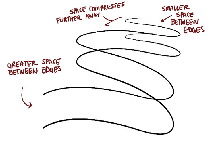
Your leaves are coming along fairly nicely as well, in terms of how they move through space. Sometimes your linework gets a touch stiff, but generally the lines are smooth and fluid, and you're capturing not just the sense that it exists in a specific part of 3D space, but how it actually moves through that space as it is influenced by the wind and air currents that govern it.
One thing that does come to mind however is how you're approaching a lot of your detailing here, and in other areas of your constructed plants. More than anything, it is important to remember that while you may be inclined to see certain details as line in your reference image and then draw those lines on the page, this is not correct. Line itself does not exist in the real world - what we often perceive as lines is actually shadows being cast by the forms present along the surface of our object. Identifying the forms that exist there and then thinking about how they would cast their shadows is key when it comes to conveying a believable texture.
As explained here, it's normal for students to want to enclose and outline the little forms that exist there, drawing each form directly. This however locks us into the contract with the viewer that we will be drawing each and every little form that exists here on this surface, and anything we have not drawn doesn't exist. This throws away a very important tool - the ability to imply detail without drawing it entirely, and that is something that cast shadows excel at. Instead of drawing each little form directly, we draw the shadows they cast on the surfaces around them, effectively implying their presence by not drawing them. This gives us much greater flexibility when we need to transition from dense textures with a lot of black ink, to sparser areas with only the slightest cracks of shadows being captured.
So next time you want to draw the veins on a leaf, or the lines along the surface of a petal (like in the daisy), or draw the full outline around each and every pebble at the base of your cactus, keep this in mind.
Your branches are definitely coming along well, and you're moving in the right direction with reducing the prevalence of those little visible tails at the end of each segment where they veer off the intended path. As you continue to practice and get them to follow the correct path, I'd like you to try resolving this problem from both ends. That is, keep working on that front, but for the segment that follows, I want you to use the last length of the previous segment as a 'runway', effectively drawing directly on top of it as you start the next stroke rather than drawing where it ought to have been. This will help continue to make the flow of the compound line seamless, and continue to narrow the gap in your performance until it is entirely gone.
I also noticed a tendency to use the same degree in your ellipses across the entire branch - don't forget that the degree of the ellipse corresponds to its orientation in space relative to the viewer. As shown here, even if the branch were straight across, given that we're looking each contour ellipse from a single position in the world, their orientation relative to us would change.
Moving onto your plant constructions, you're applying the principles of construction quite well. You're very thorough in drawing through each and every form and leaf, and you achieve solid results. The main thing I was going to raise here was the textures - but I went and shot that early. I do have a one other minor point to mention.
When dealing with cylindrical objects - mainly flower pots in this case - they essentially are made up of a series of ellipses that are aligned to one another. We can achieve this more easily by putting down a minor axis line that penetrates through the entire object, allowing us to align the ellipses each to that minor axis, rather than eyeballing their relationships to one another. The other important properties of cylinders also come into play here - such as the far end of an cylinder having a wider degree than the closer end. This is the same kind of deal as the degree shift I mentioned in regards to your branches.
It's also worth mentioning that when drawing an open-mouthed flower pot, the opening is going to have a rim of some thickness. It may not be much, but it's still enough that drawing another ellipse inset within the opening will help show that this pot is not paper thin, making the illusion of your construction a little more believable.
And that's about it! I'll go ahead and mark this lesson as complete. You've done a good job, and are cleared to move onto lesson 4.
LookaSketch
2019-08-06 11:05
Hey,
Here is my submission https://imgur.com/a/OyJamrG
Thank you for your feedback
Uncomfortable
2019-08-06 21:15
Starting with your arrows, one thing stands out - I really appreciate that you've drawn so many zigzags, but it highlights the fact that the spacing between your zigzagging lengths of ribbon does not change as we look farther away. Perspective dictates that the same distance seen farther away will appear to be smaller. As such, these arrows actually contradict basic rules of perspective, and undermine the illusion that they're moving back in space. I explain this a little further in these notes.
That said, your leaves are very well done. They flow smoothly through space, and don't show any of the stiffness I sometimes see from students as they transition into drawing concrete, real objects rather than abstract forms. You're still treating these leaves as though they represent the forces of air and wind that apply to each leaf, rather than as something that starts and ends and occupies a specific piece of space. Instead, you're focusing on how this fluid object moves through that space. Very well done.
Your branches are really quite well done. At times it's unclear whether you're actually following the steps correctly (the strokes appear to be quite seamless, with only a few notable breaks and when I look more closely, a few joints where the connection between two segments becomes clearer). That said, I'm noticing that you're only allowing each segment to extend just a little past each ellipse - try and bring it halfway to the next ellipse, and then use the last bit of the segment as a sort of runway for your next stroke. You want that next stroke to overlap the previous one. This will help smooth out the slight breaks in flow that give away the illusion we're creating.
Also, where you play with branches, I'm noticing a few of the 'knots' you add (the spheres) are small enough that they end up falling inside of the branch itself. Try and make these forms a little bigger, like they're really a sphere that is wrapping around the branch at that point. We want to sell the idea that everything we're adding to our construction is a solid, three dimensional form, and we want to clearly define how they relate to one another.
Overall your actual plant constructions are quite well done. With the branch forms there's still some breaks in the flow, but your petals and leaves flow very nicely, and your more solid constructions (like the mushroom) are looking very firm and believable.
Your flower pots are struggling a little - it's great that you're utilizing cylinder-based techniques, like the minor axis to align a series of ellipses, though there is sometimes a lack of symmetry there due to ellipses that are drawn a little unevenly. The cactus' pot was definitely much better than the aspidistra.
There are just two main points I want to address:
-
Leaf edge detail. You definitely have a lot of leaves that have wavier edges to them. A good example of this is the aspidistra. This kind of wavy line is visibly much more complex than a simple, swooping curve, and as such, should always be given some degree of underlying and supporting structure before that level of complexity is added to a drawing. What you've done here is skipped a step - you should have constructed your flow line (step 1), then constructed the basic footprint of how that leaf flows through space with SIMPLE, non-wavy lines (step 2), then built your waviness onto those simple edges similarly to how it's demonstrated here. Don't jump into that sort of thing too soon.
-
Texture/Shading. I see a lot of places here where you're mixing up texture and detail with shading, and as a result we see a lot of hatching lines. A good example of this is the tulip. Remember that back in lesson 2, I explain that we don't actual deal in shading on its own in these lessons. We focus instead on texture, which is made up of the little forms that exist along the surface of an object, and which is represented visually by the little shadows they cast on their surroundings. Often times shading is used by beginners as a way to make a flat object appear three dimensional. We have much, much better tools for this - focusing on constructional principles, drawing through forms and contour lines. Furthermore, how we approach things is always a matter of techniques being used as a means to an end. As a tool to achieve something. Our main goal here is to communicate through visual means. If shading isn't the best tool we have to describe how a form exists in space, then what is it used for? Generally, it's used for its own sake - as a decoration. There is however one other instance where we can use it. Shading requires some form of transition from light to dark. This is where hatching lines usually come in. Instead, we can use it to create an excuse to convey texture in key areas, as the arrangement of cast shadows that we can control (making it denser or more sparse) can bring us from dark to light. As such, we CAN use shading only as a tool to help communicate areas of texture. This also means that there's really no valid place for hatching lines, aside from surfaces that legitimately have no physical texture along their surface (like generic boxes in the earlier exercises).
All in all, you're doing quite well. You just have a few things to keep in mind. So, I'll go ahead and mark this lesson as complete. Feel free to move onto lesson 4.
DementedBanana89
2019-08-07 07:57
Hello, this is my submission for lesson 3: https://imgur.com/a/YFsgE67.
Uncomfortable
2019-08-07 19:54
Starting with your arrows, they generally flow quite well through space, but there's one key issue you need to keep an eye on. On a lot of these, the spacing between the zigzagging lengths of ribbon remains consistent even as the arrows move farther back in space. Based on the rules of perspective, that spacing should compress more and more.
Moving onto your leaves, these are fairly well done, with a few things I want to mention:
-
On most of these, you're working additively when it comes to appending additional spikes/ripples/etc. to your leaf constructions. There is one however towards the lower left where you've cut back into the shape. While this is a valid approach, it's not one I recommended early on. Working additively makes it easier to get used to the fact that you're taking a three dimensional form and extending it into space. When beginners jump into working subtractively, they tend to treat the shape they're cutting into as being flat and two dimensional, existing only on the page. As such their cuts don't follow the surface in 3D space, and instead flatten out the construction.
-
I'm noticing some definite sloppiness when it comes to texture, and some blurred lines between what you're adding as texture/detail and what constitutes contour lines. Towards the far right half of the page, you've got some more conscientious, planned contour lines that are doing their jobs - defining how the whole form flows through space by running along its surface. As we move into the center however, there are more examples where the contour lines are much sloppier, and there's a lot more arbitrary lines that are just haphazardly thrown on there in a somewhat lazy attempt at adding detail. When we add detail, it's always going to be as texture - meaning, the result of little forms that exist along the surface of our object, represented only by capturing the shadows those little forms cast on their surroundings. We do not draw these as lines, and every single mark we put down is cast by some form we can identify. No random squiggles meant to replicate some feature you may have seen in your reference, but didn't take the time to properly understand.
Moving onto your branches, these are pretty good. You're doing a good job of merging the individual segments into longer, continuous, almost seamless edges. A few things though:
-
Right now you're only extending each segment a little ways past the previous ellipse. Extend it halfway to the next one, and use that last bit as a sort of 'runway' for your next stroke. The next stroke should be overlapping it directly.
-
Your ellipses' degrees are generally much too wide, considering that these branches are moving across the page. The degree of those ellipses corresponds to that cross-sectional slice's orientation in space. When they're as wide as you've drawn many of them, it tells us that they're facing towards the viewer. This does not correspond with the actual way those branches are moving. The ellipses should generally be much narrower.
-
Also watch the alignment of those ellipses to the central minor axis line.
Moving onto your plant constructions, these are generally quite well done. Just a few observations to point out:
-
You tend to draw through your forms quite well, though I noticed a few places in your potato plant where you did not draw a few leaves in their entirety, and instead had their lines stop where they were overlapped by another form. I know this one in particular is prone to getting quite cluttered, but drawing each and every form in its entirety is critical.
-
In your pitcher plant, the edges started to get rather scratchy. There's definitely a fine line between the smooth, flowing, compound strokes explored in the branches exercise and basic chicken scratch we've worked against in lesson 1. Don't fall back into bad habits.
-
The flowers/petals of this page were handled very well, despite how much is going on. The main body of the plant to which all the branches/stems connect however, definitely suggests to me that you may not have observed your reference as closely and carefully as you could have. The arrangement of forms there does not create a particularly believable illusion of how such a plant might behave. I can't be guaranteed of that without seeing the reference but generally when something looks off, it's because we miss important relationships between forms when studying our reference.
-
It's good to see you delving into cast shadows in this one, though there's definitely room for improvement there. Along the top, you're not entirely consistent in where those shadows fall. Think about where your light source is meant to be, and make sure your shadows remain consistent. Additionally, as we start to get into areas that are dense with little textural objects - like the pebbles and rocks along the base - we need to consider whether constructional tools like the use of full outlines is the best choice. At this point, it's often better to set that tool aside and rely completely on the shadows they cast, refraining from outlining them at all. In this regard, we end up implying their presence through the shadows they cast on the surfaces around them, rather than drawing each little form directly. I explain this further in these notes, which I believe I shared in my critique of your lesson 2 material. The key here is to stop outlining those forms and focus only on the shadows they cast.
-
I also did see a few places throughout your drawings where you were tending a little too much towards hatching/shading. Remember that we don't actually deal with shading in any of these lessons, as it tends to be distracting. If we want to achieve some sort of a smooth gradation from light to dark, then we use texture - which is a collection of those alternating shadow shapes - to achieve it. Otherwise we stick to stark, crisp cast shadows to separate our shapes.
All in all you are doing pretty well, with a slight tendency to get a little sloppy in certain places. I'll go ahead and mark this lesson as complete, and leave you to continue working on that through lesson 4.
MatheusNunescp
2019-08-12 13:04
Thank you so much about the tip you gave me in the last exercise delivery, regarding me being ashamed of the drawings. My hand is looser, but I still feel a medium resentment. I was afraid to make several flowers on the same page and end up missing one and ruining everything. I use a cloth to wipe the sweat off my hands, I feel the pen is heavier than a military rifle.
At the beginning of the course, you talk about quitting school and drawing a little for fun. I'll start this second part starting today and see if it helps me.
Uncomfortable
2019-08-12 14:31
Your work here is very, very well done overall, but you're submitting way too early. Your last submission (for lesson 2) was 6 days ago - students must wait a full 14 days before submitting the next lesson's work. Please hold onto it until August 19th, and I will critique your work then.
MatheusNunescp
2019-08-12 15:23
Your work here is very, very well done overall, but you're submitting way too early. Your last submission (for lesson 2) was 6 days ago - students must wait a full 14 days before submitting the next lesson's work. Please hold onto it until August 19th, and I will critique your work then.
sorry i forgot
Advayia
2019-08-17 17:35
Hello! This is the lesson 3 exercises https://imgur.com/gallery/aIIsCms
This took me way to much time to finish and i did my best.
I learned a lot doing this lesson.
Uncomfortable
2019-08-17 19:14
All we can ask is that you do your best. Overall you've put in a solid effort, and while there are some issues I'll address, you're moving in the right direction. As long as it is your best work, the critique I can give will be useful, and will help push you along.
Starting with the arrows, these are generally pretty well done, although definitely smaller than they should be, resulting in a lot of empty space on the page. Giving yourself more room for your brain to think through spatial problems helps a great deal in both exercises like these, and general construction, so definitely avoid making anything particularly cramped or small when it doesn't need to be.
All in all though the arrows do flow pretty nicely through 3D space, and for the most part you're doing a good job of compressing the amount of space between the zigzagging lengths as we look farther away from the viewer.
Looking at your leaves, I do suspect that you may be getting a little distracted by what you want to achieve with each one in terms of detail/texture, to the point where you're not necessarily entirely focused on what you're doing at the given moment. By which I mean, when your focus should be on establishing how a leaf flows through the space it occupies, your brain is at least partially moving ahead to how you're going to add some of the more interesting details to it. That's not to say your leaves don't have a decent sense of flow, but that I think you can probably achieve better by focusing on one thing at a time.
Also, when adding detail - especially with the leaf on the bottom right - never use any kind of hatching line pattern. It is virtually always meant as filler when the person drawing doesn't want to put the time into really observing the textural patterns that are actually present, or when they want to focus on conveying shading information - neither of which we want to be doing.
Moving onto the branches, it's a good start, but there's definitely a visible shift in the flow at every ellipse. The purpose of this exercise is to get used to drawing long, continuous, complex edges in overlapping segments, so we can maintain control while still achieving the illusion of a single stroke. Ensuring that the flow is maintained between them is critical to achieve this.
That said, the main issue I'm seeing is that where the instructions state that a previous segment should continue halfway to the next ellipse, you are only extending it by a minimal amount in many cases. Give the instructions there another read.
In addition to extending those segments further, when drawing the following segment, make sure you have it overlap the last piece of the previous one directly, rather than drawing where it ought to have been. This will help you improve on both ends - on getting the previous stroke to aim more accurately towards the next ellipse, and on compensating for any issues in achieving that goal with the following segment.
One last thing about this exercise - I suspect you may be drawing somewhat from your wrist here, so try and push yourself to draw from the shoulder in order to maintain a more even, flowing execution of your marks. Drawing larger will also help with this.
I am pretty pleased with how you're utilizing your ellipses' degrees to properly convey the orientation of each cross-section in relation to the viewer, so that's pretty good. There definitely is a lot of work to be done on this exercise however.
Moving onto your plant constructions, there's a lot of good here, with a few issues mixed in. The issues are more related to how you approach things, so it's less a question of skill and more a matter of the choices you make.
-
One common issue is that you don't always draw each form in its entirety, allowing your edges instead to stop when a form gets overlapped by another. For example, on the daisy, you've only drawn the petals on the far side up until they get overlapped. Towards the side closer to the viewer however, you do a much better job of drawing through each form. You should be doing this more consistently.
-
On the bottom left of that same page, you have some added complexity to your leaves that you've drawn without the appropriate scaffolding to support them. You need to be following the 3-step leaf construction process in all cases, especially when it comes to the earlier steps. The second step, of defining the basic footprint of the leaf with simple edges is key. You can add any additional complexity to that afterwards, but don't jump right into it.
-
Your mushrooms are coming along quite well. Keep an eye on maintaining the evenness and confidence of your ellipses, but the forms are well done, and the texture/detail has a nice focus on the shadows being cast by the small textural forms on the surface of the various objects. On the bottom right there though, making the stalk mostly black was probably a poor decision though.
-
Jumping down to your cactus, your flower pot, being a cylinder, should be constructed around a single minor axis line to keep all the ellipses aligned to one another.
-
The different spines of the cactus are so numerous, and so start to fall into the category of texture - meaning we need to start thinking about drawing the shadows they cast, rather than trying to draw each spine itself. The difference being that the shadows are subject to whatever light sources we choose to apply, in order to make certain areas more sparse and others more densely packed with shadow. In your case, it's very uniform and evenly spread out across your drawing, which tends to make it look kind of boring.
-
Similarly, the pebbles/gravel/soil you drew at the base of the cactus also falls into the territory of texture, and so you don't want to be outlining all of these as you have done here. When dealing with texture, stay away from thinking or working in line, and focus on everything you draw being a shadow cast by some identifiable form present along the surface. I go into this somewhat in these notes.
-
Jumping down to this drawing, I really want to warn you away from any situation where you feel the need to dump this much ink on a drawing. It's not that there aren't situations where that might be appropriate, but you need to ask yourself - what is it exactly that I need to convey by filling all of these in with black ink? If it's the local colour of an object or surface - like if the surface itself were painted black or some other dark colour - then that's something we fully ignore. Just like we don't go out of our way to convey that something is yellow or pink, we aren't bothering with conveying any other colour or tone that is naturally part of a material. All we care about are the actual textures themselves, which are made up of shadows cast by small forms on the surfaces of our objects. Sometimes we might also invent shadows in order to help push the attention towards a certain form or area of the drawing as well (you did this in the hibiscus, although honestly the cast shadow on its stem strayed too far from the petals, making it look awkward), but never to convey local colour.
All in all I think you've got a bit of a mixed bag here. You are capturing a lot of the major points of the lesson, but there are a number of areas that you're still struggling with. So here's what I want you to do before I mark this lesson as complete:
-
1 page of leaves. Fill it up completely, and don't go into any texture. You can build up the complexity of the edges, but make sure you do so with individual strokes rising off the simpler edges and returning to it. Focus on how the leaves flow through space as well, and on following the basic leaf construction steps. Also, you may want to do some following a few of the less formal leaf demos like this one and this one.
-
2 pages of branches. Draw the branches a bit bigger, draw from your shoulder, extend the lines a full half way towards the next ellipse and make sure the following segment overlaps the last bit of the previous one.
-
3 more plant drawings, with no texture/detail whatsoever - just pure construction.
Advayia
2019-08-17 20:17
Thank you for the critique! I did not deserve to pass this one.
Yeah... My drawings where not that good this time.
Back to the drawing board!
Uncomfortable
2019-08-17 20:19
Think of it less in terms of "deserving", and more in terms of us making sure you get practice where you need it.
lessldraws
2019-08-17 19:29
Hey! If this is okay, I used to have a different reddit account for submitting these, but I'm going to use this one from now on. I've sent you a message on patreon with my old username. Sorry for the inconvenience.
Anyway, here's is my lesson 3 homework https://imgur.com/a/gOxYbJn. Thank you.
Uncomfortable
2019-08-17 20:06
Honestly, when you'd increased your (previously dormant) pledge to $10, I was a little worried, given that your submission for lesson 2 was from over three years ago. The fair assumption would be that you'd gotten rusty, and even if not, the lessons from back then were a far cry from what they are now (with a lot of different requirements, different standards, and an instructor a lot less certain of the material he was teaching). So I was preparing to have to tell you that maybe jumping back into lesson 3 would be a bad idea.
Thankfully, my worries were unwarranted. I can't actually see the full lesson submissions from back then, since you seem to have deleted them, but I did see a little snapshot I'd taken for one of my critiques - and compared to that, your overall line confidence has improved a great deal since then.
Starting with your arrows exercise, these are very well done. They flow very confidently across the page, and through the three dimensional space of the scene. The only issue I'd like to mention here is that the spacing between the zigzagging lengths of arrow should generally compress as we look farther away (based on the principles of perspective). In your case, they tend to be either consistent, or somewhat arbitrary. So keep that in mind - as they move farther away from us, the consistent distance between two objects will appear smaller and smaller to the viewer.
Your leaves demonstrate a solid grasp of the constructional process introduced here - you're not afraid to break your leaves down into successive steps, and you focus on the purpose of each individual phase without getting distracted by what you're planning on doing next. There are cases here where I feel that your flow lines are a little rigid. You have good flow towards the upper right corner, but many of these are a little on the stiffer side. Adding a little arrow head on the end of your flow lines and trying to imagine how these lines flow through space in an abstract representation of force (like the wind and air that governs the movement of these leaves) can help bridge over that fluidity and confidence from your arrow exercise.
Your branches are generally well done, with a few little hitches that you are well on your way to resolving. Your lines flow very smoothly and confidently, and when you're able to nail the seamless transition from one stroke to another, you're able to maintain the illusion that it's a single stroke. Of course, the issue is that you're not always able to nail that transition without visible tails or a visible change in line weight. You're pretty close, and you're definitely getting better, but it's still something to work on.
Here's three things to keep in mind:
-
The previous segment should be extended half way to the next ellipse. In a lot of these, you're only extending a little past the previous ellipse.
-
For the following segment, draw it such that it uses the end of the previous one as a runway, overlapping it, rather than drawing it where the previous segment should have been.
-
Try and build a slight tapering to your strokes, just in general. This will help overlapping lines (both here, and when adding line weight) blend into each other more seamlessly. Usually this natural tapering comes from executing the mark with a confident enough pace that the pen is already moving by the time it presses down on the page, and has already gone a ways down before you've hit your intended level of pressure. Drawing too slowly or pressing too hard are a common cause of this, though I think in your case it's because you slow your strokes to a stop. Instead, get used to lifting the pen up from the page when it hits your desired end point, rather than trying to stop the motion.
All in all, your plant constructions are very well done. Your leaves flow smoothly and confidently (definitely improved over the leaves exercise), and you're applying the constructional method quite well.
One thing that does stand out however is the use of those large ellipses to define the bounds of your petals early on when constructing a flower. These are in all honesty not really necessary, at least in the way that you're using them. If you're going to put those bounds down, try to respect them more directly, as every single mark we put down is an assertion of some form. Asserting that "my petals will reach this far" and then making no effort to actually follow through with that does undermine the illusion we're creating for the viewer, though perhaps not as egregiously as other ways this kind of problem can manifest.
Honestly, aside from that, the only other piece of advice that I can offer is a serious nitpick - but in some of your flower pots on this page, you've got these little arcing lines along the cylindrical form, which I'd imagine is a sort of texture of the pot itself. The issue here is that you're drawing them as line - when dealing with texture, we don't want to use line at all. As explained here, line is a tool that is extremely useful in many cases (especially construction and defining the boundaries between forms and volumes), but when it comes to conveying the little textural forms that exist along the surface of an object, it becomes less effective.
Instead, we have to think of every mark we put down (in regards to conveying texture) as being a shadow cast by some other form. If we can identify the nature of that form, we can think about how its shadow would be cast, and usually this does not result in a uniform line (as you've drawn there), but as a line with a bit of variance in where it gets thicker or narrower. When dealing with anything textural, try to think in those terms, and make sure that whenever you see a detail, that you think about what is producing the shadow you perceive, before transferring it to your drawing.
Aside from that, you're doing great. So, I'll go ahead and mark this lesson as complete, so feel free to move onto lesson 4. Keep in mind that since you haven't completed the 250 box challenge (which is usually a prerequisite for lesson 2), that is still something you'll have to complete before lesson 6, along with the cylinder challenge. Those are a ways off, but definitely something to keep in mind as you continue to move forwards.
lessldraws
2019-08-17 22:37
Yeah. It has been a long time and a lot has changed on drawabox, and, without a doubt, for the better. Before attempting lesson 3 I did go through all the previous (but now updated) content, and from what I remember this website is now even more of an amazing find for someone who really needs some structure to their learning. Rustiness was definitely a concern for me too, but I ultimately decided that I remember most of the things I learned, and apart from couple of exercises chose not to redo anything completely. And I guess it worked out in the end.
Anyways, thank you for the critique and advice, I'll try to keep all of it in mind for the next exercise. Especially the lifting-the-pen one, because I definitely do stop before lifting, and the whole idea of doing it in reverse is kinda... strange to me. I mean, it makes sense for confidence's sake, but I feel it would take some time to get used to.
And about those ellipses for petals. I haven't really meant them to serve as bounds, more to establish some sort of general plane they all settle around, to better visualize perspective and "believe" into 3d-ness of space myself. It's a thing I should probably work on visualizing better in my mind, so I'll try to avoid doing it next time, but it definitely helped me there I think.
Oh, and as for the previous lessons, here they are, for completeness sake, I guess.
Uncomfortable
2019-08-17 23:44
Looks like both links are dead, though it doesn't really matter. It's been so long that they're not going to be of any use in terms of assessing your strengths/weaknesses.
FullmetalCarcajou
2019-08-19 03:03
Hey hey! So here is my work for lesson 3 -
thanks!
Uncomfortable
2019-08-19 17:47
Very nice work overall! I think by and large you're demonstrating a pretty solid grasp of the concepts covered in the lesson. There are a few things I want to point out, but most are a bit nitpicky.
Starting on your arrows, you've done a great job here. You're exploring all three dimensions of space with these, and I'm pleased to see how the gaps between the zigzagging lengths of your arrows shrink as we look farther back in space, rather than remaining consistent and evenly spaced. This does a great job of conveying the full depth of the scene.
Your leaves carry the same kind of energetic flow as your arrows, so you're definitely not getting caught up in the fact that you're drawing a physical object with a clear start and end point. You're conveying a sense of how those leaves move through that space, pushed by the force of wind and air currents, rather than simply how they exist within it.
I'm also pleased with how you generally adhere to the underlying scaffolding when adding more complex edge detail. Sometimes you do stray from it a bit, but you're still for the most part sticking to how that footprint moves through space, allowing your complex problems to be separated into manageable stages.
One area where you didn't quite approach things correctly was with the leaf in the bottom right of the page. This one's clearly got a lot of complex arms, and as explained here, it'd be better to follow the spirit of the leaf construction method rather than trying to apply it directly. Each individual arm can be broken down into its own "leaf-form", which can then be merged together.
I've also got another demo on how to tackle maple leafs here, as they're a pretty common example of this kind of issue. Remember that every technique you're being shown is less about how to tackle a very specific problem, but how to tackle a certain kind of problem. Think about how they can be applied beyond the bounds of the example itself.
Your branches are coming along quite nicely, but I noticed just a couple things:
-
Make sure you extend the previous segment halfway towards the next ellipse - right now you seem to be stopping them a little short of that mark, giving yourself less room to aim it correctly and confidently.
-
It looks like your ellipses are roughly all of the same degree. Don't forget that as we move through the length of the form, the orientation of each cross-sectional slice relative to the viewer changes slightly, as explained here back in the organic form with contour lines exercise.
-
When constructing more complex branches, I noticed that you had a tendency to put the "knot" ball inside of the branch itself. Generally speaking this isn't a great idea because as far as construction goes, it's a bit contradictory and can be visually confusing due to how it's purely inside of otherwise occupied space. When I construct my knots, I'll usually place the sphere around the branch section, as if the tube is passing through the sphere.
Moving onto your plant constructions, these are generally very well done. You're doing a great job of capturing the flow of your leaves and petals, and constructing forms that feel solid and three dimensional. There are a couple things I want to point out:
-
You're definitely drawing very small, packing loads of drawings into each page. While this is admirable, drawing so small can seriously interfere with both your brain's ability to think through spatial problems, and your own inclination to engage your whole arm from the shoulder. Avoid working in a cramped fashion and try limiting yourself to a maximum of two drawings per page.
-
There are a lot of cases where you've got a central minor axis line to which you're setting your ellipses, but the ellipses tend to be slanted rather than aligned to it correctly. You may want to practice the funnels exercise from lesson 1 in particular to work on this, or the organic forms with contour ellipses.
-
The issue I mentioned above about the degree of your ellipses not shifting along the length of a form is an issue through your constructions as well.
-
You've got a few cases here where you get a little distracted in trying to apply form shading to your drawings. Keep in mind that our textures are composed strictly of the shadows cast by the little forms that exist on the surface of our object. Don't use any hatching lines in an attempt to add any shading for shading's sake, as explained here. For the most part though, your use of texture is actually very well done - there's just a few cases where you get distracted and fall into shading instead.
All in all, very well done. I'll go ahead and mark this lesson as complete, so feel free to move onto lesson 4.
FullmetalCarcajou
2019-08-20 01:11
Thanks for the feedback! In retrospect, yep, a lot of those issues were the result of becoming distracted and/or impatient so I'll be sure to be wary of that. To be honest, it's kind of a relief to see that I've been working too small as I often found myself thinking the 0.5 pen was too big for what I was trying to do (I in my big-brainedness couldn't come up with a solution).
Anyway, thanks a lot!
MatheusNunescp
2019-08-19 21:43
Thank you so much about the tip you gave me in the last exercise delivery, regarding me being ashamed of the drawings. My hand is looser, but I still feel a medium resentment. I was afraid to make several flowers on the same page and end up missing one and ruining everything. I use a cloth to wipe the sweat off my hands, I feel the pen is heavier than a military rifle.
At the beginning of the course, you talk about quitting school and drawing a little for fun. I'll start this second part starting today and see if it helps me.
sorry for posting at the wrong time before*
Uncomfortable
2019-08-20 20:20
Starting with your arrows, these generally flow very confidently through space. I am mildly concerned about two things however:
-
They're generally drawn quite small - when it comes to spatial problems, drawing larger can help engage important parts of the brain and generally make it easier for your brain to sort through the relationships between different elements within 3D space.
-
Your line weight here goes a bit crazy. My guess is that you perhaps made some mistakes with your linework and went back over them, and then tried to fuse all the resulting lines as a way to correct the issues. Regardless of what caused it, the result is linework that feels very clunky. If you make mistakes, leave them be, instead of piling on more ink and drawing attention to the problematic area. For line weight in general, make sure you're drawing the additional strokes with the same confidence you would have used when drawing the original mark (with the ghosting method and all). Don't trace slowly and carefully along it, as this will stiffen your linework. Furthermore, don't be too vert with how much you thicken parts of your lines. Line weight is meant to be subtle - you're whispering to the viewer's subconscious, not shouting in their face.
Moving onto your leaves, these are very well done. They convey a good sense of flow as they move through the space they occupy, rather than becoming stiff and static as can sometimes happen when a student transitions into drawing objects that are less abstract than we've been handling thus far. You're also generally applying constructional drawing techniques very well - when adding complex edge definition you're adhering to previous phases of construction so as to avoid any contradictory marks.
There are a couple minor issues that I should mention:
-
On the bottom right corner of your leaves page, you've got one that has many different arms, but that you attempted to draw all in one go. This is an example of skipping steps and jumping into too complex a form when there was not enough supporting scaffolding already built up to support it. There is an example of a similar kind of leaf with many different arms towards the center of this page that was handled much more successfully.
-
You're definitely a bit vague and half-assed when it comes to the actual texture you've drawn on these leaves. It's totally fine not to add texture here, but whenever you do decide to add texture, make sure it is with the use of proper observation and study, and focusing on every mark you put down as being a shadow being cast by some small textural form that exists on the surface of your object. Don't put arbitrary marks to give a loose impression of texture - if you delve into texture, make sure you give it your full effort.
Your branches exercises are similarly well done, and you've done a pretty good job of drawing individual segments that flow smoothly into one another. They're not perfectly seamless, and there are actually some issues in how you're handling the bridging between segments, but you've still managed to pull things off well.
The main issue is that you don't really allow the segments to overlap very much. In the instructions, you're told to extend a segment halfway towards the next ellipse - you often fall short of that. For the next segment, you're meant to draw starting from the previous ellipse, directly overlapping the end of the previous segment, treating it like a runway to ensure that the strokes flow together as one. You're doing a great job of matching the general flow, but there's still a visible hitch because you're not allowing them to run together long enough.
Moving onto your plant constructions, these are very well done. Again, there are a few issues to point out, but they're minor in nature and overall you're demonstrating a solid grasp of form and construction. You're also making good use of texture as shown in your mushroom (though on the daisy, I think we're slipping back into being a little less attentive, and also mistaking rendering/shading for texture, which it is not).
-
Taking a look at this hibiscus, I noticed that with the wavy edges are drawn continuously (instead of being broken up into individual segments as explained here). Don't forget the tenet of markmaking: once the consistent trajectory of a stroke is broken, the mark should stop and another should begin. You did a good job of this in the leaves exercise, so I suspect this was just a matter of you getting forgetful.
-
In this drawing, your flow lines are getting to be something of an afterthought - you're not drawing them with a strong sense of the energy and flow that drives each of these petals, and as such they end up coming out quite stiff. Don't get too relaxed to the point that you forget the individual steps of the processes taught in the lesson.
-
Also in the drawing referenced in the previous point, you've stopped drawing through all of your forms, resulting in leaves that exist more as flat shapes on the page, rather than three dimensional forms that exist independent of one another. Don't allow the lines to stop where they are overlapped by other forms - we're not here to have a clean, pretty result at the end. We're here to understand how our forms exist in space and relate to one another within it. This perhaps relates back to the issues you described with your submission - fearing failure, fearing mistakes, wanting to avoid "ruining" a page at all costs. You've generally done a very good job of pushing past that regardless, but hopefully it is a mindset that we can properly push past and dismantle. Fighting it is good enough for now, however.
Aside from those points, you've done very well. I'll go ahead and mark this lesson as complete, so feel free to move onto lesson 4.
I do have to ask though:
At the beginning of the course, you talk about quitting school and drawing a little for fun.
What do you mean by "quitting school" ? Do you mean setting aside the focus on learning and allowing yourself to just relax and enjoy drawing for what it is, in order to avoid burnout and build a healthier relationship with drawing as a whole? My guess is that there might be a slight language barrier here but "quitting school" spooked me a little bit :P
MatheusNunescp
2019-08-20 21:25
i'm using google translater.. " quitting school" I meant trying to be less tense
- I will adjust your requests. thank u
I really forgot some things, sorry for that, this is the hardest thing I have ever done in my life, I will take some time and thank you for your patience in teaching, it is your greatest treasure. My relationship with drawing is the same as a bird trying to drink water in a river full of alligators. I want to break this, so the design slipped a little
ps: by the end of the course I can speak english, I'm working on it, don't worry :)
Uncomfortable
2019-04-22 19:20
Nope, as soon as the pledge is increased, you're welcome to submit. Just remember not to cancel your pledge prematurely.
You've done a pretty great job with your leaves exercise - they're flowing quite naturally and fluidly through space, and your approach to adding detail and complexity to the edges shows a good deal of respect to the constructional approach. That is, you're adhering to the underlying, simpler phases of construction, rather than ignoring them or treating them as though they're simply 'suggestions'.
Your branches are definitely moving in the right direction, but you'll want to continue practicing the techniques involved in getting your segments to flow smoothly and seamlessly from one to the other. Currently we can see quite a number of little tails that protrude from the end of each segment, making it clear that the long edge is made up of several pieces.
In both of these exercises, one thing does stand out to me - it's that you have a tendency to draw quite small. Remember that construction is a spatial problem, and our brains benefit quite a bit from being given more room to think and explore. Drawing smaller has a tendency to cause us to stiffen up, and makes it a little tougher to engage the use of our shoulder.
Moving onto your plant constructions, you've got some that stand out quite well (the edelweiss, tulip, cannabis leaf, rosemary, thyme, etc.) but there are a number where you don't employ as much of a constructional approach and instead slip back to being much sketchier.
Remember that this process is not one that involves a lot of sketching and exploration on the page - each mark we put down is planned and considered beforehand, and weighed against other options before we commit. For example, your orchid definitely fell away from this - you put a lot of marks on the page as you tried to figure things out, rather than breaking it down into its basic components and constructing each one using the specific techniques explored in the lesson.
Similarly, you get caught up sometimes in shading/rendering (like in your raspberries), something I specifically point out is not an element of this course in this section of lesson 2. Additionally, when attempting to move into texture, you have a tendency to rely more on general scribbling (like the bark of your palm tree), rather than actually observing your reference carefully and transferring specific detail and information piece by piece. This is also something warned against in lesson 2.
Throughout the lesson you do show yourself capable of constructing quite well, but you don't always follow that process, and instead at times get caught up in the desire to make a nice drawing (rather than treating the drawing as an exercise in construction and spatial problem solving). In addition to this, there are a few specific issues I'd like to address:
When constructing branches/stems, don't overuse your contour ellipses. In your rose/tulips, it definitely stands out that you didn't need nearly so many, and having them spaced so close together resulted in that area getting a little stiff. The point is to break down complex edges, placing an ellipse as a sort of "dot" to connect. The primary goal should still be to achieve smooth, fluid strokes, drawn from the shoulder.
You have a tendency to leave the leaf construction process by the wayside - for example, if we look at your amaryllis, the petals don't have any singular line responsible for determining how it should flow through space prior to the construction of the overall leaf shape.
Draw every form in its entirety, rather than allowing it to stop where it gets overlapped by another form. For example, in the amaryllis you've got a lot of leaves that are not drawn in completion, and the same occurs in your fly amanitas mushrooms, where you do not determine where and how the stem connects to the cap.
One last point - for the palm tree, I would treat each fern as a single leaf construction before breaking it down. This demo shows what I mean.
So, before I mark this lesson as complete, I'd like you to do 4 more plant drawings, taking into consideration what I've said throughout this critique. Be much more focused in your use of the constructional method, don't skip steps, don't sketch loosely, take full advantage of all the space the page affords you (rather than drawing small), don't attempt to shade/render, and when adding detail (if you should choose to), take the time to observe and study your reference carefully, looking at your drawing only long enough to transfer one or two specific marks before looking back at your reference.
cbc2508
2019-04-24 21:24
Thanks for the very detailed critique! I made 4 new plant drawings: https://imgur.com/a/GfW3cjd. I think they're an improvement, as your comments were very helpful to pinpoint what I was doing wrong previously. Drawing bigger was a game changer. Cheers!