Uncomfortable in the post "Lesson 4: Applying Construction to Insects and Arachnids (Patreon Critique Thread)"
2019-08-03 17:50
I definitely see an overall improvement over this set, where you're striving to apply the principles of construction more conscientiously throughout, and making clear strides forward.
Early on there's visible shortcomings when it comes to establishing the relationships between the simple forms you add to your construction - you're definitely making a decent start, but I noticed the sausages in your legs being quite uneven and unconfidently drawn, and lacking the contour curve that is meant to reinforce the joint (you can see that additional step depicted in these notes).
I also noticed that you went through a phase of overusing contour lines at times (like with the beetle at the top of this page - the individual contour lines themselves aren't particularly well drawn, so you attempt to compensate with quantity over quality. Of course this isn't an approach you stick to for very long, as you clearly notice that it's not really working.
I am noticing however that when you do add contour curves on the thoraxes of the next few insects, they have a tendency to be quite shallow. Again, these do continue to improve, but it is something I want you to keep an eye on. Always make sure the contour curves are hooking back around at the edge, and overshoot them if necessary to really sell that curvature.
Jumping over to your scorpion, there are a couple things I want to point out:
-
In the video demo, I construct inside of the box in a way where I'm adhering to the side planes of the box very closely. I'm using the box to help define the top/side planes of the body, and even though I end up occupying a smaller space of the box, I'm still constructing along its sides rather than floating arbitrarily within its volume. In your case, you're not quite adhering to it in that manner, and so it does break away from the constructional mindset. I actually do talk about this in the video, so you may want to revisit it.
-
For the big claw that is closest to us, make sure that when you've got two different forms that are fused together, that you clearly define where they intersect with one another with a contour line.
Jumping forward, I think the last several pages have come out quite well. Still need to focus on using simple, basic sausages for every segment of your leg constructions - remember that you can build up on them afterwards just like everything else, but for that simple underlying structure, we need to start with something that yields as solid a form as possible, and that solidity comes from simplicity. You've got a lot of very good ribbing, especially in the third last page's abdomen. You've clearly wrapped around a solid form there, it's generally a much better example than other places where you've attempted similar things, where it's difficult to mentally separate the layering on top, and the underlying base form.
The last point I want to mention is about detail and texture. I'm mainly looking at the grasshopper, where you've attempted to add little bits of texture to its wings. It's important that you go back to lesson 2 and read through the notes on texture, both in the lesson and on the texture analysis exercise. The key here is that all texture is made up of little forms that exist on the surface of our objects, and any mark we put down is made up of the shadows cast by those small forms. Don't think in terms of seeing "lines" in your reference image and then attempting to draw those lines. Since every mark we put down is a shadow, we have to be aware of what form casts each shadow we draw. I explain this further in these notes in particular, but be sure to review that entire section.
Anyway, you're doing a good job as is, and you've shown a good deal of improvement. I'll go ahead and mark this lesson as complete, so feel free to move onto lesson 5.
Uncomfortable in the post "Lesson 2: Contour Lines, Texture and Construction (Patreon Critique Thread)"
2019-08-03 16:51
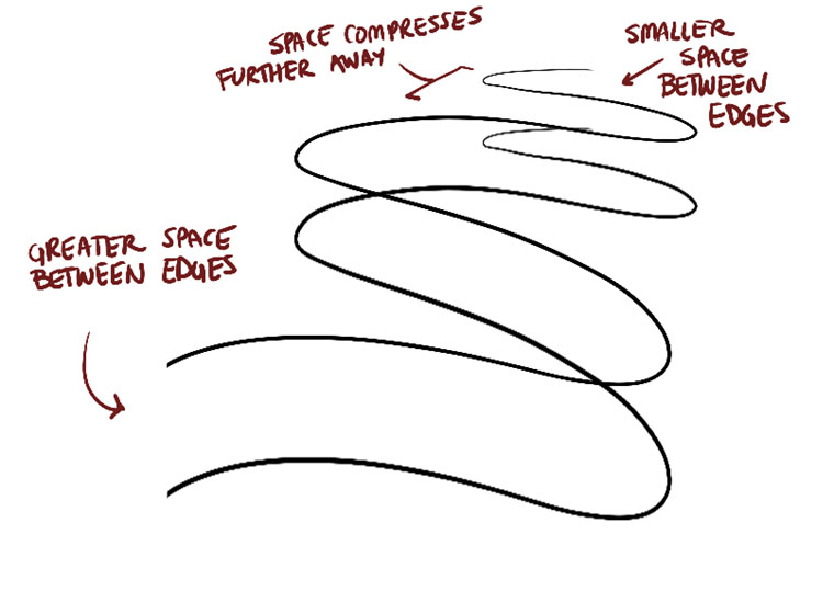
Overall you've done a pretty good job! To start with, I'm extremely pleased with your arrows - you've demonstrated a great deal of confidence in how you've focused on drawing each arrow in isolation, not worried about how they overlap or interfere with one another. While it makes it a little difficult to critique, I still love what it says about your mindset, so it's worth the trouble. Overall these are flowing very nicely through all three dimensions of space, though one thing I want to remind you of is that as we look farther back in space, the space between those zigzagging lengths of ribbon is going to get more and more compressed. I explain it further here.
Your organic forms with contour ellipses are pretty well done - your ellipses are fitting pretty snugly between the edges of the form, your ellipses are even and confidently drawn, and you're demonstrating a solid shift in the degree along the length of the forms. The only issue is the sausage forms themselves. As explained here you want the sausages to match two equal spheres connected by a tube of consistent width. You've got sausages with ends of different sizes and some with pinching through the midsection. Your sausages in the contour curves exercise are much better - though I think you're missing the degree shift in those, so keep an eye on that.
Moving onto your texture analyses, you're definitely moving in the right direction and are paying attention to the right kind of approach. I can see that you're trying to leverage shadows a lot more, and you're diminishing your reliance on lines. There is one issue however - when you actually draw a mark (which is always going to be some manner of cast shadow), try to think about what is actually casting that shadow. Each one is being generated by some form present on the surface of your object. Being aware of that and treating each mark as though it is a shadow being cast by some form blocking a light source will help your textures feel more believable. Right now they're still seeming more like lines with additional line weight in certain areas. You can also read the notes here to get a better sense of how to leverage those shadows as well. This will all apply to the dissections as well, although I think when dealing with these, due to the fact that you're more aware of how the textures are sitting on a three dimensional surface, you are showing more awareness of the individual forms sitting on the surface of the object.
As for the rest, your form intersections and organic intersections are very well done. You're demonstrating a solid grasp of how these forms exist in 3D space and relate to one another. With the form intersections, I'd watch out for the foreshortening you're using - it's a little more dramatic than it ought to be, but it's pretty close. Your organic intersections are doing a great job of conveying how these forms slump and sag against one another as they find a state of equilibrium.
Keep up the great work and consider this lesson as complete. Feel free to move onto lesson 3.
Uncomfortable in the post "Lesson 3: Applying Construction to Plants (Patreon Critique Thread)"
2019-08-03 16:11
Alrighty, so I've done most of my critique here directly on your images. There is definitely improvement overall, but a few things I noticed that I want you to continue to work on. Here are the redline notes: https://i.imgur.com/VkKCSSu.png
So the main issues I'm seeing:
-
You still have a tendency to jump a little far into complexity when constructing your basic leaf shapes.
-
Your lines tend to be somewhat hesitant and a little rough. I can see areas where you draw a line that should really just be a single stroke (due to being simple) with compound strokes.
-
On your aloe vera you demonstrated a pretty significant misunderstanding of how contour lines are meant to work, so I'd go back and revisit the notes on that technique. The whole thing is built around the idea that by drawing lines that create the illusion that they're running along the surface of an object, we can describe to the viewer how that surface deforms through space. Additionally, don't overuse this technique - you only really need one or two or so (depending on the case) to strongly reinforce the illusion. More than that tends to result in the student just relying on quantity over quality, and making the result feel unnatural and stiff.
I'd like you to do 3 more plant drawings, applying what I've pointed out here.
Uncomfortable in the post "Lesson 2: Contour Lines, Texture and Construction (Patreon Critique Thread)"
2019-08-02 18:11
Starting with your arrows, very nice work. These flow very confidently through space, and they do an excellent job of pushing through into the depth of the scene rather than coasting across the surface of the page. You're also not afraid of letting your forms overlap, so I'm very pleased to see how you're drawing through each and every one in its entirety.
Your organic forms with contour ellipses are coming along quite well. You're fitting them snugly within the silhouette of the form, you're showing a good grasp of that degree shift over the course of their length, and your ellipses are each drawn with confidence to keep them smooth and even. The same goes for your contour curves - they're wrapping around each form very well and build a convincing illusion of volume.
The only issue with both of these is in the nature of the sausage forms themselves. It's not a big deal at this point, but it will be a much bigger factor - the sausages are meant to be as simple as possible. As explained here, this means maintaining what is essentially two equal spheres connected by a tube of consistent width. The ends have to be the same size, and there should be no pinching or swelling through the midsection. You were very close, but I did see those two issues in small amounts.
In your texture analyses, you definitely put a great deal of effort into paying very close attention to your reference image and all of the details contained therein. Your observational skills are moving along really well. The execution - or more specifically, what you drew and how you drew it, does show pretty common issues that I'm not surprised to see at this point.
The main point here is that you're still relying very heavily on lines. Line itself doesn't exist in the world around us. It's a very useful tool we can employ to define the borders between volumes for our objects, and works really well when dealing with the construction of major forms. Once we start dealing with texture however, enclosing all of our forms in line has a number of downsides that makes it less than ideal.
Firstly, it tends to become really visually crowded and noisy. Secondly, when we enclose every little textural form that exists along the surface of our object with a line, we fall into the trap where we've told our viewer that we are going to draw every form present in this texture explicitly, and anything that we have not drawn does not exist. We don't leave much room for the implication of forms being present. What we want to rely upon instead of line are the shadows cast by those small forms. Instead of drawing the forms directly, we imply all of them by drawing the shadows they cast on the surfaces around them, effectively drawing everyhing but the forms we wish to convey.
Now, you are demonstrating a grasp of some of this more in some textures than others. For example, in your hexagons we can see lines being lost and found, and we can see variable weights to your lines in the blue stone's cracks. They are still, however, line weights, and not shadows. The difference is that a line weight is bound to an edge or line, and follows along its length. A shadow however is bound to some form that is casting it.
When putting a mark down as part of a texture, you need to be aware of the nature of the form that is casting that shadow. In the case of the cracked blue stone, every crack is a bit of stone that is higher or lower than its surroundings, and so one chunk is likely to cast a shadow on one of those around it. The crack may continue on past many different chunks, but each chunk is casting its own independent shadow.
When it comes to handling the actual gradients, I recommend you give these notes a read.
Moving onto your dissections, I do feel that you're generally demonstrating a well developing understanding of these concepts, and you're certainly moving in the right direction. I think what I've said above in regards to the texture analyses will help in general, and apply here as well.
Lastly, your form and organic intersections are very well done, and give an excellent example of your thoroughness, patience, and ultimately your grasp of how forms interact with one another in 3D space under different circumstances. With the form intersections, you've established the relationships between the forms in space and how their volumes can intersect, and with the organic intersections you've established how these forms actually occupy that space, and how they must sag and slump and wrap around one another in order to find a state of equilibrium that does not interfere with each others' established volumes.
Overall you're doing a great job, and I'm very pleased to see the quality of your work. I was concerned that you were jumping straight into lesson 2 here despite the ten odd months since your last submission. You clearly haven't gotten rusty at all.
Keep up the great work, and consider this lesson complete. Feel free to move onto lesson 3.
Uncomfortable in the post "Lesson 4: Applying Construction to Insects and Arachnids (Patreon Critique Thread)"
2019-08-02 16:39
So while there's still a lot of the issues I saw in your previous submission, there are a handful here that are very promising. Overall what that tells me is that while you're struggling a great deal overall, there are little breakthroughs happening, and that you do certainly have a path forward.
To start, your organic forms with contour ellipses are drawn quite well. The sausage forms themselves aren't exactly right but they are close - you just need to work on getting the ends to be the same size, and to eliminate any pinching through the midsection. Remember that back in lesson 2, sausages are described as "two equal spheres connected by a tube of consistent width". Nailing this form in its simplest state as described is at the core of then being able to chain these sausages together to create a believable, solid construction. If however we sneak in a lot of extra complexity to each form, it becomes much harder to make them feel solid.
It's worth mentioning that I'm also pleased that you're showing good use of the ellipses themselves - they're fairly evenly shaped, they fit snugly between the edges of the sausage form, and their degree shifts appropriately along their length.
For your contour curves, there are just two issues:
-
I'm not seeing that same degree shift, so the sausages end up looking a little more rigid and flat.
-
Their lineweight is EXTREMELY uniform. If you look at the ends of these curves, there's no tapering whatsoever, which tells us that you're either drawing with WAY too much pressure, or you're drawing way too slowly. I suspect it's probably both, but that applying too much pressure is definitely an issue for you. In general, we want to draw confidently and without actively trying to push our pen into the page - we just want to make contact with it. The natural tapering that comes as the pen touches down on the page while moving gives it a sense of liveliness that we don't see here.
That point on applying too much pressure definitely comes up throughout your drawings. I see a lot of lines that look VERY thick relative to the size of the drawing as a whole. This can be because the student is applying too much pressure, and also because they're drawing too small - but the result is generally the same. It makes a drawing much harder to work with, makes it more difficult to think through the spatial problems involved, and makes the drawings feel clunky and clumsy. It's the sort of thing that often makes students feel very frustrated with themselves, even though it is for the most part an issue of their own making. So don't press so hard, and draw bigger - there's nothing wrong with devoting an entire page to a single insect, especially if it allows you to engage your whole arm when drawing, and helps your brain work through the spatial problems involved in construction.
Now you follow along with the demonstrations fairly well, and I think they show us some issues that your other drawings don't quite accomplish:
- Your use of the sausage method in these drawings is generally much better than in your own drawings, but we can definitely see that the sausage shapes aren't nearly as consistent as the ones you did for the contour line exercise. As far as following the "two spheres connected by a tube of consistent width" formula, these are straying a great deal more. This means you are capable of doing better with these, but that when you try drawing them as part of something, you psych yourself out. You focus too much on the whole of what you're drawing, and not enough on the individual mark you're putting down at a given moment.
Also, I can see areas where you skip an important step of the sausage method - putting the contour curve down at the joint that defines the intersection between both sausages. So when you go to draw the legs of any insect or animal, because you have issues remembering all of the steps of this process, you should go back to this diagram and apply it directly, rather than trying to rely on your less than stellar memory.
Looking forward to how you construct legs in your own drawings, you tend to rely more on stretched ellipses rather than sausages, where the roundedness is stretched out over almost the entirety of each segment, rather than being limited to the end. This is what causes the considerable stiffness in each segment - where proper sausages can be used to convey rhythm and gesture in these limbs, yours are virtually straight and entirely stiff.
Another issue I noticed in the louse demo was that when you draw the ribbing along its abdomen - those layered segments that make it quite bumpy - I noticed that you're not really wrapping those additional layers around the solid form underneath. If you look at this demonstration from lesson 2, you can see two individual parts. First we have the simple sausage underneath. Then we have the segmented layering I've placed on top of it. At no point does the segmented layering cut back into the sausage form - it only ever builds on top of it. This is because I'm treating that sausage as a solid, three dimensional form. If I were to cut back into it as though it were a flat shape (which you do frequently in your louse's abdomen) it's going to undermine the illusion I want to create. So instead, I need to believe that this sausage form is solid and simply cannot be manipulated in that fashion. If you had a physical sausage in front of you and you were wrapping things around it, you wouldn't be able to wrap it in such a way that it actually went inside of the sausage. The notion would be preposterous to you - and so that's how you need to think about the forms you draw and how they interact with one another.
Looking through your own insect constructions, there is one that I felt shows real promise: this praying mantis. Most of your other drawings don't quite hold the illusion of being three dimensional, but this one actually does convey the idea that this praying mantis is sitting on a surface in front of us, in three dimensions. It's not without its own issues - there are several places where you haven't drawn through forms (like the back leg, you allow its lines to stop where it gets overlapped by another form), and the sausages aren't great - but the actual relationships between the different elements you've drawn are very well done. I'm also seeing signs that you were observing this one much more carefully than the others. This is a big step in the right direction.
With the rest, there are a number of the same issues as before:
-
There are still some forms you don't draw in their entirety. Rather than thinking in terms of each thing you're drawing as being an independent three dimensional form that exists in the world, you're thinking about them as shapes you're adding to the page. If you were focusing on a form, you'd know that form would still exist in its entirety despite the objects in front of it. You are drawing through many forms here, but I do see a bunch of places where you don't, and this undermines your ability to think of what you're drawing as 3D.
-
Your contour curves are all very shallow and don't wrap around convincingly. You CAN do contour curves quite well, as you've shown in the contour curve exercise, but you stop thinking about how to wrap that curve around your form when it comes to these drawings. None of this has to do with you not being able to do it - you're just thinking about a million different things at once, instead of focusing on the specific mark you're meant to put down at that moment.
-
Observation observation observation observation. Your drawings are still very cartoony, and it all comes down to you still drawing more from memory than from what you actually see in front of you. This is also one of those things that comes from you psyching yourself out and trying to think about a million things at once, but this is definitely the biggest hurdle for you. You need to get used to drawing a tiny fraction of the time, and spending most of your time actually looking at your reference and thinking about how to break it down into its major forms. Only ever look away from your drawing for a moment or two before looking back. I explain this all here at length.
-
Your choice of reference - as far as the insects themselves goes - is actually pretty good. There's a very interesting array of insects with reasonably simple construction. Just make sure that you're looking for reference images that are as high resolution as you can manage. Like 2k and above. Remember that these insects have evolved to be easily hidden in the wild - as such, unless you can get up very close, it's easy for their various parts to blend into one another, especially to an untrained eye. Working with super high res images can help make it easier.
I meant to make this critique a lot more brief since I'd already covered a lot of this in my previous one, but it seems I've talked at quite some length. So I'll end it here. You are moving forward and are making progress, but you have a long way to go. Here's what I want you to do:
-
Draw a page of sausage chains - that is, sausages connected together in groups of 3. Focus on maintaining the two-equal-spheres-connected-by-a-tube-of-consistent-width. Fill the page up, and focus on achieving those smooth, tapered, lively lines in your contour curves especially. Don't press too hard.
-
I want you to redraw every single insect in your reference images there, but try looking for higher resolution images for each. They don't have to be higher res versions of the same images, but rather high res photos of the type of insect.
-
Focus on observation - what you've been drawing often does not reflect what is in the photos.
Uncomfortable in the post "Lesson 5: Drawing Animals (Patreon Critique Thread)"
2019-08-02 15:37
Overall your use of construction is pretty solid, though there are a few issues here and there that are impeding you along the way. There is however a great deal of improvement over the course of the whole set, which is great to see.
One of the things that stands out to me early on is an issue with proportions - specifically the heads of your animals. That first wolf and the donkey both end up feeling quite juvenile due to having heads much larger than they ought to be. This is something you improve upon however, which is good to see.
When it comes to head construction, you're definitely doing a lot of things right, but there are a number of reasons some of your heads are considerably weaker than others. For example, if we look at this one, it's quite well done. You're mindful of how the snout connects to the cranial sphere (curving along its surface), and you've drawn the eye socket with decisively straight lines that cleanly carve that sphere into a more planar form. The cranial sphere itself is a little bit on the big side, so I would lean towards making those smaller than your instincts may desire, but overall this is well done. You've even been mindful of how the connection between the ears and the sphere exists in 3D space, keeping them from appearing flat.
On the page after it however, we don't see those strengths quite as clearly. You're still mindful of the muzzle as a structure and how it connects to the sphere, though your eye sockets are considerably more vague and curved, and the curvature of the ears as they connect to the sphere is inverted. Those edges should curve into the ears when seen at this angle, rather than bulging outwards.
One major factor with that particular drawing is that it's a lot more cramped. You're trying to solve the same spatial problems, but you're giving your brain a lot less room in which to do it. I also noticed that in general, you tend not to draw through many of your ellipses (as you're meant to for each and every ellipse you draw for these lessons). When you do draw through them, you often still try to do so with a fairly careful stroke, resulting in a lot more stiffness rather than a confident, even shape.
There are some places where your ellipses are better - like the elephant's ribcage and pelvis - although the ribcage itself is proportionally incorrect. Ribcages are generally going to be longer than they are tall, as shown here.
Another concern I have is that you're not applying the sausage method for constructing legs as consistently as you ought to, and when you do, you're not always minding the full process. For example, you frequently leave out the single contour curve we place at the joint between two intersecting sausages to help reinforce the illusion of form there. You also tend to draw these legs very stiffly, rather than taking advantage of the sausages' capacity to convey rhythm and gesture. Even when a limb is seemingly rigid in a reference image, you should try to seek out that subtle flow so and exaggerate it a little in your drawing so as to ensure your animal doesn't look stiff and lifeless.
When adding the additional masses we use to convey some of the bumps and bulges that the basic structure doesn't capture, it's important to remember that these aren't just flat shapes that we're pasting onto the constructions, only to add a few contour lines as an after thought to try and make something flat feel three dimensional. Instead, you need to regard these things as solid, three dimensional volumes - like a lump of putty - that you're placing onto the construction. It's going to have its own volume already, which is going to govern how it tries to wrap around the forms beneath it. As you can see in the lesson notes on this topic, where yours (like on this wolf's back) still feels rather flat, the masses in that diagram even if removed from the rest of the construction still feel three dimensional on their own. Even without the contour lines, the way the silhouette is crafted would still convey this.
This brings me to my last point - we are not drawing a series of flat shapes, or a collection of lines on the page. Constructional drawing is all about treating the process of drawing as though you are physically building something in a three dimensional space. Every individual component you add is itself solid and three dimensional, and you cannot jump between treating them as flat and as 3D as you please. You always have to respect that illusion of solid form, and you have to believe in it - otherwise you will contradict it, and you will erode the viewer's suspension of disbelief.
When you make moves to start adding detail to a drawing, it becomes very easy to forget about the solid structure underneath and only pay attention to how the lines you're adding make the flat drawing feel. These detail additions and decisions can very easily undermine the underlying structure, by cutting across a form you've drawn (for example the back leg of this wolf - we can see where the thigh used to extend into space, before you cut into it as though it was a two dimensional shape), or by adding hatching that unintentionally flattens areas you mean to feel solid. When adding detail, you need to always focus heavily on how each mark you're putting down jibes with the rest of the construction. They need to constantly reinforce each other, rather than undercut the illusions you worked hard to create previously.
So. Before I mark this lesson as complete, I'd like you to do three more animal drawings. For these, I want you to do each drawing on its own page (give yourself as much room as you need), and focus ONLY on construction. Take that construction as far as it will take you, and don't worry about detail or texture at all. Once that's done for all three drawings, take pictures of them. Then go back in with each drawing and add as much detail as you like.
Submit the photos of the constructions, as well as those of the final drawing - so I expect to see six individual images.
Uncomfortable in the post "Lesson 4: Applying Construction to Insects and Arachnids (Patreon Critique Thread)"
2019-08-02 14:48
As your last submission was just 3 days ago (On July 30th), you are way short of the 14-days-between-lesson-submissions rule. You will have to hold onto this and resubmit it no earlier than August 13th.
Uncomfortable in the post "250 Box Challenge (Patreon Critique Thread)"
2019-08-01 14:00
Your last submission was 5 days ago - you may have forgotten, but students have to wait 14 days between submission, except when revision work has been requested as part of a critique. This is both to ensure that we don't get overwhelmed with homework submissions and to ensure that students don't have any incentive to rush through the work.
You'll have to hold onto this work and resubmit it no earlier than August 10th.
Uncomfortable in the post "Lesson 3: Applying Construction to Plants (Patreon Critique Thread)"
2019-07-30 21:05
Starting out with your arrows, these are quite well done. They flow very nicely across the page, and do a good job of exploring the depth of the scene as well. With these it's a bit tricky to determine whether or not you're applying perspective correctly to the spacing between the zigzagging lengths of arrows as shown here so be sure to keep that in mind, but these are looking good overall.
Your leaves are coming along fairly nicely as well, in terms of how they move through space. Sometimes your linework gets a touch stiff, but generally the lines are smooth and fluid, and you're capturing not just the sense that it exists in a specific part of 3D space, but how it actually moves through that space as it is influenced by the wind and air currents that govern it.
One thing that does come to mind however is how you're approaching a lot of your detailing here, and in other areas of your constructed plants. More than anything, it is important to remember that while you may be inclined to see certain details as line in your reference image and then draw those lines on the page, this is not correct. Line itself does not exist in the real world - what we often perceive as lines is actually shadows being cast by the forms present along the surface of our object. Identifying the forms that exist there and then thinking about how they would cast their shadows is key when it comes to conveying a believable texture.
As explained here, it's normal for students to want to enclose and outline the little forms that exist there, drawing each form directly. This however locks us into the contract with the viewer that we will be drawing each and every little form that exists here on this surface, and anything we have not drawn doesn't exist. This throws away a very important tool - the ability to imply detail without drawing it entirely, and that is something that cast shadows excel at. Instead of drawing each little form directly, we draw the shadows they cast on the surfaces around them, effectively implying their presence by not drawing them. This gives us much greater flexibility when we need to transition from dense textures with a lot of black ink, to sparser areas with only the slightest cracks of shadows being captured.
So next time you want to draw the veins on a leaf, or the lines along the surface of a petal (like in the daisy), or draw the full outline around each and every pebble at the base of your cactus, keep this in mind.
Your branches are definitely coming along well, and you're moving in the right direction with reducing the prevalence of those little visible tails at the end of each segment where they veer off the intended path. As you continue to practice and get them to follow the correct path, I'd like you to try resolving this problem from both ends. That is, keep working on that front, but for the segment that follows, I want you to use the last length of the previous segment as a 'runway', effectively drawing directly on top of it as you start the next stroke rather than drawing where it ought to have been. This will help continue to make the flow of the compound line seamless, and continue to narrow the gap in your performance until it is entirely gone.
I also noticed a tendency to use the same degree in your ellipses across the entire branch - don't forget that the degree of the ellipse corresponds to its orientation in space relative to the viewer. As shown here, even if the branch were straight across, given that we're looking each contour ellipse from a single position in the world, their orientation relative to us would change.
Moving onto your plant constructions, you're applying the principles of construction quite well. You're very thorough in drawing through each and every form and leaf, and you achieve solid results. The main thing I was going to raise here was the textures - but I went and shot that early. I do have a one other minor point to mention.
When dealing with cylindrical objects - mainly flower pots in this case - they essentially are made up of a series of ellipses that are aligned to one another. We can achieve this more easily by putting down a minor axis line that penetrates through the entire object, allowing us to align the ellipses each to that minor axis, rather than eyeballing their relationships to one another. The other important properties of cylinders also come into play here - such as the far end of an cylinder having a wider degree than the closer end. This is the same kind of deal as the degree shift I mentioned in regards to your branches.
It's also worth mentioning that when drawing an open-mouthed flower pot, the opening is going to have a rim of some thickness. It may not be much, but it's still enough that drawing another ellipse inset within the opening will help show that this pot is not paper thin, making the illusion of your construction a little more believable.
And that's about it! I'll go ahead and mark this lesson as complete. You've done a good job, and are cleared to move onto lesson 4.
Uncomfortable in the post "Lesson 3: Applying Construction to Plants (Patreon Critique Thread)"
2019-07-29 21:51
While that could be an appropriate place to reinforce the silhouette, I still personally wouldn't do do the whole silhouette and instead would limit it to certain sections (which in turn would make the whole line stand out a little more). Either way, while there may be valid points where one could argue that reinforcing a whole stroke is a worthwhile endeavour, you should not be doing it for now. Not until you have a much stronger grasp on how to reinforce the weight with confidence on more limited sections of line.
Uncomfortable in the post "Lesson 4: Applying Construction to Insects and Arachnids (Patreon Critique Thread)"
2019-07-29 17:15
Very, very nice work! You've done a great job here and have really nailed the core concepts covered in the lesson. Your constructions are solid and believable, and your drawings come out conveying the full creepy-crawliness in full force.
There are just a few little things I'm going to call out - most are very nitpicky, as it's often difficult to find a way to validate my taking your money each month when students apply the concepts from the lesson in a particularly effective manner.
-
The most nitpicky of them all - your organic forms with contour curves are well executed, but there are just a few that don't quite hold to the definition of a simple sausage as laid out in the exercise instructions. Stick to forms that are essentially two equal spheres connected by tube of consistent width. This is because construction is dependent on the idea of all our components being as simple as possible, and building up complexity through the addition of more simple forms, rather than increasing the complexity of those base components. So avoid branching, as well as forms that taper towards their midsection.
-
Generally I caution students against drawing their individual insect constructions too small on the page (and as a result, cramming too many things onto one page). This is because it is more difficult for our brains to think through spatial problems without being given enough room to think. That said, you still managed this quite well, aside from one area - your use of the sausage method for constructing the legs of your insects tended to suffer most, specifically in establishing the clear intersections of the sausage volumes. You had some solid uses of it - like in the louse demo - but had weaker results in cases like this spider. You stopped using it altogether through many of your beetles - I understand that their leg configuration may look different, but remember that the structure we're putting down with these simple chains of sausages are not representative of the outside of the object - we can still wrap the chitinous exoskeleton around it as we please, and add additional forms to make one end of a sausage larger than the other - but it's an important part of laying down the solid groundwork for the leg and how it exists in space. This will continue to be a major factor as we move into lesson 5.
-
In the bottom right of this page of beetles, you've got one with a lot of lovely little bumpy nodes along its thorax and abdomen. I noticed that when drawing these bumps you found it difficult to separate yourself from outlining each one in its entirety. As explained in this more recently added section of the texture analysis notes, this sort of full outlining should be avoided, as should the tendency to think in terms of line when dealing in texture. Lines are an excellent tool for capturing the boundaries between forms and volumes, but they don't work super well with texture. Instead, we stop drawing each textural form directly, and instead imply their presence by drawing the shadows they cast on their surroundings. This helps avoid situations where textures become noisy and distracting - something you've GENERALLY done a great job of (though this was the only occasion where there were a lot of clear, concrete forms being outlined in this manner).
Anyway, as I said at the top, you're doing a great job, and I'm happy to mark this lesson as complete. Keep these points I've raised here in mind and feel free to move onto lesson 5.
Uncomfortable in the post "Lesson 3: Applying Construction to Plants (Patreon Critique Thread)"
2019-07-29 16:59
There is definitely considerable improvement over this set, especially in how you handle the leaves flowing through space. Honestly, your additional pages of the leaves exercise itself are pretty bad (especially the second one), for one simple reason - you crammed your leaves into tiny sections of the page, leaving huge swathes of empty space in between them. This is something I called out in regards to your branches last time. Drawing smaller both robs your brain of the room it needs to think through spatial problems, and robs your arm of the room to easily be engaged all the way to the shoulder, resulting in stiffer marks overall.
That said, as you push through it you do a much better job of forcing yourself to draw bigger, to draw through your leaves, and to think about how each leaf exists in its entirety in 3D space.
So, I'm going to go ahead and mark this lesson as complete. Be sure to continue keeping what you've learned here in mind, specifically when it comes to drawing larger and pushing the illusion of flow and fluidity. Feel free to move onto lesson 4.
Uncomfortable in the post "Lesson 3: Applying Construction to Plants (Patreon Critique Thread)"
2019-07-29 16:54
Despite your self-critique (which frankly is potentially harsh to the point of distraction from the focus of this lesson), you're actually doing a pretty great job across the board. There are a few minor points I'd like to address, but as a whole you're capturing the core principles of the lesson very well.
Starting with your arrows, they flow very fluidly through space, giving a full sense of all three dimensions and exploring the full depth of the scene. You carry this over quite well to your leaves exercise, where instead of getting caught up in the idea that we're now drawing concrete, real objects with clear starting and end points in where they occupy space, you're allowing the leaves to represent a more abstract, continuous force that flows through them. You capture the essence of the wind and air that pushes and pulls at the leaves, rather than making them stiff and static.
With your branches, you're achieving smooth, continuous branches that reasonably successfully achieve the illusion of being made up of two longer, continuous edges. Now there are visible tails and gaps here and there, but the discrepancies are minimal compared to what I see from other students, and are usually small enough to maintain the illusion of solidity of the branch form as a whole. There certainly is room for improvement, and one recommendation I have is that you use the last bit of the previous segment as a 'runway' when drawing the following one, overlapping the previous stroke with the new one rather than drawing where it ought to have been. Essentially, commit to what you'd done during the previous step, and see it through, rather than giving your viewer two contradicting messages as to where the edge of the branch at a particular point exists.
Moving onto your plant constructions, I have a few things to mention, but again - your construction as a whole is well done throughout the lesson.
Daisy:
-
Your cast shadows are effective, though inconsistent. It's not impossible, but a little strange that the shadows of those petals would fall both to the left and right of the objects that cast them (depending on which petal we're looking at). This can be achieved with a light source that is very close to the daisy, but it does bend the viewer's suspension of disbelief a little, and therefore is best to stick to a far-off light source that casts shadows in a single direction.
-
When drawing the "textural" lines along the edges of each petal, you've fallen into a common pitfall students have when it comes to detail. They see lines, and so they draw lines. As discussed in lesson 2 however, every single element of texture/detail that we draw in our objects is the result of a small textural form along the surface of the object casting a shadow. Lines themselves do not exist - they're a tool we leverage to great effect in construction to define the borders between volumes and forms, but they don't serve us terribly well in detail due to the tendency to create densely packed, visually noisy spaces that draw the attention away in a manner that is unintended. Instead, we use cast shadows - but the key to using an effective cast shadow is to be aware of the nature of the forms that are actually casting them. The way you've drawn the lines here tells me that you were not thinking about what caused them to exist - you were merely seeing lines in your reference and therefore manifesting them in your drawing. These notes go over the whole line-shadow dichotomy.
Cactus:
- A similar thing here - when capturing these little nodes that exist on the surface of the cactus, don't outline them. Only focus on the shadows they cast. This is something that doesn't come through terribly well in the demo, as it's an approach to texture that has solidified for me more recently through doing countless critiques of that nature. As always, the drawabox material is constantly evolving as I draw new conclusions based on the work I review for my students.
Potato Plant:
- Nothing, I just wanted to remark that you did a great job here, drawing each individual leaf in its entirety and then organizing them after the fact with line weight/cast shadows. Great work.
Corpse Lily:
- What you did great with the potato plant, you did less so here - specifically, you didn't draw through each petal entirely, you allowed the forms to stop where they were overlapped by the central form. While it's not entirely clear how a petal/leaf should behave towards the core, and technically speaking it doesn't actually exist within that central form, it helps maintain our understanding of how these things exist in space to draw them all the way through, completing the shape that is implied by the nature of the existing edges.
Berry Plant:
-
This one was definitely the weakest of the bunch. Remember that when dealing with branches, the ellipses are placed only to give us a sort of connect-the-dots to handle particularly complicated branches. Here you've added a lot more of them than were actually necessary, which served to stiffen things a great deal (which was already an issue in how the branches themselves were laid out).
-
Something that will generally help with drawing large balls/spheres in 3D space is to draw a contour ellipse towards one "end" or "pole" of the form. This helps solidify the illusion that it's a three dimensional form.
-
There were a few places where you had a given branch go all the way to the center of one of the berry spheres, but the actual contour ellipse drawn at the end of the branch was of a fairly narrow degree (telling us that it was mostly pointing away from the viewer). This is a pretty strong contradiction, since if the branch were connecting to the berry at its center, the branch at this point would have to be facing directly at the viewer (resulting in a wide-degree contour ellipse, basically a full circle).
The rest of your work is coming along very well. The only other thing I wanted to address was where you mentioned an instance where you tried to correct a mistake in your proportions - it's very important that as soon as you put a mark down on the page, you accept that you have committed to it. A successful construction doesn't really depend on the proportions being correct. The usual analogy I use is one of passing on the blame - if your construction is solid and the proportions are off, it'll look like your drawing is fine, and that it was just a drawing of a particularly weird plant.
If however you try to correct things mid-construction, you'll end up with contradictions where some marks assert certain things to the viewer, while others assert something else. The more contradictions that build up in a drawing, the more you erode their suspension of disbelief. It's absolutely true that proportion will come as you continue to practice, but there is no need to fret too much over it right now.
As for drawing for fun - you may feel limited by your lack of fundamentals, but that is only because you are still focusing on deriving your enjoyment from the end result. This puts us in the headspace of asking ourselves, "am I ready?" - the answer is, of course, no. You're not ready to draw that cool thing you want to draw, but you will never truly be ready because all the skills in the world will teach you nothing about how to actually apply them to your own ideas. That is a skill in and of itself, and it needs to be practiced, and the failures that result must be embraced. Deriving enjoyment from the end result is unsustainable.
Anyway! I'll go ahead and mark this lesson as complete. Feel free to move onto lesson 4.
Uncomfortable in the post "Lesson 3: Applying Construction to Plants (Patreon Critique Thread)"
2019-07-29 15:24
Starting with your arrows, they're generally flowing quite nicely, though remember that as they zigzag through space, the space between the zigzagging lengths should be compressing as we look farther back in space. Right now you seem to keep those distances fairly consistent, resulting in a very shallow sense of depth. I explain this further in these notes.
the leaves are a good start, though what I'm noticing most of all is the tendency to be a little stiff, especially with the smaller leaves, focusing on how they exist statically within a certain space. The thing about leaves is that, like the arrows, they are representative of more than just where they exist, but rather represent the forces that are applied to them. Because they're so thin and susceptible to outside forces, like wind and air currents, they'll move according to forces that push well beyond the space they occupy. As such, it's important for us to think about the flow of that force as a whole rather than just the limited points between which the leaf begins and ends.
Push yourself to engage your full arm more when drawing these flow lines and focus on how the leaves move. You're doing a better job with some of the larger ones to be sure, but it's important to think about that flow in all cases. Also, your contour lines do tend to be a little bit rushed, so you may want to slow down a little more and think through the ghosting method before drawing each one.
Your branches are coming along decently, with a few little hitches:
-
You're definitely ending up with a lot of 'tails' of segments that stray from the overall path of the compound stroke. This is normal, but we'll take steps to improve upon that.
-
Your segments seem to extend only a small distance past the last ellipse - they should be extending fully halfway towards the next one.
-
Along with working to aim that segment towards the next ellipse, another thing you should be doing is after it has been drawn (presumably missing the mark a little bit), instead of drawing the next stroke where the previous one should have been, use the end of the previous stroke as a sort of 'runway', overlapping it directly. This way you kind of tackle the issue of those tails from both ends - trying to improve the accuracy of the initial stroke, and then reducing how obvious it is in how you draw the following one.
Now I do have to say that your actual plant constructions, while moving in the right direction, are visibly rushed. You're not necessarily putting all of the time into planning and preparing each stroke as you should be, and seem to be jumping into the execution of your strokes a little too soon. This results in a lot of corners/joints between lines either being overshot or left open. This in turn undermines the solidity of our forms.
Now I am definitely very pleased with just how much you draw through your forms, though when doing this with lines that are less carefully planned before execution, it can result in a lot more clutter.
Another issue I'm noticing is that there are signs that many of your lines are drawn with considerable pressure. There are a lot of strokes that lack any visible tapering towards their ends, which tends to occur either when a student is pressing too hard with their pen, or drawing too slowly. Both of these situations can yield lines that feel like they stop a little suddenly, which end up feeling more stiff and lifeless.
Further, as you start exploring line weight (and to an extent, cast shadows) later on in your drawings, your marks tend to be quite hairy and sketchy, applying chicken-scratch like tactics to follow along existing lines. It's critical that when going over these marks that you apply the ghosting method just as you had when drawing the original stroke. Your mark must be confident and continuous, otherwise we imbue the underlying stroke that may have been confidently drawn previously with a great deal of stiffness. I also recommend that you limit line weight to specific local areas of a given line, rather than trying to cover the entirety of a stroke. Line weight exists to clarify specific overlaps between forms which happen at a fairly limited portion of a line. Therefore there isn't any need to go back over the entire thing - just the area where it is needed. This also means you need to get used to having your strokes taper more so they can blend back into the weight of your original line.
There is a lot to work on here, so before I mark this lesson as complete, I'd like you to draw 6 more plant drawings.
-
Give each drawing a full page's worth of space
-
Be sure to apply the ghosting method to each and every mark you put down - that means planning and preparing beforehand, and being entirely aware of what you hope to achieve with that stroke, and how it contributes to the drawing. Furthermore, think about how that stroke moves through three dimensions rather than just across the page.
-
Avoid plants with long branch systems for now, focus on collections of petals and leaves.
-
Work on your use of line weight.
-
Don't worry about any texture or detail. You haven't done much of that here either, so stick with that. Focus entirely on construction, on understanding how the forms you've drawn exist in 3D space and how they relate to one another within it. Nothing you're drawing is just a mark on a page - you're constructing solid, 3D forms in a 3D world to which your page is just a window.
-
Above all, don't rush. There's a lot of signs that you're letting your mind look ahead to what you're going to do next, rather than focusing on exactly what you're doing at the given moment.
Uncomfortable in the post "Lesson 4: Applying Construction to Insects and Arachnids (Patreon Critique Thread)"
2019-07-27 16:17
Starting out with your organic forms with contour curves, these are generally okay, with a few minor points to keep an eye on:
-
You're generally doing a good job of maintaining simple basic sausage forms though I am seeing a couple places where they widen through their midsection (often when turning).
-
Keep working on getting those curves to align to the minor axis - you've generally got it, but just like the previous point, your alignment tends to go off the mark a little when your forms turn.
Your grasp of form and construction definitely improves a great deal over the course of the lesson. Your earlier drawings were rather rough - not terrible or anything, as they did demonstrate a growing understanding of 3D form and space, but they generally didn't fit together in an entirely believable manner.
Once you hit this spider however, I could see considerable improvement overall, so I'm going to offer my advice on these later ones:
-
In that spider, I noticed that your use of the sausage method for constructing limbs was coming along decently, but had a few issues. Firstly, you had a tendency of drawing sausages that were more akin to stretched ellipses. Remember that we're looking for two equal spheres connected by a tube of consistent width. The roundedness on the ends (provided by the spheres) of your leg segments tended to be quite stretched, like those spheres were elongated. This often yields a stiffer form. The other issue is that the sausage technique involves also reinforcing the joint between the two sausage forms with a single, clean contour curve. You don't seem to have been doing this, and in general, the intersections between your sausages tended to feel rather flat, making them feel more like 2D shapes rather than 3D forms. Make sure they intersect a little further, and try to think about how these sausages exist in 3D space rather than as lines on the page.
-
You often try to capture some of the 'line' detail along the surface of the wings. It's important to always remember that line isn't really something that exists in the world. It's a tool we use to define the borders between forms and volumes, and when looking at detail, this tool no longer really works well - especially when you're looking to just create a line on its own. Instead, as discussed in lesson 2, the marks we put down for texture are the shadows cast by the small forms that exist on the surface of our objects. In the case of these wings, those 'lines' are actually veins that exist within the wing structure, and therefore they themselves are forms that can cast shadows. If you do wish to capture that kind of detail, focus on determining what kinds of shadows they'd cast in order to avoid the sort of overly noisy result that lines on their own tends to give us. You may also want to read these relatively new notes on handling shadows when transitioning from dense to sparse areas of texture.
-
It's important to remember that again, back in lesson 2's texture section I mention that we generally stay away from shading. That is, the shading we apply on a form in relation to how it interacts with a given light source, with the parts facing away from the light getting darker and those facing towards it getting brighter. You have applied form shading of this sort to most of your drawings. Now you're actually not entirely incorrect here - there is a circumstance in which we do use shading, but it's never just for shading's sake. The great thing about form shading as a tool is that it provides us with midtone areas that we need to somehow achieve - a transition area from light to dark. And that is exactly what texture, with its arrangement of black shadows and solid white areas - can give us. So the one valid place I allow students to use form shading within the drawabox lessons is where you want to communicate the texture of a surface. You've almost done that - you've added some areas where that shading has been added, the only problem is that you didn't actually use any sort of the textures present within your reference in the transition areas, and only used generic hatching. As a rule, stay away from hatching like this in your drawings, purely because it works as a generic catch-all that makes you forget to really study your reference closely and identify the textures that are present there. Without texture, that shading is just there for its own sake, and is serving no real purpose. Our drawings aren't there to be pretty - we're learning how to communicate things by visual means, and therefore every mark we put down must somehow contribute to that goal. Sometimes students will try to use shading to help convey how a form is three dimensional, but construction itself already achieves that in a considerably more effective manner.
All in all, you really are doing well. While the legs are at times a bit of a weak point, you really nail the construction of their torsos, and demonstrate a really strong grasp of how these solid, three dimensional forms fit together to create a tangible, believable object that doesn't read as a series of lines on a page.
Keep up the good work. I'll go ahead and mark this lesson as complete, so feel free to move onto lesson 5.
Uncomfortable in the post "Lesson 4: Applying Construction to Insects and Arachnids (Patreon Critique Thread)"
2019-07-27 15:48
It looks like you'd submitted this a day early, but instead of having you submit it again, I just put the critique off for a day. And look at that! Now you're on time :D
Starting with your sausage forms with contour curves, there are two main issues with these:
-
In the exercise, you'll see that I have a specific definition for what constitutes a 'sausage' form. Two equally sized spheres connected by a tube of consistent width. This means the ends should be the same size, and there should be no pinching through their midsection. For this reason, it's very important that even when you feel confident you know what an exercise involves, that you go back and quickly read through its instructions, as there are often things that we forget.
-
Your contour curves are drawn here pretty sloppily. In a lot of cases, the curvature is quite shallow as you reach the edge, There are also a few that slip outside of the silhouette of the form, and others that aren't quite aligned correctly to the minor axis line as the sausage turns. These are all things you definitely will need to work on, though first and foremost, take a step back and put more thought into how you want to draw each mark before you put it down.
As far as the actual construction of the insects goes however, you are doing a pretty good job. There are still issues, which I'll list below, but by and large you're building things up quite nicely and are respecting the general process of construction. Here are the issues I noticed:
-
You've got a habit of not drawing through a lot of your ellipses. Remember that I want you to draw through each and every ellipse you draw for the drawabox lessons without exception. This isn't necessary for anything that deviates from a basic elliptical shape (so for example, sausage forms).
-
You definitely struggle with putting down the smaller, narrower sausage forms. I saw all the practice attempts next to your wasp, and when we get down to the wolf spider, you're definitely struggling to maintain a consistent width through their lengths. What's important here is that you do seem to be striving towards that goal, but you do need to keep working at it.
-
Don't forget that the sausage method for drawing limbs involves reinforcing the joint where the two sausages meet with a contour curve. This of course requires us to construct these sausages in such a way that we ourselves perceive them as solid, 3D forms, and having them intersect a great deal. This is where the whole consistent-width thing comes in. Keeping the forms as simple as possible really helps emphasize this illusion of being three dimensional, and in turn allows us to buy into that illusion ourselves. Even if there is further complexity to the form you're trying to capture - for example, actual tapering through the midsection - our focus isn't on capturing each visible form immediately. We build up towards that (adding additional forms as needed). It's more important that we maintain a consistent illusion of three dimensionality, which means building up from simple forms.
One significant concern I noticed early on, but much less so towards the end, was an initial tendency to focus a lot on texture by focusing primarily on drawing additional lines. Now you ended up leaving texture aside for most of the lesson, and frankly your drawings benefitted from it. At the end especially, the praying mantis is pretty solid, and the fly is fantastic. That said, it doesn't mean the issue was resolved, just delayed - which is perfectly acceptable as our focus here is on construction and form.
That said, the key to drawing texture is understanding that line isn't real. It doesn't exist in the world around us, at least not in that particular capacity. Line is a tool we use to help define the borders between volumes and forms, and is very useful when dealing with construction. Texture however is only different from construction in that it often involves a LOT of densely packed little forms that exist on the surface of our object.
If we attempted to use lines for this, we'd end up with a very visually noisy result - lot of lines packed together, lots of high contrast black/white, and so on. Doesn't work well, and it draws the viewer's eye where we don't mean it to go. It also tells the viewer that we're explicitly drawing every single textural form that exists along the surface of our object. We've drawn everything directly, and therefore nothing that has not been drawn exists. With texture, we instead often want to rely a lot on implied detail, so having to draw everything explicitly doesn't work for us.
So we need to employ a different tool. As discussed throughout lesson 2's texture section, that tool is cast shadows. We don't actually draw any of the forms present on our surfaces. We don't outline them at all, we don't draw their internal details, nothing. What we do draw however are the little shadows those forms cost - the things we often interpret to exist as lines. Shadows are however much more flexible as they don't simply exist as narrow lines. Sometimes they're narrow, but they are always shapes and can be expanded, can merge together with neighbouring shadow shapes, and so on. They can also be blasted away by direct light, causing shadows that get lost and found along the way.
In doing this, we end up drawing all of our detail as implied - drawing the shadows around the forms, and implying those forms' presence on the surface of our object by effectively drawing where they aren't. Give these notes on the subject a read. They're a fairly new addition, having only been added two weeks ago to help explain concepts students were often struggling with.
Anyway, all in all you're doing quite well, and while you have a number of key areas to continue to focus, I'll go ahead and mark this lesson as complete. Feel free to move onto lesson 5.
Uncomfortable in the post "Lesson 5: Drawing Animals (Patreon Critique Thread)"
2019-07-25 20:05
This is certainly moving in the right direction, and you're certainly more mindful of the things I pointed out yesterday. As you continue to work on this however (and there certainly is plenty of room for further improvement), the biggest suggestion I have is to allow yourself to spend more time on each individual drawing. There's definitely a degree of impatience there in how you're approaching your drawings, and while you're applying the constructional techniques more effectively now, the tendency to rush and try and get your marks down quickly is holding you back. Remember that every single mark you put down should be drawn with the ghosting method - which means taking the time to plan and prepare before each confident execution. It certainly stands out to me that you got all this done in less than a day after having it assigned, and seeing that from a student usually gets me to look out for signs of moving through it all a little too quickly.
Anyway, I'll go ahead and mark this lesson as complete. I suspect that lesson 6 will definitely force you to take a little bit of a different stance on your approach and speed, and will push the importance of construction and planning your lines a great deal. Before you move onto that however, it appears you'll have to complete the 250 cylinder challenge first.
Uncomfortable in the post "Lesson 1: Lines, Ellipses and Boxes (Patreon Critique Thread)"
2019-07-25 13:41
As homework submissions are meant to only be made when complete (so we don't get buried in people asking for partial critiques), I'm just going to point out three issues I noticed at a glance:
-
You seem to be focusing entirely on boxes with very shallow foreshortening, rather than a healthy mix of shallow and dramatic foreshortening
-
You're pretty consistently drawing sets of parallel lines that diverge ever so slightly rather than converging as they move farther back in space. This is contrary to the standard rules of perspective, and is exactly what you should be looking for through the use of the line extensions and attempting to correct. Don't just extend the lines and move on - think about what errors they're revealing (in terms of your convergence) and keep that in mind when you approach the next page of boxes.
-
On box 100, you seem to have extended your green lines in the wrong direction (towards the viewer), and you don't seem to have extended the lines you usually mark in blue.
I hope that helps. Make sure you read the provided notes carefully, as the things I've pointed out here are all explained there, and don't submit your work until it is completed. You can get additional eyes on your work throughout the process by sharing it with the community on the subreddit, or perhaps even better, by sharing it on the discord server.
Uncomfortable in the post "Lesson 1: Lines, Ellipses and Boxes (Patreon Critique Thread)"
2019-07-24 21:39
The key thing to remember about the warmups is that you're not expected to complete the whole thing. You're picking two or three from those you've been exposed to to do for 10-15 minutes total. So you might get into a chunk of the rotated boxes, or may explore a quadrant, but not the whole thing.
Uncomfortable in the post "Lesson 4: Applying Construction to Insects and Arachnids (Patreon Critique Thread)"
2019-07-24 21:36
Hah! Shouldn't tell me that - I might just assign more. I'm kidding, of course - but don't think me cruel if I decide you need it.
Starting with your organic forms with contour curves, these are generally pretty well done, but keep an eye on the alignment to those central minor axis lines. Your curves are frequently a little slanted relative to where they should be, especially when the flow of the sausage form turns. This impedes one's ability to get them to wrap convincingly around the entire form.
Your actual insect drawings are generally fairly well done, and demonstrate a decent grasp of 3D space, construction and the combination of forms. There are a few notable issues that I want to address however:
The biggest is that I'm noticing a tendency to put your early construction lines down really faintly, and then to go back over them with a darker line once you feel confident enough to commit to them. This kind of binary of "underdrawing" or "sketch" and "final drawing" is something I rail against as far back as lesson 2, where I talk about it in the form intersections video.
It's really important that you draw every single mark with confidence, not trying to actively hide them from the final drawing. Just put all your focus on ghosting through the motion and executing it as well as you can. Then when it comes time to add line weight, you can go back over limited sections of those lines with a similarly confident stroke to help add the kind of hierarchy that clarifies how the forms overlap and how they fit together, as you can see in my demonstrations. The word "hierarchy" is important here - it's not a binary of old lines and new lines - it's taking all the lines that exist and arranging them on a spectrum, and adding weight only to certain parts where they need it (rather than to the entirety of a given stroke).
One thing I was very pleased with was how you handled the segmentation on the ant from this page. The layered chitin looks really tangible and thick, and they wrap around the underlying form very well.
Another concern I had was that you're cramming a lot of drawings into each page. That in itself isn't a worry, but rather the issue is a matter of not giving each drawing as much room as it really needs. Our brains benefit considerably from being given more room to think through the spatial problems of construction, so when we try to draw something cramped in a quarter or less of a page, it really impedes how we're able to execute our marks. It also keeps us from fully engaging our arms, especially when not as confident or skilled in drawing from the shoulder.
One minor point that is worth mentioning is the relatively sloppy hatching you use to fill the cast shadows. Any kind of sloppiness should generally be avoided, but there are very few situations where hatching is actually something we should be adding to any of these drawings, as it often acts against the natural strengths of the tools we're using. Fineliners put rich, dark marks, and so as you may remember from the notes on detail and texture, we try to lean more towards leveraging those rich darks rather than treating our pens like they're pencils, or something else that they are not.
In the case of the cast shadows in particular, I'd have left them empty - laying down the footprint is enough to ground the construction, and anything more will tend to draw too much attention from the viewer, when you really want that attention to rest of the insect.
The last point I want to make is a minor one about texture and detail. You do tend to have a lot of cases here where after you've put down your fairly solid construction, you sometimes feel it necessary to add some sort of detail. The issue is that when you do so, you don't really go beyond a cursory attempt. For example, the bee's wings on this page have only vague, arbitrary marks. Its fur is also quite haphazard and random.
Detail and texture is not something to be done lightly. If you're going to add texture, take the time to really study your reference closely and carefully, and identify the forms that sit along the surface of the object. Those forms are what cast the shadows we interpret as lines - lines themselves don't exist. So being aware of each form as you draw the shadow it projects onto its surroundings is key to achieving an effective texture. This of course is a significant investment of time, and is not required, so if you don't want to put that in, that's fine. But don't split the difference and put down sloppy lines.
I do recommend that you reread the material on texture, specifically the lesson 2 page on it and all of the notes on the texture analysis page. This will help refresh some of your memory on the topic as you move forwards.
All in all, despite my concerns, you are doing pretty well. The matter of putting your construction lines lightly is definitely my biggest worry, but I can see that improving fairly quickly with a shift in your approach.
I'll go ahead and mark this lesson as complete. Feel free to move onto lesson 5.
Uncomfortable in the post "Lesson 5: Drawing Animals (Patreon Critique Thread)"
2019-07-24 21:08
You definitely started out pretty strong, and maintained a level of quality throughout. You're fairly flexible and confident in your combination of shapes, and clearly have well developed observational skills that you lean on quite heavily throughout the set.
Often times when students have observational skills that are especially strong (usually developed from having drawn prior to working through drawabox), it's not uncommon to find those students drawing in a much looser fashion that can frequently fall a little flatter than they might intend. This happens especially often with more complex subject matter, like the animals we explore here. Focusing overmuch on the observational skills they developed previously can often cause them to slip up on the front of actual construction - they end up relying more on flat shapes, looser gesture lines and thinking in a manner that is more about a loose collection on the lines as an image starts to take shape. That is, as opposed to building up with firm, solid, tangible forms.
Now you aren't quite falling into that category. You are definitely leaning on those observational skills pretty hard, but you're still bringing a great deal of what you've learned through drawabox to the table, and so you're somewhere in the middle. What's important to point out however is that your constructions do tend to be a little looser, and you frequently start out with more complex forms than you should. Construction is after all, all about building up simple forms and adding more in successive passes, focusing on the idea that these masses are real and physically present in the 3D world in which we're working. That means we can't hop back and forth between treating them as being three dimensional and two dimensional - we have to respect the fact that they exist, and if we want to, say, alter their silhouettes, we have to physically cut into them in a manner that clearly defines how both the piece that is cut away and the piece that remains exist in 3D space.
An example of this is the drawing on the left side of this page, with the full cat. Notice how you have an earlier line defining the curvature of its back? This appears to be from the sausage constructed when joining the ribcage mass and the pelvis. You ended up redefining the curvature of that back with another line that was placed on top, effectively telling us to ignore the line underneath.
Construction doesn't work that way - once a mark has been put down, we have to work around it. If you remember back in lesson 2, we talk about drawing as though we are telling a lie to the viewer, convincing them of an illusion that is not real. Every mark we put down is an assertion about the thing we're drawing, just as we make assertions when lying to someone. Similarly, when we make multiple assertions that contradict one another, the audience takes notice. One or two minor contradictions may be forgiven, but they gradually accumulate and eventually we hit a point where the viewer has lost their suspension of disbelief.
For this reason, once we assert some quality of our drawing, we need to either adhere to it, or modify it in such a way that we don't simply tell the viewer, "oh ignore this line, that's not there."
Another element your drawings tend to be lacking is the defining of the actual intersections and connections between forms. For example, in this drawing the connection between the tail and the backside is left quite flat, because we're just given flat shapes interacting with one another. Adding a contour curve to properly define where the tail intersects with the torso would give considerable reinforcement to the illusion that these are both three dimensional forms.
Your drawings are generally really well done when working for reference, but the looseness with which you apply the actual principles of construction caused you to have much weaker results when asked to stray from those references, or combine several together to create something new. Specifically, your hybrids definitely suffered because there was less to latch onto as far as observation goes, and the underlying construction wasn't strong enough to support it.
Your construction actually did improve a fair bit towards the end (as you worked through the demos - you demonstrated this improvement in that fantastic toad). Still, once you hit the hybrids, it was far enough out of your wheelhouse that you reverted to past habits, and tried to sketch loosely.
So, before I mark this lesson as complete, I'd like you to do the following.
-
Reread the first page of the lesson - look carefully at the diagrams there, specifically at how I've drawn them. Each form is drawn carefully and fully. There's no loose sketching, everything is drawn to be precise and clear. Also, pay attention to the section on additional masses - notice how the forms themselves are solid and maintain a sense of volume? They wrap around the forms beneath them, they don't just get pasted on like flat shapes with a few contour lines added after the fact. The actual silhouettes of the forms convey how they are three dimensional as well.
-
Refamiliarize yourself with the sausage method for drawing legs. This applies to limbs of all sorts, as it allows us to maintain the confidence and gesture of our forms while also keeping them solid.
Then, a few extra pages:
-
3 extra pages of animal studies
-
3 extra pages of hybrids
Your drawings are lovely, but we need to make sure that you're focusing on the specific lessons being taught here, not just on having something pretty at the end.
Uncomfortable in the post "Lesson 2: Contour Lines, Texture and Construction (Patreon Critique Thread)"
2019-07-24 13:30
These are definitely looking much better. Your contour curves are much more even and confidently drawn, and the accuracy has increased a great deal. There's still plenty of room for improvement on that last point, but you're moving in the right direction.
I'll go ahead and mark this lesson as complete, so feel free to move onto lesson 3.
Uncomfortable in the post "250 Box Challenge (Patreon Critique Thread)"
2019-07-24 13:27
Yes, I'll add you to the backlog so you should receive a critique from a review later today or some time tomorrow. Thank you for getting it sorted out.
Uncomfortable in the post "Lesson 2: Contour Lines, Texture and Construction (Patreon Critique Thread)"
2019-07-23 21:30
Very nicely done overall! There are a few minor points I'd like to mention, but by and large you've demonstrated a good grasp of the major concepts across this lesson.
Starting with your arrows, you've got a nice flow through each of these, and you're definitely exploring all three dimensions of your scene, including its full depth, which is good to see. I did notice that you had a tendency to draw a lot of arrows that had a pretty low-amplitude ripple through the length (as opposed to the big, swooping ones that go back and forth in a larger zigzag). In general when doing this exercise, I'd recommend going more with the latter - the big swoops allow us to gain a better grasp of the full scope of the space in which we're working, so it tends to be a more valuable use of the exercise.
Moving onto the organic forms with contour lines, I'm glad to see that you stuck primarily with simple sausages that were essentailly two equal spheres connected by a tube of consistent width. You also did a great job of keeping the ellipses evenly shaped and fitting snugly within the bounds of the form itself. I noticed a few of these ellipses were drawn in one round - rather than drawing through them. Remember that I do expect you to draw through each and every ellipse you draw for my lessons. I am glad that you held to this for the most part, but don't slip up on that fornt.
On your organic forms with contour curves, I noticed two main issues:
-
Frequently your alignment was a little off relative to the minor axis line, resulting in a slant which made it a little trickier to get them to wrap around the form in a convincing manner (although this was still achieved fairly well)
-
Your ellipses' degrees didn't seem to shift over the length of the sausage form. Based on your contour ellipses I know that you understand the concept of having the degree shift, but you seem to have maintained a roughly consistent degree in these curves.
You definitely improve on both these fronts, especially the alignment, through the next few pages of this exercise, though I still want you to keep the degree shift in mind. There are definitely still cases where you forget about it.
Jumping onto the texture analyses, these are exceptionally well done. You've demonstrated excellent observational skills, and a good sense of how to transition smoothly from the darks on the left to the sparser, lighter area on the right. My only complaint is a pretty minor one. When we deal with texture, specifically with the kinds of pens we're drawing with, and within the bounds of the drawabox lessons themselves, it's important to distinguish the difference between cast-shadows and form-shading. Form-shading is what we usually think of as shading - it's the relationship between an object's surfaces and the light source. The surfaces that point away from the light source end up darker, the surfaces that point towards it end up lighter. Simple enough. Cast shadows are alternatively the shadows that are cast from one object onto another, when that first object blocks the light source from shining upon the second.
In these lessons, we generally stay away from form shading altogether, even at the level of these small textures. Instead, we focus entirely on cast shadows, specifically the little shadows that the small textural forms along the surface of a given object will cast on their surroundings. This way we can stick entirely to a full black/white binary, rather than trying to use subtle hatching to achieve gradients that don't really lean into the basic properties of the kinds of pen/ink we're using.
The only time we do leverage shading of a sort is as a tool to give ourselves somewhere to convey the texture of a surface. Since shading gives us a demand for some kind of transition from light to dark, we can achieve that by actually drawing the texture (made up of little cast shadows) on the surface of our form, rather than relying on generic hatching lines. This isn't shading for shading's own sake, but rather using it as an excuse to sneak in a little extra communication to the viewer, to tell them about the surface quality of the object we're drawing. So for this reason, shading within the textures themselves - shading of a scale or something like that - doesn't fit into our formula.
Furthermore, when we truly lean into the cast shadows in our textures entirely, we stop drawing the small textural forms themselves, and instead rely entirely on implying their presence by drawing the cast shadows around them. I explain and demonstrate this further in these notes. This allows us to create textures that can fully transition to being completely black or completely white with complete flexibility and the control being in our hands as the ones doing the communication to the viewer.
Of course, these same principles apply to the dissections as well. In your dissections, you didn't really have anywhere to "slip in" some texture or any way to transition in or out of it - that's where using shading as a tool comes in. Remember that our focus is, first and foremost, communicating the properties of what we're drawing to the viewer. Making it pretty is a secondary concern.
Lastly, your form and organic intersections are both done quite well. You're demonstrating a strong understanding of how all these forms of different sorts exist cohesively and consistently with one another, and how their volumes can interact within space. You do a great job of pushing the illusion that these are not just flat shapes on a page, but rather real, tangible 3D forms that can slump and sag around each other, or cut directly into one anothers' volumes.
Overall, despite a few things to keep in mind, you're doing a good job. I'll go ahead and mark this lesson as complete, so feel free to move onto lesson 3.
Uncomfortable in the post "Lesson 4: Applying Construction to Insects and Arachnids (Patreon Critique Thread)"
2019-07-23 21:10
Overall these are phenomenally done, and demonstrate a really solid grasp of 3D space, of how forms can intersect together to create more complex objects, and of well developed observational skills. There are a few minor things I want to point out here and there, but you're doing a great job across the board.
Starting with your organic forms with contour curves, a minor point - you've got some deviation here form the standard "2 equal spheres connected by a tube of consistent width" definition, and it's important that we adhere to it (as explained here). We want to avoid ends of different sizes, and any sort of pinching/swelling through the midsection, in the interest of keeping our forms as simple as possible. Construction is after all, all about building up complexity through the addition of more simple forms, rather than by increasing the complexity of our base components.
Moving onto your actual insect constructions, I noticed that you didn't really apply the sausage technique covered in the lesson. Your legs were still generally pretty well done, though didn't always maintain the kind of solidity that they could have. There's a lot of leeway with legs to allow them to appear flatter without necessarily harming the result or the overall illusion that what we've drawn is three dimensional, but it is something that we still need to be able to control at our own will. You had a tendency to put down a bunch of loosely associated lines to flesh out the leg you saw, relying more on the sort of sketching we see in observational drawing (where we rely less on concrete forms) at first, before trying to tie it all together with contour lines (which themselves were at times a little rushed, and not always wrapping around the rounded forms in an entirely convincing manner). It didn't hurt your drawings much, and they still came out great largely because the torsos were so solid and well constructed, but the sausage method (as explained here) would have definitely given you a much stronger structure on which to build.
The key to the sausage method is that it allows us to capture the flowing gesture of a limb and its solidity with as little linework as possible in order to keep things clean and economical. We only put contour curves right at the joint itself, where two sausages intersect, freeing us from having to put any others along the length of a given segment. These kinds of contour lines can serve to stiffen things up at times, so we generally do what we can to avoid them where they're not entirely necessary.
Always remember that at its core, the constructional drawing method is all about putting down simple forms, and building them up in successive phases. Drawing through all of these forms in their entirety as they layer on top of one another, in order to understand how they all sit in space and to properly define how they relate to one another is critical.
Additionally, as these forms are solid, real masses that we have added to the world, it is necessary to interact with them in a way that conveys this degree of respect for their tangibility. I noticed that in the caterpillar on this page you had a tendency to cut back into it at times when adding the ribbing along the length of its body - this basically amounts treating our 3D drawing as though it is flat, and conveys that assertion to the viewer. We need to always treat everything like it's three dimensional - in this case achieving that ribbing by wrapping new forms around the circumference of that rounded body. You can see a better example of this in this section from lesson 2.
Despite these few key points I've drawn attention to, your constructions still do for the most part hold up a great deal of solidity. The wasp at the very end for example, has a body that feels believable three dimensional, and the use of line weight really pushes that illusion. There are however key, minor areas where you break away from the tenets of construction, like the antennae, where treating the drawing as being a two dimensional collection of lines can undermine the lie we're telling to the viewer. At the end of the day, you still manage to maintain their suspension of disbelief, but we want to avoid anything that could potentially erode it, as it is an accumulation of such mistakes that ultimately causes a drawing to fall flat.
So! Keep those points in mind as you continue to move onwards. I'll go ahead and mark this lesson as complete, so feel free to move onto lesson 5.
Uncomfortable in the post "Lesson 2: Contour Lines, Texture and Construction (Patreon Critique Thread)"
2019-07-23 20:56
Starting out with your arrows, these are definitely looking quite fluid, exploring all three dimensions of space. Admittedly, the actual execution of the lines themselves are a little bit rushed and haphazard, though I can certainly understand that drawing two arbitrary wavy lines that match one another can be quite difficult. Continuing to leverage your shoulder as the main pivot for your arm's motions can help with this however, as it reduces the amount of small-scale deviation and allows us to maintain a more consistent motion that can be replicated a little more easily.
Your organic forms with contour ellipses are generally quite well done, with just a few minor points that I believe would mostly be alleviated by again, taking a little bit more time with these exercises:
-
Your ellipses are quite confident, but have a tendency to spill outside of the sausage form. Keep pushing the use of the ghosting method to maintain the confidence while increasing your overall control and precision.
-
Great work on the degree shifts across the length of the sausage forms.
-
Remember the basic description of what a sausage form should be. Two spheres of equal size connected by a tube of consistent width. You frequently have ends that are of different sizes. Give these notes a read.
In your contour curves, your control definitely decreasesm uch further, and we also start to see them at times getting more uneven. It looks somewhat like you're trying to hit each of these in once go, without necessarily applying the ghosting method, which should be applied to every single mark we put down. Both the confidence of the strokes and their accuracy are certainly on the weaker end - you know what you should be aiming for, but you're not quite engaging the whole of your arm, drawing from the shoulder, and preparing adequately before the execution of each mark.
In your texture analyses, I feel that in terms of how you're drawing the various marks, you're focusing on the right areas. You're clearly paying attention to the shadows rather than trying to enclose every little surface form with an outline, and you're allowing those shadows to dissipate as we move farther towards the sparse end of the gradient.
That said, you're definitely still struggling in creating a smooth gradient especially towards the darker end of things. You're able to get the shadows to dissipate, but you're still overly conscious about having them deepen beyond a certain degree. Give these notes a read. I added them just a couple of weeks ago, so I'm not sure if you had the chance to see them yet. They should help walk you through how to cover the full gradient.
It's also worth mentioning that your overall observational skills will benefit from some more work. Specifically, I think right now you're working heavily from memory - that is, looking at your reference for a while, recording as much as you can to your memory, then drawing from that for an extended period of time. Instead, as explained here, our memory is not particularly reliable and instead we should be constantly looking back at our reference, picking out only little bits of information at a time, focusing in on individual textural forms and drawing the shadows they cast before jumping back to find something new.
You're continuing to demonstrate growth and development in your dissections, though I can see you jumping between different levels of observation and focus. There is definite improvement however, as your strongest ones are towards the bottom of the second page of this exercise.
Your form intersections came out very nicely. You're showing a good grasp of how these forms exist consistently within the same space, and you've defined the relationships between them in a convincing manner. The only suggestion I have here is to perhaps use shallower foreshortening in the future. As that foreshortening gets more dramatic, it can be easy to end up with a sense of scale that doesn't quite feel consistent between such a large group of forms.
Lastly, your organic intersections are similarly well done. You've captured the illusion that these forms are not simply flat shapes pasted on top of one another on a page, but rather that they interact believably in 3D space, that they sag and slump against one another, distributing their weight as they find a state of equilibrium.
You're doing quite well overall, but I am still concerned about those organic forms with contour curves. As such, I'd like you to do two more pages of that specific exercise (contour curves only, your contour ellipses are fine) before I mark this lesson as complete.
Uncomfortable in the post "Lesson 3: Applying Construction to Plants (Patreon Critique Thread)"
2019-07-23 20:42
Honestly you've done a pretty great job here. Your arrows flow fluidly through all three dimensions of space, exploring the full depth of the scene very nicely. Your leaves carry the same sense of three dimensional flow without getting caught up in the fact that you're drawing real, static objects. I'm very pleased to see that you focused instead on how those leaves move through space, giving them a sense of being alive rather than focusing too much on where they start and where they end.
One thing to keep in mind is that a lot of these are generally moving across the page, rather than into the depth of the scene - but as they are quite short it's particularly difficult to achieve any sense of depth with them. Still, try to think in terms of your flow lines moving both across the page as well as farther away from the viewer.
I'm also pleased to see that you applied construction fairly well, adhering to the underling, simpler phases of construction when adding any additional edge detail. One other recommendation I have however is to try and draw the leaves a little bit bigger on the page, taking greater advantage of the space you have at your disposal (specifically on the second page of leaves).
Moving onto your branches, these are very well done. You've done a great job of blending most of the individual segments into one another to achieve more seamless, longer complex edges. You've also maintained consistent widths, and as a result achieved solid-feeling branches. Just a couple suggestions as you move forwards:
-
For the little 'tails' that stick out where the transition from segment to segment wasn't entirely seamless, I noticed that you only extended these a little past the previous ellipse. Extend them halfway to the next ellipse.
-
Draw directly over the remaining tail of the previous segment, treating it like a "runway" that your next segment should overlap as it moves out towards the next ellipses. This will further help keep your focus on making those transitions from segment to segment as seamless as possible.
Moving onto your plant constructions, you're continuing to do a pretty good job of both applying the principles of construction, as well as managing how your flatter, more fluid forms flow through space. One thing I noticed however in your daisy was that you were struggling a little when it comes to having those petals come out towards the viewer (along the bottom half of the flower). They ended up appearing to be shorter, rather than having lengths that actually curve outwards at us. The key here is to have the petals fold back over themselves somewhat, rather than coming straight out.
Your mushroom construction on the following page is looking very solid, and you're leveraging the use of cohesive and successive ellipses very effectively to achieve a tangible cylindrical object.
Generally speaking I can see you applying the concepts from the first two exercises throughout these drawings. There are a couple additional tips that I have to offer however:
-
For your flower pots, don't forget that as these are cylindrical, you can construct them around a single minor axis line. This will help you to keep them aligned in a more consistent manner.
-
When looking at cylinders, like the flower pot on this page, the ellipse on the end closer to us is always going to have a degree that is narrower than the end farther from us. In this drawing, the relationship is reversed, which is why it looks a little off.
-
When adding detail or texture, try to fight against the urge to work in any sort of line. It's pretty easy to get caught up in seeing a bunch of things you perceive to be lines in your reference, and then go and draw exactly the lines you saw (or attempt to). This however isn't the correct approach. Instead, you need to remember how we discussed back in lesson 2, about textures being made up of a bunch of small forms that exist on the surface of an object, and how the lines we perceive are in fact just shadows being cast by these small forms. Line itself doesn't exist - it's a handy tool we can leverage when applying construction to define the boundaries between major forms, but that isn't always a great tool to use. Instead of trying to outline everything, focus only on the shadows that are present. I explain this much further in these notes I added to the texture analysis exercise a couple weeks ago.
-
On that same point, I noticed that in the petals on your daisy, you added a few arbitrary "detail" lines along its surface. Always make sure that whenever you draw anything as detail or texture, that you're aware of the textural surface forms that are actually casting those shadows. If you're not sure what is causing those lines to appear, don't draw them. In this case, they ended up looking a little haphazard and arbitrary, because they weren't grounded in an understanding of that surface.
Overall you're doing a great job, just be sure to keep these points in mind as you move forwards. I'll go ahead and mark this lesson as complete, so feel free to move onto lesson 4.
Uncomfortable in the post "250 Box Challenge (Patreon Critique Thread)"
2019-07-23 16:37
It looks like when patreon attempted to charge you for last month, your payment method was declined. In order to be eligible for a homework critique, you'll have to first resolve that (to pay for the critique you received for lesson 1). You'll also have to wait until the beginning of next month so you can be charged up front in case your payment gets declined again.
Uncomfortable in the post "Lesson 2: Contour Lines, Texture and Construction (Patreon Critique Thread)"
2019-07-22 15:27
While a few areas are a little rough (quite literally), despite your long break you're doing a pretty good job overall.
Most of the roughness is with the arrows, where your first couple of pages have some visibly scratchy lines. I'm very pleased to see that you sorted this out by the last page, shifting back into smooth, confident strokes. I assume the scratchiness came from the use of line weight - remember that even with this, you're meant to apply the ghosting method, and ensure that your strokes are smooth and confident. Don't chicken scratch, and don't trace slowly along the lines, otherwise you risk stiffening them.
One additional thing to keep in mind with the arrows is that as we look farther back in space, the gaps between the zigzagging lengths of ribbon will shrink, as all space compresses the farther we look (based on the rules of perspective). This is going to eventually result in some nice overlaps of those ribbons, which overall gives a stronger sense of depth in the scene. I demonstrate this in this section.
Remember that the arrows are all about exploring the full three dimensions of a given scene.
Moving onto your organic forms with contour lines, your ellipses are smooth and confident, your curves wrap nicely around the forms, both demonstrate a nice degree shift over the length of the sausages, and you're doing a good job of fitting them accurately and snugly within the bounds of the form's silhouette.
There is however one significant problem - the sausage forms themselves. In the exercise instructions, I mention that the sausages should essentially be like two equally sized spheres connected by a tube of consistent width. This means the ends should be the same size, there should be no pinching or swelling through their lengths, and the roundedness at either end should only last as far as it would for a regular sphere (rather than being stretched over a longer distance). I explain this further in this relatively new section, added because people kept ignoring that definition of what a sausage form should be.
Moving onto your textures section, your texture analyses definitely move in the right direction. Your'e focusing heavily on careful observation, which is great, and then trying to sort those details out. The key to achieving those density gradients is to actually stop drawing the little textural forms that exist on the surface of your object directly. We're actually not that interested in rendering their form shading, or drawing their internal details - instead, in order to gain the most flexibility, we want to leverage our cast shadows (which you have been to an extent) to IMPLY the presence of each of these forms. In effect, we're drawing around them, implying the fact that they're there through their absence.
These notes dig into this topic. They were also added recently, as this too is a common area of difficulty. I can definitely see you working on how to get your textures to fade from being dense to sparse, but your choices on which elements and marks get cut out is a little arbitrary right now. In those notes, you'll see how certain shadows get blasted away by light sooner than others, with the shadows caught in the gaps between multiple forms lasting much longer than those that are more out in the open.
Now, I'm very pleased with your work on the dissections - I think you've continued to move forwards in your understanding of how to rely more on shadow and less on line, and while these are still generally quite dense, they demonstrate an excellent use of observation, and a balance that is still quite successful.
Moving onto the form intersections, just a couple things to keep in mind:
-
You're trying pretty hard not to be sloppy with your hatching lines, but you're still falling a little short - remember to keep those lines stretched all the way across the form from edge to edge.
-
Your foreshortening, especially on that first page, is a little on the dramatic and exaggerated side. Making it a little shallower will certainly help with this kind of exercise, especially in keeping the sense of scale more consistent.
-
Don't forget to draw through all of your ellipses.
-
The instructions state to avoid any forms that are overly elongated in any one dimension (like the many longer cylinders you've got in here) so as to eliminate any unnecessary complexity from an already difficult exercise.
Aside from that, you're doing quite well. You're demonstrating a good grasp of how these forms relate to one another in space.
Lastly, your weights in your organic intersections are weirdly heavy, even on the lower end, and especially compared to the rest of your drawings, so that's a bit odd. All in all however, you are doing a decent job in capturing the relationships between those forms, in how they slump and sag against one another in three dimensions. Do be sure to keep these sausage forms simpler in the future (as explained above), and try to stick to forms that are closer in size to one another rather than a few very large ones with a bunch of tiny babies stacked atop them.
Overall you're doing well. I'll go ahead and mark this lesson as complete, so feel free to move onto lesson 3.
Uncomfortable in the post "Lesson 2: Contour Lines, Texture and Construction (Patreon Critique Thread)"
2019-07-22 15:06
To start with, your arrows are flowing quite nicely, though remember that as we look farther back in space, the gaps between the zigzagging lengths of the arrow's ribbon will get smaller and smaller as space itself compresses (based on the basic rules of perspective). I explain this a little further in this diagram. This will help you further sell the illusion of the depth of your scene.
Moving onto the organic forms with contour ellipses, the biggest issue here is with the sausage forms themselves. In the exercise instructions, I mention that these should essentially be like two equally sized spheres connected by a tube of consistent width. This means both ends should be about the same size, and there should be no pinching or swelling through the midsection, as explained here.
The contour ellipses themselves are looking fairly even and confidently drawn, with only a few wobblier ones here and there. You're also doing a pretty good job of keeping them snug within the bounds of the sausage form, without many falling outside of the sausage's silhouette or floating loosely within it. Keep an eye on the alignment to the central minor axis lines however - we essentially want to keep these cross-sectional slices perpendicular to the overall directional flow of the sausage form.
Also, I noticed that the degree of your ellipses seems to be at times a little arbitrary, and frequently you have the same degree used for all the ellipses along the length of a given sausage. As explained here, the degree will naturally shift wider/narrower as the orientation of that cross-section relative to the viewer changes.
The same strengths and weaknesses apply to your contour curves as well.
The things you mentioned while submitting about your texture exercises had me a little worried. The particular phrasing ("I am not a very careful drawer") - specifically how it implies that as being part of who you are, rather than just something you're working on right now was a bit of a red flag, up there with people declaring themselves to be perfectionists. I am glad to see that this didn't seem to reflect itself in your work. You demonstrated, especially in the texture analyses, a good eye for detail and a great deal of patience.
One thing that you do need to work on is your willingness to step away from outlining all of your forms completely. Right now you're doing a good job of thinking more in terms of shadow, but as explained here, you need to be willing to let those shadows evaporate more towards the sparser end of the gradient. This is a common issue, and as such those linked notes were added just last weekend in response to the trend I was seeing, so you wouldn't have seen them yet. Definitely give them a read.
Admittedly through the dissections your observation definitely takes a bit of a dip. You're doing okay, but there are definitely cases that get a little oversimplified and cartoony. Keep working on being patient and taking the time to study your references as closely as possible. Focus on the little forms you see along the surface of your object, and think in terms of the shadows they cast. Don't work with line at all - instead, remember that everything you perceive to be a line in a texture is really just a shadow being cast by some form or another. Finding out what the nature of those forms are, and then figuring out what kind of shadows they'd cast in your particular drawing, will yield much better results.
Moving onto your form intersections, these are generally looking pretty good. You're demonstrating a good grasp of how these forms exist in space and how they relate to one another within it. I'm noticing some areas where your boxes get a little weaker, with their convergences becoming less consistent than they ought to be, but this isn't abnormal. Also, note that in the instructions I mention that you should stay away from any forms that are stretched in any one dimension, and stick to more equilateral forms. You didn't stray too much in this, but I did notice one particularly stretched cylinder. Also, when drawing cylinders, make sure your ellipses all sit completely on the minor axis line, rather than hanging half off of it, or barely touching it. Lastly, I'd recommend that you try and stick more to forms that are roughly the same size - the wildly disproportionate ones in the last page of form intersections definitely took away from the focus of the exercise.
Finally, your organic intersections are coming along well. I'm definitely getting the impression that they're relating to one another in three dimensions. The way in which they're slumping and sagging is quite convincing, and they don't feel as though they've been pasted on top of one another in two dimensions. A couple things though - first off, again it's best to stick to sausages that are roughly the same size, rather than one big one and a bunch of smaller ones. Secondly, the top left of your last page doesn't seem to be sitting in a believable manner - the gap between it and those beneath it seems unnatural. Just something to keep in mind when doing this in the future.
Overall, you're doing reasonably well, though you do have a number of things to work on. I'll go ahead and mark this lesson as complete, so feel free to move onto lesson 3.
Uncomfortable in the post "Lesson 4: Applying Construction to Insects and Arachnids (Patreon Critique Thread)"
2019-07-22 14:46
For the ant, I see what you mean. The sentiment was good, but the execution didn't really accomplish what you meant to, because the heavy set out in that way, adhering to the curvature of those particular masses, drew a lot of attention to those specific masses.
Instead you may have wanted to reinforce the line weight on the legs themselves, especially where they overlapped the thorax/abdomen. There are certainly cases where putting in small cast shadows from one form onto another can accomplish this as well, but that's not what you did (though it may be what you were thinking about).
As for your dragonfly, it is difficult to speak to without actually seeing the reference, especially in this case. I'm still fairly certain that while the segmentation on your dragon fly may not have been perpendicular to the flow of its abdomen (like how we usually align our contour lines), the particular angling you ended up going with probably wasn't an accurate representation of what was actually there. If you can dig up the reference image, let me know and I'll take a look. Until then however, it's difficult to speculate.
All I can really say is that when the real world works in a way that is contrary to the expected, we have to put that much more effort into carefully observing what is actually going on, and strive to make our choices appear intentional. This is definitely something that is challenging at this point, but the viewer is constantly gauging whether what we drew was intentional, or if it was a mistake. If it comes off as a mistake (even if it's fairly accurate) it'll break the illusion. If it comes off as intentional (despite being completely different from what was actually there), it'll still be believable.
Of course, how to make things look intentional depends on the case at hand.
Uncomfortable in the post "Lesson 3: Applying Construction to Plants (Patreon Critique Thread)"
2019-07-22 14:38
Since I don't have your reference, I constructed this based on what you seemed to be going for in your drawing: https://i.imgur.com/xfEuMog.png
To clarify, the second attempt was much more correct than the first, but the zigzagging was the main problem. Looking in my demonstration, you'll see that when I add the waviness, I always bring it back to the simpler edge from the previous phase of construction. I draw each 'wave' as a separate stroke, coming off that simpler edge and returning to it.
Uncomfortable in the post "Lesson 3: Applying Construction to Plants (Patreon Critique Thread)"
2019-07-22 14:20
Sounds like a plan. Taking a break is always a good idea, it can help you get a fresh perspective on things.
Uncomfortable in the post "Lesson 3: Applying Construction to Plants (Patreon Critique Thread)"
2019-07-22 03:52
Before I mark this lesson as complete, I'd like you to do the following:
-
2 more pages of leaves
-
4 more plant constructions (make one of these a follow-along of the potato plant demo, and follow the actual demonstration more closely).
I don't usually like having students look at others' work, but take a look at this particularly good lesson 3 submission. It should help you get a better sense of what you should be aiming for.
Uncomfortable in the post "Lesson 3: Applying Construction to Plants (Patreon Critique Thread)"
2019-07-22 03:52
I'll go through the different sections of this lesson one by one.
For your arrows, these are generally okay (although the page is admittedly kind of sparse), but there are is one major issue that I want you to keep in mind both for this exercise, and in general. These exercises are all about understanding how to draw different kinds of forms in 3D space, understanding how they occupy that space and how they relate to one another. For this purpose, drawing our forms in their entirety, even if they're overlapped by something else, is critical. Here you've both neglected to draw arrows where they got overlapped by others, and drew plenty of arrows that went off the page. This limits your ability to understand them as 3D forms in a 3D space to which the page itself is just a window, and instead shifts them to existing as simple lines on a flat page.
For your leaves, the main point I noticed was that you frequently strayed from the basic tenets of the constructional method. If you look at the three steps of the leaf construction process outlined in the lesson, it follows the constructional method very closely by answering one question at a time, and then adhering to the answers given as we move forwards. For example, if we decide that a leaf is going to move in a certain way through space, and we establish that through our initial flow line, we do not then go on to ignore that later and have it move a different way. Once we assert an answer to such a question, we stick to it to avoid contradictions.
If you remember back in lesson 2, we talk about the idea of each drawing being an illusion, or a lie that we are trying to convince the viewer into believing. The more contradictions that accumulate in our drawings, the more we erode the viewer's suspension of disbelief. Eventually we lose them, and all they see is a flat drawing on a page.
On the upper-left of your second page of leaves, you had established how that leaf would occupy space (the second step of the leaf construction process, where you define the general shape and size of the leaf with simple lines). Then you went on to completely change the right side of that leaf, extending it far beyond that. This is a clear contradiction, and would be significant enough to undermine and break the illusion.
If we look at the leaf to the right of that one, the issue here is more minor - when establishing the waviness of the leaf's edge, you zigzag rather fluidly back and forth, passing over the edge defined earlier. In doing so, you behave like that edge is not there, ignoring something that was asserted to exist beforehand. Instead, you should always make sure that your deviations come off that simpler edge and then return to it, as explained here. Of course, we also want to avoid any kind of zigzagging in general because this breaks one of the major rules of markmaking: an individual stroke must maintain a consistent trajectory. Whenever that trajectory is to change sharply, we should stop and start a new one.
This kind of zigzagging is something we see in the bottom left of this page as well - in general, you should strive to have every phase of your construction be supported completely by the phase that precedes it. Furthermore, every phase of construction must continue to adhere to the assertions made by those before it, and every time you ignore such an assertion, you risk breaking or eroding the illusion as a whole. You'll see more structured examples of the complex problem you've attempted to solve (a multi-armed leaf) here and here. Notice how neither of those demonstrations skip through any steps or make any jumps. Every step's result is supported by what came before it, like the solid scaffolding holding up a building.
Oh, and as I've mentioned to you before: Don't do an underdrawing and then go back over your lines with a different pen. Tracing over your linework in this manner is going to result in your lines getting either stiffer or considerably less accurate. For all the drawabox lessons, I want you to use one kind of pen (aside from areas where you need to fill things in with solid ink, in which case a brush pen can help).
Your branches are certainly a bit of a struggle, but they're fairly in line with what I see from students at this stage. I do have a couple recommendations however:
-
Draw bigger. Having the various ellipses/cross-sections that build up these branches being so thin is going to limit your brain's ability to think through these spatial problems, while also making it much easier to end up drawing from your wrist or elbow, rather than engaging your whole arm. In general, the brain benefits considerably from being given more room to tackle spatial challenges, and cramping up in small spaces works against this.
-
Try to keep the branches the same width throughout their length - don't have them get smaller or larger.
-
I noticed a number of places where you only extended a segment just a little past a given ellipse. Remember that it should be extended halfway to the next.
-
While it's pretty normal to end up having that line not quite aim entirely towards the next ellipse, when you draw your next stroke, you should still try and use the last chunk of the previous segment as a sort of "runway". Basically make it overlap the previous stroke directly and work from there, rather than having it follow a separate path (even if the separate path is "more correct" as far as going from ellipse to ellipse goes).
Moving onto your plant constructions, there's some hits and there's some misses. I really liked the mushroom drawings, especially the ones along the lower end of the page. These demonstrate a really good grasp of form and construction, in how you combined forms in a manner that clearly defines how and where they intersect and connect. The linework is also confidently drawn, and the contour lines help reinforce the illusion of volume.
A lot of the leaves in your drawings feel kind of stiff. There's a couple places where they flow nicely (like the flower on the top left of your first page of plant constructions). On that same page however, the plant on the far right, with the four distinct leaves, are pretty sloppy. It's clear that you didn't put a whole lot of thought into the flow lines, and they feel pretty flat. Lastly, the tendency to have gaps between your lines (resulting in forms that aren't properly enclosed, and instead have little holes or overshot lines) weakens the solidity of your constructions.
One thing about leaves that I'm seeing is a lot of contour lines. That isn't a problem in and of itself, but it's important to think about what you're trying to achieve with these particular lines. Leaves tend to have vein-like patterns on their surfaces, and sometimes students will think, "well I'll put some quick contour lines on here and that'll capture the veins". Not quite - those veins are quite complex, and are an involved texture involved in a lot of the little shadows that those raised veins will cast on their surrounding surfaces. Texture should never be captured as simple lines, even when a quick glance may make us think that there's lines present in our reference image. Those "lines" are always an arrangement of cast shadows, and drawing them without an awareness of what it is that is actually casting the shadow will make it read poorly.
Now, if we are instead simply using those lines as contour lines - made-up lines that run along the surface of a given form to help describe how that surface flows through space - then in that case, you need to be careful not to overdo it. Often times you only really need one or two contour lines to really sell that illusion, and adding more than is necessary can cause a drawing to feel stiff, and push into the territory of "did that person try and convey a texture in line?"
Looking at your cactus, I do kind of like the overall construction of the major masses (although you definitely overdid it with the contour lines there - think about what you're trying to achieve with every mark you put down, and consider whether or not that job is already being fulfilled by the marks that are already present). There are a couple issues however:
-
You've drawn the little spines as lines, and as we've discussed already and in lesson 2, lines don't really exist and texture should always be captured by drawing the shadows cast by the little textural forms. We effectively want to imply the presence of those forms rather than drawing them directly. We draw around them instead. Otherwise things end up looking cartoony.
-
The pot at the base of the cactus was drawn pretty sloppily. If you've got a cylindrical object, or really anything that requires ellipses that are all aligned to one another, construct them around a shared minor axis line. Draw through your ellipses. And given that this is a pot, it's going to have a rim along the top with thickness, so draw an ellipse inset within that top one to create the illusion of a lip. Right now it reads as being paper thin.
Another point I noticed in a few of your drawings was the tendency to draw clumps of dirt, but you outline them completely. Again, once you end up with a lot of densely packed forms on a surface, we start to get into texture territory and should shift to drawing with cast shadows rather than attempting to outline everything completely. These notes can help you think about how to approach them.
I've run up against the character limit for this reddit post, so I'll continue with the last bit in a reply to this comment.
Uncomfortable in the post "Lesson 2: Contour Lines, Texture and Construction (Patreon Critique Thread)"
2019-07-22 03:09
It appears that you've only submitted a few of the exercises (arrows, texture analyses and dissections) in that imgur album. I'll hold off on my critique until you fix that and post the remaining pages.
Uncomfortable in the post "Lesson 3: Applying Construction to Plants (Patreon Critique Thread)"
2019-07-22 03:05
Here are my comments:
-
You're mostly drawing through your petals, though not all the time, so you need to work on making that a total habit. Throughout all of your drawings this round though, you've done a better job of that.
-
As discussed back in lesson 2, texture is completely made up of cast shadows. You need to hold back on your urge to see lines, and simply draw those lines. Lines don't exist - they're just a tool we use to convey the borders between forms. Everything you perceive to be a line in a reference image is usually a shadow being cast by some small textural form. In the case of these petals, there's veins in the petals and by being slightly raised on the surface of the petal, they cast these little shadows. Thinking about what casts the resulting shadows is key to actually conveying texture in a believable manner.
-
Give these notes I added to the texture analysis exercise last weekend a read. They're tangentially related, as they discuss how people have a tendency to outline everything instead of focusing on those cast shadows.
-
Your addition of line weight by tracing over the lines slowly and carefully serves to stiffen the linework a great deal. Every single mark you put down must be applied using the ghosting method, and line weight should be limited to certain portions of existing lines rather than their entirety, to clarify specific overlaps. Not to reinforce a whole stroke.
-
As you can see in my little demo there, you can capture the illusion that these sausage-like masses are three dimensional with far fewer contour lines than you used.
-
Your contour lines were frequently drawn rather sloppily. They weren't aligning to the general flow of the form, they were sometimes too shallow in their curvature (making them not read as wrapping around the form), etc. Slowing down and taking the time to first draw the form to be much smoother and more evenly shaped, and secondly to draw the contour lines to wrap around the form better will help you achieve far more with fewer contour lines. The solution is never to pile those contour lines on. It's to draw them better.
-
Admittedly did a pretty good job overall with the illusion that these petals sit in 3D space, which is quite nice. Of course there's still room for improvement, but it's a good sign.
-
Many of the petals have edges that include waviness despite having no scaffolding to support detail of that complexity. As I mention time and time again, construction is about building that stuff up, and solving one problem at a time. Try and think in terms of your construction being set up in several phases that run one after the next, and ask yourself what question you're answering for the viewer. With the flow line, we determine how those petals move through space. With the enclosing of the basic space around the flow line, we're extending that flow into three dimensions. Once that's down, we push and pull the edges of that simple shape to create more complex edge detail, and so on. The more of that you try to do all in one go, the less convincing it will appear.
-
The pebbles and larger rocks in the soil should be treated more as texture - meaning cast shadows rather than strong outlines in most cases.
Now, there's some things you're doing better with, and others (like the abundance of contour lines) that you still are struggling with. That said, at this point we're not gaining anything by having you grind out more and more boring plants. So I'm going to go ahead and mark this lesson as complete.
This is the fifth critique I've given you this month, all of which have included fairly detailed explanations and a significant investment of time. As such, I'm going to ask that while you're free to move onto lesson 4, that you not submit your homework for one month - that is, no submission until August 22nd at the earliest. This will give you ample time to go through the lesson at length, read and reread the material and the demos, and continue to integrate the exercises from the previous lessons into your warmups so as to improve the general fluidity and confidence of your linework.
Uncomfortable in the post "Lesson 3: Applying Construction to Plants (Patreon Critique Thread)"
2019-07-21 20:31
Before I do the critique, I'll address your concerns at the end of your post.
The struggles you encountered gradually help the student to develop an eye for the references they're choosing - they either learn to pick something suitable for their purposes, or suffer through the difficulty of it going badly. At the end of the day, if it results in them having to do some revisions, that's not such a big deal. It certainly is something that can and does distract them a little from the core focus of the exercise, but I long since decided that it was a distraction that was still worth it, and for the most part students have managed fairly well.
As for copying the demonstrations, you're absolutely right that it isn't the same as drawing from reference - but that doesn't mean it's not useful. Keep in mind that the number of homework submissions I've received number in the thousands, so my empirical observations do carry some weight. There are many students who've found the demonstrations to be a useful bridge in adjusting how they think about approaching a particular kind of construction before tackling them on their own.
Anyway, onto your work. I should mention that I'm writing this without reading your own comment, so my feedback isn't influenced by your own observations.
Page 1:
-
You certainly chose a very simple one for your first shot. This was a good choice as far as simplicity goes, although it definitely is one of those photographs you really need to think about. Looking at this photo, you can tell that the leaves are all organic and flowing and smooth - but when you analyze them to find where their "flow lines" might sit, it's easy to end up finding relatively straight and stiff lines. As such, it's important in cases like this to really exaggerate things. What we're doing here is communicating to the viewer - not necessarily capturing everything in hyper accurate realism, but rather conveying all of our subject matter's qualities to the viewer. This means having to really push the flow and fluidity you know is there into your flow lines, even if it means deviating from what you perceive to be a largely straight line.
-
You picked a photograph with many, many leaves, and drew only four. The potato plant demo is similarly filled with similar leaves, and each and an effort was made to match its quantity. I don't see why you only drew four.
-
When adding more detail to the rightmost leaf, you focused in on the actual lines you perceived. This is pretty normal to see early on, but it's important to always remember what texture is. Texture is made up from the actual forms present on the surface of an object. Leaves tend to have two such kinds of textural elements - the basic rippling of the surface (which is often too subtle to cast any shadows), and the actual veins that sit inside the leaf. When adding texture and detail, and you see lines in your reference image, you need to think about what is actually producing those lines. Are they just basic local colour of the surface (in which case we ignore it) or is it actually a shadow being cast by some small almost imperceptible form? If it is a shadow, then we need to be aware of what is casting it, to be able to capture it in a believable manner.
Page 2:
-
This one's definitely better in terms of the flow of your leaves.
-
While I dinged you about choosing to draw only four leaves instead of the many that were present in the reference image, that is largely because it was an obvious choice to take the easier road. In this case, because there's several complete plants present in the photograph, you're welcome to pick just one and focus on that. In this case, the middle one was definitely quite successful as far as the leaf constructions goes, while the other two being less so.
Page 3:
-
This one wasn't necessarily a bad choice, but your decision to arbitrarily construct elements that were not visible at all was. That is, the stem/branch that each leaf was connected to isn't visible at all here. Finding other reference to fill in that gap is an option, though it's probably better just to focus on the elements you can see. Most photos like this are going to end up with a lot of overlapping forms, but in those cases, they're usually the same sort of thing, and what you can't see of one, you can see in another and infer the necessary information. When it comes down to inventing large chunks of your drawing however, that isn't going to do us much good at this point.
-
Here's how I would have tackled this one. Construct the flow line, then draw what is essentially a somewhat directional ellipse to match the leaf. I'm still keeping this simple - yours were quite complex, trying to trace along the silhouette of a leaf in your mind, rather than focusing on solving one problem at a time. Then for the section cut out of it, I drew SIMPLE curves coming out from the start of my flow line (I'll add complexity to them later). Then I add further edge complexity, being sure for my strokes to come off the simple shapes from the previous phases of construction and returning to them. And of course, when it comes to detail, I'd focus on shadow shapes rather than lines.
-
You didn't really take those leaves very far at all - certainly not as far as construction could have taken them. Texture/detail is entirely optional, and frankly, can be a distraction - but construction goes a lot further than simply dropping in the most basic forms.
Page 4:
-
I feel like you're showing more effort on every other one - so your second, and this one, show much greater effort and time being invested in your drawing.
-
Probably overdid it with the contour ellipses - you need only put as many down as you feel you require to serve as connect-the-dots when creating those complex curves from individual segments.
-
The individual segments should extend halfway to the next ellipse, you only seem to have drawn them a fraction of that.
-
You didn't draw through your ellipses. You should be drawing through each and every ellipse you draw for these lessons.
-
Remember that the degree of each ellipse tells us of the orientation of that circular cross-section relative to the viewer. Yours seem to be more arbitrary, without thought to what degree would best communicate the particular orientation of that part of the branch.
-
I think this one would be a great choice for doing a focused study for one of the flowers without the stems to worry about.
Page 5:
-
This was another one that received a good bit of effort, although it has its fair share of issues.
-
The main issue is proportional - looking at your reference image, that flower pot only occupies a quarter of the height of the overall object, but you've drawn it being at least half the overall height.
-
You jump into the concave/inward curvature of the leaves at their ends way too quickly. You need to define the leaf in simple terms first, THEN cut into that surface to refine it.
-
It's good that you attempted to place a minor axis down for your flower pot, but it barely touches any of your ellipses - and therefore it's hard to imagine how it helped you with any of their alignment. Draw your ellipses right on the minor axis line, so you can actually make direct use of it.
-
Drop an ellipse slightly inset within the top of the flower pot to give the impression of a clear "rim" with thickness, even if it's slight. Otherwise it can read as being paper-thin.
-
When adding line weight to anything - in this case your leaves - don't trace over the line with a slow-and-steady stroke, and don't attempt to add line weight to the entirety of a line. As discussed back in lesson 2, line weight should be added with a confident, persistent pace just as with any other line you've drawn. It should apply the full three sets of the ghosting method to ensure accuracy and flow, and the line weight itself should be limited to the area whose overlaps need to be clarified. Drawing slowly as you have done will make the underlying stroke very stiff.
-
Again, draw through your ellipses.
All in all, you have a lot to work on. There are issues that come up frequently that were covered in previous lessons (your linework tends to have a lot of stiffness to it, so you need to keep pushing yourself to apply the ghosting method and achieve smooth, fluid strokes, and you're not drawing through your ellipses as you should be, etc.). Make sure you're still keeping up with those lesson 1 and 2 exercises as regular warmups so as to not get rusty with them.
There are also a lot of decisions you're making throughout your work here that aren't really sound. There are many cases where you're putting in the bare minimum, and not really investing the kind of time and patience that these lessons demand.
You've got a lot of ground to cover. I'd like you to do another 6 pages of plant constructions. I'm not generally in favour of students comparing their work to other peoples', but in this case looking at some particularly exemplary submissions - such as /u/madsketch's lesson 3 homework can give you an idea of what you should be looking for in your reference images, and what you should be focusing on.
Uncomfortable in the post "Lesson 4: Applying Construction to Insects and Arachnids (Patreon Critique Thread)"
2019-07-21 19:05
So you've got a variety of results here - some weaker, some stronger - but overall you demonstrate a well developing grasp of the material. I do have a few things to point out however, and I'll start with the organic forms with contour lines exercise at the beginning.
There are a few things to keep in mind here:
-
You're generally doing a good job of keeping these sausages simple, though I'm noticing that you have a tendency to have the ends of your sausages be different sizes, as well as a tendency to sometimes stretch the roundedness of the ends over a longer distance. Remember that, as explained here, the sausage is made up of two equally sized spheres connected by a tube of consistent width. The equal size thing is obvious, but the fact that they're spheres means that their roundedness can only occupy so much space before transitioning into the tube of consistent width.
-
Keep an eye on the degree of your contour curves. Remember that the degree of one of the cross-sectional slices (which the contour lines represent) tells us how that slice is oriented in space relative to the viewer. Many of yours are pretty consistently the same, or in some cases they shift but they convey a confusing arrangement of orientations.
Jumping into your insect drawings, the follow-along of the wasp demo is definitely a bit off in terms of proportions, but it's a good start. I'd certainly have more to say if it was later in the lesson, but I will mention that the slight addition of "detail" to the wings should have been left out. That was clearly a half-assed attempt, and generally speaking when you want to dig into detail, it's going to mean spending a lot of time studying the textures in your reference image, identifying what actual little forms sit on the surface of the given object, and what kinds of shadows they'd cast. As discussed back in lesson 2, all textures are made up of shadows, and so we want to capture those details as a series of shadow shapes - not a few arbitrarily placed lines.
Your drawing of the louse has definitely come along much more successfully. The proportions of the head definitely make it feel a little cartoony, but I'm quite pleased with how you've handled the intersections between the different forms, and how you've applied the sausage method for its legs. The ribbing along its abdomen is also giving a strong impression of the three dimensional nature of this creature.
With a lot of these - like the scorpion - I do get the impression that the drawings would benefit considerably from being given more room on the page. It certainly would have been possible, given that a significant fraction of the page was left blank and unused, so it is a bit of a shame that you didn't take full advantage of that. Drawing larger gives our brain more room to think through the various spatial problems involved in constructing solid, believable forms, and in resolving the relationships between them. It also gives us more room to engage our full arm when drawing.
Jumping down to the ant, I'm noticed that you added a pretty heavy black portion along the underside of the major masses. If this was an attempt at adding some form of shading, I want to emphasize the fact that back in lesson 2, I mention that we do not apply any form shading through these lessons. More specifically, we do not want to get into any shading for shading's sake. If we need some sort of a transition from light to dark to communicate a certain texture (as those transition areas are where textures become most useful), we can use shading as a tool to achieve that, but in general since our focus is entirely on construction, we want to push the capacity to convey the solidity of our forms through those means rather than relying on any additional crutches.
Another point I wanted to mention about the ant was how you tackled its thorax. As we can see in the reference, the thorax is actually made up of two major visible masses. When drawing it, you approached it by applying the usual formula of one ball for the head, one ball for the thorax, one ball for the abdomen that was introduced in the lesson in a sort of rote-memorization fashion. It's important that you understand that these concepts are introduced with the expectation that you will think about why they are approached in a certain way, so when you're tackled with something that is a little different, you can apply those same principles, rather than following the exact same steps without any additional critical thinking. It's similar to how the leaf construction method is introduced in lesson 3, and how when faced with more complex, multi-armed leaves like maple leaves, we would apply the concepts conveyed in the leaf construction method, but not those steps directly (we'd approach it like this).
To that point, when you have two obvious ball forms like that, construct the thorax with two ball forms intersecting together. You did ultimately end up doing this, but not until after you'd already placed a solid mass there at the beginning. The reason this isn't correct is because you're asserting to the viewer that there is a mass encompassing the entirety of the thorax, then asserting that there are two forms within that space (and ignoring the presence of the first one). It results in a contradiction that undermines the illusion you're trying to convince the viewer to believe.
Try to focus on working additively for now - that is, rather than trying to subtract from forms you've added to the construction (which is valid, but considerably more advanced), focus on building things up only from putting forms down, and then attaching more masses to them, or around them.
Jumping down to the dragonfly, watch how you draw your contour curves, especially when using it to define segmentation. Along its abdomen, the contour curves were drawn backwards, telling the viewer that they segmentation is layered and wrapped around the underlying form in a very unnatural configuration.
The last one I'm going to discuss is the grasshopper. Overall, I quite liked this construction, and I felt like it conveyed a good grasp of 3D space overall. I can see that with its abdomen, you mistakenly drew in a much longer form, then opted to shorten it - this is the same kind of issue as with the ant's thorax, and I'd recommend instead sticking to the decision you made in the first place and seeing it through. Remember that every phase of construction is about making a decision and asserting it to the viewer. If you go on to undermine a decision and offer an alternate answer later on, you will gradually build up more and more contradictions through your construction - effectively making it more difficult for the viewer to suspend their disbelief and believe your lie.
At the end of the day, I'm not nearly as concerned with your ability to draw exactly what was in your reference, as I am in your ability to draw something that, without the reference present, would still be convincing.
So, overall you do have plenty of things to work on, but I am going to be marking this lesson as complete. Feel free to move onto lesson 5.
Uncomfortable in the post "Lesson 5: Drawing Animals (Patreon Critique Thread)"
2019-07-21 18:39
Fantastic work. I do agree that your proportions are probably your biggest struggle, but all in all you're demonstrating an excellent use of construction, and a strong grasp of the material covered in the lessons. There are a few things that stand out that I want to mention, but by and large you're showing that you understand how the simple forms you're manipulating exist in 3D space and how they can be combined within it to create believable, complex objects. At the same time, you're showing solid observational skills, especially when it comes to identifying a lot of the more nuanced aspects of your reference image. You have an excellent eye not only for detail, but for the small textural forms that cast the shadows we perceive as detail along the surface of an object.
Most of all, I'm really pleased to see the overall improvement between those early sketches at the end of the album and the more recent ones.
So the issues I wanted to address are as follows:
-
Obviously you're aware of the proportional concerns, so I won't get into that. Beyond continuing to observe your references more carefully and identify negative shapes (something I discuss in this video, around 10:50)
-
I noticed that you have a tendency to make the torso sausage quite straight, and then add an additional mass to help convey the sag of the belly. In the lesson notes, specifically in this section, I talk about constructing that sausage with a slight sag to capture the belly's behaviour by default, then build up muscle along the back with additional forms as needed.
-
In a lot of these additional forms, you tend to draw them more like they're flat shapes that are being added to the drawing, and then try to make them three dimensional by adding contour lines. Instead, I want you to think about how those forms exist in three dimensions right off the bat. Consider how those lumps would conform around the structure beneath them, and think about how they would maintain their own volume (instead of just flattening out). This is very much a practical use of the organic intersections. I demonstrate and discuss this in this section of the notes.
-
Keep an eye on your use of the sausage method to construct legs. Often you do it just fine, but there are instances where I'm seeing sausages that are more like stretched ellipses, or where you've neglected to reinforce the joint between sausages with a contour curve. Always refer back to these notes. Additionally, even when you feel that a given leg is very stiff and straight, try and sneak in a little bit of a curve to it to create a rhythm going back and forth. This will help give your animal a sense of being a little more alive. I demonstrate this in this donkey demo.
-
When drawing particularly furry animals - like bears - I noticed you putting down fairly skinny sausages for their limbs, and then drawing their fur a ways out. Instead, I want you to draw the original sausages as being the full width of that limb. This will help avoid a situation where we have components that have a "floating", less defined relationship to one another.
Oh, and one additional tip about spot/stripe patterns on animals - remember that it's still just fur. Fur is the actual texture, the patterning is more of a local colour. Usually we don't bother to capture the local colour of a texture, but in this case we can leverage those patterns as giving us somewhere to capture the furry transition from one colour to the other. As such, you wouldn't want to draw these with solid, clean edges to all the stripes or dots. Instead you'd want to leverage those areas to show the nature of the fur itself.
So! I'll go ahead and mark this lesson as complete. You've done a great job, and while you've got areas to improve on, you're more than ready to move onwards. Looks like your next step is the 250 cylinder challenge (a prerequisite to lesson 6), so feel free to move onto that.
Uncomfortable in the post "Lesson 5: Drawing Animals (Patreon Critique Thread)"
2019-07-21 18:07
Yours. 100% yours.
Uncomfortable in the post "Lesson 5: Drawing Animals (Patreon Critique Thread)"
2019-07-21 17:44
And feel good you should! You've done a pretty great job overall, and frankly I'm kind of impressed with your overall growth. I know I haven't seen your work that often, since it's been a few months since your last submission, but based on what I remember, you've improved a great deal. Your overall grasp of 3D space and form seems a lot more confident and flexible, which suggests that you're really starting to understand the underlying principles. This is giving you the capacity to take those looser, flatter gestural studies and then apply form to them to really bring them to life.
I'm especially pleased with how comfortable you seem to be with building up those additional masses to suggest the presence of underlying muscle. When you build up those masses, they very clearly sit on top of the existing construction in three dimensions, rather than just as flat shapes being pasted onto the page. It gives a strong sense of bulk being developed, which is exactly the effect we want to see. I think the line weight plays a big role there - you're not afraid to add more weight to demonstrate how the additional forms overlap those beneath them, and while as we discussed before you'll want to work on making your line weight more subtle (more whispering to the subconscious than shouting in the viewer's face), you're still building up a spectrum and hierarchy of weight so despite being a little heavier it still feels very solid and well built.
I especially love your head constructions. For example, on the middle-bottom of this page, that horse head is fantastically carved, showing clearly distinguished faces and building a sort of planar model that reads as strongly three dimensional. We can see something very similar in this weird fucking fish thing, where it maintains the three dimensionality of planar construction while still being fluid and organic - kind of like a car. A weird fish car. You're weird, sluggy.
One of the few shortcomings I see is really just a bit of laziness. For example, looking at your birds' feet, these generally maintain the same kind of gestural sketchiness of your earlier thumbnails. The owls' feet in particular look pretty cartoonish, and were drawn all in one go, rather than constructed from simple to complex. It's small and inconsequential, and so you simply didn't put the effort to figure out how to tackle its construction. Not giving yourself the opportunity on that front isn't going to help you do better at it next time - so you should always be striving to try these things out, to mess them up, and to learn from that. Perhaps you're getting a little preoccupied with how nice your results generally turn out that you may not have wanted to "ruin" it? As you well know, that's not the way we want to look at these exercises.
Looking at your hybrids, there are a couple things I noticed:
-
These drawings, especially the birdbear, were pretty small, all things considered. You handled drawing at that size fine with your other drawings, but these are definitely where it'd start ringing some alarm bells, likely due to your general lack of familiarity with this kind of a challenge. Giving yourself more room will help your brain think through the spatial problems, reducing some aspects that give you trouble and allowing you to focus on the more important stuff.
-
You were visibly more timid when putting down your initial constructed masses, and as a whole, I can see a clear sort of "underdrawing" followed by you tracing over the lines you wanted to keep - a process we stay away from within the drawabox lessons. In all your others, you drew everything quite confidently, and as I mentioned before, built up a spectrum of weights and a hierarchy of linework rather than just a binary underdrawing/finaldrawing relationship. That's entirely missing here - so to put it simply, you didn't actually attempt these in the same way you drew everything else. As a result, they came out somewhat weaker.
Anyway! Overall you're doing great. You definitely do get a little bit spooked when having to tackle things that aren't coming directly from a reference image, but it's all psychological - you just need to work on approaching everything in the same way, rather than seeing things as different kinds of problems that require different solutions. I'll go ahead and mark this lesson as complete, so feel free to move onto the next step, which I believe would be the 250 cylinder challenge.
Uncomfortable in the post "Lesson 3: Applying Construction to Plants (Patreon Critique Thread)"
2019-07-20 15:55
They certainly are better overall, but I'm still seeing a lot of the issues I pointed out before. Your overall execution and grasp of 3D space is definitely improving, but the fact that things I've pointed out are still present is worrying.
So there are three main issues, two of which I definitely mentioned before, and a third that I may not have.
-
As shown here, when constructing your petals/leaves, you put your flow line down properly, and then draw the second phase to be much more complex than the previous phase of construction (the flow line) can reasonably support. You're solving multiple problems at the same time, and in doing so, aren't doing as well as you could with any of them if handled separately. That's what construction's all about - we establish the flow as a line through space first, then we extend that into two dimensions. No need for any additional edge detail or complexity. Then once that's established, we build our further complexity onto that.
-
Also mentioned on that same page, you're not drawing through each leaf/petal in its entirety. You're doing a great job of that towards the front, but not on the back, where you're allowing lines to just stop arbitrarily. Drawing through all of our forms is an important part of being able to understand how they all relate to one another in 3D space.
-
In this one, you did a great job of drawing through all of your forms, but seriously overused your contour lines once again, as I addressed in my previous critique. Admittedly this drawing came out okay, but most of those contour lines are simply not necessary. We're not creating a wireframe of our objects, we're only adding as much as is needed to reinforce the illusion.
Your work is definitely good enough to move onto lesson 4, but I'm going to ask for another 3 - both to drill home the importance of following instructions, but also to ensure that you do understand the use of these two critical techniques that come up time and time again in the next lessons. That is, the use of contour lines and the purpose they serve, as well as the basic step-by-step, one-problem-at-a-time methodology of constructional drawing.
Uncomfortable in the post "Lesson 2: Contour Lines, Texture and Construction (Patreon Critique Thread)"
2019-07-20 15:34
Starting with your arrows, you're doing a pretty good job here in getting them to flow fluidly through space. One thing I do want you to keep an eye on however is the spacing between the zigzagging lengths of the ribbon as it moves back into space. I can see some small signs that you're shrinking that spacing a little as it moves back (which is good) but it does seem kind of inconsistent, and it certainly could be exaggerated further. I explain what I mean in this diagram from the lesson.
I'm glad to see that you're prioritizing the confidence and evenness of your ellipses throughout the organic forms with contour ellipses exercise. You definitely do need to keep refining your use of the ghosting method to get those ellipses to fit more snugly and accurately between the edges of the sausage form, but by and large that is a secondary priority that comes after the evenness has been nailed down. I also noticed that your sausages do generally adhere to the definition explained in these notes (two equal spheres connected by a tube of consistent width) though there's definitely a visible stiffness/wobbling to the outline of the sausage as you draw it, which suggests that you may be slowing down. Always remember to execute that mark with a confident stroke.
In your contour curves section the sausage forms definitely start to loose that basic simplicity, where you end up with ends of different size. Remember that we absolutely want to keep those forms as simple as possible (this comes into play when we get into construction), again as explained here.
Overall you've done a pretty good job with the texture analyses, although your particular question does suggest a slight misunderstanding in what it is you should be aiming for. Luckily this misunderstanding only shows up here and there in your actual work, with your main focus being correct.
You ask about how you should approach shading the forms in your textures, and the answer is, as explained in the lesson, you shouldn't. Instead, we are focusing exclusively on the shadows being cast by the forms present on the surface of our object. There's a difference - form shading is the interaction of the form itself with the lightsource (how its surface gets darker/lighter based on its orientation and the position of the light), and cast shadows are the interaction between the lightsource, a form, and its given surroundings.
The key to understanding the technique we're using here is that we're not actually drawing the little textural forms themselves. We're implying their presence by drawing around them, by drawing the impact they have on their surroundings. Actually attempting to shade them individually works against this premise. I explain this somewhat, along with other useful points in these notes I added to the exercise page last weekend.
In general, if ever you feel the need to add hatching to any part of your drawing, step back and think about it. Hatching is a generic, catch-all-but-describe-nothing approach usually used to shade for shading's sake. That is, it doesn't require us to be aware of the textures actually present on a surface. In the drawabox lessons, we won't be doing any shading without it being used as a tool for something else.
Drawing is, at its core, a means of communication. We have specific things we want to tell the viewer about what is being drawn. As such, every mark we put down helps towards the goal of communicating something. Construction itself (the core of drawabox) is enough for us to convey how our forms sit in space and how they relate to one another. This is often what people will attempt to achieve using shading (making things feel three dimensional), though it is generally a less effective approach that ends up falling flat if the construction isn't already well executed.
So, if we were to try and use shading to that effect, there's a better tool to focus on instead. As such, we only use shading where it can serve as a tool - for example, if we want to convey the texture of an object, we can often do this most effectively by using texture as part of a gradient from white to black (something that hatching lines attempt to do in a more generic fashion). So if we want to sneak some texture in, we can do it as part of shading - but the shading itself is not the goal. It is simply an excuse to communicate that texture. And of course, as discussed previously, within the texture itself we rely entirely on cast shadows to govern the marks we put down.
Now, I've gone off on a bit of a tangent - for the most part here your use of those cast shadows is really quite good. I especially liked the pine cone, and the wooden board was coming along well too. In the cracking paint, the only thing that was somewhat less good was that while drawing, you were focusing on looking at the cracks, and then you carried the cracks over into your drawing. While this is correct as far as observation goes, the missing component is that you weren't thinking about the actual forms that would cast those shadows. Having an awareness of the source of each shadow will allow you to draw it more convincingly (as you did very well in the pine cone).
Overall your dissections were quite well done, though in certain places - like the corn - you definitely exhibited an inability to move away from outlining each textural form (an issue covered in the newer notes I linked previously).
You did a much better job of this in the raspberry, aside from one key point. As your shadows got blasted away by the light, the specific shadows you decided would last longer were incorrect. The shadows that form where more forms meet are going to last longer, while those out in the open will disappear much sooner. The way you drew them, you had that reversed, with those deeper cracks where multiple forms met were obliterated first.
Lastly, your form intersections and organic intersections are both coming along very well. You're demonstrating a good grasp of how these forms exist together within the same space, and how they interact given different circumstances - where in the form intersections they can cut straight through one another, and in the organic intersections they can merely lay atop each other, having to respect each others' volumes. Both came out quite convincingly, with only one little last piece of commentary.
On your organic intersections, I'm pleased to see the use of the contour ellipses along the ends of the forms - you do have a few where these are placed incorrectly however. Those ellipses should be sitting right at the tip of the form, and their degrees should correspond with that cross-sectional slice's orientation relative to the viewer. Yours tended to be too wide, and offset from the actual tip, which breaks the illusion somewhat.
Anyway! I'll go ahead and mark this lesson as complete, so feel free to move onto lesson 3.
Uncomfortable in the post "Lesson 4: Applying Construction to Insects and Arachnids (Patreon Critique Thread)"
2019-07-19 15:59
Edit: Damnit, I just realized after finsihing the critique that you're still not at the $10 tier, and aren't eligible for getting this lesson critiqued. That's the second time I've done that, as I made the same mistake with your lesson 3 work. I'm going to make an additional note so I don't do this again in the future, and for now you can count yourself doubly fortunate.
Starting with your organic forms with contour lines, these are generally looking pretty good, with two main issues:
-
The bigger one is that you aren't shifting the degree of your ellipses through the length of your sausage forms. Leaving them all the same degree causes the sausage to feel stiffer and more static, since it implies that the whole world in front of the viewer has been flattened out.
-
As explained here, make sure you're sticking to the provided definition of a sausage form: two equally sized spheres connected by a tube of consistent width. This is particularly important when we start looking at the actual sausage method for constructing legs as introduced in this lesson.
Overall your use of construction throughout this lesson is actually really well done. There are a few little points I want to address, but your drawings feel solid and believable. I'll definitely be scrounging around at the bottom of the barrel for advice to offer you:
-
The first thing that jumps out at me is that you are definitely cramming a lot of drawings into each page. Assuming that you're working around the standard A4 page, this can definitely result in each drawing getting a little cramped in its corner of the page. Construction as a whole benefits immensely from your brain having more room to think through all of these spatial problems. In addition to that, it also pushes us to engage more of our arm, and fall less into the pitfalls of drawing from our wrists. In general, it is best to give your drawings more room on the page, even if that means limiting yourself to two - or even just one - drawing on each sheet.
-
You do have a tendency to draw your construction lines a little more timidly, like you're actively trying to keep them from being present in your final drawing. This results in these forms being drawn too roughly and loosely. For example, looking at the beetle on the top right of this page, the abdomen was definitely blocked with what resembles chicken scratch. That was definitely the most egregious of the lot, but taking the time to draw each individual form with full confidence and not worrying about how that'll impact your end result is going to teach you more about drawing solid forms. As you can see in my demos, I don't hold back on the underlying linework, and I'm always able to come back at the end and clarify my drawings by applying line weight to key areas.
-
On the topic of line weight, because you put down a lot of loose, rough, and sometimes scratchy marks initially, they effectively become underdrawings that have to be fully reinforced and committed. This results in you using line weight in a manner that traces over existing lines and replaces them with a darker stroke. This is something I actively campaign against. As I mention back in the form intersections video in lesson 2, line weight should be reserved for smaller, local areas of lines rather than the entire stroke being replaced. Tracing over your linework carefully will stiffen it, and will take some of the life out of your drawings. Remember that line weight is about clarifying and building a hierarchy. It doesn't push any of your linework out of the view of your audience, but it does pull some lines forward and pushes others back. That isn't to say that it's meant to group your lines into "final" and "underdrawing" - it's not so binary as that. Instead, it's a gradient of importance, all built up with the intent of communicating clearly with the viewer.
-
I noticed here and there that when you attempted to add detail to your drawings, you did attempt at times to add shading, or something akin to shading, purely for its own sake. As explained here, we purposely avoid shading/hatching in our lessons because we first want to hammer out a firm grasp of construction as it can be used to convey the solidity of our forms on its own, without any additional help. From there, we also push the idea of shading itself, if it is ever applied in any fashion, being a tool rather than a goal. Form shading by its very nature involves gradual shifts from dark to light, with grey areas in between. Therefore if we want to communicate the texture of a surface in a key area, we can use shading as a tool to give us somewhere to convey that texture (creating a gradient from sparse to dense texture). If there's no such target or purpose to our shading however, we end up with marks that don't really contribute anything, or worse - loose, generic hatching that can risk contradicting the underlying curvature of our forms. So, as a rule, if you end up wanting to use hatching lines, step back and think about why. There are a few cases where we purposely use hatching lines to flatten out rear legs to draw attention away from them, but other than that, it should be avoided.
So! Overall you're doing a good job, but you do have a few things to keep in mind as you continue to move forwards. I'll go ahead and mark this lesson as complete, so feel free to move onto lesson 5.
Uncomfortable in the post "Lesson 3: Applying Construction to Plants (Patreon Critique Thread)"
2019-07-18 21:21
Starting with your arrows, these are done fairly well. They flow confidently through all three dimensions of space, and you're doing a pretty good job of moving into exploring the depth of the scene, rather than just the two dimensions of the page you're drawing on. It's clear that you're starting to believe in the idea that these aren't just lines that move across the page, but rather that you're actually creating something within a 3D world.
This isn't something that carries over particularly well into your leaves - at least, not at first. On your leaves exercise, your lines tend to be a lot flatter and stiffer, especially when we look at the maple leaf. There you were getting distracted by the complexity of the whole, that you ended up not focusing properly on the individual parts as you drew them. Construction is ultimately about taking large complicated problems and breaking them down into many smaller ones that can be solved one at a time. This allows us to focus on small things bit by bit, though this doesn't work too well if you're not taking advantage of it. Whenever you're on a given step, solving a specific problem, focus on that alone. Don't worry about what's going to happen later.
Now I would stay on the leaves and discuss what went wrong more, but in your later constructions you actually demonstrate a much better grasp of it all, so it'd end up being a little bit of a waste. So I'll move on.
Your branches exercises are following the core principles fairly well, although you do tend to have a lot of those little tails sticking out at the end of each segment where they haven't quite aimed towards the next ellipse correctly, resulting in a divergence. Obviously the solution to this is to get better at handling their trajectory and aiming it properly, but we can work to solve this from both ends. While working on aiming towards that next ellipse, I also want you to treat the end of the first segment as the "runway" for the next one. That is, as you start drawing that next segment, I want you to overlap the end of the first one. Its trajectory may not be entirely correct, but this will help smooth out those tails and swallow them up into the overall compound line. It will also cause you to focus more in the long run on improving the aiming of the first segment, improving everything across the board.
Additionally, I noticed that many of your ellipses here were not aligned correctly against the central minor axis line, so keep an eye on that. Many of them were a little slanted, resulting in those cross-sectional slices not flowing perpendicular to the overall flow of the branch.
Now, I'm very happy with your daisy, specifically how its petals flow through space. They feel prominently three dimensional, and move through all that space has to offer. One complaint I do have however is how you utilized line weight here. It seems you drew those petals, then went back over to fully replace the lines that you'd put down, or trace right over them, adding weight across the board. That isn't really how line weight is meant to be used. We don't ever trace the linework - we draw those marks the same way we would have in the first place, using the ghosting method to ensure a confident, well planned stroke that avoids stiffness or wobbling. Tracing on the other hand has a tendency to make things a lot stiffer, robbing some of the fluidity of a well executed line.
Instead of trying to apply line weight to the entirety of a mark, reserve it for specific areas where you want to clarify particular overlaps between forms.
Jumping down to this one, the construction is generally pretty good, but there are a couple minor points to raise:
-
Your flower pot started out well, around a minor axis, but you should definitely extend the minor axis line so it passes all the way through all the ellipses you intend to draw, rather than ending halfway through the bottom one.
-
Your flower pot's ellipses are pretty uneven and stiff, so you'll want to work on that.
-
Your flower pot has no visible rim thickness - we can use an additional ellipse inset into the top one to achieve this. Never leave things paper-thin.
-
Again, there are signs that you tried to trace back over your ellipses (at least somewhat), which further made them stiff and uneven.
-
Right now, where the plant actually meets the soil underneath, you just leave the lines entirely open-ended. This in turn flattens out the construction and leaves the relationships between forms undefined. Instead, you should clearly establish the intersection line between the forms. If it were the stem of a plant, you'd cap it off with a contour ellipse. In this case, just a line with a slight hint of the form's thickness would be appropriate to close it off.
This one definitely ended up quite cartoony, though a lot of the core principles are there. Again, your petals are left open-ended, and here I don't think you put as much effort in really pushing the flow of each one as you had done in previous drawings. What's important is to always remember that while a petal or a leaf may occupy a specific part of space, and this may make us lean towards making it more stiff and static, it is anything but. Leaves and petals are flat so they are constantly moving to respond to the wind and air that pushes it around. When drawing such a form, focus not on where it sits in space, but how it moves through that space. Sometimes that means exaggerating the flow line beyond what we see to communicate what we know to be there.
There certainly is plenty of room for growth and improvement, and that will come with practice, but there is one last topic I want to touch upon. It's what you mentioned you'd struggled with - detail.
There are a few reasons your detail/texture passes weren't particularly great:
-
You're still relying at least somewhat on drawing from memory. That is, you're not drawing exactly what is present, you allow your brain to simplify what you see and you draw from that. The main solution to this is to get used to carrying over only small bits of information at a time, and avoiding any situations where you identify patterns you can draw more "automatically".
-
You're not thinking about what the 'details' you see actually represent. Detail can fall into a couple different categories. First off, we've got what I like to call "wallpaper". That is, a pattern that is really just painted on, it's a difference in local colour or pigment. This kind of detail, at least for now, we're going to completely ignore. Don't even bother with it. The other category is texture. Texture is something you can actually feel, should you run your hand along the surface of the object, because it is made up of actual forms that sit along that surface. Little bumps, little ridges, little folds, etc. The marks you perceive are actually shadows being cast by those forms, which is something we go into at length in lesson 2. This is what we actually draw - shadows. And going back to the first point, when you're transferring information from the reference to your drawing, don't just transfer visual information. For every mark you want to put down, think about what it is that is casting this shadow. Understanding its source will help you to draw it in a more believable manner, and it'll force you to stay away from any kind of automatic strategies for covering an area with lots of ink without really thinking about it.
On this page we do see one other pitfall - here you've gotten caught up, at least in part, in trying to shade the forms you've drawn. Shading is easy to confuse with the cast shadows we care about, but instead of being made up of one form blocking the light and projecting a shadow onto another surface, shading is just how a surface gets darker on the parts of it that are facing away from the light source. It's not one form acting on another, it's just a relationship between that form and the light.
As mentioned back in lesson 2, this is something we don't bother with at all. Instead, we focus completely on the little shadows being cast. This is partially because it ends up being more of a distraction and a crutch that can cause students to put less effort into developing their overall grasp of 3D space and construction as a whole to achieve the illusion of 3D form, but also because the tools we use don't lend themselves particularly well to the more subtle greys and gradients that helps when shading.
I actually expanded a little on the texture analysis notes this weekend, adding this section. It doesn't apply directly to what I've said here, but still would likely help you get a better grasp of what texture really is, and what kinds of things you should be looking for and exploiting.
Now, I'll go ahead and mark this lesson as complete. You do have plenty to work on, but you've demonstrated a good enough grasp of the fundamentals of construction that I feel you'll benefit more from moving onto the next one. So, feel free to move onto lesson 4.
Uncomfortable in the post "Lesson 1: Lines, Ellipses and Boxes (Patreon Critique Thread)"
2019-07-18 20:32
/u/sillystrawneck - just jumping in here to make one small correction to spelling_expirt's critique. Your next step is the 250 box challenge rather than lesson 2. Your freely rotated boxes are looking good, though the challenge will help you improve on getting your sets of parallel lines to converge more consistently towards their shared vanishing points.
Uncomfortable in the post "Lesson 3: Applying Construction to Plants (Patreon Critique Thread)"
2019-07-18 20:29
Honestly whenever a student comes back with the requested revisions in under 24 hours, I usually feel a little suspicious that the resulting work hasn't necessarily been given the best possible chance. At the very best, it usually means that the student jumped right back into drawing without reflecting on any of the lesson content (the notes or demonstrations), and that they may not have set aside any time for proper warmups. Of course, that isn't always true, but it is a trend I see.
Your first drawing is definitely one that shows signs of skipping constructional steps. While I can see the flow-lines for every major petal having been drawn, they're generally rather flat without much conveyance of how they're moving through the three dimensions of space. That is, it doesn't look to me like you understand how the line itself is moving through three dimensions. Instead, it gives the impression that you see it as a mark moving across the flat surface of the page. This isn't inherently bad - it's where we all begin and students don't necessarily start believing in the illusions they're creating at this point. It is however something that is hindering your ability to convince me that what you've drawn is 3D.
More importantly however is the fact that the middle step - laying out the actual space a given petal or leaf occupies - has been skipped is a much bigger issue. Construction is all about breaking complex problems into simple components, and building things up one piece at a time. We never put down shapes or forms that are more complex than the existing scaffolding within our drawing will allow. We work through it in phases, laying down the groundwork for what will be the next phase until we can achieve the full complexity of our subject matter.
Looking here for example we see a continuous outline for many of these petals. The lines are a little wavy as well, which adds to its complexity. Instead, you should be approaching this in a manner more similar to this demonstration, where each arm is constructed as an individual leaf, and then merged together. I did see you attempting this in one of the others, which at least a move in the right direction.
For your second page, I quite like the overall construction, and these petals do feel like they're moving through the three dimensions of space. The flow lines are still a little stiff, but this is definitely an improvement. The third page also conveys the illusion of 3D space much better, with some of these arms reaching out towards the viewer. That said, you're seriously overusing those contour lines, which only compounds the already stiff linework. Generally when I see such a heavy use of contour lines, it tells me that the student doesn't necessarily think about what they're trying to achieve with each individual contour line, but rather that they're just throwing what they've got at the wall and seeing what sticks.
With every single mark you put down, you need to be aware of what you're trying to do with it - what is its purpose, what is its goal? It's a tool you have in your belt, so what are you trying to use it to achieve? If you're trying to help reinforce the illusion that a form is three dimensional, by visually describing how its surface moves through 3D space, think about where you can place that contour line to get the greatest impact from it. Contour lines have diminishing returns - past the first two, maybe three depending on the circumstance, they're not going to achieve much more than has already been done.
Furthermore, you've got a lot here that were drawn quite sloppily, in terms of alignment, positioning, etc. Take your time, apply the ghosting method to every single mark you put down, and make sure that you've planned and prepared appropriately before your pen touches the page.
Your results aren't bad here, but there are enough factors that suggest that this isn't necessarily the best you can do. You're moving in the right direction, but I do feel you're cutting corners in order to get past this and move on.
So, I want to see 4 more plant drawings. Don't do more than one in a sitting, and make sure you dedicate as much time as you've got to ensure that every single mark you put down is of value to the overall construction. Also, make sure you're giving yourself time for your warmups.
Uncomfortable in the post "Lesson 2: Contour Lines, Texture and Construction (Patreon Critique Thread)"
2019-07-18 20:14
Starting with your arrows, these are really well done. You're conveying a strong sense of how each one flows through all three dimensions of space, including the depth of the scene. They all flow fluidly and show a good reliance on your shoulder as you draw. Admittedly when the arrow gets particularly narrow you do end up with more wobbling and inconsistency, but I can certainly understand why that happens at such a tiny scale where it's quite easy to accidentally get your lines to touch.
Your organic forms with contour ellipses are looking pretty well done. You're generally keeping the forms pretty simple, though I noticed a few here and there where the ends are different sizes. I actually added this section very recently to help emphasize the individual qualities we want to look for in our sausages, so it's worth taking a look at.
Additionally, I did feel that some of your ellipses tended a little bit towards being a little more stiff. You were definitely focusing very much on maintaining the accuracy of having them fit snugly between the edges of the form. Remember that at the end of the day, while this is certainly important, our first priority is always to achieve a smooth, confident stroke, and in the case of ellipses, maintaining the evenness of their shape.
The same points largely apply to your organic forms with contour curves as well - some of these forms aren't quite matching the 'simple sausage' standard, and some of the curves do stiffen up. You are however doing a good job of wrapping the curves around the form and overshooting them slightly along the other side, which is great to see. Once you're more comfortable with nailing the confidence and smoothness of each stroke, continue to work on your accuracy, to improve the illusion that each curve runs along the surface of the form.
Your texture analyses really demonstrate a remarkable degree of patience and care, and you're definitely doing a great job of leveraging the cast shadows we discuss in the lesson to build up a more flexible texture that can be shifted more towards dense or sparse as needed. I have just one thing I want to point out - when it comes to drawing these, or really anything in the drawabox lessons, stay away from form shading. Form shading is different from cast shadows, in that when a form in isolation interacts with a light source, some parts of that form will be darker or lighter than others, based on how it sits in space. This is what we always regard as "shading", and generally relies heavily on being able to transition through levels of grey in between our blacks and whites.
Because we're working with particularly heavy ink that does not allow for such grey zones it does limit what we can achieve with these marks. There are ways around it - hatching for example, as you've done on occasion, stippling, and so on - but as I explain here, I simply want students to leave form shading alone through these lessons, as it can tend to be somewhat distracting. Instead, focus only on what you can achieve with the shadows cast by each form onto their surroundings, and see just how far you can push that single tool to convey convincing textures for your drawings. As a rule of thumb, if you're about to use hatching or stippling, or really about to put down any marks that aren't themselves shadows cast by some sort of form you can identify along your object's surface, then don't draw it, as it likely constitutes an effort to shade for shading's sake. Every mark we put down, every shadow we capture, is there to help communicate some aspect of that object and its surfaces.
As I added a few extra notes this past weekend on the organic forms with contour lines, I also did the same for the texture analyses. Now here I think you grasp all of it, but I felt I should point them out anyway, just in case.
Your dissections similarly are coming along quite well, although I noticed a few places - like the cracked dirt - where you got a little too caught up in the texture and didn't quite sell the illusion that the texture wraps around the underlying form. You did a much better job with this in most other parts of this exercise however, I just felt it was worth calling out, as it's easy for a student to forget that every mark they put down must reinforce the illusion created by the basic construction underneath, and that it is possible to undermine the assertions made during construction quite easily.
Your form intersections are generally speaking, very well done. With this exercise, there are two aspects that I look for most. First and foremost, I check to see if the student is capable of constructing forms within the same space and scene such that they look like they belong together. It's easy to have inconsistent foreshortening that makes the forms all feel like they exist in isolation from one another. You've definitely nailed this well - your collections of forms feel cohesive and integrated, and the construction of each form is generally done quite well.
The second point I look for is, of course, the intersections. This isn't something I expect students to nail just yet, but I do want them to give it a shot, to try and establish the relationships between the individual forms. With this you've done an okay job. There are several intersections that show a well developing grasp of those relationships, while some others aren't quite as good, but still within the range of what I'd expect to see.
This is also a topic that I've addressed in several different ways over the last few years, as I've tried to find a more successful and concrete way of explaining things. The video that is currently available is definitely helpful and valuable, but rather than focusing on that, I want to draw your attention to this section from the notes.
The idea of the intersection line falling on both forms' surfaces simultaneously is the most succinct I've been able to make it. The focus is on the surfaces of those forms, and that if your intersection line can only be said to exist on the surface of one form at a time, then it is incorrect. It is a shared boundary - always shared, never shifting to one form over another. When I do my yearly release of new video content, I'll definitely be redoing the form intersection one to explain this better.
As you said though, it is one of those things that needs to be attempted a lot in order to properly sink in - the explanations can only go so far. Fortunately, you will find this making more sense as you move forwards, as it is inherently a question of our understanding of 3D space as a whole. All of the lessons after this point deal with developing our grasp of 3D space in different ways and from different angles, so even when you're not actively attempting this exercise, you will get closer to having it make sense. That said, when you do this exercise as part of your warmups, definitely give the intersections themselves a shot. I noticed that in the last page of this exercise, you left those out.
Lastly, your organic intersections are doing a great job of conveying the relationships between these sausage forms as they slump and sag against one another in search for a state of equilibrium. At no point do these feel like they've been cut out and pasted on top of one another - instead, through their well defined relationships and the way they've been layered across one another, they create a strong illusion of depth.
I'll go ahead and mark this lesson as complete. This submission is very strong, and I feel quite confident in your work. Feel free to move onto lesson 3.
Uncomfortable in the post "Lesson 4: Applying Construction to Insects and Arachnids (Patreon Critique Thread)"
2019-08-03 19:37
So you're mistaken in one thing - I don't say never to cut back through the original forms. I say to avoid it wherever possible, and always see if there's a way to approach things in an additive rather than subtractive fashion. If there is no way to do that however, then you can try to do it subtractively.
The main reason is that no matter what, you always have to draw in such a way that the relationships between your forms and how they sit in 3D space is reinforced, rather than contradicted or ignored.
I push students to work additively as much as possible because it helps build this understanding. Drawing subtractively is usually a bridge too far for students (at least earlier on), and they tend to fall back into looking at their drawing as a series of flat shapes, and cut back into them without the cuts reflecting how the form exists in 3D space. When working subtractively, always try and "cut along the surface of the form". Envision your cuts as being contour lines, rather than just arbitrary strokes on the page.