


9:55 AM, Thursday July 21st 2022
Heya! Congrats on finishing lesson 2. I'm Strauss and would be pleased to critique your work, I hope that they can help you one way or another on your art journey. I’ll divided this into 5 major sections, now let us dive into it:
=========
Organic Arrows
-
First, with arrows section, your lines are being executed smoothly and confidently. You also made some great attempt at drawing the arrows bigger/smaller towards/away from the viewer (this is very important since we want to convey perspective), plus, the act of adding line weight in overlapping areas also help strengthen the illusion of 3D space we’re trying to make. Though, try to make the lineweight less tight next time (as we all know, less is more), and don’t forget to employ the ghosting method plus rotating the canvas to achieve the smoothest linework.
-
Remember the purpose of hatching lines for this particular assignment is to help us visualize which side overlap the other in order to create a believable “ribbon” flowing through space. Any other purpose of hatching line, such as this: https://imgur.com/a/MaNrNEn is irrelevant for the purpose of the course itself.
-
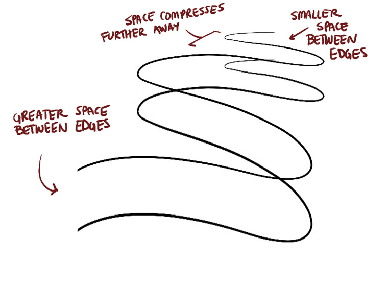
Please take a look at this image (https://d15v304a6xpq4b.cloudfront.net/lesson_images/011d064f.jpg) not only did the size of the arrows have to change, but the negative space between each fold has to also change adhere to it, too. I can see you actually apply this in some of your arrows, I just want to remind you since this is an element that people tends to overlook.
Organic Forms with Contours
-
Now moving on to the organic forms with contours ellipses exercise, you’re doing great with confident lines. You’re also sticking to simple sausage forms which is nice, since we don’t want to end up with forms that are too complex, as being said in the official instruction material. For contour ellipses, I can see that you're intentionally shifting the degree of your ellipses with an awareness as to how they rotate and moving through space, the ellipses also fit in snugly/tightly within the sausage. Good job.
-
The contour curves are also beginning to wrap around believably on the surface of the forms, but they barely changing any degrees unlike your previous exercise, keep in mind when you decided to use this exercise for future warm-ups. One way to help with this is to try using the ghosting method with more consideration and calculation beforehand, also, try to imagine how a sausage would look like in your head and the way the contour lines wraps around the form itself will help you immensely before you put a mark on the page.
-
I also want to note that the concept of “contour” itself. is a double-edged sword. Granted, it’s a very useful tool to describe how a form sits in 3D space, but it can easily work against us by flattening our drawing and makes it hard to read, so use them wisely and sparingly, and make sure to keep experimenting later on.
Textures
-
Textures Analysis: Good! I can see a smooth and seamless transition of dense/sparse in your work. You also being able to identify and distinguish the differences between cast shadow and form shadow, and apply them in your analysis, which consists mostly of cast shadow and clean, implicit mark-making. Also, check out this link: https://imgur.com/a/hCZadzX
-
Dissections: Solid attempt at minding, respect the curvature of the sausage forms, and wrapping the textures around them logically. You also take every chances you got to break the silhouette of the forms, which makes them easier to read. Silhouette-breaking is a super useful tool to help convey the texture better and makes it look more believable/realistic.
-
Some of your texture looks good and you’re able to achieve a nice range of gradient, for example, the Waffle, Mushroom and Strawberry texture. I am also glad to see that you’ve maintained the technique you’ve learned from Texture Analysis and employ it here to your texture drawings.
Though…. We actually request 2 pages of Dissections, not 1!
Form Intersections
- Now moving on to the form intersections, you have drawn your forms in a way that they seem to be sharing the same cohesive, believably 3D space. Good job. It’s very normal to feel like you’re not really comprehend this at its core, since this exercise is only meant to introduce to you about forms and how they can interact and intersect with each other, like puzzle pieces. We will have a lot of opportunities to tackle this again in later lessons so no worries.
Organic Intersections
-
And for the last one, organic intersections, , I want to point out a few things, take a look again at the official website as how it should look like: https://drawabox.com/lesson/2/9/example , https://drawabox.com/lesson/2/9/complicated and https://drawabox.com/lesson/2/9/shadows. Please also check out this link: https://imgur.com/a/fEDQrOs
-
One common mistake people usually made for this particular assignment is not drawing through forms. You should always draw through forms, just like the form intersections exercise. This isn’t mentioned in the instruction, so it’s reasonable that you do not acknowledge and choose not to apply this technique in your assignment, but you have to know that some of the material written on this website is a bit…old, and is in progress of reconstruction. Next time, try to draw through forms when you’re using this as your warm-up exercise.
Overall, you did great! Though, I’ll ask for a redo of Organic Intersections exercise. Please keep in mind everything that I’ve discussed above.
Next Steps:
1 page of Organic Intersection


