Lesson 1: Lines, Ellipses and Boxes

5:49 PM, Sunday December 13th 2020

Drawabox Lesson 1 - Michael Wein - Album on Imgur

Direct Link: https://i.imgur.com/NXHjoht.jpg

Post with 33 views. Drawabox Lesson 1 - Michael Wein

Hello everyone,

This is my first time posting here.

To be honest, drawing with the shoulder and ghosting ended up being much harder than I expected it to be. I'm not really sure what the problem is - when I accidentally revert to drawing with the wrist or drawing without ghosting, I end up with more accurate lines that feel easier to draw. I think I must be doing something wrong, and I'm afraid that I'm picking up a bad habit that I won't be able to fix. I really want to continue with the lessons and improve my drawing skills as a whole, but I don't think I can do so while drawing with the shoulder feels so unnatural.

Any advice or tips whatsoever would be extremely helpful and very much appreciated!

0 users agree
8:14 AM, Friday January 1st 2021

Hi Michael,

I've reviewed your Lesson 1 exercises. I feel that I'm still pretty inexperienced and I just completed Lesson 1 myself, so definitely take what I say with a grain of salt, but I hope my observations can be helpful to you.

Superimposed Lines: I noticed some wobbling on your second page of the exercise, but overall you have pretty steady strokes that maintain one trajectory. You're good at starting lines at the same spot and minimizing fraying at the start point. There's fraying at the end point of your lines, but that’s probably less important that having a steady stroke. There's some more significant wobbling when it comes to curves, but that’s to be expected.

Ghosted Lines: I notice slight wobbling or arcing in some of your lines, but I'm seeing it improve and I think you have a good idea of what you should be aiming for. You'll probably improve just by practicing these as warm-ups from time to time.

Ghosted Planes: Not much different from the Ghosted Lines exercise. There's some wobbling on the first page, but I feel it's getting better by the second and you'll improve with practice. I notice that you don’t really plot the points for the bisecting lines within the planes. The lesson does state to plot out the points for all your lines to guide your ghosting, so I'd recommend trying that and your lines may come out smoother.

Table of Ellipses: You're using the correct technique for drawing your ellipses, e.g. passing over them two to three times, but I do feel that some of your ellipses aren’t too evenly shaped or smooth, so maybe that could be something for you to work on. That might improve with more ghosting of the ellipses. The main focus of the lesson is the smoothness and consistency of your ellipses, so I don’t want to detract from that, but I wanted to mention that your ellipses sometimes extend out of bounds, either overlapping with one another or outside the box. Additionally, the angle they’re pointing at sometimes shifts. These are all things you could work on if you happen to practice the exercise in the future.

Ellipses in Planes: I have the same critiques here regarding your ellipses; I think the strokes could be smoother and more confident. I do think you are improving from Tables of Ellipses exercises, so good job there!

Funnels: Same critique regarding ellipses. You do a good job of keeping the ellipses snug against each other. I did want to add that an additional criteria for this assignment was to try to keep the ellipses aligned with the minor axis. Some of your ellipses slant at an angle and this varies as you go through the funnel. Ideally, the minor axis should bisect the ellipses evenly. This might be easier for you if you use a ruler and something round to draw the outline and extend the axis all the way through the funnel itself. I'd recommend giving this exercise another go with that in mind, and you can work on your ellipses as a whole too!

For the boxes exercises, I just wanted to point out that the lessons wanted us to create two or three frames within a page to do sets of these exercises multiple times. If you feel like you need the practice, you could use this set up to get more practice. The smaller frame might also help because then you could draw smaller boxes, and I feel it’s easier to make smoother lines that way.

Plotted Perspective: This is a pretty straightforward exercise and I don't really see any issues, but I am a bit confused with the perspective of your top-rightmost box. I’m not sure if it’s just the picture, but i believe all the vertical lines of each box should be exactly perpendicular to the horizon. In the picture, the vertical lines of that box looks slanted, so I would just check and make sure all your vertical lines are perpendicular.

Rough Perspective: I do feel like you struggled a bit with this exercise. Some of your lines seem wobbly (which I totally get, I was guilty of this a lot on my exercise as well), but more importantly, some of the plotted points for your boxes lead to slanted edges. With the exception of your edges that converge into the vanishing point, all the other edges of your boxes should be either parallel or perpendicular to the horizon. This is explained quite well in the lesson itself so I would give it another read to make sure you're doing it correctly and give it another try!

Rotated Boxes: I think you did a good of capturing the range of rotation, but some of the boxes are jutting out. The lesson does mention it would be good to keep the gaps between the boxes consistent and narrow, so that’s something you should try to incorporate. Additionally, I feel that some of the angles of the outer boxes might not have the correct trajectory, although it’s a little difficult for me to tell. For example, your two boxes to the center right seem to be getting “taller” or extending vertically, but the top and bottom lines should be angling progressively inward, towards the horizon line. You did this correctly for the two boxes on the center left, so I think you're aware of how it should go. Maybe I'm just seeing it wrong, but if I'm not, I think it would be beneficial to try it again. I did my exercise while watching along with the YouTube video and I found it extremely helpful to see it done step by step. I’d recommend checking it out if you haven’t already!

Organic Perspective: I wanted to point out that you should do your best to make the opposite edges of each face of the box parallel. This was a critique that you gave me when I did the exercise as well, so I’m sure you’re well aware. Knowing it and executing it are totally different things though, so I completely understand the struggle! I think it's fine if you haven't got that down yet, since it'll be a focus in the 250 Box Challenge. Another thing I have to mention is that I feel the sizes of the boxes should increase consistently, to give that sense of dimension as the boxes approach the viewer. I notice that as you travel down the line, some of the boxes get smaller, then larger again. I think it'd be good to give this exercise another attempt.

In regards to your concerns about drawing from your shoulder and ghosting: I personally found that my ghosting improved in accuracy by starting it off more slowly and deliberately. In the beginning, I would just blast through the arm motions over and over without really thinking about where I wanted my pen to start and stop. I found that when I slowed down the motion and tried to ghost closer to the line I wanted to draw, it was more accurate. I'm still struggling to draw good lines, but give that a try and see if it helps! As for drawing from your shoulder, I haven't really found that to be a problem for me (as far as I'm aware). Perhaps finding a good angle for your hand motion would make it easier for you?

Let me know if you have any questions about what I wrote. I hope you found this useful!

  • Francis

Next Steps:

1 page of Funnels

1 page of Rough Perspective

1 page of Rotated Boxes

1 page of Organic Perspective

When finished, reply to this critique with your revisions.
1:35 AM, Sunday January 3rd 2021

Thank you so much for the critique! It was very clear and helpful (especially the part about ghosting), and I'll be sure to keep your advice in mind when redoing these exercises soon!

One quick question - I noticed when doing ellipses that the beginning of the line (the part soonest after I put my pen down to paper) tends to jut out a bit the rest of the ellipse. Do you think that this is a problem? If so, do you have any advice on how to fix it?

7:05 AM, Sunday January 3rd 2021

I can only answer this based off of what I intuitively feel is correct. I would say that it's not something you want to have happen, but it's also not something for you to worry too much about. Theoretically, if you were to draw a perfect ellipse, your entire stroke, from start to finish, should be a part of the ellipse and you wouldn't have any jutting "appendages". That's why I think you don't want to have that happen, but it's pretty normal if it does, because we're obviously not perfect. This probably also depends on how serious the jutting is, but I looked over your ellipses again and I don't think it's that noticeable of an issue.

Ultimately, it's probably better to focus on the qualities emphasized by the lesson e.g. smooth, even shapes. I would imagine this is a problem that will go away as you become more experienced, or it'll at least be something you can work on as you practice ellipses for warm-ups. I don't think you should let it hold you back from moving forward in the lessons. Also, I believe the example homework posted in the ellipses section of Lesson 1 also contains the same type of jutting. If it's even in the example, I'm sure it's expected that students will make similar kinds of mistakes!

4:48 PM, Tuesday January 19th 2021

https://imgur.com/a/pWzY6uJ

Here are my redos! It would be very much appreciated if you could look over it.

View more comments in this thread
The recommendation below is an advertisement. Most of the links here are part of Amazon's affiliate program (unless otherwise stated), which helps support this website. It's also more than that - it's a hand-picked recommendation of something I've used myself. If you're interested, here is a full list.
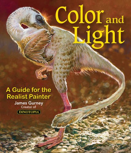
Color and Light by James Gurney

Color and Light by James Gurney

Some of you may remember James Gurney's breathtaking work in the Dinotopia series. This is easily my favourite book on the topic of colour and light, and comes highly recommended by any artist worth their salt. While it speaks from the perspective of a traditional painter, the information in this book is invaluable for work in any medium.

This website uses cookies. You can read more about what we do with them, read our privacy policy.