Lesson 1: Lines, Ellipses and Boxes
3:29 AM, Saturday May 22nd 2021
Please give reviews for my homework

Hi Introvert2005. Let's see:
Also, in the second page there are lines that have too much fraying on both sides. There are even lines that look accurate at the beginning, but have different points of start. You have to take the time and care to put the pen at the starting point. Weirdly, the first page looks better in that aspect, but still, there's fraying.
Ghosted Lines: Much better than the first ones. There is still some wobbliness though. Follow through the line until the end and don't try to correct it midways, that may be causing some of the inestability at the end of the lines.
Ghosted Planes: Same problem as the Ghosted Lines. Some lines are okay, but some are way too wobbly. I don't wanna be a pest, but remember: draw from the shoulder, ghost the lines, and execute them. Try to be accurate, but if the lines don't come out that way, don't worry. It's not the priority right now.
Also, don't redo/trace your lines. There's one plane that has one middle line traced, and another that has a correction. As I said, if the line came out wrong in direction, but confident, it's okay. You can work with that.
Ellipses
Table of Ellipses: They look good in general. There are some that are more angular than others, and there was some spacing issues, but for the most part they look good. In the smaller ones though, you tend to distrust your shoulder and they end up looking wobblier than the big ones. They are all drawn through two to three times, which is great.
Ellipses in Planes: Some of them look good, and some of them have an issue where they look like you restrained yourself so that they could fit the plane perfectly, and as a result, more wobbliness. Still, they look a bit better than the Table of Ellipses, specially some of the smaller ones.
Funnels: Looks like you got the point, since most are close to being symmetrically cut by the minor axis. Some tilt one way or another, and there are a couple funnels where it looks like you could've squashed them together a bit more, but overall, it has the right idea.
Boxes
Plotted Perspective: Looks great for the most part. There's a but, but I'll include it in the Rough Perspective.
Rough Perspective: Two issues. First, the correction lines have to reach the horizon line, and don't go any further. Second, it is important that the lines that go perpendicular/parallel to the horizon line are actually that way. That happened too in some of the boxes of the Plotted Perspective.
Rotated Boxes: Great job here overall. One thing to keep in mind is that sometimes the boxes have too much space in between them (specially the last ones in the central row). But in general, it looks really good.
Organic Perspective: Looks good! Watch out for correcting lines, though.
Great job and congratulations on finishing Lesson 1! I think you will be fine, but remember to draw from your shoulder and ghost your lines, as some of them in those last boxes were still a little wobbly. No worries though, since between warm-ups and the 250 Box Challenge, you'll have the chance to keep working on those lines.
Next Steps:
Move onto the 250 Box Challenge and complete it before tackling Lesson 2.
Incorporate two or three of these exercises into a warm-up routine (ten to fifteen minutes).
Don't forget to have fun and apply the 50/50 rule.
As you move forward, maybe consider helping the community making critiques of Lesson 1. It will be helpful for all of us, including yourself. There's this guide to help you, if you wanna give it a shot, and if you have any doubts, you can go on Discord or Reddit for help.
Thank you!! This made a lot of sense! I will try better next time.

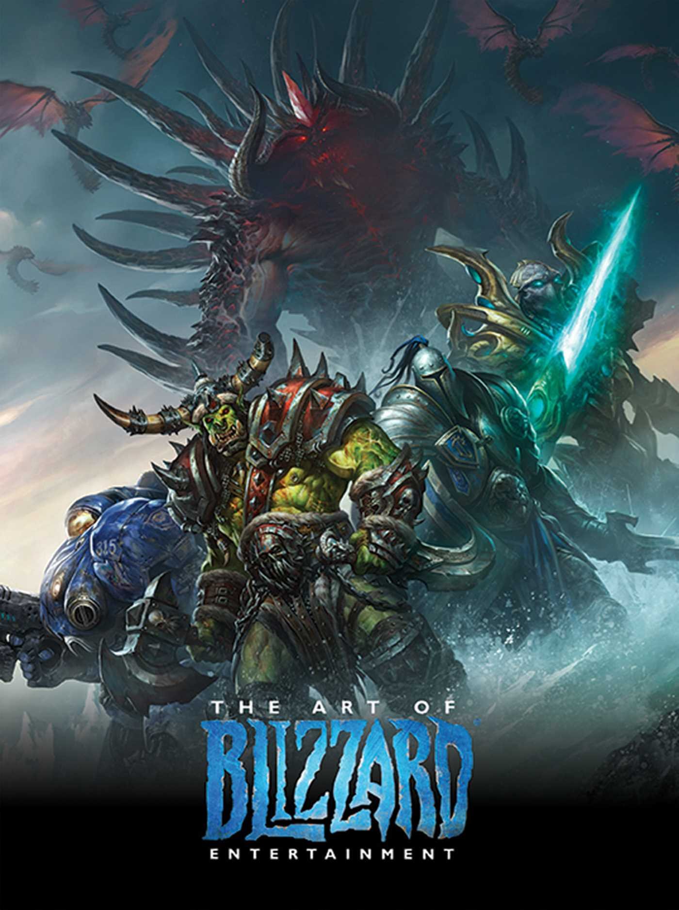
While I have a massive library of non-instructional art books I've collected over the years, there's only a handful that are actually important to me. This is one of them - so much so that I jammed my copy into my overstuffed backpack when flying back from my parents' house just so I could have it at my apartment. My back's been sore for a week.
The reason I hold this book in such high esteem is because of how it puts the relatively new field of game art into perspective, showing how concept art really just started off as crude sketches intended to communicate ideas to storytellers, designers and 3D modelers. How all of this focus on beautiful illustrations is really secondary to the core of a concept artist's job. A real eye-opener.
This website uses cookies. You can read more about what we do with them, read our privacy policy.