250 Box Challenge
11:25 PM, Saturday January 2nd 2021
Submitting again since i got no response in over 2 months :/

Box size is decent but you could challenge yourself with bigger boxes like the last two you've made. There is room for that. Line extension is good. Dramatic to shallow box ratio is good, but there could be more shallow boxes. With those, you want to avoid parallel convergences since those are considered mistakes. Lines are okay. Just remember confidence>accuracy so they don't wobble.
Boxes are generally varied. Good job with that. Only thing to say is that your Y angles could be a bit more varied. Here's a diagram that might help you with that. Remember, the Y can have any with or angle combination as long as the angles are greater than 90°. Try doing more boxes along the horizon line or facing towards the viewer.
For the back lines/inner corner, they tend to diverge and converge too much, and sometimes it's a byproduct of the outer line convergences. This diagram shows how you can think about the relationships between lines instead of in pairs. Basically, if the inner corner sits closer to the center of the Y, the back line convergence can be parallel to the initial Y. Conversely, if the inner corner sits farther from the center of the Y/closer to one of the tips (usually seen on longer boxes), the back line convergence can be almost parallel to the outer edge of the box. it's okay if you don't understand this right now. It takes a lot of time and practice before it properly sinks in. There's also this diagram which shows how you can change the order in which you draw the lines to get a better understanding of the back line relationships.
Overall solid work. you've improved a great deal over the course of this challenge. I'll mark as complete so you can move onto lesson 2.
Next Steps:
lesson 2
Thank you for the review! Like I mentioned in the above, I finished them over 2 months ago and in the meantime I also finished lesson 2 and have been waiting since :P
If you have the time I would appreciate you taking a look at that one as well.
Doing one was such a massive pain to me that i didn't even notice i needed to do 2 pages... Could you critique it anyway I hate the textures exercises so much
Hello, RANDOMY220. Congrats on completing the 250 Box Challenge! Here are some of my thoughts and remarks:
-Lacks line weight, don't be afraid to go over your lines, as long as you plan them and apply the ghosting method you will be fine. (confidence > accuracy)
Remember line weight is applied to the contour of a form to clarify which side is facing towards the viewer.
-Hatching could use improvement, I suggest keeping it tighter, and I expect your accuracy will improve as you continue to practice.
-Great improvement on the lines' convergences. There is a noticeable improvement from the beginning to the end.
-Line quality seems pretty solid, so does accuracy, with some minimal wobbling.
-I'd advise against going over your original lines while checking your convergences (as you sometimes did), as this makes it harder to evaluate the actual quality of the line.
-Inner corner could be improved, but this is to be expected. Keep this in mind (https://i.imgur.com/8PqQLE0.png). Alternatively, some students find it easier to employ this (https://imgur.com/FGdtVwm) method.
Overall a pretty solid submission. I have no problems marking this as complete and wish you the best moving forward!
If you have time I'd appreciate a review of my submission
https://drawabox.com/community/submission/7I17HXKL
Cheers!
-Slyx
Next Steps:
Overall a pretty solid submission. I have no problems marking this as complete and wish you the best moving forward! If you haven't I suggest you join the Drawabox Discord server for more guides and tips on common mistakes.

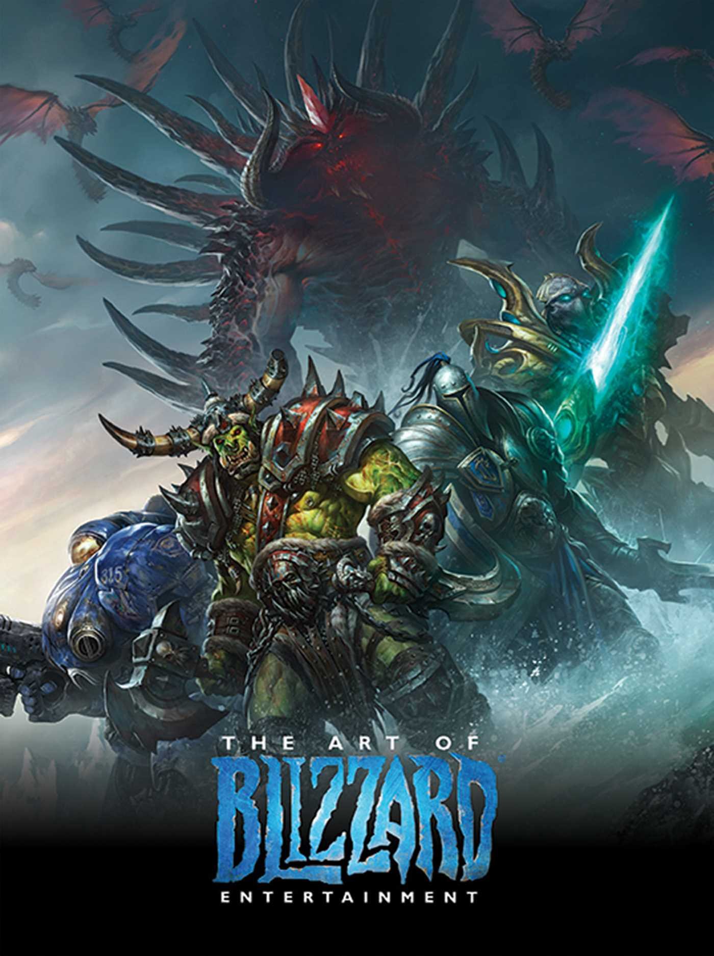
While I have a massive library of non-instructional art books I've collected over the years, there's only a handful that are actually important to me. This is one of them - so much so that I jammed my copy into my overstuffed backpack when flying back from my parents' house just so I could have it at my apartment. My back's been sore for a week.
The reason I hold this book in such high esteem is because of how it puts the relatively new field of game art into perspective, showing how concept art really just started off as crude sketches intended to communicate ideas to storytellers, designers and 3D modelers. How all of this focus on beautiful illustrations is really secondary to the core of a concept artist's job. A real eye-opener.
This website uses cookies. You can read more about what we do with them, read our privacy policy.