


Lesson 3: Applying Construction to Plants
10:36 AM, Friday March 12th 2021

Hi, I'm enjoying the challenge of drawabox. Looking forward to the feedback.
Thanks
Starting with your arrows, you've drawn these with a good deal of confidence, and have done a good job of capturing a strong sense of fluidity in how they move through space. You do hesitate a little and use a more chicken-scratchy approach when adding line weight though - remember that you should be using the ghosting method to execute those marks just as confidently as the original linework. If you miss the mark, that's okay - these are just exercises. So don't worry about correcting the mistake, or drawing in a way that prioritizes that accuracy over fluidity.
Continuing onto your leaves, you've done a good job of carrying over that same confidence and fluidity to capture not only how the leaves sit in space, but also how they move through the space they occupy. I'm also quite pleased with how you've built up your edge detail, doing so with individual strokes for each little bump/variation. Do be sure to take a little more time and care when doing this in the future though - you end up with little gaps in some cases as shown here and here, where the addition doesn't blend seamlessly into the original edge.
Continuing onto the branches, these are headed in the right direction, although in a number of places you aren't quite extending your segments fully halfway to the next ellipse. As explained here in the instructions, the overlap we get from that additional extension helps the segments flow more smoothly and seamlessly from one to the next.
Moving onto your plant constructions, as a whole you've honestly done a pretty great job. Your constructions feel solid, your metals and leaves continue to flow fluidly through space, and you're approaching each object in stages, building up to a final result through the combination of simple forms, rather than jumping ahead in complexity without sufficient structure to support it.
Looking over your work, I'm really only seeing one minor issue I want to address. There are definitely cases in some of your drawings, like in this specific crop of this page where you end up with sudden jumps in line weight. Usually when I see this from students, it's because they've made a mistake and they've attempted to cover it up or correct it - resulting in more line weight in an area where it really doesn't belong.
As a rule, don't fix your mistakes. Leave them alone, so they have a better chance of blending into the rest of the drawing, instead of standing out. Line weight itself isn't intended as a tool for fixing things - it serves its own purpose, to clarify specific overlaps between forms, in localized areas. Line weight should always be subtle (like a whisper to th viewer's subconscious, rather than a shout), and should be limited to specific sections, blending back into the original weight of the stroke instead of attempting to reinforce its entirety.
On a related note, on this succulent plant, it seems that here you're kind of mixing line weight and cast shadows. This is common, because they seem very similar, but it's important to lay out the differences in how they're meant to be used. Where line weight needs to be kept really subtle, and can cling along the silhouette of a given form, cast shadows can be as bold and broad as we want, but must be cast onto the surface of another form. They can't just cling to the silhouette as line weight can, because that makes it seem like there's meant to be a surface floating in the air to receive them.
In your succulent, it appears that those shadows follow the silhouette of the forms that are casting them. In situations like this, you'll want to put a bit more consideration into the distance between the form casting the shadow, and the surface receiving it, and ensure that the cast shadow is indeed wrapping along that surface.
Lastly, make sure your cast shadows abide by a consistent light source - you don't want them casting both to the left and the right.
Aside from that, you're doing very well. I'll go ahead and mark this lesson as complete.
Next Steps:
Feel free to move onto lesson 4.
Thank you so much for the feedback.
I will definitely try to keep these points in mind.
Drawabox has been such an eye-opening, challenging and useful learning experience so far. Thanks for creating this brilliant monster!
Much appreciated,
Cheers
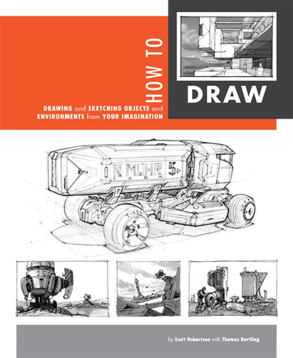
When it comes to technical drawing, there's no one better than Scott Robertson. I regularly use this book as a reference when eyeballing my perspective just won't cut it anymore. Need to figure out exactly how to rotate an object in 3D space? How to project a shape in perspective? Look no further.
This website uses cookies. You can read more about what we do with them, read our privacy policy.


