View Full Submission View Parent Comment
2 users agree
2:43 PM, Saturday April 24th 2021
edited at 6:05 PM, Apr 24th 2021

I tended to focus on 3d shapes only in this exercise although I did add what was considered too much detail or black fill in a couple.

My view is to focus on consistent pen weight for as long as possible. Only use extra where it helps with a potentially confusing situation that it will help clarify. Such as ensuring one of two crossing legs is in front of the other.

Spines, antennae etc are all 3d shapes in space so they are construction not detail. You could have one long, thin tube for an antenna and then add segmentation around. That is fine.

If you see clear cast shadows then you can use them but I think clear construction is more important.

edited at 6:05 PM, Apr 24th 2021
6:19 PM, Saturday April 24th 2021

Thanks! Your point about using consistent pen weight is well taken. It made me realize that I probably push the pen too hard way too early, and that those thicker lines end up clashing with the lighter lines of the initial construction. I'll try to apply my pen pressure more uniformly and save the heavier lines for clarification like you suggested. Really good advice!

The recommendation below is an advertisement. Most of the links here are part of Amazon's affiliate program (unless otherwise stated), which helps support this website. It's also more than that - it's a hand-picked recommendation of something I've used myself. If you're interested, here is a full list.
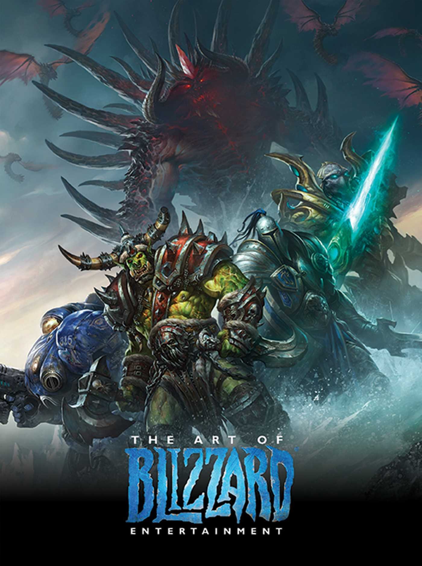
The Art of Blizzard Entertainment

The Art of Blizzard Entertainment

While I have a massive library of non-instructional art books I've collected over the years, there's only a handful that are actually important to me. This is one of them - so much so that I jammed my copy into my overstuffed backpack when flying back from my parents' house just so I could have it at my apartment. My back's been sore for a week.

The reason I hold this book in such high esteem is because of how it puts the relatively new field of game art into perspective, showing how concept art really just started off as crude sketches intended to communicate ideas to storytellers, designers and 3D modelers. How all of this focus on beautiful illustrations is really secondary to the core of a concept artist's job. A real eye-opener.

This website uses cookies. You can read more about what we do with them, read our privacy policy.