Lesson 1: Lines, Ellipses and Boxes
8:32 PM, Thursday February 13th 2020
Hello,
Here's my submission for lesson 1. Any feedback is appreciated.
Also, can I move on to the 250 box challenge or is there anything that I should redo first?

Hey there, TA Meta here to look over your work, so let's get started.
Starting with your superimposed lines, these are looking great. They're nice and confident and you're taking the time to line your pen up on the starting point, which limits the fraying to one end of your line. Your pen does seem to be dying a lil but looks like you replaced it before starting your ghosted lines and planes - which are again, looking beautifully straight and confident.
Next your tables of ellipses are looking really good. You've packed your ellipses in there nice and tightly and the ellipses themselves are a good shape and drawn with a lot of confidence. As you get more mileage with these, you'll be able to work on tightening that second pass up and having it fall closer to the first. Your ellipses in planes exhibit the same well-shapen and confident linework that we saw in the previous exercise. It's great to see that you haven't sacrificed this confidence for a need to be accurate. Finally, your funnels also look really good, you've managed to correctly align them to the minor axis. There's only very slight signs of skewing here and there but that's honestly more of a nitpick.
Onwards to your rough perspective and you've done a fantastic job here keeping your horizontals and verticals aligned parallel and perpendicular to the horizon line respectively. There's a very slight drop in line confidence here but it's clear that you've taken your time to think about what line you need to put down next and as a result, a lot of your boxes a pretty close with their convergences and where it does stray, it's generally in the ways we expect to see - e.g. boxes further from the VP are more inaccurate.
Next you've done a good job keeping the gaps between the boxes on your rotated boxes nice and consistent. You did draw this a bit small, we do encourage students to draw as large as possible because it gives our brains room to work through the spatial problems we're presenting them with, especially tricky ones like this! Anyway, you've managed a fair amount of rotation on a couple of the axes while on others you've tended to follow the vanishing point of the previous box rather than sliding it along the axis. I noticed this particularly on the rear planes of your boxes, where some of them are almost facing us straight on while the front face is converging. These last two exercises are intended as a kind of introduction to new types of spatial problems you'll tackle in your box challenge, so we don't expect students to nail them down the first time.
Finally, your organic perspective is off to a good start, you've created some interesting compositions here with the variation in scale of your boxes and overlapping conveying a fairly relatable scale. I did notice that you had a tendency to "correct" lines here, which we discourage, as you tend to reinforce the mistake and draw more attention to it, as well as these particular lines not being as well planned as the first one you lay down.
Next Steps:
Solid work! Make sure you draw large and try not to correct lines as a kneejerk reaction to being wrong. Feel free to move onto the 250 box challenge.
Thank you very much for the in depth reply.
Regarding the corrections, I noticed that myself, as you guessed, they do not come up as a "thought" mark, it's more like an intuitive reaction. Perhaps an old habit. I will try to stop doing that.
I'm going to continue while keeping in mind everything you said.
Onward to the box slaughterhouse then!

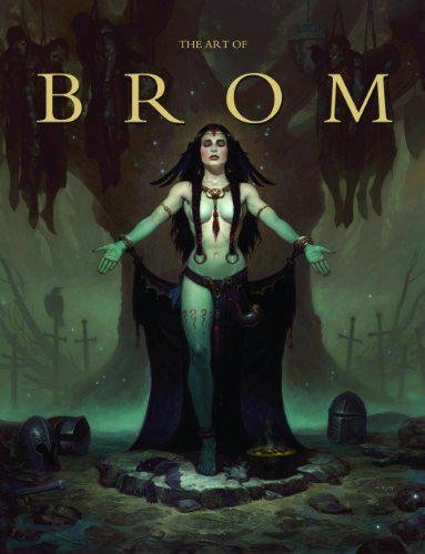
Here we're getting into the subjective - Gerald Brom is one of my favourite artists (and a pretty fantastic novelist!). That said, if I recommended art books just for the beautiful images contained therein, my list of recommendations would be miles long.
The reason this book is close to my heart is because of its introduction, where Brom goes explains in detail just how he went from being an army brat to one of the most highly respected dark fantasy artists in the world today. I believe that one's work is flavoured by their life's experiences, and discovering the roots from which other artists hail can help give one perspective on their own beginnings, and perhaps their eventual destination as well.
This website uses cookies. You can read more about what we do with them, read our privacy policy.