


250 Box Challenge
2:47 PM, Saturday July 4th 2020

Finally done with my boxes :)
Wow! These look incredibly solid. Are you sure you drew these freehand? Because your lines are incredibly straight, it's impressive!
Apart from a few places where the lines don't meet perfectly at the back, a few stray lines who diverge from their VP, and a few boxes who seem slightly too distorted by perspective, I think you really got the hang of it. One last thing though : when putting weight on lines, make sure the lines merge with one another, otherwise it gives the impression that you tried to draw the same line several times until you got it right, and the final result looks more sketchy.
Next Steps:
Move on to the next lesson on contour lines, texture and construction. You can go back to previous lessons if you feel the need or just to warm up, but otherwise I'd say you're on the right path.
Thanks!
The more distorted boxes are intentional, I recall the assignment saying you could throw in some boxes with more dramatic foreshortening. I will work on the line weight.
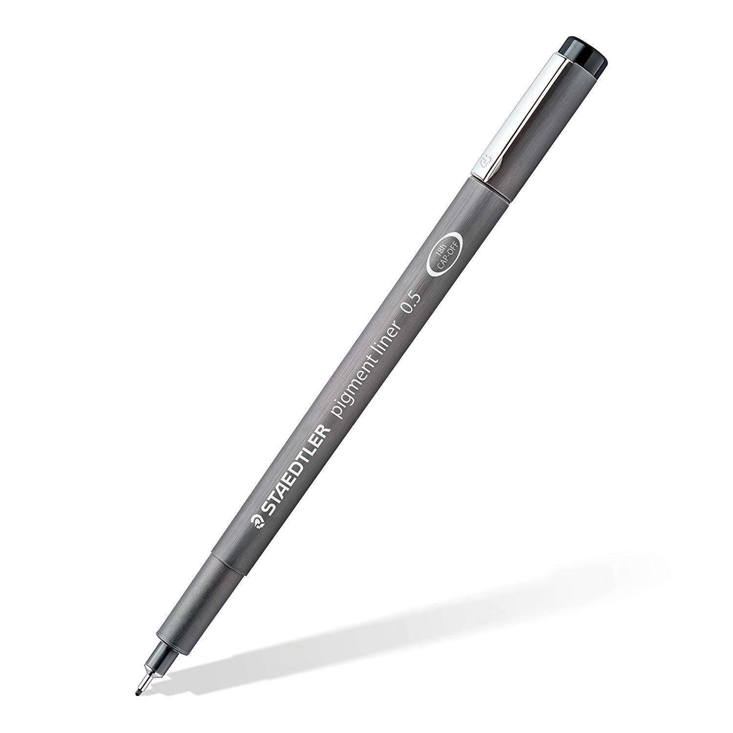
These are what I use when doing these exercises. They usually run somewhere in the middle of the price/quality range, and are often sold in sets of different line weights - remember that for the Drawabox lessons, we only really use the 0.5s, so try and find sets that sell only one size.
Alternatively, if at all possible, going to an art supply store and buying the pens in person is often better because they'll generally sell them individually and allow you to test them out before you buy (to weed out any duds).
This website uses cookies. You can read more about what we do with them, read our privacy policy.


