


This website uses cookies. You can read more about what we do with them, read our privacy policy.
2 users agree
7:11 AM, Thursday December 9th 2021
Hello rafael,
i will be looking over your lesson 2 , so lets see what we have got here
Arrows :
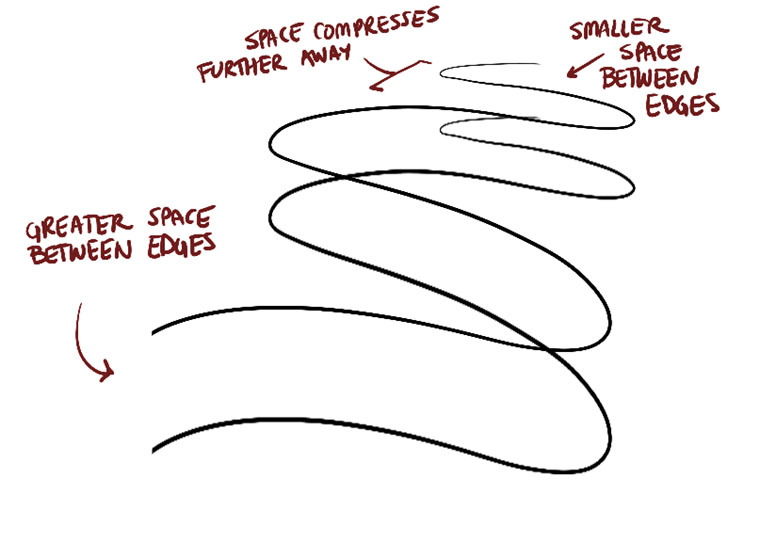
Good confidence of line, i will over look the wobbly line arrow in top right corner of 1st page and one in middle of your 2nd page. you've properly compressed the width of the arrows but i'm concerned about the "space" which is not compressing reference here and in some arrows its reverted too. . I see you have made some arrows reverted , the arrows end being farther and the blunt end being nearer to the viewer. I wont really deem it as a mistake because its not that bad and some technical facts like perspective is on point. But i will recommend you to not do more than the lesson has advised. Good use of line weight. It seems it was being properly shosted and then drawn. The hatching is also fine.
Organic forms:
They sure do feel solid thanks to the change in degree of ellipses and curves inside the organic form. i will mention you about the "shape" of the organic form. What you have done cant really be called a mistake but i'm sure you could do lot better. keep your sausages simple and avoid midsection pinch, plus the ends of sausage should be made of two identical spheres . reference here. try ghosting your organic forms before drawing them too. The contour curves and ellipses do fit well inside the sausage form, and are confidently drawn. nice work.
Texture :
The texture analysis is fine but the transition isnt very smooth. Your dissection part is very interesting and cool. You have done great job in breaking the silhouette which helps to convey the information more accurately. You have a little problem with wrapping the silhouette with texture. As i can see in ginger, the texture line should be curved with respect to the curve surface of the organic form. same with the end of seashell's , curve those texture lines . reference here
Form intersection :
The forms are consistent. good and confident lines, overall it feels solid, and the intersections are on point as well.
i see a little problem in your organic intersection though, You know the shadow is supposed to take the shape of the form it is being casted upon. reference here
we are supposed to make the sausage that feels like water balloons , they'd float while still maintaining the 3d form. so i'd say the slender sausage on top right of your second page feels quite stiff. here's the reference
so thats it. you've made some minor mistakes here and there. Just make sure to go over them once again and try to avoid such mistakes in future. Overall, you've done fine so i'm marking this lesson complete.
Next Steps:
on to lesson 3.
5:56 PM, Monday December 13th 2021
Thank you so much for the in-depth critique, really appreciate it !
I recognize the mistakes i did on the arrows and organic forms, i think they could have been avoided if i was more focused on what i was supposed to do.
On the texture i was struggling with the transitions a lot, couldn't make them smoother and was not sure how much/less shadow forms i should have added to the transitions. On the sausages some i was able to somewhat make them turn around the shape but others i got i bit lost.
The organic intersections i was keeping in mind the shape of the form underneath but i think i was afraid of letting the shadow curve too much and didn't push them too much. The sausage on the top right 2nd page that is floating was very badly planned.
I will keep this in mind and try to avoid such mistakes in future exercises.
Again thanks a lot for the critique !
The recommendation below is an advertisement. Most of the links here are part of Amazon's affiliate program (unless otherwise stated), which helps support this website. It's also more than that - it's a hand-picked recommendation of something I've used myself. If you're interested, here is a full list.

Cottonwood Arts Sketchbooks
These are my favourite sketchbooks, hands down. Move aside Moleskine, you overpriced gimmick. These sketchbooks are made by entertainment industry professionals down in Los Angeles, with concept artists in mind. They have a wide variety of sketchbooks, such as toned sketchbooks that let you work both towards light and towards dark values, as well as books where every second sheet is a semitransparent vellum.