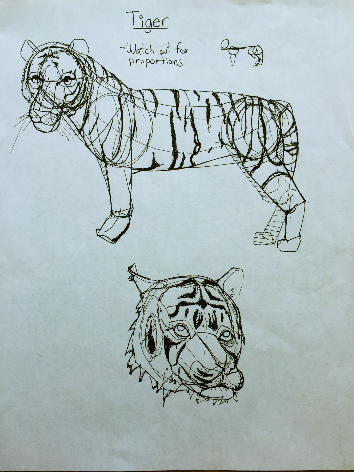
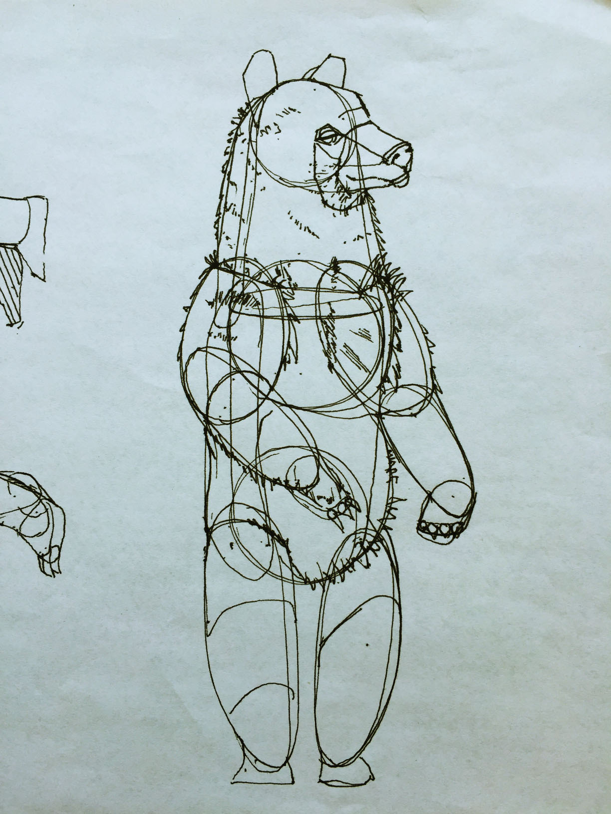
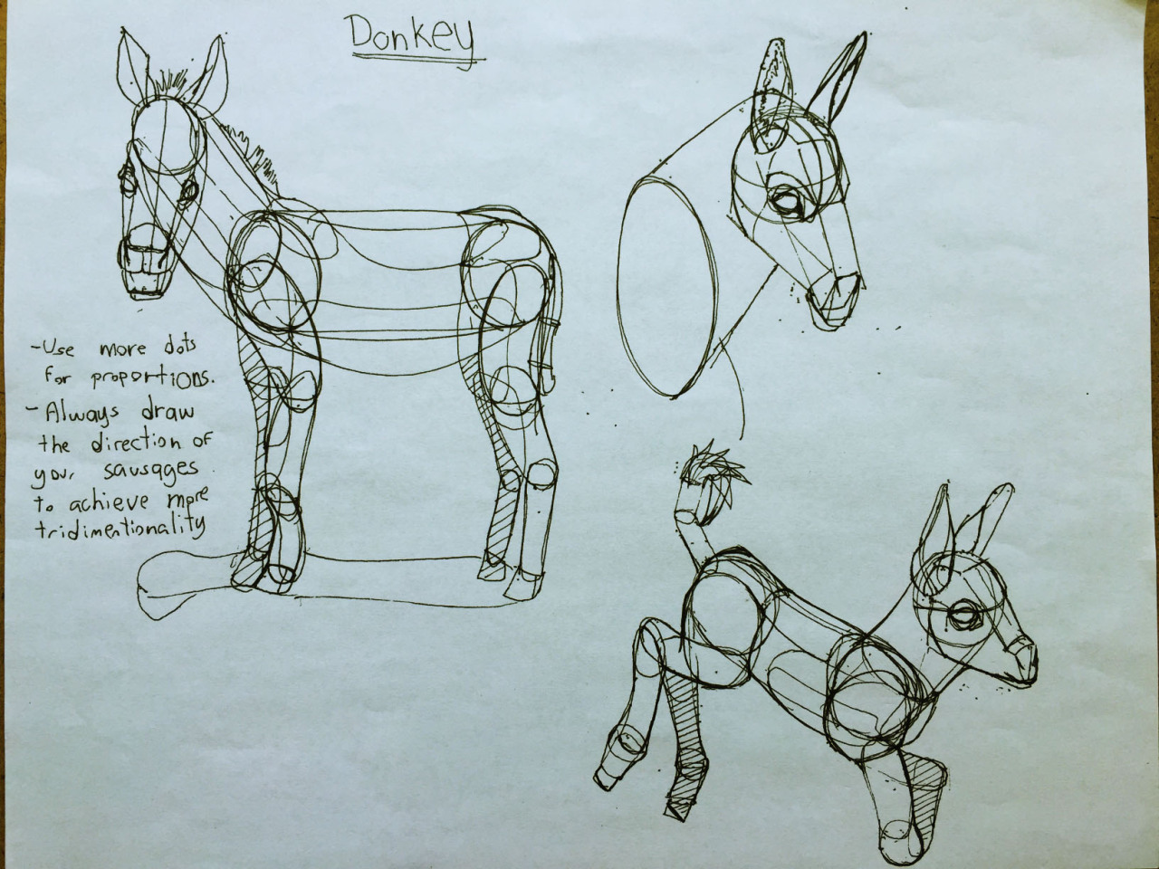
Lesson 5: Applying Construction to Animals

6:55 PM, Thursday February 6th 2020

Chears on Tumblr

Tumblr: https://mrchearlie.tumblr.com/post/190498545385/drawabox-lesson-5

Drawabox - Lesson 5

Here it is lesson 5, it was the lesson that took me the most effort to finish. The difficulty increased quite a bit compared with the previous lessons or at least for me.

I must add, someone recommend me to look for rhythm in order to improve my proportions and sent me this video. https://www.youtube.com/watch?v=PZufU_-Bj-w&t=14s It helped quite a lot, the first try I kinda went a little away from what you were asking. But I think I managed to apply the rhythm without ignoring the construction part.

As always thank you for the critique beforehand. And thank you so much for the credits. I have been applying for jobs and it looks that next week I might get one. I'll be glad to support you again on patreon as soon as I can :)

0 users agree
8:32 PM, Friday February 7th 2020

Whew! Your work here is honestly looking pretty fantastic. There's a obviously some areas that you struggled with initially, but I believe as you pushed through the lesson your grasp of the material increased a great deal, and your constructions came out, at least for the most part, solid and believable.

Starting with your organic intersections, these demonstrate a really good understanding of how these forms interact with one another in space, and how to really sell the idea that they're not just shapes pasted on top of one another. It's clear that your brain went through figuring out how they actually rest atop each other, and how gravity drags their mass downwards, resulting in them wrapping around the forms beneath them.

Moving onto your first animal constructions, you start out with a lot of strengths, though it's clear that you're still getting your head around how this stuff works. In some areas you may overuse contour lines, like adding two along the relatively short neck of the toucan was probably not really necessary, and it resulted in you thinking more about how the ellipses ran along the surface of the neck itself, and missing just how that bottom ellipse really defines the relationship between the neck and torso. This is something you did a far better job with in the pigeon, where the neck actually feels as though it is coming off the torso.

There are definitely different ways one can use contour lines, and some kinds of contour lines are far more valuable/effective than others. We've got the ones that run along the surface of a single form, describing how its surface deforms through space, and they're nice enough and can offer some additional reinforcement to our forms. The ones that are vastly more useful and perhaps should be our central focus, are those that define the relationships between two forms - the intersection contour lines that show us how things connect. They're much more effective due to how they establish a recursive link between those two forms. If one of those forms feels solid and 3D, then so too must the other one (due to the established relationship), and in turn if that second one therefore feels solid and 3D, then so too must the first, and on and on. It's a self-reinforcing illusion that becomes very strong.

It's always best to focus your use of contour lines on this kind. Sometimes the simpler sort that sit along the surface of a single form are valuable and can still help, but keep in mind that contour lines are by their very nature, diminishing in their returns. The first one we add may be very effective, the second less so, and the third even less than that. If we can nail these illusions by establishing the relationships between our forms, then any additional contour lines just along the length of a single form become unnecessary.

Moving forward, another issue I noticed early on (and less so in your later drawings), is how sometimes you cut into your forms as flat, 2D shapes on the page, rather than manipulating them in 3D space. So what stands out to me right now is this tiger, and how the little tuck along its belly cuts back into the actual 2D shape of the torso sausage.

Construction comes in two flavours - additive and subtractive. Additive is where you put down a form, and then draw another form on top of it, clearly establishing how the second form relates to the first in 3D space. This is what we usually use, and I encourage its use because through the act of doing it, it helps further develop our understanding of how these forms relate to one another.

Subtractive on the other hand is often misunderstood. Many students will try to cut back into their forms as you've done here - cutting back into the shape of it on the page, separating it into 2D sections, some that remain and others that ultimately have to be ignored. Instead, subtractive construction is all about separating the given form into sections in 3D space. That is, we cut it into pieces by drawing lines along that form's surface - contour lines where our pen works more like a scalpel, cutting into it. Once these sub-forms are defined, we can choose to say that one defines three dimensional space that is positive, and the other defines space that is negative (meaning cut away). The key is that all of this occurs in 3D space, and the result is that the resulting forms and the object that comes out of it still feels real, rather than having reminders and contradictions that suggest the object is just made up of lines on a page.

Now, when it comes to organic forms like the torso-sausage, I'd be a lot more hesitant to approach that subtractively. As mentioned before, I encourage the use of additive over subtractive wherever possible. In the case of this tiger, where it clearly has an extra tuck, the best approach would probably be to draw an additional mass, as you've done in many other later drawings (like your bears). That said, in the bears, since the belly sag is generally more evenly distributed, I would incorporate this sag into the original torso sausage instead of through an additional mass. I actually mention this in this section from the lesson. This may mean having a dip along the top of the sausage (around the spine area of the animal), but you can always build that up with additional masses, which will work better there due to them working with gravity rather than against it.

The last thing I wanted to bring to your attention is just a re-emphasis on the specifics of the sausage method (which we use for constructing legs). I think that while you're aware of it, you do stray from it here and there. The sausage method is made up of very specific requirements:

  • Each sausage needs to be essentially two equally sized spheres connected by a tube of consistent width. In this bear, you used stretched ellipses for your segments, which end up being much more stiff than these simple sausage forms, which themselves convey a greater sense of gestural flow.

  • The sausage forms need to overlap nicely, as though they're interpenetrating/intersecting one another.

  • We must reinforce the actual intersection of those sausage segments with a contour line that clearly defines the relationship between them. This helps take a gestural chain and give it the illusion of solidity and structure. They are distinct forms, but with clear relationships between them in space.

You use the sausage method more correctly in some places - like the donkey on the top left of this page - but in most cases you appear to think in terms of whether or not the leg you're looking at appears to be a chain of sausages. If not, you move onto some other technique.

The chain of sausages is ultimately intended to build an underlying armature, a structure onto which you can append more forms as shown here. So if you need more bulk, that's fine - but you should still start out with the sausage method.

So! I think I've covered all the bases here. Your animal constructions are still largely well done, and while you do struggle with proportion in areas, you appear to be approaching that problem productively. I also think you did an especially good job with your elephants, while despite not using the sausage method (I think I hadn't quite pinned that one down by the time I did my own elephant demo either), they look very solid and believable.

Oh, I should mention - I totally rewrote the textuere section of lesson 2, and while you appear to be doing fine with what little texture you've added here and there, the new material there may be of use to you.

I'm going to go ahead and mark this lesson as complete. Keep up the good work.

Next Steps:

Move onto the 250 cylinder challenge, which is a prerequisite for lesson 6.

This critique marks this lesson as complete.
9:53 PM, Friday February 7th 2020

Thank you so much for the feedback, I actually struggle quite a bit with the legs because you seem to be more carefree on how we could approach it, although I never stopped to think about the dates those demos were released. So my approach was to experiment as much as I could with all the information I was given to get legs that I liked. But now I know that the donkeys route was a good way. The little donkey's one really look solid for me :3. I'll also be more careful where to add contour lines.

Again, thanks for the feedback.

The recommendation below is an advertisement. Most of the links here are part of Amazon's affiliate program (unless otherwise stated), which helps support this website. It's also more than that - it's a hand-picked recommendation of something I've used myself. If you're interested, here is a full list.
The Art of Blizzard Entertainment

The Art of Blizzard Entertainment

While I have a massive library of non-instructional art books I've collected over the years, there's only a handful that are actually important to me. This is one of them - so much so that I jammed my copy into my overstuffed backpack when flying back from my parents' house just so I could have it at my apartment. My back's been sore for a week.

The reason I hold this book in such high esteem is because of how it puts the relatively new field of game art into perspective, showing how concept art really just started off as crude sketches intended to communicate ideas to storytellers, designers and 3D modelers. How all of this focus on beautiful illustrations is really secondary to the core of a concept artist's job. A real eye-opener.

This website uses cookies. You can read more about what we do with them, read our privacy policy.