


Lesson 5: Applying Construction to Animals
1:26 AM, Wednesday May 19th 2021

Finally, finally I finished this homework. It's even harder than I imagined, but I'm quite happy now. Thank you sooo much for your time.
It may have been difficult, but it looks to me like you did a particularly great job.
Starting with your organic intersections, these are looking quite solid. You're establishing strong relationships between the forms in how they wrap and slump against one another, and your cast shadows are generally looking fairly consistent. I can see that you specifically chose to have your light source shine from directly above, which made a rather distinctive pattern of cast shadows. It doesn't look like they were incorrect, but I would definitely advise you to pick a direction that produces shadows being cast to the left or the right in a more noticeable fashion. When we get too close to a very specific border between choices, it becomes very easy to slip up in small ways that the viewer will pick up on.
Moving onto your animal constructions, I'm going to move through them and point out both things I feel you did well, and things that could be better.
For your bird head constructions, I felt you paid a fair bit of attention to how the beak related in 3D space to that initial cranial ball, which helped reinforce the solidity of both elements. The eye sockets however were left out of this, and ended up feeling much more like they were pasted on like stickers, without being as solidly grounded in the existing construction. I saw this same issue to varying degrees throughout your animal constructions - the eye sockets were sometimes a bit more closely related to the other elements of the head, but they more often tended to be free-floating. More than that, it seems more like you were trying to draw something more akin to the eye itself, rather than the eye socket, which also limited how big you were willing to make it relative to the rest of the head.
The key here is to draw every element of the head so they wedge together like a three dimensional puzzle, as demonstrated and explained in this informal demo. Note specifically how big the eye sockets themselves are, as well as the specific way they're shaped. The upturned pentagon allows for a sort of wedge between them for the muzzle to fit, as well as a flat edge upon which the brow ridge can be placed. All of this allows the pieces to fit together, grounding one another in 3D space. Even if the eye sockets themselves are exaggerated in size in order to reach all the way to the muzzle, it works out fine because they're something more of an abstract tool - a structure we're building under the surface just to ensure that there are strong, clear relationships between all of these structures, and that we avoid gaps as much as possible.
Moving forward, I have just a minor thing to suggest when tackling wings and other similarly feathered elements. Instead of working subtractively - that is, blocking the wing out and then treating it more like a guide, it's best to treat the structure you draw as though it is solid and three dimensional, and attach your feathers to it as shown here. It's a minor thing, but it'll help your constructions feel even more solid in those situations.
Beyond those two points, I think your work is fantastic. You're demonstrating an excellent grasp of how your additional masses wrap around the existing structure, and how to specifically design those silhouettes so they establish that relationship in 3D space in a believable fashion. You're also employing the various techniques - like the sausage method - to great effect to build your way up to complexity rather than jumping straight into it too early.
So- I've given you a couple things to continue thinking about, but all in all you're doing great. I'll happily mark this lesson as complete. Keep up the fantastic work.
Next Steps:
Feel free to move onto the 250 cylinder challenge, which is a prerequisite for lesson 6.
This recommendation is really just for those of you who've reached lesson 6 and onwards.
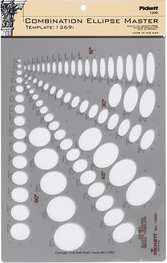
I haven't found the actual brand you buy to matter much, so you may want to shop around. This one is a "master" template, which will give you a broad range of ellipse degrees and sizes (this one ranges between 0.25 inches and 1.5 inches), and is a good place to start. You may end up finding that this range limits the kinds of ellipses you draw, forcing you to work within those bounds, but it may still be worth it as full sets of ellipse guides can run you quite a bit more, simply due to the sizes and degrees that need to be covered.
No matter which brand of ellipse guide you decide to pick up, make sure they have little markings for the minor axes.
This website uses cookies. You can read more about what we do with them, read our privacy policy.


