This website uses cookies. You can read more about what we do with them, read our privacy policy.

10:40 PM, Monday May 22nd 2023
Hey, I’ll be grading your boxes.
Extended Lines:
Here and there near the beginning, a few of your boxes have lines extended in the wrong direction. But, to your credit, you seemed to have quickly gotten the hang of it. Nice job.
Diverging/Parallel Lines:
I see more diverging lines than I do lines extended in the wrong direction, but not many. Can’t say I see any boxes with parallel lines either.
Hatching:
You didn’t hatch, which is fine, but it does help tell the viewer what side of the box is facing them.
Lineweight:
Also looks good. Subtle enough that I had to specifically look for it, but not too subtle to see once I started. I will say that it looks like you added it to the inside of the boxes sometimes though. Remember: line weight is for the silhouette of the box, not the inside.
Wobbly/Repeating Lines:
I can see in certain places where you repeated a line, probably to get the trajectory of it right. It’s hard to do, but you’ve got to ignore the urge to do it over again. Like Uncomfortable said, it makes for a messier drawing. Your lines are nice and confident though. So devoid of wobble that I actually wondered a bit if you were using a ruler to make these lol.
Box Orientation:
I mean, there’s only so many ways you can draw 250 boxes without repeating a few. I don’t see any egregious repeats like a whole page of the same type of box at the same angle and same size or anything like that, so you’re good.
All in all, I say you pass. You can move on to the next lesson.
Next Steps:
Move on to the next lesson

The Science of Deciding What You Should Draw
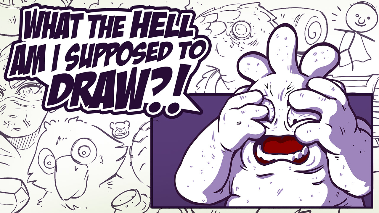
Right from when students hit the 50% rule early on in Lesson 0, they ask the same question - "What am I supposed to draw?"
It's not magic. We're made to think that when someone just whips off interesting things to draw, that they're gifted in a way that we are not. The problem isn't that we don't have ideas - it's that the ideas we have are so vague, they feel like nothing at all. In this course, we're going to look at how we can explore, pursue, and develop those fuzzy notions into something more concrete.


