This website uses cookies. You can read more about what we do with them, read our privacy policy.

11:37 AM, Tuesday January 17th 2023
Welcome to drawabox, and congrats on completing Lesson 1. I’ll be taking a look at it for you.
Starting off, your superimposed lines look great. I’m glad to see that you’ve chosen to fill your page to the brim, here – it has served you well. As for the lines themselves, they’re smooth, properly lined up at the start, and of a consistent trajectory throughout – well done. The ghosted lines/planes look quite confident, too, but it seems like you’ve forgotten to plot start/end points for the non-diagonal center lines of the planes. If I couldn’t tell this just by looking at how they’re not there, I’d certainly be able to by seeing how wobbly your lines get as they approach these missing points. That should tell you why they’re important, though you do, technically, know where the line should stop.
Moving on to the ellipse section, the table of ellipses exercise has definitely proven to be a bit of a struggle, but you’re on the right track. There’s 2 main issues, I’d say, and they all stem from the same thing. The first is that you’re a little too conscious of your frame (be it the frame itself, or the first rotation of the ellipse, when you’re drawing the second). As a result, your ellipses are a little wobbly, as you slow down in an effort to gain a little bit more control. The second is that your ellipses will sometimes come out a little pointy. More often than not, this is an indication that a lesser pivot is working its way in, exchanging smoothness for accuracy. And therein lines the problem: you’re prioritizing how accurate your ellipses are, when, instead, you should be prioritizing how smooth, and rounded they are. It’s fine to sacrifice the former, if it’s in favor of the latter. The opposite, is not. Put another way, it’s perfectly fine for your ellipses to overshoot their frame, float inside of it, or have rotations that don’t match up. It’s not fine for them to wobble, or be bumpy/pointy. The ellipses in planes are a tiny bit better at this (hey, we take all degrees of improvement!), but still suffering from more of the same, if how hard you’re pressing on your pen here is any indication. Same with the funnels, though the same-y nature of them has made it so that they improve over the set. The takeaway here is, try not to stress so much!
The plotted perspective exercise is nicely done, if a little thick. Normally, a single superimposed line is enough to establish a hierarchy, so try not to go overboard. You always need a little less than you think.
The plotted perspective exercise is nicely done. It starts off pretty strong as it is, but despite that, it still manages to show some improvement throughout the set. By the end, its linework is mostly confident, and its convergences on-point. I say mostly confident, because there’s a few instances of insecurity here and there. I’ll remind you that, though it may not appear that way from how overwhelming the big picture itself is, it’s necessary to think of what you’re drawing in smaller terms – as a collection of lines – and realize that what you’re ultimately drawing is no different from what you were drawing in the ghosted lines exercise. Because, regardless of what they add up to, you’re still drawing lines one at a time. So, try not to let yourself get overwhelmed.
The rotated boxes exercise looks fantastic. It’s huge!, its boxes are snug, and they do a decent job of rotating. This is a little less the case in the back, but that’s perfectly understandable, and something that we’ll go into more detail on as we move onto the box challenge. Hold out until then!
Speaking of boxes, despite some strange overshooting, the organic perspective exercise is nicely done. Your boxes are well constructed, and, more to the point, flow well as a result of their size, and foreshortening. Keep up the good work (and consider this lesson complete!)
Next Steps:
Onto the box challenge!
6:35 AM, Thursday January 19th 2023
Ah, great catch on the ellipses. Now that you mention it, it become quite obvious that I was thinking too much about accuracy but didn't pay enough attention on the smoothness. Thank you for the review, Benj! :)

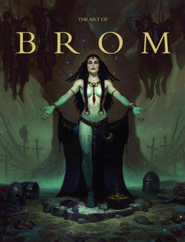
The Art of Brom
Here we're getting into the subjective - Gerald Brom is one of my favourite artists (and a pretty fantastic novelist!). That said, if I recommended art books just for the beautiful images contained therein, my list of recommendations would be miles long.
The reason this book is close to my heart is because of its introduction, where Brom goes explains in detail just how he went from being an army brat to one of the most highly respected dark fantasy artists in the world today. I believe that one's work is flavoured by their life's experiences, and discovering the roots from which other artists hail can help give one perspective on their own beginnings, and perhaps their eventual destination as well.


