250 Box Challenge

6:46 PM, Sunday December 27th 2020

Album — Postimages

Album — Postimages: https://postimg.cc/gallery/w639gY6

250 boxes under my belt!

The images are numbered by each count of 5 from 0 - 250. I apologize that they aren't in order, and that you can't scroll. For whatever reason Imgur wasn't uploading properly, so I had to use another website.

Thanks for your help!

(I accidentally uploaded this twice, the first time forgetting to ask for official feedback).

0 users agree
10:04 PM, Sunday December 27th 2020

Congratulations for completing the 250 Box Challenge!

You did a good job on the challenge overall.

I can see you made some good improvement with the quality of your mark making. Your lines steadily become straighter and more confident looking as you progressed through the challenge. You drew your boxes at a pretty good size and with a variety of orientations and foreshortening. You also start to do a better job of getting your sets of parallel lines to converge more consistently towards their shared vanishing points!

One thing I would recommend is that you try adding extra line weight to your boxes as an added step. When you go to add weight to a line it is important that you treat the added weight the same way you would a brand new line. That means taking your time to plan and ghost through your mark so that when you go to execute it the mark blends seamlessly with your original mark. This will allow you to create more subtle and clean looking weight to your lines that reinforces the illusion of solidity in your boxes/forms. Extra line weight should be applied to the silhouette of your boxes. I recommend that you try adding your extra line weight in no more than 1-2 pases.

Extra line weight should never be used to correct or hide mistakes. You should read more about this here. Something to keep in mind as well, when you are working through Drawabox you should be employing the ghosting method for every mark you make. This includes the hatching that we sometimes use for our boxes.

I see that throughout many of your boxes, you appear to have purposely tried to keep your sets of lines parallel on the 2D page, drawing them all to an "infinite" vanishing point. As explained in this section, because these boxes are oriented with us looking at the corner of the box, we should be drawing it in 3 point perspective - meaning with 3 concrete vanishing points, each set of lines converging towards a real point in space, even if that point is far off and the convergence is gradual.

I think this diagram will help you as well. So, when you are looking at your sets of lines you want to be focusing only on the lines that share a vanishing point. This does not include lines that share a corner or a plane, only lines that converge towards the same vanishing point. Now when you think of those lines, including those that have not been drawn, you can think about the angles from which they leave the vanishing point. Usually the middle lines have a small angle between them, and this angle will become negligible by the time they reach the box. This can serve as a useful hint.

Before moving onto lesson 2, I am going to have you draw 30 additional boxes. Make sure you visit every link I have left for you and reread the challenge instructions in their entirety before beginning your revisions. I will mainly be checking to see that your boxes are being drawn in 3 point perspective with your sets of lines converging towards their shared vanishing points.

Next Steps:

30 additional boxes as described in the critique.

When finished, reply to this critique with your revisions.
7:28 PM, Sunday January 3rd 2021

Thanks so much for your advice!

Thanks for pointing out that my convergences were very slight. I was afraid of making the boxes look distorted so I tended to make modestly converging boxes. For this thirty I pushed myself to make the vanishing points a lot closer for steeper boxes.

I also tried really hard to go over the outside contour as smoothly as possible.

https://imgur.com/a/UYsyPMO

Thanks!

LL

4:06 PM, Monday January 4th 2021

This is a good improvement! Apart from box 24 where you have a few scratchy lines, I can see your boxes are doing a better job of converging towards their shared vanishing points. Your extra line weight is also looking smoother and more confident!

I am going to mark this lesson as complete and you may now move on to lesson 2.

Good luck!

Next Steps:

Continue to lesson 2!

This critique marks this lesson as complete.
The recommendation below is an advertisement. Most of the links here are part of Amazon's affiliate program (unless otherwise stated), which helps support this website. It's also more than that - it's a hand-picked recommendation of something I've used myself. If you're interested, here is a full list.
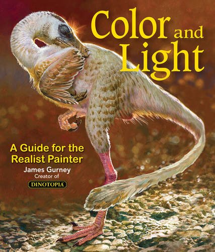
Color and Light by James Gurney

Color and Light by James Gurney

Some of you may remember James Gurney's breathtaking work in the Dinotopia series. This is easily my favourite book on the topic of colour and light, and comes highly recommended by any artist worth their salt. While it speaks from the perspective of a traditional painter, the information in this book is invaluable for work in any medium.

This website uses cookies. You can read more about what we do with them, read our privacy policy.