


Lesson 2: Contour Lines, Texture and Construction
10:50 PM, Friday May 6th 2022
I'd really appreciatte your reiew :D.
Hi! I will check your homework today.
I will try to be as concise as possible, and first of all good job for finishing it.
Arrows:
Starting with the arrows, it's great that the negative space and size of these decrease as they get further away from the viewer.
The application of lineweight on these looks appropriate.
Keep applying this only in parts where one section overpowers another.
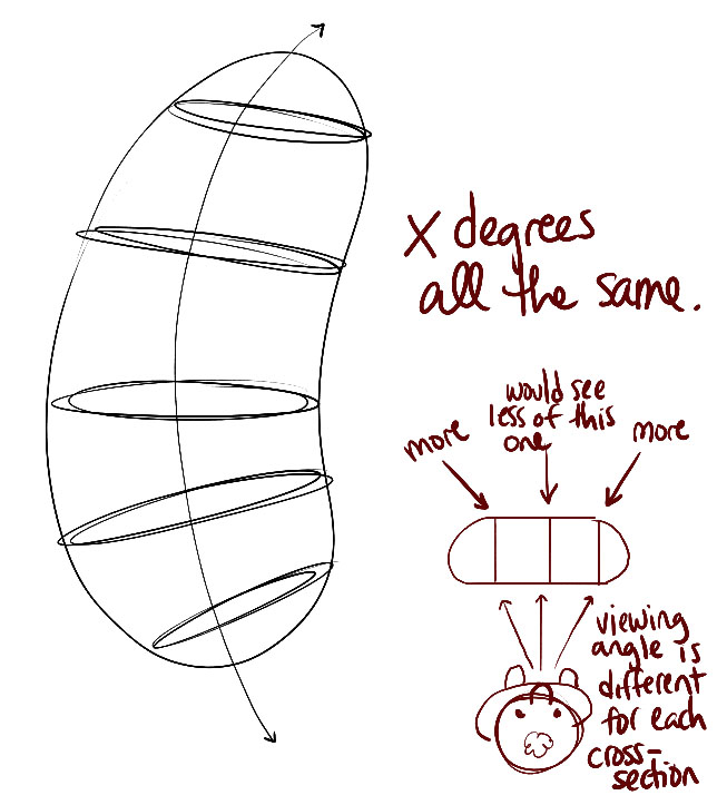
Organic shapes / Ellipses and contour curves:
The overall shape of your "sausages" is adequate, nothing is overdone.
Regarding the ellipses I like that they are well aligned to their minor axis.
Although the degree of your ellipses doesn't change much as they move away from the center.
Like here: https://d15v304a6xpq4b.cloudfront.net/lesson_images/6822fd02.jpg
This change must be there to give the illusion of three-dimensionality.
Here's a guide to correct it: https://imgur.com/rXLBxSg
This degree change should also be applied to contour curves.
Textures:
Texture work looks adequate.
While the textures themselves look good, the transition from dark to light could be extended a bit more.
As in the last section of this image: https://d15v304a6xpq4b.cloudfront.net/lesson_images/7d1f3467.jpg
I will point out that in the textures we will always draw the shadows cast, nothing to do with the shading of the shapes themselves.
The difference between both shading is here: https://imgur.com/L21Mqxh
Dissections:
Your textures roll nicely into the sausage shape.
The transition from light to dark in some textures is perfect, as in the flake texture.
Applying this one will always reinforce the three-dimensional feeling, I recommend you to do it every time you can.
Intersection of shapes:
All the shapes look like they belong to the same scene because of their similar size and foreshortening, all good in that part.
I'm impressed by how solid the intersections look on all shapes.
We'll come back to these in the lessons later.
Organic intersections:
The shapes look well supported on top of each other, that's appropriate.
There's not too much to emphasize here.
You seem to already know this but let me point out that the cast shadows are shaped according to the shape they are cast in, rather than the original shape.
As stated here: https://d15v304a6xpq4b.cloudfront.net/lesson_images/516f8d4f.jpg
I'll leave you a simple corrections task, you don't have to rush to complete it.
Next Steps:
Remember to try to change the degree of each ellipse.
This is the only thing you have to focus on.
Sorry for the lateness
Well, now you can see a grade change by the thickness of your ellipses!
The corrections have worked out well, I will mark your lesson as complete.
Keep up the good work next time!

While I have a massive library of non-instructional art books I've collected over the years, there's only a handful that are actually important to me. This is one of them - so much so that I jammed my copy into my overstuffed backpack when flying back from my parents' house just so I could have it at my apartment. My back's been sore for a week.
The reason I hold this book in such high esteem is because of how it puts the relatively new field of game art into perspective, showing how concept art really just started off as crude sketches intended to communicate ideas to storytellers, designers and 3D modelers. How all of this focus on beautiful illustrations is really secondary to the core of a concept artist's job. A real eye-opener.
This website uses cookies. You can read more about what we do with them, read our privacy policy.


