This website uses cookies. You can read more about what we do with them, read our privacy policy.

7:56 AM, Tuesday March 9th 2021
Hello, and welcome! Let’s see here.
Your superimposed lines look really smooth. They’re also properly lined up at the start, and of a consistent trajectory, though I notice that your pen will lift off of the page sometimes, so try to maintain an even, consistent pressure, if you can. The ghosted lines/planes look solid. It’s a little hard to tell, because of the image size, but it doesn’t seem like you’re plotting start/end points for the non-diagonal center lines of your planes. Be sure to, if that’s the case.
Your ellipses look fantastic. They’re smooth, rounded, and properly drawn through. You’ve kept their degrees/angles in a frame consistent, and tried out a bunch of them, too. The only thing I’ll recommend is to lift your pen off the page at the end of your rotations, rather than flick it off – it’ll get rid of those tails at the end. The ellipses in planes are similarly good. Despite this more complicated frame, they’re still confident, and circular. The funnels look great, too, though I’ll recommend spending a tiny bit longer on the ghosting stage, and being a little more mindful of your marks, as you’re making them (specifically, how many times you’re rotating around your ellipses – it’s a little inconsistent).
The plotted perspective exercise looks solid. By the way, if you find your back line being misaligned, you should estimate its position, rather than double down.
The rough perspective exercise improves nicely throughout the set, though I’ll caution you against automatic reinforcing (correcting and incorrect line) – it doesn’t fix your mistakes, it just draws attention to them. The convergences look good, and it’s great to see that you’re taking your time planning them. To help push them even further, start paying attention to the shapes of your planes. Because we’re dealing with 1-point perspective, our near/far planes need to behave in a certain way. Specifically, they need to be of the exact same shape (though not size, the far one being smaller). This is something that you can point out in the early stages of your planning, so, if you spot a mistake of that kind, give your points another look, rather than committing. A good example of this is that middle box in the last frame of page 2. Notice the shapes of its planes, and how if you’d made the far one into more of a rectangle, similar to the front one, the correction lines would’ve been spot-on.
The rotated boxes exercise is a little uneven, and a little stretched, but well done, nevertheless. If you’re wondering, it would’ve been best if every quadrant looked like the top-left one – we like our boxes big. The other aspects of it – the boxes being snug, drawn through, and properly rotating – are nicely done.
Finally, the organic perspective exercise looks really good. You’ve got a ridiculous number of boxes here, which really does a lot to push the illusion, especially when coupled with their consistent, shallow foreshortening. Some lineweight, to clarify the hierarchy, would’ve really pushed them to the next level, but that’s alright – there’ll be plenty a chance to practice that in the upcoming box challenge.
Next Steps:
Speaking of, as I’m marking this lesson as complete feel free to move on to it.
8:38 AM, Tuesday March 9th 2021
Thank you very much BENJ!! :D
I'll be sure to check back over your critiques for each part as I return to them for warm-ups ;)

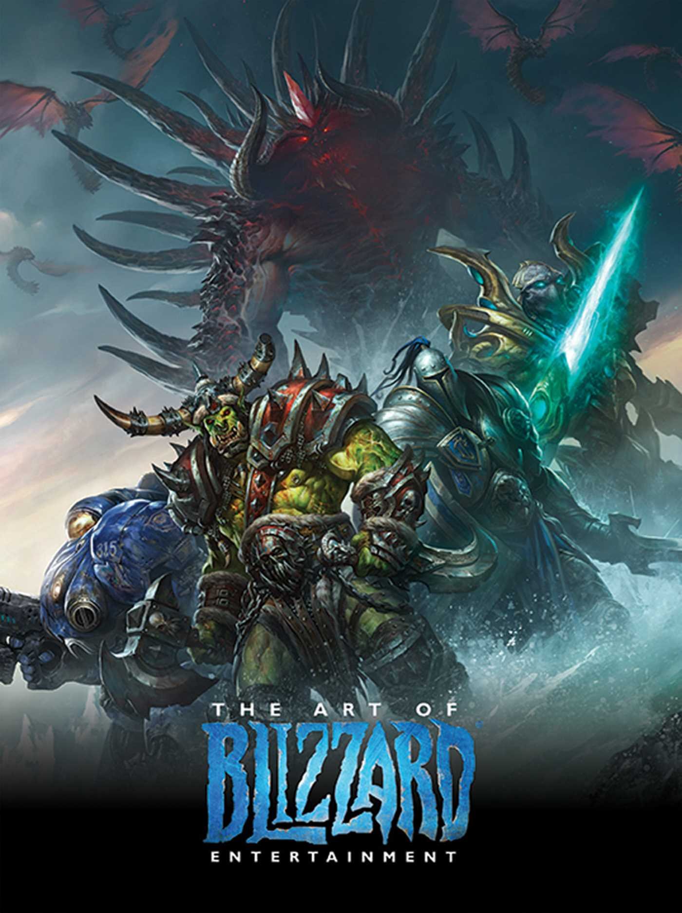
The Art of Blizzard Entertainment
While I have a massive library of non-instructional art books I've collected over the years, there's only a handful that are actually important to me. This is one of them - so much so that I jammed my copy into my overstuffed backpack when flying back from my parents' house just so I could have it at my apartment. My back's been sore for a week.
The reason I hold this book in such high esteem is because of how it puts the relatively new field of game art into perspective, showing how concept art really just started off as crude sketches intended to communicate ideas to storytellers, designers and 3D modelers. How all of this focus on beautiful illustrations is really secondary to the core of a concept artist's job. A real eye-opener.


