Lesson 1: Lines, Ellipses and Boxes

6:30 PM, Wednesday October 14th 2020

DRAWABOX Lesson 1 - Album on Imgur

Direct Link: https://i.imgur.com/I2lFmT5.jpg

Discover the magic of the internet at Imgur, a community powered enterta...

Hello everyone!

This is my completed homework for lesson 1, any comments will be much appreciated.

The organic perspective exercise was giving me problems, because at first I didn't exactly understand what I was supposed to do, but I think by page 2 I got the hang of it. Other than that I did the best I could.

btw: on the superimposed lines exercise I drew dots before each line to mark the beggining and the direction - although I suppose that wasn't really necessary, but oh well :) just thought I'd mention it.

2 users agree
7:59 PM, Wednesday October 14th 2020

Hi! Good job! I think your works are all quite well executed and in line with the expectations. Some of your ellipses are not regular in shape, and their orientation is not always consistent, but that will improve with practice and is to be expected at some degrees. I see what you mentioned for the organic perspective, and i agree that you improved towards the end. I would advice you to be careful when applying more weight to the stroke of your boxes, try not to make a "repeated strokes" effect. If you think you were getting the hang of the organic perspective, I would recommend you to move on to the 250 box challenge, to solidify your understanding of forms and vanishing points in a 3D space. Nice work overall, keep it up!

Next Steps:

I would advice to move on to the 250 box challenge, good luck!

This community member feels the lesson should be marked as complete, and 2 others agree. The student has earned their completion badge for this lesson and should feel confident in moving onto the next lesson.
10:28 AM, Thursday October 15th 2020

Thank you for your comment!

I agree about the ellipses, they were definitely giving me some problems. I will try and practice them more with some warmups.

The line weight is also something I'm not quite sure how to fix, I think it might be because of the pen that I'm using as it is not the best quality. Is it ok to go over the lines with repeated strokes to make them thicker (and just be more careful doing it), or am I supposed to do that with just one stroke but applying more pressure?

And thank you for your advice, I have actually already started with the 250 box challenge :)

3:52 PM, Thursday October 15th 2020

To add some weight to the stroke, i trace over it just once more with a little bit of added pressure to the pen. Every pen is different, so you have to find out what is the best pressure to use normally and when adding weight to the lines. It can be tricky because you still have to make a confident stroke, but also trace over an existing one with precision. I would avoid doing more repeated strokes over one line, and stick to this method instead. Hope this can help :)

4:59 PM, Friday October 16th 2020

Thank you, this helps a lot!

The recommendation below is an advertisement. Most of the links here are part of Amazon's affiliate program (unless otherwise stated), which helps support this website. It's also more than that - it's a hand-picked recommendation of something I've used myself. If you're interested, here is a full list.
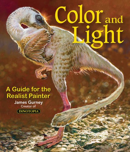
Color and Light by James Gurney

Color and Light by James Gurney

Some of you may remember James Gurney's breathtaking work in the Dinotopia series. This is easily my favourite book on the topic of colour and light, and comes highly recommended by any artist worth their salt. While it speaks from the perspective of a traditional painter, the information in this book is invaluable for work in any medium.

This website uses cookies. You can read more about what we do with them, read our privacy policy.