This website uses cookies. You can read more about what we do with them, read our privacy policy.

12:25 PM, Friday May 15th 2020
Hey! I'm Tora, I'll be going over your work today :)
Right into it,
Lines - Looking good! Smooth, confidently executed. You paid attention to realign your pen to the starting point in your superimposed lines. Well done!
Ellipses - Again, fine job on this one too. It is clear you understood the exercises well - your tables of ellipses have varying degrees, varying angles, but they meet their mark of the confining box. Ellipses in planes, very good job here too, even on the largest ellipses which I would assume were the most difficult to put down. Well done on funnels, too! I especially like that you employed the wider degrees as the funnel opens up. The only thing I could maybe see here is that you were a bit looser, and therefore less accurate with some of your ellipses. But that would absolutely be splitting hairs, the accuracy will come with time and practice and you're fairly accurate as is already. The main purpose of the exercise was smoothness in the ellipses, which you've completely nailed. Great job!
Boxes - Great job on the rough perspective exercise! This is likely one of the cleanest looking attempts, in terms of line quality, that I've seen so far. One thing I will note, however -- At times you went over your lines twice, I assume you did so instinctually after not being satisfied with the first mark you've made. I get this, sometimes it slips and you forget to stop yourself, old habits die hard etc., but try to be mindful of this as you go into 250 boxes. You definitely don't want to be going over any lines. Moving on, well done with rotated boxes too! They're rotating nicely, some of them are a little squished, but you got all of them in their place.
Finally, organic perspective. First off, I love the sense of scale, they're rotating, they're flowing nicely. Overall, the sense of scale is clearly readable, well done on that! However, here is where a bit of that confidence and quality escapes you, understandably so! But, I will reinforce my advice -- don't go over your lines twice or more times. Even if it's the worst line you've ever seen, just keep it there. The only time you're going over your lines is if you're adding line weight, but even that should not be used everywhere, and should not look like there are 2 lines. Lastly, when hatching one of your box planes, try to do it neatly. Yeah, it's boring and a bit grueling, but you want to produce clean work.
So, I think that's it! Overall, great work on this lesson. I'm looking forward to seeing how you employ the beautiful line quality you've established here in your future exercises! :)
Next Steps:
250 box challenge.
3:42 AM, Saturday May 16th 2020
Thank you very much for the encouragement there, Tora! I appreciate it. Now I can go on smoothly forwards to the next lessons. I hope to see you again in good spirits +w+)7
12:38 PM, Friday May 15th 2020
Hi DonDon55,
I checked your work and its solid homework.
Your lines are looking confident, exercises are done in a good way.
Circles end ellipses are looking really nice. with future warm ups and lessone you will manage to make them even more solid.
I like your box rotation, maybe the furthest boxes are too long, but you got point of exercise.
Go for Box challenge and keep this exercises as a warm up.
Next Steps:
Go for 250 Boxes challenge
3:40 AM, Saturday May 16th 2020
Thanks Hamsetro, I appreciate all your crituques. I hope to see you again with my other lessons! For now, time to go ahead to do the 250 boxes! ^v^)

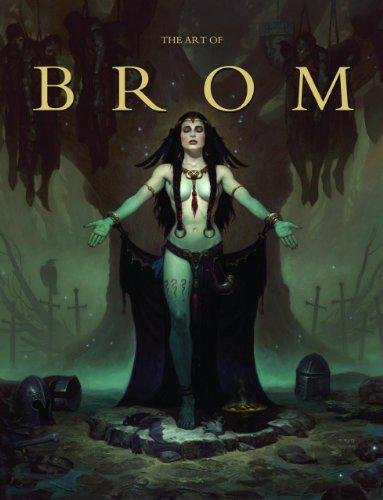
The Art of Brom
Here we're getting into the subjective - Gerald Brom is one of my favourite artists (and a pretty fantastic novelist!). That said, if I recommended art books just for the beautiful images contained therein, my list of recommendations would be miles long.
The reason this book is close to my heart is because of its introduction, where Brom goes explains in detail just how he went from being an army brat to one of the most highly respected dark fantasy artists in the world today. I believe that one's work is flavoured by their life's experiences, and discovering the roots from which other artists hail can help give one perspective on their own beginnings, and perhaps their eventual destination as well.


