Lesson 3: Applying Construction to Plants

5:15 PM, Thursday November 11th 2021

Lesson 3 - Album on Imgur

Direct Link: https://i.imgur.com/ZMvxNNS.jpg

Find, rate and share the best memes and images. Discover the magic of th...

Hi

I took a break from DaB to learn the Loomis Method for Heads, while trying to keep up with the warmups.

Should have done more warmups, so it took some time to get back into it, as I struggled through the lesson.

One thing i noticed later on was that it was way easier to draw on a whole page instead of halfs,

especially with the smaller details.

There was some confusion when i had the leaves overlapping each other on leavy plants.

I made another Album with my references: https://imgur.com/a/1JA2DYQ

Thanks for going through them

0 users agree
10:36 PM, Friday November 12th 2021

Before I get started, I wanted to comment on one thing you pointed out - that it was easier to draw on a whole page instead of splitting things into halves. This is a good thing for you to have observed, and it's something I call out when critiquing students every now and then. Basically, while it's admirable for those who wish to put many drawings onto a single page, it actually hurts somewhat to artificially limit how much room you have to work through a single construction. Limiting how much space you have impedes your brain's capacity for spatial reasoning, while also making it harder to engage your whole arm while drawing.

Ultimately, every drawing requires two things: time, and space. Time is simple - how long a drawing requires is determined by its complexity, and a drawing made up of 100 lines will inevitably take longer than one made of 10 lines (though some people will mistakenly think that's cause to rush through, which it most certainly is not). Space on the other hand is about ensuring that our drawing is given as much room as it requires (within the bounds that the page is able to offer). Once we've finished a drawing, we can always assess whether another one will fit on the same page. If it will, then it should certainly be added (to make good use of the space available to us), but if it won't, then it's perfectly okay to have just one drawing on a given sheet.

Anyway, let's jump right into your work. Starting with your arrows, these are looking quite good. You're drawing the linework with confidence, which is helping you to capture how they each flow smoothly through the world, something you've carried over quite nicely into your leaves. There you've done a great job of capturing not only how each leaf sits statically in the 3D world, but also how they move through the space they occupy. You've also done a great job of building up additional edge detail, one stroke at a time, upon the existing structure of the simple leaf. You've even experimented with one more complex leaf structure, and that came out nicely - although it was pretty cramped, and should have been drawn larger given the space that was available to it.

Continuing onto your branches, here I did catch one key mistake - you don't appear to be following the specific instructions on how we are to transition from one edge segment to the next. As explained here, we are to draw from one ellipse, past the second, stopping halfway to the third. The next segment then starts at the second ellipse and repeats this pattern, resulting in a much more significant overlap between them, which in turn allows for a smoother, more seamless transition from one to the next. Right now you've got plenty of examples of overlaps that are just way too short.

Moving onto your plant constructions, as a whole you've largely done a pretty great job. You're working with simple forms, focusing on how they can be combined to create more complex overall results, rather than making leaps of logic and jumping into overly complex structures far too soon. I do have a few things to suggest however:

  • I can definitely see a number of cases where by your own admission, you really didn't give yourself all that much room to work. Ultimately what's important is that you understood the issue, and did eventually move onto correct it in later drawings. Along with simply using more space on the page and not splitting the page up ahead of time, another point you can consider is that when you have a reference with a lot on it (like for example the one you used for the right side of this page, you do not actually need to draw the entire plant. The reference image is just a source of information - it's not a strict goal that you must draw completely. Instead, you could opt to focus on a smaller subsection - maybe a branch with a few bulbs. This would in turn allow you to explore each flower in greater depth, scaling it up to the space available to you, instead of limiting each bulb to being especially tiny.

  • When constructing cylindrical structures, like the base of this plant, be sure to construct them around a central minor axis line. this will help you keep your ellipses and any other forms (like the ball form that sits between the base and the actual leaves) aligned to one another.

  • While you've generally handled the addition of leaf/petal edge detail fairly well, in the last couple of drawings you do tend to get a little more lax in that regard. For example, here on the last page you end up trying to incorporate too much complexity in one go. The complexity that can be added to a construction in a single step is entirely dependent on what the existing structure will support. As shown here on another student's work, sometimes you need to spend several steps laying down what will essentially serve as support for the more complex edge. There were also a couple spots where you ended up zigzagging your edge detail back and forth across the existing edge, which as explained here is a common mistake that should be avoided.

So! Be sure to keep those points in mind, but feel free to consider this lesson as complete.

Next Steps:

Move onto lesson 4.

This critique marks this lesson as complete.
1:46 AM, Saturday November 13th 2021

Thanks Uncomfortable

I'll try to slow down more and keep your tips in mind :)

The recommendation below is an advertisement. Most of the links here are part of Amazon's affiliate program (unless otherwise stated), which helps support this website. It's also more than that - it's a hand-picked recommendation of something I've used myself. If you're interested, here is a full list.
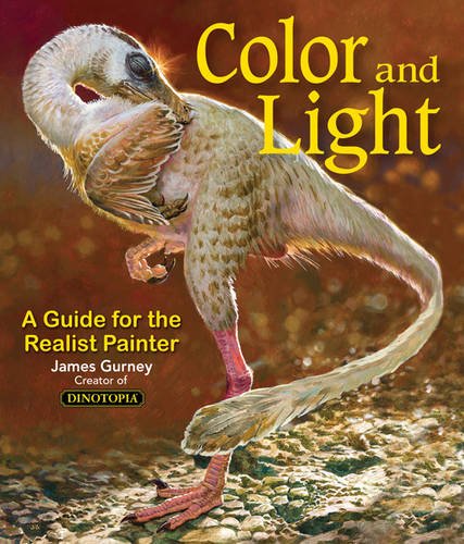
Color and Light by James Gurney

Color and Light by James Gurney

Some of you may remember James Gurney's breathtaking work in the Dinotopia series. This is easily my favourite book on the topic of colour and light, and comes highly recommended by any artist worth their salt. While it speaks from the perspective of a traditional painter, the information in this book is invaluable for work in any medium.

This website uses cookies. You can read more about what we do with them, read our privacy policy.