View Full Submission View Parent Comment
2 users agree
8:32 AM, Thursday July 9th 2020

Hi, I think everything looks really good, however I noticed that some of the boxes on your organic perspective pages look really distorted. This can happen when the vanishing points are too close together. I suggest revisiting that part of the lesson. One thing that helped me was ploting out the points first to make sure they look right by placing a dot, then using the ghosting method to draw the line. If you watch the video by ScyllaStew at the bottom of that page I believe she demonstrates that method. It worked well for me (you don't have to watch the whole 3 hour video though ;) ).

I'd really like to see you do another page of organic perspective before moving on to 250 boxes and lesson 2 before I mark the lesson as complete.

Next Steps:

Please do 1 more page of organic perspective.

When finished, reply to this critique with your revisions.
1:27 AM, Sunday July 12th 2020

Hello, first I'd like to thank you for the critique! I definitely felt like the organic perspective gave me a lot of trouble. I didn't get a chance to see your advice before starting the 250 box challenge but I was barely a 1/4 of the way through before going back to the organic perspective exercise and I think it actually helped me grasp the concept much easier. I took your advice and used the dots method for drawing the box and think I improved a lot.

Let me know what you think and thank you again!

[https://imgur.com/a/recBNZs]

9:14 AM, Sunday July 12th 2020

Hey, no problem I think I did the same thing when I finished lesson 1. I didn't check back for a while haha. No worries! These look good I'll mark it as complete!

This community member feels the lesson should be marked as complete, and 2 others agree. The student has earned their completion badge for this lesson and should feel confident in moving onto the next lesson.
The recommendation below is an advertisement. Most of the links here are part of Amazon's affiliate program (unless otherwise stated), which helps support this website. It's also more than that - it's a hand-picked recommendation of something I've used myself. If you're interested, here is a full list.
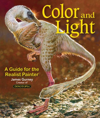
Color and Light by James Gurney

Color and Light by James Gurney

Some of you may remember James Gurney's breathtaking work in the Dinotopia series. This is easily my favourite book on the topic of colour and light, and comes highly recommended by any artist worth their salt. While it speaks from the perspective of a traditional painter, the information in this book is invaluable for work in any medium.

This website uses cookies. You can read more about what we do with them, read our privacy policy.