Lesson 5: Applying Construction to Animals

4:12 PM, Wednesday December 2nd 2020

hw5 - Album on Imgur

Direct Link: https://i.imgur.com/rifrZNU.jpg

Discover the magic of the internet at Imgur, a community powered enterta...

References - https://imgur.com/a/WlpmmII

I re-submitted my revisions as a new lesson 5 submission, as you asked here https://drawabox.com/community/submission/XNYEX7QD

I spaced out the drawings over a longer period this time around. I feel that I may have made my forms more complex than they need to be for the Kangaroo, Elephant, and Rhino and this was a point in your last critique. I only came to this conclusion after taking a second look at all my drawings while also reading through your previous critique to see if I adhered to your points. I do have multiple questions, but I'll only ask the most vital one and that is about line weight.

I feel this is most noticeable when I attempt drawing the heads, but I can't seem to be able to easily change the line weight when I draw slower. I tried drawing some lines on some scrap paper to see if I could change the line weight, but regardless of the the pressure I put down, the line weight seems the same. There is a certain point I do not go over, because I feel that would damage the pen. I've damaged one of these staedler pens earlier in the year so I think I have a feeling of how much pressure is too much but I don't know if I have damaged my pens already or I am just doing it wrong. The only way I have found to get a different line weight is the speed at which I make a stroke. I have 4 pens, 2 I got earlier in the year, damaged them, recognized I damaged them, and another set that I use as my main pains that I have been much more careful with.

A elementary question, but it is something I noticed and would like to bring up.

My other questions consist of simple things like how to draw forms like paws better but I am sure I can work that out over time so I won't waste your time with them.

And as a follow up to your previous critique as well, I have been following the 50/50 rule much more as of late. (After you pointed it out)

For a while I had trouble following the 50/50 rule but as of late I feel like I have gotten more and more into the habit of it.

Here is a post I made in september about the 50/50 rule actually. - https://drawabox.com/community/submission/AFQKUAY3

Sorry to keep hitting you with these walls of texts. If they are more a nuisance than helpful, just let me know and I'll scale it back a little.

0 users agree
8:19 PM, Thursday December 3rd 2020

So the issue about line weight actually makes me think you might just not have understood how we're meant to be applying line weight in the first place. I don't expect (or want) students to purposely vary their pressure while they're drawing an individual stroke. You draw everything with the same confidence as you figure out your construction - drawing confidently generally yields a stroke that will taper on both ends (as shown here), but aside from that the weights will generally be about the same.

Adding line weight is a separate step, which we achieve by going back over our lines. We still employ the same techniques, draw with the same confidence, because the strokes we want to create also need to be tapered on both ends in order to blend more smoothly into the existing marks. But it isn't all done at once. Breaking the drawing process into a series of separate steps is what we're after wherever possible, and this is no exception. Solve one problem at a time.

It is however worth reminding you that drawing slowly and hesitantly will create wobbly lines. You should drawing all of your marks with confidence. That doesn't mean everything should be super fast, but that you should not be drawing with any kind of hesitation, or attempting to steer the lines with your eyes.

Anyway, your work here has definitely improved , and I'm seeing you employing different aspects of what I introduced previously. There are, however, some areas where you're forgetting things I'd mentioned, though this is understandable.

With first several pages (all the way up to the kangaroo), I could see clear thought being put into head construction especially. The quality of your eye socket shapes is a little hit and miss - the meerkat at the start's eye sockets are quite well shaped, but here you end up with more simplified diamond shapes, and here you've got a more simplified pentagon shape. The key difference is that when you fall back to simplified shapes, it suggests that you're not thinking as much in 3 dimensions, where the world doesn't adhere to these basic shapes. Still, the way you're approaching those additional masses is improving, but there is a tendency to leave really thin gaps between them which we can see here. Don't leave those gaps - there's no reason for them. Your masses should be butting up against one another tightly.

When it comes to building up additional masses along the body, you've definitely made progress, but there are still plenty of areas where you're either adding complexity, like an inward curve, or some kind of corner where there is no logical cause for it (remember that all complexity is created from pushing our additional mass against something else that is specific and concrete), as well as areas where a form is pushing up against something, but still retains a simpler outward curve. I've marked out some issues on this kangaroo.

I've also noticed that you have a tendency in some places to attempt to wrap one form around another, but where it's not done so correctly (take a look at where I drew over your kangaroo's foot, for example).

Lastly, remember that when you pile one mass on top of another, because both have thickness and volume to them, they can't just blend smoothly into a smooth, continuous edge along the structure's silhouette. You're going to end up with a "pinch" where the top mass's thickness comes into play, as I demonstrated above your elephant's back here.

Now, as I said, there is progress here, but you still have a tendency to draw your forms' silhouettes with more complexity than is needed, and so there is more work to be done. Rather than just having you draw a bunch of animals, I'm going to give you a separate, new exercise to do first.

I want you to draw a bunch of sausage chains, like the one shown here. Fill a page with them. Once you've filled the page, then I want you to build up additional forms along those sausages, using animal and insect legs as reference (absolutely use reference for these, the higher the resolution the better), as shown in the two examples I provided to you previously: the ant leg and the dog leg. For your first two sausage chains, I want you to just reproduce those very same examples to the best of your ability.

I'd like you to do two pages of these, followed by 2 animal drawings.

Next Steps:

Please submit the following:

  • 2 pages of sausage chain/leg studies.

  • 2 animal drawings

When finished, reply to this critique with your revisions.
1:31 AM, Tuesday December 8th 2020
edited at 1:32 AM, Dec 8th 2020

Just a quick question, for the sausage chains, should I make them uniform? Should I use a reference image?

Because my current understanding is to make random sausage chains consisting of 3 sausages each, and add additional forms (use leg references here), not to make them look like a leg per se(in terms of sausage chain layout), but just for the practice of it.

With the exception of the first two, as you stated. Is this correct?

edited at 1:32 AM, Dec 8th 2020
2:25 AM, Tuesday December 8th 2020

I suppose it's probably better to lay them out according to some reference image, just to make your life easier. It's not about training you to make up legs better, just to pay closer attention to building up those masses.

1:27 AM, Tuesday December 15th 2020

The assignment - http://imgur.com/a/7h8yLZe

I didn't make a gallery of my references this time.

I don't have any questions or nothing to add for now, other than I spread the work out over a longer time than I usually would.

View more comments in this thread
The recommendation below is an advertisement. Most of the links here are part of Amazon's affiliate program (unless otherwise stated), which helps support this website. It's also more than that - it's a hand-picked recommendation of something I've used myself. If you're interested, here is a full list.
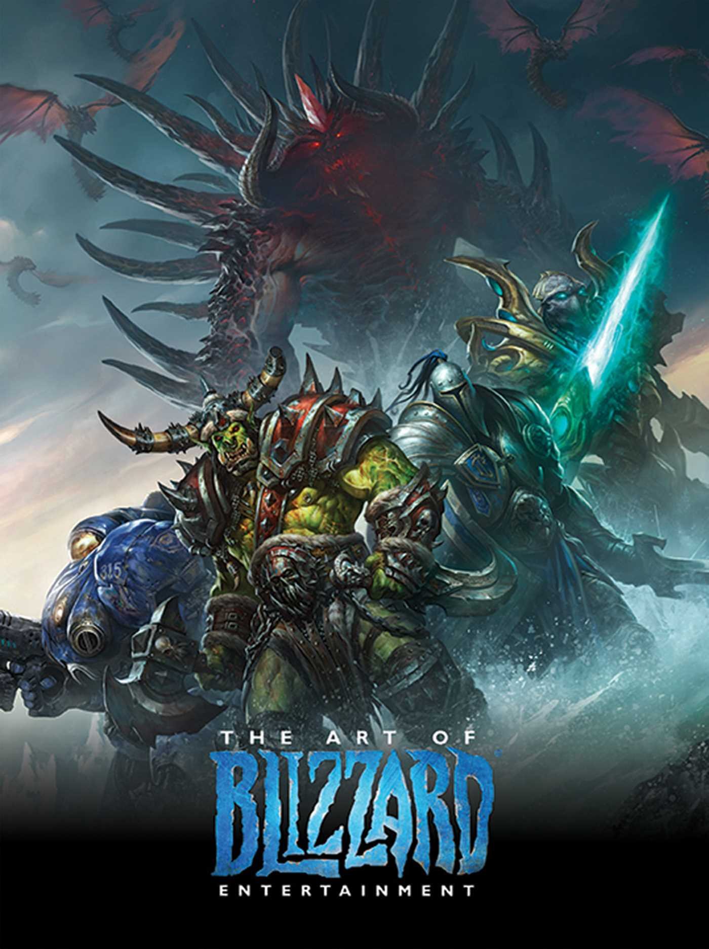
The Art of Blizzard Entertainment

The Art of Blizzard Entertainment

While I have a massive library of non-instructional art books I've collected over the years, there's only a handful that are actually important to me. This is one of them - so much so that I jammed my copy into my overstuffed backpack when flying back from my parents' house just so I could have it at my apartment. My back's been sore for a week.

The reason I hold this book in such high esteem is because of how it puts the relatively new field of game art into perspective, showing how concept art really just started off as crude sketches intended to communicate ideas to storytellers, designers and 3D modelers. How all of this focus on beautiful illustrations is really secondary to the core of a concept artist's job. A real eye-opener.

This website uses cookies. You can read more about what we do with them, read our privacy policy.