250 Box Challenge
3:15 PM, Monday July 6th 2020
Hi just finished box challenge. Thanks for your critique in advance)

Hi,
Good work on getting through the challenge, it's a tough one!
I'd like to start with some general feedback on the whole challenge.
Boxes per page - You have way too many boxes per page, It's advised to have 5-6 boxes per page in the exercise. Putting so many boxes on the page will make each individual box be smaller, and on smaller boxes it's easier to hide your mistakes. You don't want to hide your mistakes, you want to see them clearly so you'd be able to learn from them.
Box Y's - You use similar orientation for most boxes. While you do change the length of the lines for the initial Y corner, your angles between lines are pretty similar throught most of the exercise. I'd definitely try a doing a couple of more pages with a focus on making each box have a 'unique' orientation. You can even find a tool to generate your Y's.
For some 'page specific' feedback:
Your boxes are pretty distorted up to about the 80th box. After that you kind of get into the grove and there's a noticable different in quality. There will still be an off box here or there but that's to be expected.
You do face some issues with long boxes where the back face is still kind of distorted and the persective lines diverge. Some notable boxes with this issue are:
235, 220, 193(i think), 164
Next Steps:
For a revision I would suggest doing 5 pages with 5-6 boxes on them that are bigger than your current ones so as we could give you more quality feedback and so you'd be able to see for yourself as well which things you need to work on more.
You showed a lot of improvement over the 250!
Make sure to not let your lines get wobbly, as some edges are still prone to do that. Also, it would be nice if you reinforced the outside lines a bit.
Hi , thanks for your critique, it really means a lot for me. I'll definitely keep this in mind and keep working on it.
Thanks again and good luck ;)

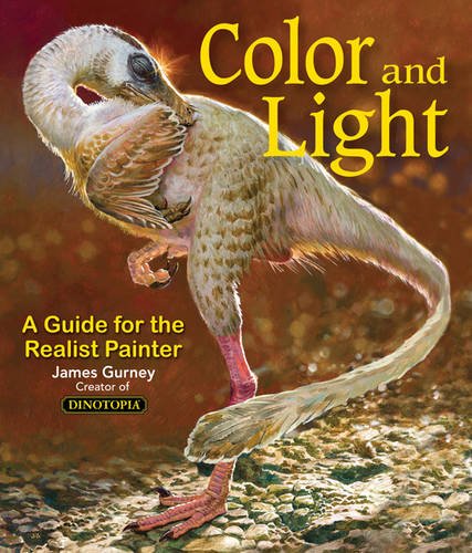
Some of you may remember James Gurney's breathtaking work in the Dinotopia series. This is easily my favourite book on the topic of colour and light, and comes highly recommended by any artist worth their salt. While it speaks from the perspective of a traditional painter, the information in this book is invaluable for work in any medium.
This website uses cookies. You can read more about what we do with them, read our privacy policy.