


This website uses cookies. You can read more about what we do with them, read our privacy policy.
2 users agree
5:08 PM, Saturday April 1st 2023
Hello, I will be critiquing your lesson 2 work
Organic Arrows
The linework on your organic arrows is looking pretty confident, and it seems that you are making good attempts at the perspective. I notice that you did not connect the ends of your ribbons on your first page of arrows, but it looks like you fixed that on the second page. I also see that your second page of arrows has improved in terms of how the arrows compress and become thinner as they move away from the viewer.
For the lineweight, I would like you to reserve the extra superimposed line for only the parts that overlap. In both pages, I noticed that you added lineweight to longer lines rather than just the overlapping areas. Also, it would be best to only go over the original line once, as your lineweight looks particularly thick in some areas.
Organic Forms with Contours
-Your sausage forms are turning out great and are very solid. I like to see that you kept a consistent width throughout the entirety of your shapes.
For the organic forms with ellipses, you did well with trying to change the degree of the ellipses as they moved in space. They also look nice and snug within the form, which is what you are supposed to aim for. Good job
Similar to the organic forms with ellipses, your contours are wrapping around the surface of the sausage and are fitting in snugly. However, I would like to see them change degree more as they move in perspective.
Textures
Starting with your texture analysis, you made good use of bold ink for the cast shadows. I see that you achieved a nice transistion between the zones with high density of detail to the areas that are more sparse.
--you also did a good job of drawing the shapes of the shadows and then filling them in, rather than simple, thin lines.
Looking at your texture dissections, I see that you applied the same bold shadows and transistions like in your analysis. Good job at breaking the silhouette as well.
Form Intersections
Form intersections are a new concept and rather hard so don't worry if you completely understand the concept just yet. It will make more sense as you will practice these concepts more in later lessons. However, I would like tosay that your forms are turning out pretty solid here and that you did a nice job with applying the lineweight.
Organic Intersections
Your forms are starting to become more believable here, but I feel like you are having some trouble with the cast shadows. Some of the shadows are being cast unnaturally to the shape below them. You should try pushing the shadows further like in this example: https://d15v304a6xpq4b.cloudfront.net/lesson_images/516f8d4f.jpg They should follow the curvature of the contours that you added onto the shapes beforehand.
Alright, I will go ahead and mark this lesson as complete.
Next Steps:
Lesson 3
The recommendation below is an advertisement. Most of the links here are part of Amazon's affiliate program (unless otherwise stated), which helps support this website. It's also more than that - it's a hand-picked recommendation of something I've used myself. If you're interested, here is a full list.
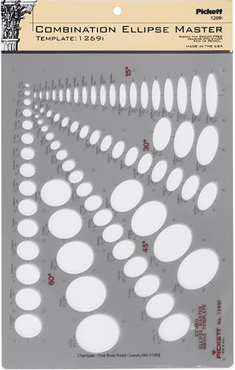
Ellipse Master Template
This recommendation is really just for those of you who've reached lesson 6 and onwards.
I haven't found the actual brand you buy to matter much, so you may want to shop around. This one is a "master" template, which will give you a broad range of ellipse degrees and sizes (this one ranges between 0.25 inches and 1.5 inches), and is a good place to start. You may end up finding that this range limits the kinds of ellipses you draw, forcing you to work within those bounds, but it may still be worth it as full sets of ellipse guides can run you quite a bit more, simply due to the sizes and degrees that need to be covered.
No matter which brand of ellipse guide you decide to pick up, make sure they have little markings for the minor axes.