Lesson 2: Contour Lines, Texture and Construction

3:45 PM, Saturday December 18th 2021

Drawabox Lesson 2 - Album on Imgur

Direct Link: https://i.imgur.com/FSWhZlX.jpg

Find, rate and share the best memes and images. Discover the magic of th...

After procrastinating for about 3-4 months, finally finished this lesson. Stuck on dissections, the recommended pinterest page helps, but because i dont know how to call each texture, i ended up not using it aside from texture analysis.

Problems i found on my own:

-Still suck at drawing forms, but hey at least now it does flow a bit better

-Textures turns out weird, too much detail, came out wrong. Probably putting too much emphasis on less distinct details

-Flying sausages in the organic intersections,too scared to make it overlap

-Weird intersections, rotated the page around and then came out wrong when i rotate it back

If you're reading this, critique's are welcome and thank you for your time

2 users agree
5:20 PM, Saturday December 18th 2021

Hi Kilta I'll be handling the critique for your lesson 2.

-Starting with organic arrows you are doing a great job drawing them confidently and keeping in mind the foreshortening, keep in mind though, that the negative space (space between the zigzaging sections of the ribbon) should decrease as the arrows move further away, this is a minor observation and you only made this mistake a couple of times.

-Moving on to the organic forms with contours, you are drawing your sausages consistently, avoiding any overstretching, elongated and unequal size ends.

  • When adding the ellipses you have drawn them confidently, and fitting snugly inside the form, also you nailed the alignment and kept in mind the degree shifts. It seems that you have some trouble when drawing ellipses that are close to 90 degrees (when they approach a perfect circle), so keep practicing them.

  • Your contour curves not looking quite confident, and sometimes they wobble, I'd suggest that you don't try to fit in that many contour curves, by adding a few well placed ones should be enough.

-Continuing on to the texture analysis, I think you are focusing mostly on outlines and negative space, also the initial black bar at the left side of the rectangle is still visible, so you want to work on making your gradients more subtle, and having that black bar merge more seamlessly into the transition from dense to sparse.

-Moving on to the dissections, you're focusing largely on outlines and negative space rather than cast shadows created by forms along the texture itself. This makes it difficult to create gradients with implied information which we could then use to create focal points in more complex pieces, by doing so we can prevent our viewers from being visually overwhelmed with too much detail. You also show that you're drawing from memory at times rather than giving yourself enough time to focus on your reference. Most of our time when doing exercises like this will be spent observing our reference and looking away for a quick second to add something to our page. I'd also like to quickly direct you to this image which shows that when we're working with thin line like textures if we outline and fill the shadow we will create a much more dynamic texture than simply drawing lines.

-Moving on to the form intersections, this exercise is just meant to get students to start thinking about how their forms relate to one another in 3D space, and how to define those relationships on the page. We'll be going over them more in the upcoming lessons.Your forms are looking quite solid here and they believably appear to belong in the same cohesive 3D space, good work.

-Finishing this critique with the organic intersections, you are keeping your forms, simple, which is a good strategy to produce better results, but there is much room for improvement left.

  • You are not pushing your cast shadows far enough, instead they mostly hug the form creating them, try pushing them further.

  • There are a number of missing shadows, considering you filled the entire page, there are not too many of them to imply how they relate to each other.

Next Steps:

Before you can move on I'd like you to redo the organic intersections exercise, keep in mind that with each sausage that you add you should also add one cast shadows, also haver your organic forms wrap around each other tightly.

  • 1 page of organic intersections
When finished, reply to this critique with your revisions.
1:07 AM, Monday December 20th 2021

here's my attempt https://imgur.com/a/a6ZgcDZ

Reread the exercise page, noticed its suppose to be one pile (oops), so this time tried doing it with only one pile. May have gone a bit overboard with the shadows, noticed some feels unnatural. Struggled to draw the sausage part that are supposed to be behind the other objects. I dont know if i had done it well this time, let me know what you think.

4:41 AM, Monday December 20th 2021
edited at 4:41 AM, Dec 20th 2021

Okay, so yeah by working with more manageable sausages and keeping them simple you have achieved better results. Your sausages begin to wrap around each other more believably, I have only one thing to call out.

Avoid the big mother technique where you draw a big sausage at the start and you draw a bunch of smaller ones around it, but overall you have done great, I-ll go ahead and mark this lesson as complete.

This community member feels the lesson should be marked as complete, and 2 others agree. The student has earned their completion badge for this lesson and should feel confident in moving onto the next lesson.
edited at 4:41 AM, Dec 20th 2021
10:08 AM, Monday December 20th 2021

Yeah im having trouble making the same sizing on the sausages, noticed as i gradually stack it on top it becomes smaller each time. Otherwise, thank you for your time !

The recommendation below is an advertisement. Most of the links here are part of Amazon's affiliate program (unless otherwise stated), which helps support this website. It's also more than that - it's a hand-picked recommendation of something I've used myself. If you're interested, here is a full list.
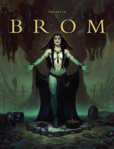
The Art of Brom

The Art of Brom

Here we're getting into the subjective - Gerald Brom is one of my favourite artists (and a pretty fantastic novelist!). That said, if I recommended art books just for the beautiful images contained therein, my list of recommendations would be miles long.

The reason this book is close to my heart is because of its introduction, where Brom goes explains in detail just how he went from being an army brat to one of the most highly respected dark fantasy artists in the world today. I believe that one's work is flavoured by their life's experiences, and discovering the roots from which other artists hail can help give one perspective on their own beginnings, and perhaps their eventual destination as well.

This website uses cookies. You can read more about what we do with them, read our privacy policy.