Lesson 2: Contour Lines, Texture and Construction

10:50 PM, Friday May 14th 2021

lesson 2 - Album on Imgur

Direct Link: https://i.imgur.com/LPoAMsL.jpg

Discover the magic of the internet at Imgur, a community powered enterta...

Learnt a lot! I know now from my 250 box challenge that you might not read this before you do the critique but there are some questions at the end if you could please check that afterwards.

I left in my mistakes and the original organic forms with ellipses and contour lines that I attempted but I hope you can see from the texture dissections that I went away and did them for my warm ups and improved over this lesson.

I really don't understand how to draw the pyramids successfully - the construction lines end up making it look like a pentogram to me and my eyes really struggle to see the 3D shape. Are they essential for the next couple of lessons?

Discord has been a godsend for this lesson - being able to ask for feedback as I went and improve has really really helped. For example my bricks not following the contour lines of the sausage I was drawing them onto.

I also got some feedback about the top left sausage being too rigid in the final organic intersections page, so I added in some little sausages to prop it up in the final image in this album ;)

Question about the textures: Are we truly meant to only draw cast shadows, or is it any shadow that is black - core and cast shadow? There is a lot of confusion about this in the L2 discord channel, with the same question popping up from confused students every week. This isn't a case of them not understanding what a cast shadow is - more a case that the text and the images don't allign. For example, chrome has no cast shadows, being a fully smooth texture, and yet is an example on the homework page.

0 users agree
11:07 PM, Monday May 17th 2021

I'll be the TA handling your Lesson 2 critique.

You're making progress towards understanding the concepts introduced in this lesson and hopefully this critique will help you in your future attempts.

  • Starting off with the arrows section you want to be making sure you're drawing confidently to keep your arrows as smooth as possible, accuracy will come with mileage. There are spots where your arrows bulge/narrow suddenly, this is an issue because it gives the impression that your arrows are stretching which hurts their solidity. Remember that as our arrows move closer to the viewer we want them to widen consistently. This is a good exercise to experiment with line weight but when applying it we want to make sure we do subtly to key areas like overlaps to give clarity to our forms. Here are some things to look out for when applying line weight, and here are some reminders on how to apply it subtly. I'd like you to experiment more with foreshortening in your future attempts, by utilizing it in both the arrows themselves as well as the negative space between their curves we can create a stronger illusion of an object moving through 3D space as demonstrated here.

  • Moving into the organic forms with contours exercise your forms are getting a bit too complex. We want to create our forms with both ends being the same size and to avoid any pinching, bloating, or stretching along the form's length as discussed here. Some of your line work here shows a lack of confidence resulting in stiffness, remember that our first priority is that we want all of our linework/ellipses/contours to be drawn confidently and mileage will improve our accuracy. Speaking of contours I'd like you to try and shift the degree of your contours more. The degree of a contour line basically represents the orientation of that cross-section in space, relative to the viewer, and as we slide along the sausage form, the cross section is either going to open up (allowing us to see more of it) or turn away from the viewer (allowing us to see less), as shown here.

  • In the texture exercises (more so in your dissections) you're focusing largely on outlines, form shadows and negative space rather than cast shadows created by forms along the texture itself (although you have some good attempts here as well like your corn and lava rock). This makes it difficult to create gradients with implied information which we could then use to create focal points in more complex pieces, by doing so we can prevent our viewers from being visually overwhelmed with too much detail. For more on the importance of focusing on cast shadows read here. I'd also like to quickly direct you to this image which shows that when we're working with thin line like textures if we outline and fill the shadow we will create a much more dynamic texture than simply drawing lines.

To comment on your question, the examples in the lessons are meant to be examples of what a good submission would look like not necessarily a perfect one. This is to discourage people from grinding even more than they currently do in hopes to achieve a "perfect" submission, there are mistakes in the examples at times and they are even talked about in some of the videos at times. When it comes to chrome it's honestly not the best choice for these exercises but because it lacks a texture that we can reference cast shadows from we instead simulate the reflections. So to recap focus on casts shadows, it's definitely not an easy set of exercises and each texture is it's own challenge, we don't expect you to nail these concepts or form intersections just yet but we want to introduce you to the ideas as they'll be used more later on.

  • If you feel like you don't fully grasp form intersections just yet don't worry, you're on the right track but right now this exercise is just meant to get students to start thinking about how their forms relate to one another in 3D space, and how to define those relationships on the page. We'll be going over them more in the upcoming lessons. Your forms are looking quite solid here and they believably appear to belong in the same cohesive 3D space, good work. You may use pyramids later on depending on references you choose, but your pyramids are on the right track. You may be getting confused from not being used to seeing so many construction lines, but the more you practice the more you'll train your brain to keep track of what you're trying to convey and pick up some skills to help make it easier as well (applying line weight to the outer edge of our boxes was an example of this).

  • While wrapping up your submission with the organic intersections exercise you show that you need a bit more time becoming comfortable with thinking of how these forms interact in 3D space and how they'd wrap around one another, currently you have some that are floating in space a bit unrealistically but this is a good start and you're getting close. You're keeping your forms simple and easy to work with which is a good strategy to help produce good results. When it comes to your shadows you're pushing them enough so that they cast rather than just hugging the form that creates them which is a great start. Your shadows appear to be following a consistent light source, be sure to experiment with different angles and intensities when trying this exercise again in the future. I recommend pushing your light source to the top left or right corner of the page to start with, it's easier than working with a light directly above your form pile.

Overall this was a solid submission, while you may have some things to work on I have no doubt you will improve with more mileage. I'll be marking your submission as complete and moving you on to the next lesson.

Keep practicing previous exercises as warm ups and good luck in lesson 3!

Next Steps:

Keep practicing previous exercise as warm ups.

Move on to lesson 3.

This critique marks this lesson as complete.
8:50 AM, Tuesday May 18th 2021

thank you!! lots learned, lots still to learn.

The recommendation below is an advertisement. Most of the links here are part of Amazon's affiliate program (unless otherwise stated), which helps support this website. It's also more than that - it's a hand-picked recommendation of something I've used myself. If you're interested, here is a full list.
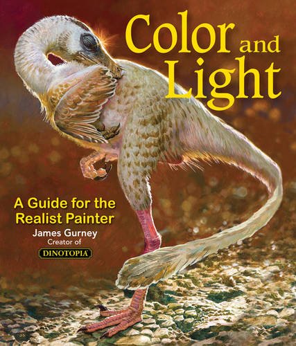
Color and Light by James Gurney

Color and Light by James Gurney

Some of you may remember James Gurney's breathtaking work in the Dinotopia series. This is easily my favourite book on the topic of colour and light, and comes highly recommended by any artist worth their salt. While it speaks from the perspective of a traditional painter, the information in this book is invaluable for work in any medium.

This website uses cookies. You can read more about what we do with them, read our privacy policy.