Lesson 1: Lines, Ellipses and Boxes
4:56 PM, Sunday August 9th 2020
Redone lesson 1 for official critique :]

Hello! I’ll be looking through this~
Starting off, your superimposed lines look great. They’re smooth, properly lined up at the start, and of a consistent trajectory. Your ghosted lines/planes are quite confident, too, and I’m glad to see that you’re not forgetting to plot start/end points for the non-diagonal center lines of your planes.
Moving on to the ellipse section, the table of ellipses exercise looks fairly fantastic, too. Your ellipses are smooth, and rounded, and they do a good job of touching all available sides of the frame. One recommendation I have is to rotate around them 2 full times, however, instead of settling for 1 and a half. The ellipses in planes exercise is really well done, too. Your ellipses maintain their smoothness/roundness, despite the added difficulty of having to touch all 4 sides of the plane. That, too, they do a great job of, so nicely done, all around. Finally, the funnels exercise looks really good, too. The ellipses in the page-corner funnels are a little misaligned, unfortunately, but you likely got a little confused from the double minor axis (if it wasn’t clear, that was uncomfortable messing up his first, and re-drawing it- you do not need to replicate his mistake, but you can feel free to re-draw yours, if you happen to mess it up, too.) The remaining funnels look good, however. If you can, though, try to extend the minor axis a little further, next time, so the edge-most ellipses have it cut them in half, as well, or, conversely, stop your ellipses a little sooner.
Starting off the box section, the plotted perspective exercise looks quite clean- good job. For the rough perspective exercise, it seems like you used a ruler for the front faces. This is incorrect, but not a huge deal. The meat of this exercise, the convergences themselves, are well done, and improve nicely throughout the set. As you’ve likely already discovered, the more time you spend planning them, the better they are, so, to take them even further, spend even longer considering and reconsidering them. Solid attempt at the rotated boxes exercise. Your boxes are snug, and they rotate quite comfortably, too. For your next attempt, I’ll recommend pushing the rotation a little further, and trying to draw a little bigger, if you can. Finally, the organic perspective exercise looks great. There’s the occasional foreshortening issue (you’ll recall that dramatic foreshortening implies an object of a huge scale, or one that’s really close to us, and, as such, it has no place in this exercise), but, overall, your boxes are correct, and their subtle increase in size, and many overlaps, do a great job of communicating their flow. A little bit of line-weight on those overlaps would’ve, too, but that’s alright- there’ll be plenty of chances to practice that in the 250 box challenge. This submission being as fantastic as it is, you can feel free to move on to it!
Next Steps:
250 Box Challenge
Thank you!
I’d been doing drawbox before I could pledge through Patreon and I can see my development compare to my first lesson 1 submit.
I also have done the 250 Box Challange in june. Do you recommend that I redo it entirely? (I asked Uncomfortable and he said just 50 boxes, but I’m tempted to do it all over again like Lesson 1).
You can, though there’s not really much point to it. The old challenge, in addition to the more recent 50 boxes, are enough for us to be able to tell whether you’re understanding the concepts we’re trying to impart here, which, at the end of the day, is what the homework is all about. It’s up to you, though.

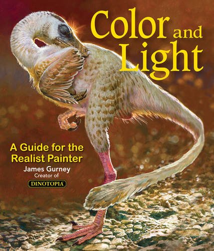
Some of you may remember James Gurney's breathtaking work in the Dinotopia series. This is easily my favourite book on the topic of colour and light, and comes highly recommended by any artist worth their salt. While it speaks from the perspective of a traditional painter, the information in this book is invaluable for work in any medium.
This website uses cookies. You can read more about what we do with them, read our privacy policy.