Lesson 3: Applying Construction to Plants

5:34 AM, Tuesday April 14th 2020

Lesson 3 - Album on Imgur

Direct Link: https://i.imgur.com/RlLJ8JR.jpg

Discover the magic of the internet at Imgur, a community powered enterta...

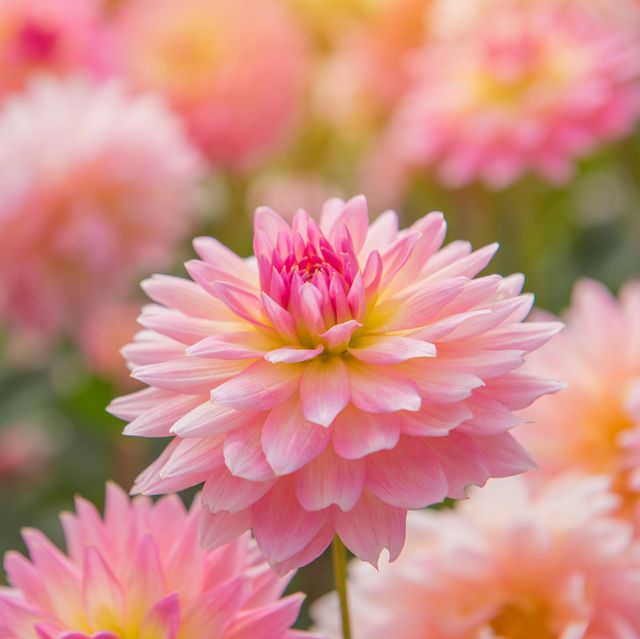
Man, when I did the first lessons, I struggle with the fact that I was not gonna be able to fix my mistakes, and I thought I came to the other end with my mind ready to tackle some more, but there is a fundamental difference between these exercises and the previous ones, now you have to draw objects that represent real ones, and that you can identify, so now my mind can be much more objective in it's criticism towards the mistakes I make, so I actually struggle more with that criticism here than on the previous lessons. And also, about constructing, I tried a few other plants on pen before attempting on ink, and decided not to pursue those instances because it will get so messy that I would not be able to make sense of it in order to apply shadows or line weight in order to make it more readable, I will post the link of a flower that made see that, and is because I tried to draw every petal as a complete petal, so those are 3 lines for every petal, the center line and the sides. This is the plant in https://www.honeygood.com/wp-content/uploads/2020/03/colorful-of-dahlia-pink-flower-in-beautiful-garden-royalty-free-image-825886130-1554743243.jpg and that made me wonder if I should attempt to draw every part of the plant as a complete form or if we can do just the main forms and the rest can be partially drawn. In this page you can see what I mean https://imgur.com/7aL6uvl the two attempts at the sides of the cactus are this same flower, I did it in ink, but I trowed away the page because it was unreadable.

0 users agree
12:43 AM, Wednesday April 15th 2020

Before I get into the critique, your approach in regards to the question you asked was correct initially - you should be drawing each and every form in its entirety, regardless of whether or not it gets messy. The point of construction as a drawing exercise is to learn to think about each form as it exists in 3D space and how it relates to its neighbours within that space. If we only draw them partially, we only understand them as part of a two dimensional drawing, which teaches us very little about what we're attempting to understand. Once a drawing is completed, line weight and cast shadows can help to clarify the construction and make it more readable, but at the end of the day, the focus is on what the process teaches you, not the result.

So, starting with your arrows, you're doing a pretty good job in drawing them such that they flow fluidly through space, though I'm noticing a couple little things to keep in mind:

  • As you're drawing your lines in segments (which is fine), there's always a visible end to one segment as it transitions to the next because your strokes seem to largely maintain a consistent line weight. When a line is drawn more confidently, and without pressing too hard, we tend to get a more natural taper in our strokes towards the beginning and end, which in turn helps make them feel more lively and also helps to blend those strokes into other lines in cases like this. That taper occurs because the pen is moving as it touches down upon the page's surface - so before it's able to reach its full pressure, it's already taken off. If however you draw more slowly or press too hard, you'll end up reaching that full pressure before it really starts moving, resulting in a very consistent line weight throughout, and an obvious jump where your segments come together like this.

  • I'm noticing that you're somewhat hesitant to let the zigzagging sections of your arrows overlap one another. Remember that since those distances between the zigzags compress as we look farther back (due to perspective), they will eventually overlap. Sometimes students try and avoid this without realizing it, resulting in those gaps getting smaller initially, then maintaining a relatively consistent width even as they keep moving back. Don't be afraid to let them overlap, as it will help convey a strong sense of depth in your scene.

Moving onto your leaves, you've done a great job here. The leaves carry the same sense of confident flow as your arrows, though I can actually see many cases where your linework has the kind of tapering I described earlier, so you're clearly drawing them with energy and enthusiasm, which in turn helps capture how the leaves move through the space they occupy, rather than just how they sit statically within it. Also, you're doing a great job of building upon your simpler, early phases of construction as you add further edge detail and break your forms down. You stick to the scaffolding that exists in your drawings, never straying too far from it and drawing anything that cannot be supported by what is already there. Very well done.

In principle your branches are coming along well, though you do have a lot of visible 'tails' where your segments end up separating. It is rather difficult to get them to run together, and it's common to have issues having the segment that comes to an end veering off slightly. This will improve with practice, but one thing that can help with this is to actually use the previous segment as a sort of 'runway', to overlap it directly with your next stroke before it shoots off towards its target. That is, draw directly over the last bit of that previous segment instead of where that line ought to have been. This will force you to have to deal with the incorrect trajectories, which will in turn encourage your subconscious to correct it more directly.

One other thing to keep an eye on - keep working on maintaining a consistent width for your branches. I'm noticing places where the branches get narrower or wider, which adds complexity to their structure and undermines the illusion that they are solid and three dimensional.

Moving onto your constructions, you've got various levels of success here, but I definitely see a lot of improvement over the course of the set. Towards the end your drawings feel more solidly constructed, with petals that flow fluidly through space, whereas earlier on they were a little more stiff. You are still adhering quite closely to your preceding phases of construction however, so you're showing that you have a good grasp of how construction works. I have just a few issues to point out:

  • For this page, your line weight seems to be somewhat arbitrary, and more importantly, you tend to lay it on pretty thickly. Line weight is really meant to be subtle - the subconscious picks up on slight changes in thickness that the eye might not perceive as easily, and it uses it to help understand the drawing as a whole. Line weight should not ever get extremely thick, because this can flatten things out. At this point the student is usually attempting to draw cast shadows instead, as I suspect you were trying to do here. The issue is however that cast shadows need to be consistent - meaning, you need to take in account the position of the light source, and the direction in which it would cast those shadows. Additionally, cast shadow does not cling to the outline of the form casting it, as line weight would. Cast shadow always falls on another surface, so where that surface ends, so too does the cast shadow. It does not follow and cling to its parent form as you've done in this drawing.

  • Also in that drawing, a minor point - if you've got a cylindrical form, constructing it around a central minor axis line will help you keep your ellipses aligned to one another. Don't forget to capture the various forms of the flower pots as well - if it's got a rim with thickness to it, then it should be drawn with two concentric ellipses, not just a simple cylinder.

  • I can see that you're definitely experimenting with ways to clarify your drawings with this one, where you've filled in the undersides of your large leaves. Towards the far right, where one part of the leaf is casting a shadow onto the other, you've handled the cast shadow correctly. The others however are not - there you're thinking more about form shading, which as discussed back in lesson 2 is something we should not be including in our drawings for these lessons. The difference is simple - when a form casts a shadow, the marks you draw are placed on a surface other than the one being cast. You're not simply "filling in" an enclosed space, or colouring in the form in question. The marks always go on another surface. In the case of the far right leaf where I mentioned you did it correctly this can seem somewhat confusing, but there we'd think of the different parts of the leaf as separate forms, one casting upon the other. Form shading on the other hand is where the colour of a form is darker or lighter based on its orientation relative to the light source. As it faces towards the viewer, it gets lighter, as it turns away, it gets darker. Remember only to work with cast shadow within these lessons.

  • For this drawing, you left the flower pot form open along the bottom - that is, the lines just stop, without being capped off or enclosed. This reminds us that the drawing we're looking at is 2D, not a three dimensional form. Always cap them off, as though you've actually cut the form with a blade, and are drawing what remains. That way you end up with a complete form. This relates back to my answer to your initial question, about drawing forms in their entirety.

Other than these points, you're largely doing a good job. There certainly is room for improvement, but I'm relatively pleased with your results. As such, I'll go ahead and mark this lesson as complete.

One last thing, though - if you have a question to ask with your submission, keep it brief and to the point, and more importantly, break your sentences into paragraphs. Large walls of text become very difficult to process, especially when I'm coming to do critiques after a long day of work.

Next Steps:

Feel free to move onto lesson 4.

This critique marks this lesson as complete.
4:58 AM, Saturday April 18th 2020

Thanks a lot for taking the time to answer my doubts and for this critique. I was a bit scared that my work might not have done an enough job to move to the next lesson.

For the questions, I'll follow those guidelines: short paragraphs, and very specific (to the point).

The recommendation below is an advertisement. Most of the links here are part of Amazon's affiliate program (unless otherwise stated), which helps support this website. It's also more than that - it's a hand-picked recommendation of something I've used myself. If you're interested, here is a full list.
How to Draw by Scott Robertson

How to Draw by Scott Robertson

When it comes to technical drawing, there's no one better than Scott Robertson. I regularly use this book as a reference when eyeballing my perspective just won't cut it anymore. Need to figure out exactly how to rotate an object in 3D space? How to project a shape in perspective? Look no further.

This website uses cookies. You can read more about what we do with them, read our privacy policy.