View Full Submission View Parent Comment
10:01 AM, Wednesday June 17th 2020

[https://imgur.com/gallery/x938lAE]

First of all I wanted to thank you very much for this critique, which I felt was very accurate and thourough. SO, thank you :).

Here I've done the assignment you gave me. I have tried to draw as big as possible, but it would appear that It is still a habit that I need to learn. I also had to refrain from going to heavyhanded with the textures, and I will be doing the texture challenge as you suggested.

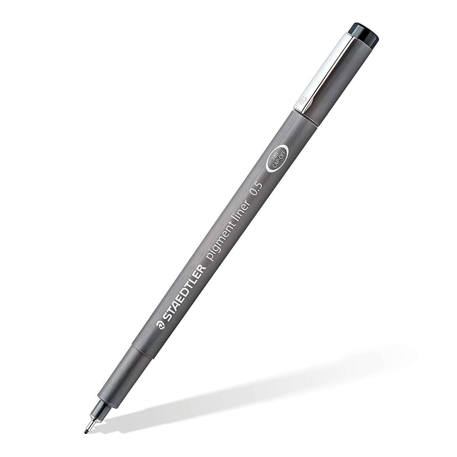
Anyways, there is one thing where i have encountered a problem : all of the Drawabox exercices I have done were made using exclusively a Staedtler pigment liner 0.5, which I believe is the pen you suggested that I use. I might have been not using it properly. These last three pages were done with another pen (still 0.5 ink).

Thanks again and have a nice day !

8:06 PM, Wednesday June 17th 2020
edited at 8:10 AM, Jun 23rd 2020

Looks good! You've put the advice I gave you to good use. Overall, your grasp of spacing is great - the scales on the back of the Camel spider, for example, are really well done and follow the shape well while not becoming distorted. You clearly take the time to plan things out, which is good.

One thing that could help make the drawings more grounded is to implement simple shadow outlines for insects which are on the ground, as Uncomfortable suggests in the lesson pages. This not only increases the perceived solidity of the forms when executed well, but also helps you grasp the drawing you have made in the full three dimensions, as drawing the shadow challenges you to estimate how the 3-dimensional object will cast a flat shadow onto the ground. This is sometimes difficult, especially with really complex forms, but is worthwhile for the benefits it can give.

Something that you could pay more attention to is the contour lines going around the forms - think about how the degree of the contours should change depending on which angle they are being looked at from. Something like this example (https://drawabox.com/lesson/2/5/degree), but keeping in mind that the degree of the contour lines will keep on getting wider and wider as they get further out from the center of vision. The main situation where I see this slip up is on the cricket, as you draw the contour lines on it's 'tail' in the opposite direction of the ones on it's abdomen. This makes little sense in terms of perspective. Also think about what the contours suggest about the form of the object they are describing; on the bottom section of the cricket's abdomen, the contours start going in the opposite direction from the ones on top, and don't feel like they wrap around the form convincingly. Contour curves can describe complex surfaces, but in those cases you have to make sure that they are explicitly passing on the information you need them to, rather than confusing the viewer. Sometimes it can be a good idea to simplify the contour curves, even if they are different in the reference.

Besides that, everything seems pretty good to me. Make sure you're not forgetting to add the small contour curves in the intersections between leg sausages, and good luck with lesson 5!

Next Steps:

Carry on with lesson 5, keeping in mind the critique I gave here.

This community member feels the lesson should be marked as complete, and 2 others agree. The student has earned their completion badge for this lesson and should feel confident in moving onto the next lesson.
edited at 8:10 AM, Jun 23rd 2020
9:11 AM, Saturday June 20th 2020

Thank you very much!

That cricket abdomen made me scratch my head quite a bit. I'll keep your advices in mind for the next lesson.

Have a nice day !

The recommendation below is an advertisement. Most of the links here are part of Amazon's affiliate program (unless otherwise stated), which helps support this website. It's also more than that - it's a hand-picked recommendation of something I've used myself. If you're interested, here is a full list.
Staedtler Pigment Liners

Staedtler Pigment Liners

These are what I use when doing these exercises. They usually run somewhere in the middle of the price/quality range, and are often sold in sets of different line weights - remember that for the Drawabox lessons, we only really use the 0.5s, so try and find sets that sell only one size.

Alternatively, if at all possible, going to an art supply store and buying the pens in person is often better because they'll generally sell them individually and allow you to test them out before you buy (to weed out any duds).

This website uses cookies. You can read more about what we do with them, read our privacy policy.