


11:59 PM, Tuesday August 9th 2022
Hello I’ll be handling the critique for your lesson 3 homework
Organic Arrows
-Starting by the organic arrows they are drawn with a good deal of confidence, and you are making some good attempts at foreshortening. I did notice some cases where there are some inconsistencies, like the ribbon bulging or getting thinner when it shouldn't. I assume that this is happening because you still do not have a good control of your strokes, what you can do is to actually draw your marks much slower while keeping the same deal of confidence, this will give you a much better control of the ribbon and you will achieve a more seamless transition from narrow to wide.
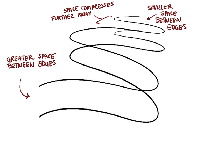
Another important thing to remember is that the negative space between the zigzagging sections of the ribbon get wider as it moves closer to the viewer, you can see an example here
(https://d15v304a6xpq4b.cloudfront.net/lesson_images/011d064f.jpg) , I think you may already be aware of this but you need to keep working on it.
Leaves
-Moving on to the leaves, they are moving in the right direction, I do think that some of them feel flat because they are not bending or folding, however I do have more important things to call out. First, make sure that you are adding the edge detail for all your leaves, take your time to design each individual bump and cut in order to achieve a more dynamic result. And second, do not try to capture textures with straight lines, instead what you can do is to outline the shadow shape first and then fill it in, this is also to make things more dynamic but it also forces you to design the shape of each individual shadow which helps with your spatial reasoning. You can see an example in this little diagram https://imgur.com/oAx2pRD.
Branches
-The branches are moving in the right direction. The only issue that I am seeing here is that the degree of the ellipses is barely changing in some cases. It is important to change the degree as the branch moves through space in order to better sell the illusion of solidity that we are looking for.
Plants
-Moving on to the plants I think we are moving in the right direction, you do seem to be employing the steps of the construction method well, but let’s see what you can do better.
-The first thing I want to call out is that you should always draw a minor axis for any cylindrical structure, like the scaffolding for your mushrooms.
This will help you to align those ellipses and you have to rely too much on guess work or eyeballing.
Also don’t forget the degree shifts it is superimportant that you are aware of them, so if you need a reminder you can revisit the lesson 1 ellipses section.
-I also noticed that on your tulips you tried to use a lot of cast shadows on the flower, but you also applied a lot of lineweight on the leaves of the plant, it is important to reserve lineweight only to clarify how forms overlap as shown here. https://imgur.com/WILCymm
Also keep in mind that if you end up making the lineweight too thick, you will take the solidity of your forms away and turn them into mere graphic shapes.
-The next thing I want to talk about is that most of your construction, specifically the flowers, feel quite simple, because you are drawing them from a straight front view.
Instead what you can do is to try more challenging angles , what if we were to look at the same flower but from a different view??
These are the kind of challenges that will help you to develop your spatial reasoning skills further, it doesn't matter how they ultimately turn up. If any mistakes were to happen then it is up to the person reviewing your work to help you with those.
Fortunately I still think that you did a great job with these, so I'll go ahead and mark this lesson as complete
Next Steps:
Lesson 4


