This website uses cookies. You can read more about what we do with them, read our privacy policy.

6:36 PM, Tuesday June 7th 2022
Hello I’ll be handling the critique for your lesson 3 homework
Organic Arrows
-Starting by the organic arrows these are drawn with a good deal of confidence which has really helped you to capture the fluidity with which they move through space, you are making some good attempts at the perspective of the ribbon, as it gets wider as it moves closer to us and the negative space decreases as it moves away from the viewer. I also like to see that you have used applied lineweight only on the parts where the arrow overlaps, the only observation I have to make is that the hatching looks a little bit rushed, remember that each line is no less important for being part of a larger group, give each additional line as much attention and time as it requires
Leaves
-The fluidity with which you drew your initial arrows carries over well to your leaves, and you are doing a great job employing the construction method to build up each additional detail, I can also see that you took your time to design the shape of each additional bump and cut to the edges which results in a more dynamic result.
Branches
-Moving on to the branches, your ellipses are drawn with confidence and you are also aware of how they change degree as they move through space, make sure that you are extending each segment fully halfway to the next ellipse without falling short. And do your best to use the previous segment as a runway, so that they overlap a good deal, this will help you to achieve a smoother transition as shown on step 3 of this diagram.
Plants
-On your plants you have made good use of the construction method, as you’ve broken each subject into its more primitive elements, and made a lot of smaller and simpler decisions rather than trying to capture a lot of things at once. But let’s see what things you can improve.
-The first thing I want to call out is your tendency to fill in large areas with ink, the problem really lies in the fact that your lineweight is pretty thick, and you are mixing a lot of form shading with cast shadows.
For example if we take a look at the plant on the left side of this page, the lineweight is pretty far out there, it is important to keep in mind that given the limitations in the tools we are using here it is better to reserve lineweight to clarify how forms overlap, this principle is shown in this demo. The potato plant's a good example for this, because you've got so many overlapping leaves that we've drawn through, creating a bit of a visual mess. Cast shadows can definitely help with this (since the shadow falls on the leaf underneath), but line weight applied specifically where the overlaps is also an extremely useful tool.
However, keep in mind that if you end up making the lineweight too thick you will take the solidity of your forms away and turn them into mere graphic forms, instead try to keep it subtle and only add one superimposed line.
-You may have confused them with cast shadows but these follow different rules, mainly that they are projected from one surface to another and thus they cannot cling to the silhouette of any given form, they must fall on another surface even if it is further away
A good example of this would be the plant on the left side of this page, it seems that the shadows are clinging to the silhouette of the berries instead of being projected from one surface to another, this would fall on the category of form shading which, as explained in this section of lesson 2 , we will not be using for the assignments of this course.
Hopefully I’ve cleared that for you, just remember:
-
Lineweight is only used to clarify overlaps, between forms and we should apply it very subtly
-
Cast shadows are projected from one surface to another and cannot cling to the silhouette of any form because that would fall in the category of form shading.
-When working with any pant like cacti of mushrooms, do not try to add the little bumps and cuts as if they were flat leaves, instead add full forms with volume and a fully enclosed silhouette, make sure that you are wrapping the silhouette around the initial form as shown here. This is a process that will be more fully explained on lessons 4 and 5, right now just try your best
-Lastly whenever you are working with pots or any kind of cylindrical structure make sure to align them to a minor axis, so that you don’t have to rely too much on eyeballing and guesswork
Okayy that should be about it, if you have any questions just let me know, I'm not an expert on the texture and all of that stuff, hopefully you did not get confused. Keep up the good work I'll go ahead and mark this lesson as complete
Next Steps:
Lesson 4
9:02 PM, Tuesday June 7th 2022
Thank you so much for the critique! This is really helpful!

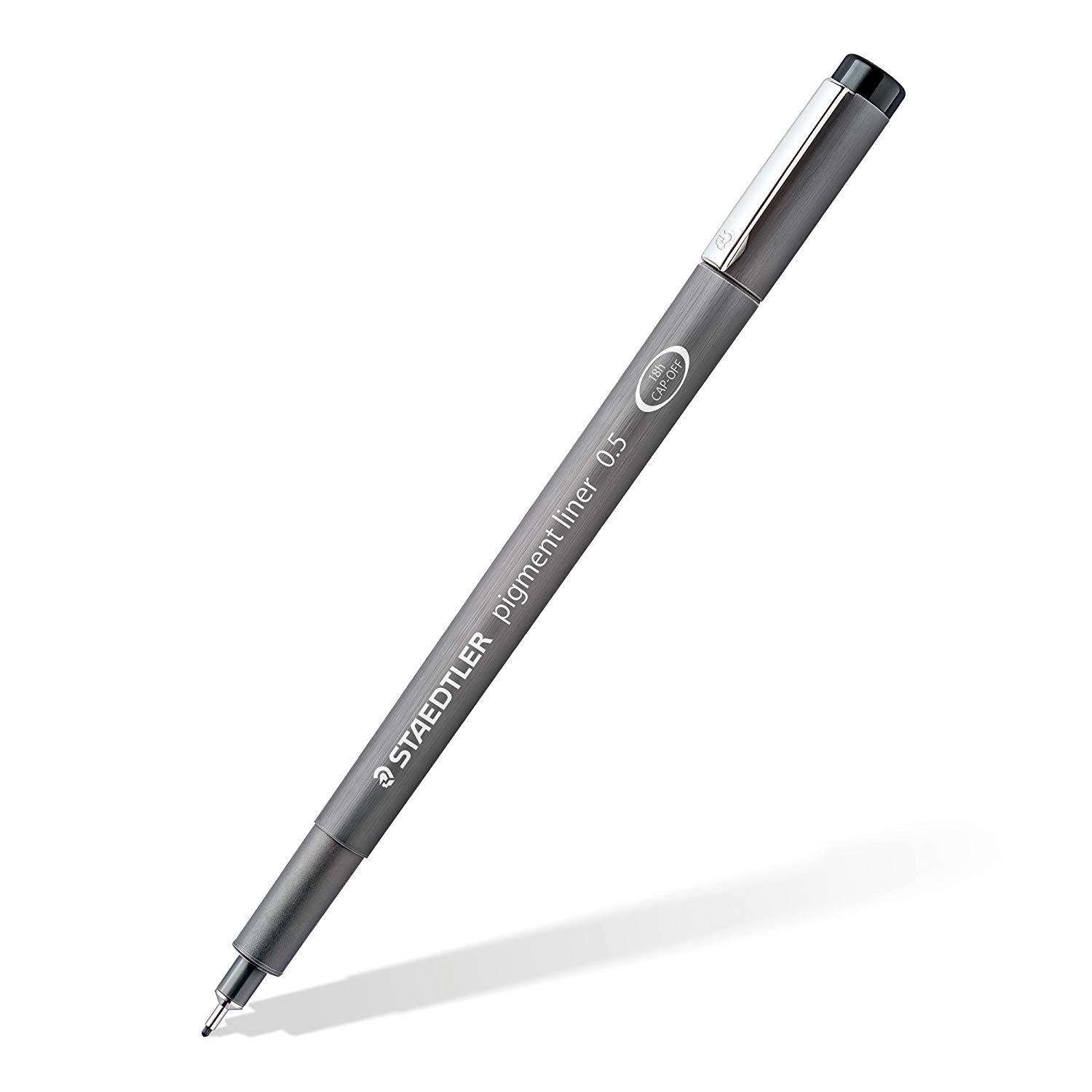
Staedtler Pigment Liners
These are what I use when doing these exercises. They usually run somewhere in the middle of the price/quality range, and are often sold in sets of different line weights - remember that for the Drawabox lessons, we only really use the 0.5s, so try and find sets that sell only one size.
Alternatively, if at all possible, going to an art supply store and buying the pens in person is often better because they'll generally sell them individually and allow you to test them out before you buy (to weed out any duds).


