Lesson 1: Lines, Ellipses and Boxes
2:34 AM, Monday January 4th 2021
What should work on?

Hi Starpixo!
Lines
Your straight superimposed lines look great! They're very confident and are only fraying at the end, which is what you want at lesson 1. The curved lines are a little less precise with the starting point, so be careful with those. Some of your ghosted lines do appear to be arching a bit--which can be the result of using your wrist instead of the shoulder pivot, so make sure you're using your shoulder. If you are sure you're using your shoulder, try correcting it by thinking about arching in the opposite direction. However, your ghosted lines otherwise look great! Very confident lines.
Ellipses
Your ellipses look great, the only comment I have is the minor axis sometimes doesn't cut symmetrically. Some of your ellipses also look like they aren't drawn through 2-3 times, only 1.5ish times--make sure you're drawing through them completely.
Boxes
For your rough perspective boxes, you should be following the rough lines you made to the horizon line, not to the actual vanishing point that doesn't reflect your actual lines. This is so you can see your mistakes and how far away you were from the actual vanishing point. You also appear to have drawn over your lines a couple of times--you should only be drawing the line once. However, your organic boxes look great!
Next Steps:
Redo your rough perspective boxes so the lines are plotted back to the horizon line, not the vanishing point. Read more about it in the homework assignment: https://drawabox.com/lesson/1/roughperspective
Post your edits and move on to the 250 box challenge!
Thanks for the critique, heres the redo of the rough perspective https://imgur.com/a/C60pc02

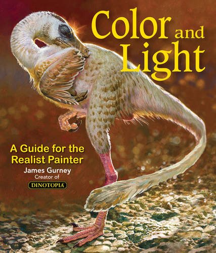
Some of you may remember James Gurney's breathtaking work in the Dinotopia series. This is easily my favourite book on the topic of colour and light, and comes highly recommended by any artist worth their salt. While it speaks from the perspective of a traditional painter, the information in this book is invaluable for work in any medium.
This website uses cookies. You can read more about what we do with them, read our privacy policy.